LassiP
Members-
Posts
37 -
Joined
-
Last visited
Recent Profile Visitors
1,520 profile views
-
 LassiP reacted to a post in a topic:
Affinity Version 2 Sets New Standards in Creative Software
-
 dannyg9 reacted to a post in a topic:
Goblin's (or Hiisi's) cat from Finnish Mythology
-
 VectorWhiz reacted to a post in a topic:
Goblin's (or Hiisi's) cat from Finnish Mythology
-
 DelN reacted to a post in a topic:
Treacherous Rocks in a Green Mist
-
I wouldn't be surprised to see something like this on a cover of a Nightwish album. Has the right feeling for such an occasion.
-
 LassiP reacted to a post in a topic:
Treacherous Rocks in a Green Mist
-
affinity designer My First Affinity Designer Works | Doctor Who Stickers
LassiP replied to endru's topic in Share your work
Simple yet elegant. Made me smile. -
 LassiP reacted to a post in a topic:
My First Affinity Designer Works | Doctor Who Stickers
-
 Old Bruce reacted to a post in a topic:
Text keeps changing to "no style" - help
-
So now there is one instruction to do the trick with just my one sentence, one with an image by thomaso and one with three images I was writing when thomaso put his explanation. Hope were on the right tracks... I need to learn to resize the images I put in the forum. "This little window..." doesn't look that little when I post it here...
-
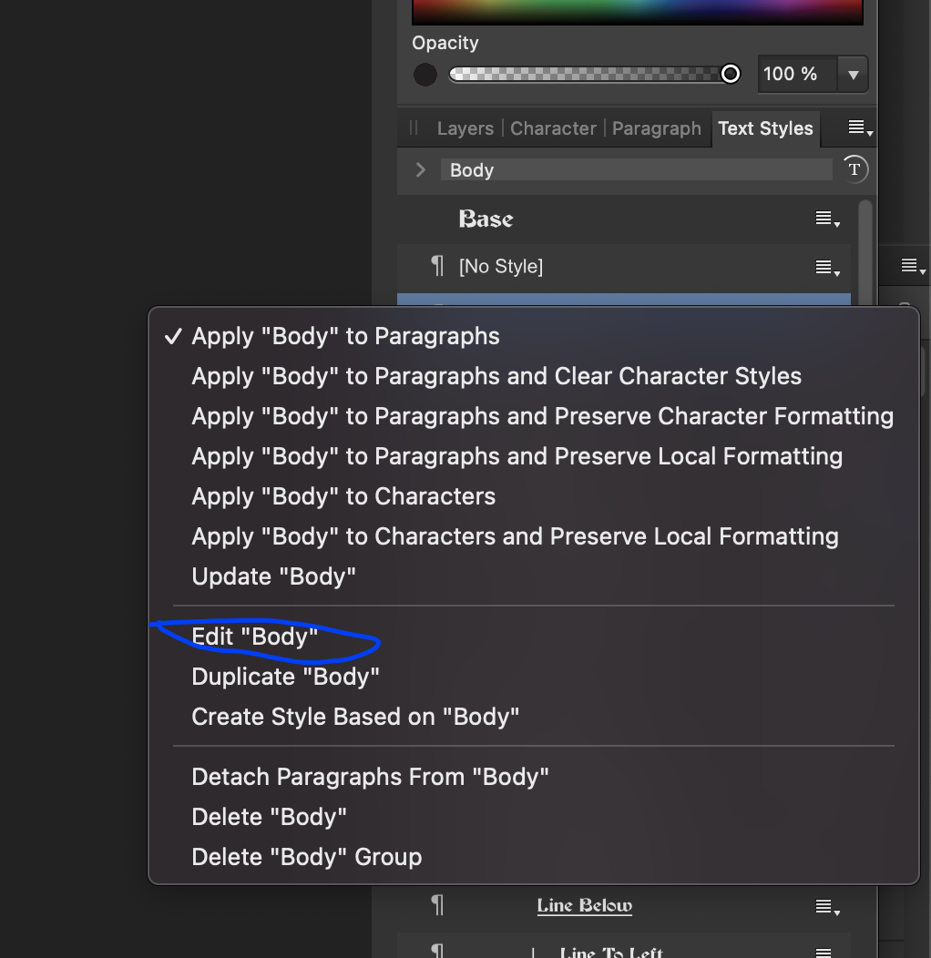
Here's a quick tour to help setting paragraph styles. On the side panel, there's the Text Styles tab. If I was trying to edit the body-style. I'd klick the icon inside the blue circle. The icon on the left of the style tells me, that "Body" is a paragraph style. Then I'd klick "edit 'body'". This little window warrants much study, for it can make your text far more interesting than just having a nice font. Now I'll how ever show, where you can find out wether the following paragraph style is set to something it shouldn't be. First. Click "style" if it is not blue already. Then nottice the area within blue circle. It tells me that "body" is based on a style named "Base", so anything that hasn't been set to be something different is just as it is in "Base". Beneath that, there might be something wrong, if everything else is set just right. Next style should usually be the same for normal paragraphs.
-
Hi. I need to ask little more questions. Which of these styles is it? If it is the one I outlined with blue, then I guess that might be because it is where you control things like emphasis and strong emphasis. Kinda like pressing command/control+i for italics. The one I outlined with green is the paragraph style, which means it is the style of the whole paragraph, and in most cases (excluding headings) the style of the following paragraph and the paragraph after that etc. That should not change on its own... Except if the style you use is set in a way that the next style is "no style" which would be very interesting.
-
Hi. I'm trying to find out whats wrong in your file, but am not quite sure, so these are more like guesses. Just to make sure. Are you using Affinity Publisher? I'm trying to repeat the issue using Publisher, so am not sure if my suggestions are any good if you're using Affinity Design. Was the panel you used named "Paragraph", or "Character" or was it the "Text styles" panel. The last of the three is the right one. Have you changed the text styles by editing the paragraph styles, or just by editing text styles? Editing paragraph styles would be the right way to change the text of whole paragraphs. Hope this helps.
-
 LassiP reacted to a post in a topic:
Lock an image/text box/shape on another layer to keep its position?
-
 LassiP reacted to a post in a topic:
Lock an image/text box/shape on another layer to keep its position?
-
 LassiP reacted to a post in a topic:
Lock an image/text box/shape on another layer to keep its position?
-
 LassiP reacted to a post in a topic:
Lock an image/text box/shape on another layer to keep its position?
-
 Glennsart reacted to a post in a topic:
"Long Journey Home"
-
Nice mood In the picture. Indeed. Long journey home. Makes me think the extreme lonelines out there. Cool pic!
-
 LassiP reacted to a post in a topic:
"Long Journey Home"
-
 LassiP reacted to a post in a topic:
A beginner's first project with Affinity Designer - My Wife
-
 Struguzzi reacted to a post in a topic:
Some of my fantasy art
-
 AdamStanislav reacted to a post in a topic:
Some of my fantasy art
-
 dannyg9 reacted to a post in a topic:
Flying battledroid inspired by a lamp.
-
 dannyg9 reacted to a post in a topic:
Some of my fantasy art
-
 dannyg9 reacted to a post in a topic:
Well with a smoke-/mist effect
-
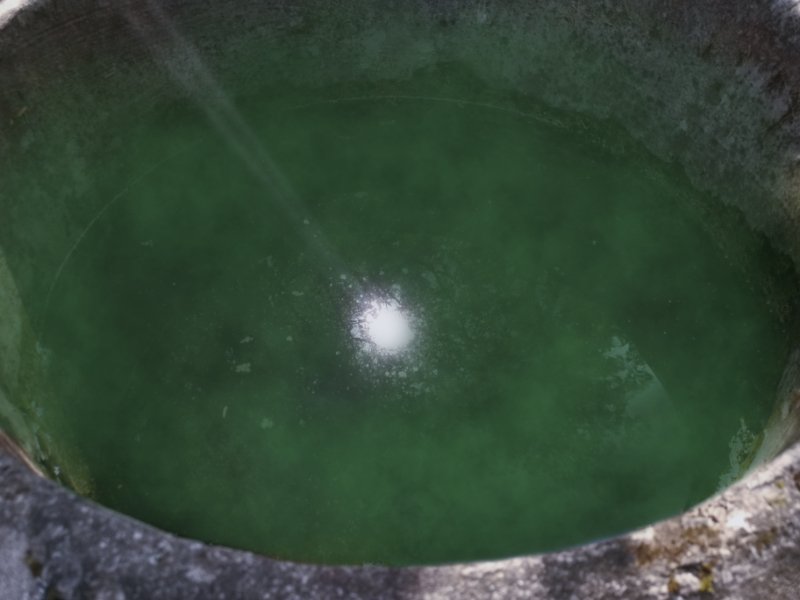
Yet another post to this forum. This photo was shot in Lohja near the local church of St. Lawrence (or as we Finns say: Pyhän Laurin kirkko) I added the mist effect using brushes that I'd created out of Affinity Perlin noise -effect and I think that works better than simply using the effect in and of itself. Lastly I noticed that the light rays leaving from the surface of the water was dimmed by the green mist so I made another pair of rays using paintbrush and zoom blur. So here it is:
-
 LassiP reacted to a post in a topic:
A beginner's first project with Affinity Designer - My Wife
-
affinity designer A cute little bee - Original design - From a beginner
LassiP replied to JerryHobby's topic in Share your work
Really nice work! One day you will be a beginner no more, but remember this work that day. The cute little feet are my personal favourite characteristic of the bee. Also the colours are great, and I like the way the sting gets a little darker toward the end. Very well done! -
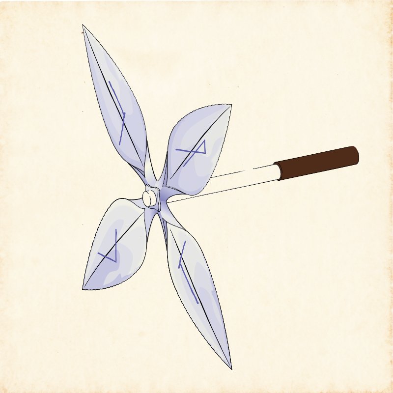
Here I'm going to post some of my fantasy stuff, starting with this little object. It's for an imaginary world people who live there call Merilmaa (from Finnish words meri (sea), ilma (air) and maa (earth). Compare with Finnish word maailma for world). This object was very much valued, and not that rare in the early days of "Merilmaa", for it literally muted (for one using it) everything someone else said, that didn't correlate with truth or perhaps, one might say, weren't wise. How ever, it is doubtful this item ever silenced everything someone said, for all of us have some wisdom worth sharing. You just sometimes have to listen long enough to get some gold. Naturally people don't like being told they're wrong, so many considered this object "rude", if not a "false witness" or even "a wicked and extremely dangerous thing". Also people used these to bully others by claiming nothing they said was audible when they applied this thing, so it's use by certain kinds of folks actually became a real problem. After some time these things first lost their value, then became exceedingly rare, then got all but forgotten. A good thing or a bad thing? Perhaps it depends... The background is a paper I first made to look old using a method I found from wikihow a long time ago. I scanned it and have since kept the scanned image safe and sound, so I can use it again and again. This is the first work where I've used isometric drawing, and will probably not be the last one. For final touch. I made the colour mode of the object "darker" so as to make it look as if it'd been drawn to the paper. The runes on the little blades are of my own invention. they signify "S" "A" "N" "A" which is Finnish for "WORD". Using Isometric mode it was no big deal to put the runes on the blades. I think it might be nice if Affinity had an isometrics system with possibility for perspective (things being smaller further away from the view), but that might be extremely difficult to achieve in a user friendly way. Thanks for watching.
-
affinity designer Book Cover created in Designer
LassiP replied to AutomatonicGinfizz's topic in Share your work
Ahh! The feeling when you get into the Pixel persona! Before trying some of Affinity features you just don't know their value. Sorry. I just got a reminder or when I first understood that Pixel persona is actually one of those things I'd missed a lot if I'd really thought about it, when I was studying and had an access to Adobe Illustrator. I don't know what the book is about, but the cover you've made is actually thought provoking. That's too rare with modern books. Also the graphics are pleasing to the eye. Thanks for sharing. -
Hi. Have you tried saving (or rather exporting) the PowerPoint, excell etc. documents (or perhaps the relevant pages/parts of them) with a format affinity supports (I'd try exporting to pdf which, if not possible through normal export is atleast possible through printing options, perhaps something like view pdf or print into document or something), then opening them with Affinity? It seems to me, the communication between os. clipboard and Affinity clipboard isn't that good 😞 But Affinity can luckily open a large variety of file formats 😄
-
Hi. Have you notticed Tex Gyre Chorus (https://www.1001fonts.com/tex-gyre-chorus-font.html). I used it to replace Monotype Corsiva, and thought it might fit to your list. It also has at least some of the letters that are missing from typical english text. Otherwise I'd not be able to use it for my Finnish works. PS. Many thanks for this list!
-
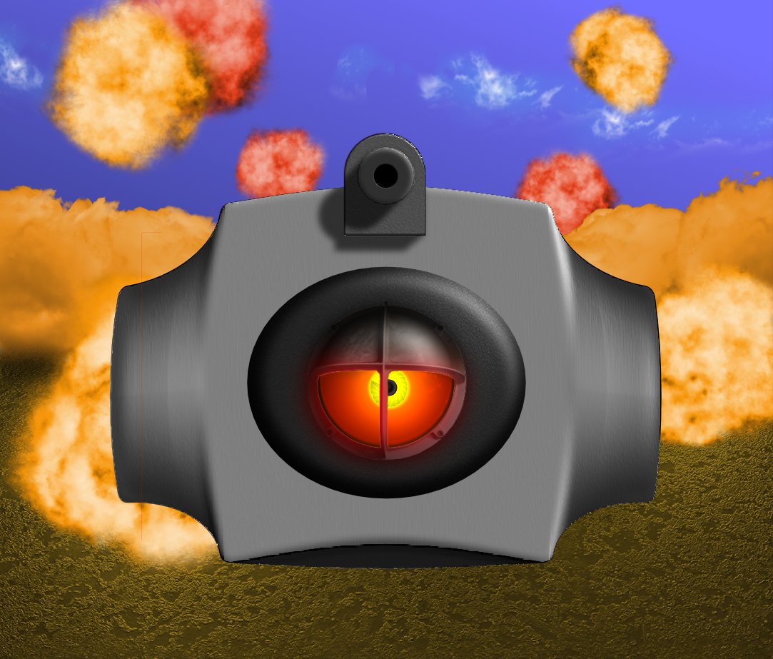
Hi. The droid in the image below was inspired by the old lamp in the image below it. Funny how something totally random can inspire you, don't you think. I myself think there's this old school video game feeling in the picture, but having grown with and loved late 80's and early 90's video games, some with a bit less polished graphics (one of my favourites being Spaceship Warlock), i'm personally happy with the results. Yours Lassi Peltomaa
- 1 reply
-
- affinity photo
- affinity designer
-
(and 3 more)
Tagged with:


