matisso
-
Posts
109 -
Joined
-
Last visited
Everything posted by matisso
-

GREP. It's absolutely vital.
matisso replied to Beemo8Bit's topic in Feedback for the Affinity V2 Suite of Products
It’s impossible without a whole number of other, often really fundamental features and you will find out the hard way (pray you don’t). My personal advice, if you’ve got a good Adobe deal (their subscriptions are negotiable to a degree, unless you’ve got an old perpetual licence then that’s even better), stick to InDesign, especially since you mention you work is complex. Sadly, and I really mean it, Publisher is still nowhere near the same league. If you add InDesign scripting capability (which is still in development in Affinity and no one knows when it’s going to be available), the number of quality scripts for it that can be found, free and paid, its value increases even more. Yes, you can get professional-looking results in Publisher (I’m curious though, if anyone has used it for such big documents as yours). But this will cost you a lot lot more elbow grease and frustration working around its inexplicable limitations. And there go your savings. -
A better way to manage LUT in Affinity Photo
matisso replied to 25fps's topic in Desktop Questions (macOS and Windows)
Well, @NotMyFault, that was a side note, really. The most important thing was it seems that Serif choose the approach based on the feature delivery (or removal, like here) rather than the customer value (who, in this particular case, needs a better performance when more LUTs have to be previewed). <disappointed rant> I remember being quite on the fence about upgrading to V2. At that time I wasn’t using it for my day to day work, I bit the bullet later, when it was discounted again, treating it as a donation for the cause that, I hoped, would keep Adobe in check in a foreseeable future (and hopefully be a worthy contender at some point). Currently I am in the middle of the project – using AfPub – which is quite similar to the one I was doing ten years ago in InDesign. The degree to which some features are heavy handedly implemented or missing altogether has been a rude awakening for me. Frankly, I wish I could go back in time and buy a perpetual license for Adobe CS6. </disappointed rant> -
A better way to manage LUT in Affinity Photo
matisso replied to 25fps's topic in Desktop Questions (macOS and Windows)
“Fix” is a good euphemism – without beating around the bush, it’s a downgrade. In case there’s a ton of LUTs loaded, you could paginate these previews (primitive but works) or implement some sort of delayed lazy load. Simple solutions, likely there are others. All it takes is focusing on outcome for the user, rather than closing a ticket. — Hey, we’ve got cases when this feature causes performance issues. — Remove it altogether, solved. Just look at that burndown chart! Since we know nothing about how Serif handles stuff internally, I can only guess, but in the other companies it’s not devs that make a final call, but a PM. So to attribute this to the development team alone might be amiss. -
Color space for CYMK printing
matisso replied to Gianni Becattini's topic in Desktop Questions (macOS and Windows)
Actually, the print company by all means should tell you. If they have decent colour management knowledge, that is. Ask them about their default colour profile, if it’s specific to their machines they should provide it for you, and if all they say is “we just want CMYK, no profiles” stay away if the job is important colour wise. Because that’s a telltale sign they know jack about colour management. There’s a lot more to colour than just CMYK vs RGB. Basically, when it comes to embedded images, if you leave it unchecked they will remain in whatever colour space they were in your document. Now, if it differs from the output (printer) colour space, either a) they will be converted to the output colour space, or b) the company will come back to you and say they have a problem with that, see above. If you want to convert, you need to know what CMYK profile you should have as a working space. Euroscale? FOGRA? Coated, uncoated, etc.? Depending on the machine, paper stock, these will differ and the company should know this. If not, it’s the question who’s paying if the colours end up not as expected. -
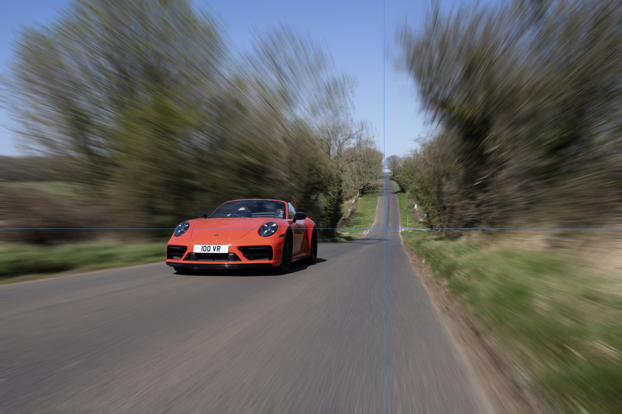
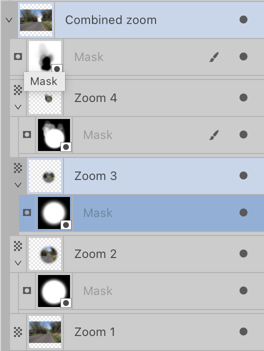
@Steve G, there’s a much better (as in “convincing”) way of doing it, I believe. The guidelines show – more or less – the vanishing point of the motion blur. To be referred later. 👇 Separate your car. Inpaint the area “behind“ the car – otherwise there will be red in the blurred background, which will be a dead giveaway. Duplicate your background without the car a few times. I made four copies. Apply Zoom Blur to each background copy, clicking the vanishing point as the centre of the filter each time. Each consecutive layers will have a smaller blur value than the previous one (or larger, doesn’t matter, it’s about the progression). The maximum value I did with this picture was 30 px, the next one was about 20 px, I guess, last ones, 15 and 6, give or take. Use your best judgement. Next, you need to mask your zoomed layers, so that there’s this illusion, that the farther from the camera things are, the less blur they get (the line of trees just at the left edge, far behind the trees by the road should not receive so much blur, but that would require a lot more work). I put the most blurred layer at the bottom, then the less blurred ones were stacked on it. Use a big soft brush for your masks. This is how my layer stacked looked like, I also grouped them and added an extra mask to the entire group: For added realism – you will notice that the foliage behind the windshield will likely be still (unless you separated the car without the transparent parts of the windshield), so you might work on this a bit, too. My result could use some more love there, it’s complicated as there are some reflections in that windshield as well. Enjoy!

-
Affinity Publisher and MS Excel data
matisso replied to liteman's topic in Desktop Questions (macOS and Windows)
If you’ve got the Adobe licence… Wow, I must admit I am lost for words here. You can pull so much more with InDesign, especially with scripts and there is plenty of free ones that are great. Personally I’ve always loved the possibilities it provides. APub still has a lot of catching up to become a serious contender.
-
OKlab - OKlch color space
matisso replied to smg's topic in Feedback for the Affinity V2 Suite of Products
Or the community could simply create plugins just like it’s possible for Figma; if only there was a way… I support the idea, but I’m skeptical this gains traction. 🤔 -
No, it’s absolutely not. It’s a common trait though, that people blame themselves for what they perceive as “failures” in operating a product, tool etc., while if it’s anyone’s actual failure, it’s of the people who had designed said tool (including those who wrote that warning). Norman’s “Design of everyday things” (where he mentions the above, BTW) is a great resource for making better products and tackling such pitfalls. Then there’s also Jakob’s law, that states people spend more time using other products than yours, hence their patterns are already established when they become your users. Which is another way of saying that 99.99% of cases, you don’t get to create your way of interacting with your product, aka invent the wheel (save for some absolutely revolutionary inventions). The choice should be to go with already established patterns, otherwise you frustrate users who can’t rely on knowledge they already have. I think it’s fairly safe to say that there’s little, if any, expectation among users that a layout / design program will alter their assets. Not many other programs do this after all, do they? The safest way would be to automatically rename the files that are being saved and then link these, of course. Remember to inform the users, the worst scenario here is they are just a tad shorter on drive space but if it’s confirmed the files are duplicates, the other ones are binned. Or perhaps offer a choice between this, and actual overwriting, whilst making damn sure the information is as clear as it’s possible, with no room for interpretation at all. Serif, are you having a vacancy in this department by any chance? I happen to be on the lookout. Cheers, Matt
-
LOL. I did not realize that this was started on February 2023 rather than 2025. How come this hasn’t been yet addressed, nor even replied to by Serif is beyond me…
-
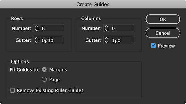
Hm, respectfully, no. This is reinventing the wheel and doing it wrong – it makes little sense as the related inputs are visually detached from their counterparts. Also, the labels might be confusing for some. Below is a window made solely for creating “regular” guides layout (HINT, SERIF, WINK WINK) in Adobe. This groups related inputs and leaves practically no room for interpretation.
-
Yes. Please. I’ve had a draft concerning exactly this issue sitting for quite a while now… 😉 It’s such a bad idea to have just a single gutter available (same goes for the Data Merge Layout tool, BTW) and a lot of similar “details” peppered around still keep this product line in a semi-professional department for me. No amount AI powered additions will change that if absolutely fundamental functions are crippled like this and there isn’t even a way to alleviate this via scripting… The only half-a**ed solution in APub I found was, somewhat related to what @loukash suggested, to create a temporary column guides setup on your master page – whether it's going to be rows or columns depends whether you need fewer rows or columns in your intended grid, because that means less stupid labour for you in the next step – then use that as a template to manually (duh! 😠) create ruler guides (because there's no way to quickly create a set of guides with predefined parameters either), then finally switch back rows ↔️ columns, adjusting the second gutter for your needs. Example: if I have a landscape document and I know that I will need a grid of 10 columns by 5 rows, I'll first create a temporary 5-row column guide layout, then recreate this by hand using ruler guides (obviously I’d rather do that for 5 rows than 10 columns), then I’ll change column guides back to 10 columns with an intended gutter. But that is awfully tedious, offers no flexibility at all in case of any document changes, and overall feels like this was early 80’s. The software is supposed to do such simple and tedious stuff for you, right? Cheers, Matt
-
Publisher - Additional gutter options required
matisso replied to rogerkem's topic in Desktop Questions (macOS and Windows)
I must admit it always strikes me as odd to see this kind of statement, as if it there was some Affinity Stockholm Syndrome®… It is required, period. Yes, the workaround kinda works but still is just that, a workaround that has an inherent flaw – you can no longer fit your Data Merge Layout within a strict grid, or margins, without doing a little maths each time you need this. The resulting layout has to be larger to artificially compensate for that extra space you can’t set in a proper way. And then you’re left with an object than no longer can be aligned to your guides or margins (or have to alter these, per @rogerkem’s response). It might look like a minor problem if a DM Layout is the only element on a page, however when there are other elements in a more complex layout, it becomes unsettling – to say the least – to be forced to (locally) ignore the grid you're working with. Even worse, it has potential to invite mistakes, and that extends farther than just an inconvenience to be creative with a DM cell size. Say you collaborate with others and perhaps share files (or maybe even work with your own file after a really long break, who knows?). How is someone else supposed to know what is the effective gutter, should they want to alter it? They will see plain 0 there after all. Or if someone’s unaware of the hack, they might either mess something up, e.g. “fix” a “misaligned” object, which could cause a costly mistake if undetected, or simply waste their time figuring this out – which sometimes could be just as costly. Good tools should be all about reducing friction wherever possible and making work easier, rather than sweating how to hack them. 😕 Cheers, Matt -
Data Merge - automatic text re-scaling
matisso replied to Joem94's topic in Feedback for the Affinity V2 Suite of Products
I’d rather have this the other way round, i.e. fitting frames to whatever length the merged data results with…- 1 reply
-
- 1
-

-
Good heavens, no. A selected checkbox indicates a confirmation, something that is set to “on”. Bad practice to complicate that. This idea is like placing a sign upside down and telling people ‘just bend over backwards and you’ll read this easily.’ You simply don’t use negative labels like this and confuse users. Fun related fact: one product in the company I worked for used a similarly worded label and, adding insult to injury (actually, doubling the injury seems more fitting), someone had a “clever” idea to use a toggle without on / off states, only coloured red and green instead. Good luck figuring out whether this was red because the parameter it controlled was effectively disabled, or perhaps actual disabling it (per the label) was …turned off? The product manager said he had a mind***k every time he saw that, lol.
-
Variable fonts
matisso replied to DarkClown's topic in Feedback for Affinity Publisher V1 on Desktop
Wow, this place starts to smell old and grumpy. @DarkClown, a solution for you is Figma. It's free – ok, they also have paid plans but the added features are useful for working on large projects involving multiple users, all design features are available in the free tier – browser based (but can be downloaded as an app, too), has extensive plugin support and a very active community developing them. If you output for print maybe leave that for Affinity if you want to, but layout… Oh, man. (I wonder if I get bad rap for mentioning different software? This would go well with the air of this thread. 😒) Cheers, Matt -
Variable Weight Fonts from Google Not Parsed
matisso replied to JHutchinson's topic in V1 Bugs found on Windows
Switch to Figma, @JHutchinson. Just recently they implemented variable fonts support, among other useful updates. There is so many great things to be written about it, including the community they managed to build. regards, Matt -
Real Vector Brushes
matisso replied to Boldlinedesign's topic in Feedback for Affinity Designer V1 on Desktop
+1 for true vector brushes, this has been mentioned countless times already! This could be nice, too, especially if it were possible to randomise size, rotation, opacity, etc. Both blobs along the path and a single click blob tool would be useful. Cheers, Matt- 22 replies
-
- 3
-
-
- affinity designer
- brushs
- (and 1 more)
-
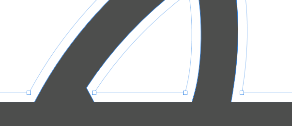
Hello there, the picture says it all, I guess, but just for clarity: there seems to be a hard coded Mitre limit in the Contour tool and there are situations where it needs to be adjusted. These are plain vertices, no funky extra ones underneath, yet the obtuse corner is behaving as expected but the acute angle leaves no choice but to either alter the geometry or switch to Illustrator’s Offset tool, where it can be adjusted. Please make AD even greater, thanks! Best regards, Matt
-
- 1
-
-
- contour tool
- ad
- (and 2 more)
-
Vector brush names
matisso replied to Alex A.'s topic in Feedback for Affinity Designer V1 on Desktop
+1 Yes please, fix this, Affinity! I’m just getting acquainted with the Pixel Persona in AD, as I am mostly a vector guy, and this is a real productivity killer here, too. Even the smallest change to some of the tool’s parameters (as basic as width) causes the highlight in the brushes panel to vanish. I did a project a while ago that relied pretty much on brushes (both Designer and Pixel personas) and the only reasonable way to manage brushes was to create an individual collection so I could remember which one is for what, but that is not the way to do it! However, with vector brushes you can always paste properties to a different object like @Jonopen had mentioned – which is a nasty workaround but does the job. Not possible for pixels, obviously. cheers, Matt -
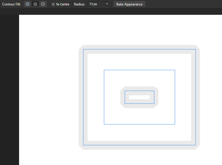
Hello, I can’t enter anything above 50 px in the radius input box. The only way to successfully achieve a higher value is to grab an object’s handle (be it corner, or side, doesn’t really matter) and drag it left to decrease the value and right to increase it. Unfortunately there’s no cursor on my screenshot but that’s how I did it. Immediately after increasing the value via the input it resets to 50. The same for moving the pop-up slider. cheers Matt
-
That’s some lovely set of added features there, thanks! Hats off to the A-team! cheers, Matt
-
Yes, but you seem to ignore the fact I had mentioned already. Microsoft is a giant player, so is Adobe, Corel probably to a lesser extent but still. Which is exactly why they can afford bundling very expensive fonts that you mentioned. Affordable, for the end user. Do you happen to know how much Corel or Microsoft are paying for these? From what I found googling, “Usually Japanese font has 8,000-16,000 glyph so making new fonts means you need to make at least 8,000 glyph, which is pretty heavy task.” Welp. You want kinda premium software (I can’t wrap my head around designing 8000+ glyphs, even if some contain the same components) at an affordable price, am I getting it right?. Serif would probably have to significantly ramp up their sales for it to be possible. But that’s just my wild guess. Have you ever done any type design?
-
Hello, Sure but I suppose that even the Corel’s user base is far greater than Serif’s, not to mention Adobe’s. Even if fonts are bundled with the software, font designers still must be paid for their work, so the deal is fair for them. Otherwise no designer would agree to that, obviously, as type design is very labour intensive and time consuming. The company releasing the software will then hope that their investment in bundled fonts will pay off with enough licences sold. The question is how many licences Serif can sell, whether bundled fonts would be a factor affecting sales (that would depend a lot on both quality and selection of potential fonts) and whether that would affect the price. Remember how competitive their prices are even without any promotions. That calls for cutting corners somewhere, I imagine, and I wouldn’t hope this changes in the future, unless Affinity prices goes up and / or there will be clear indicators that such bundling will be a strong incentive for potential customers. You’ve got plenty of sites around that sell fonts in bundles already. But 99% of it is probably Latin script rather than Japanese… Which (kinda) proves there is far less supply of Japanese fonts, so logic dictates these would fetch higher prices… But you want to get something which is quite rare (compared to how many Latin script fonts are being released) and also at a low price. Doesn’t work that way, I’m afraid. cheers, Matt
-
affinity designer Female old world swallowtail butterfly
matisso replied to IsabelAracama's topic in Share your work
Impressive! Great work there, Isabel. -
Yes, please. I have no clue why this has so little activity? This is needed very, very much. If you get some artwork that had all been flattened (i.e. layers and groups removed), picking out the things you need can be really nasty. I personally would opt for Alt for subtraction (also, drag+Ctrl(Cmd) currently selects objects directly within groups, which is handy on its own) and also another mode, Ctrl(Cmd)+Alt for intersection – which would not select anything additional, unlike inversion. 📣 Go, Affinity, go! 📣 regards, Matt