

Max N
-
Posts
522 -
Joined
-
Last visited
Posts posted by Max N
-
-
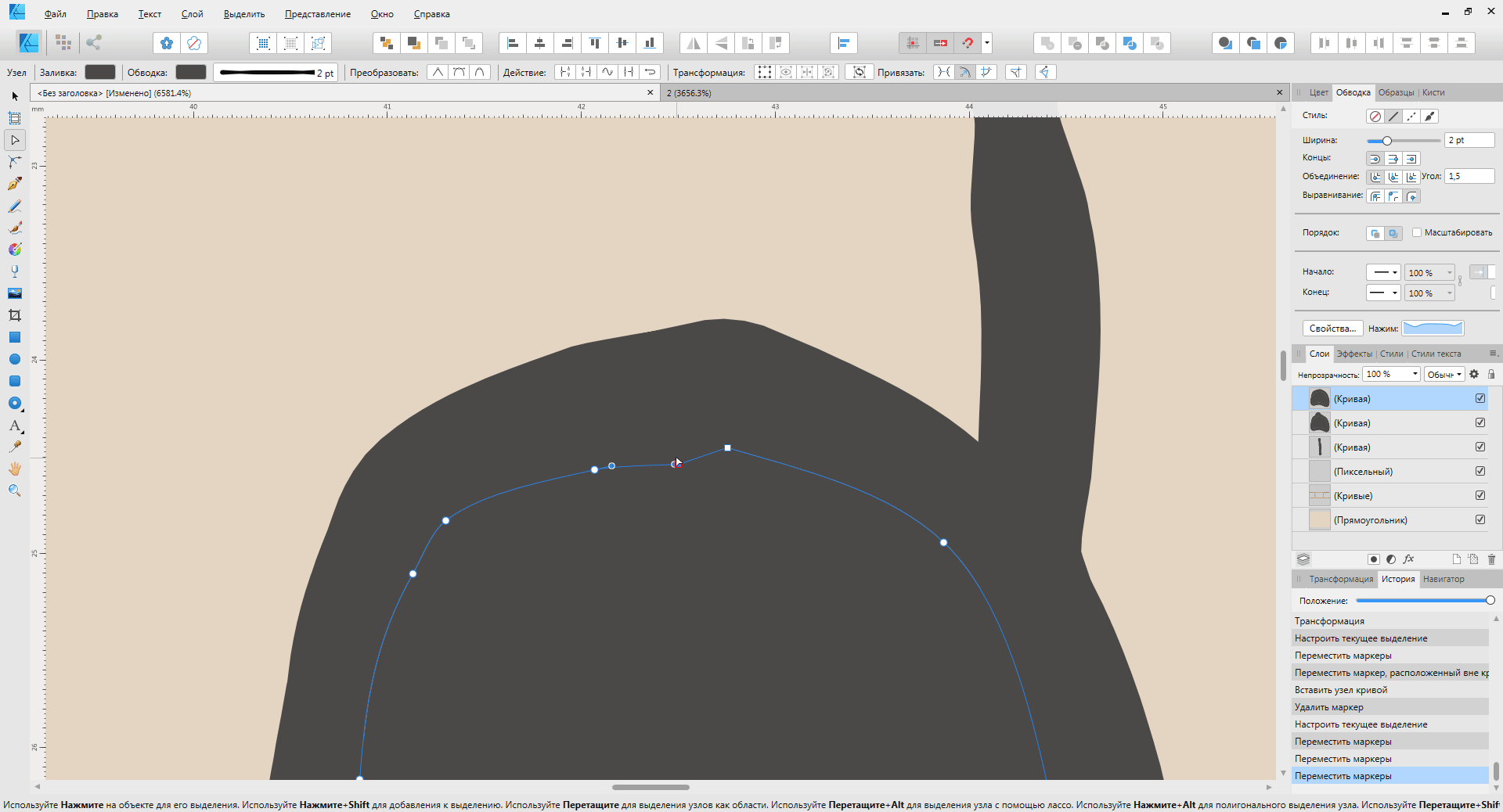
The x and z axes have a different origin.
The planes are offset from each other. Isometric drawing is impossible, if only every time not to move the entire image.
Maybe I'm doing something wrong?
-
On 4/16/2019 at 2:02 PM, Mark Ingram said:
There are 2 issues here.
1) When we save a loaded JPEG, we don't save it at it's original compression level, this is a bug we can address.
2) The size of afphoto files can become large. There is no bug here, afphoto files are designed for fast load, fast save, and fast editing. It is not designed to be a size efficient storage format.
1. item is still relevant.
-
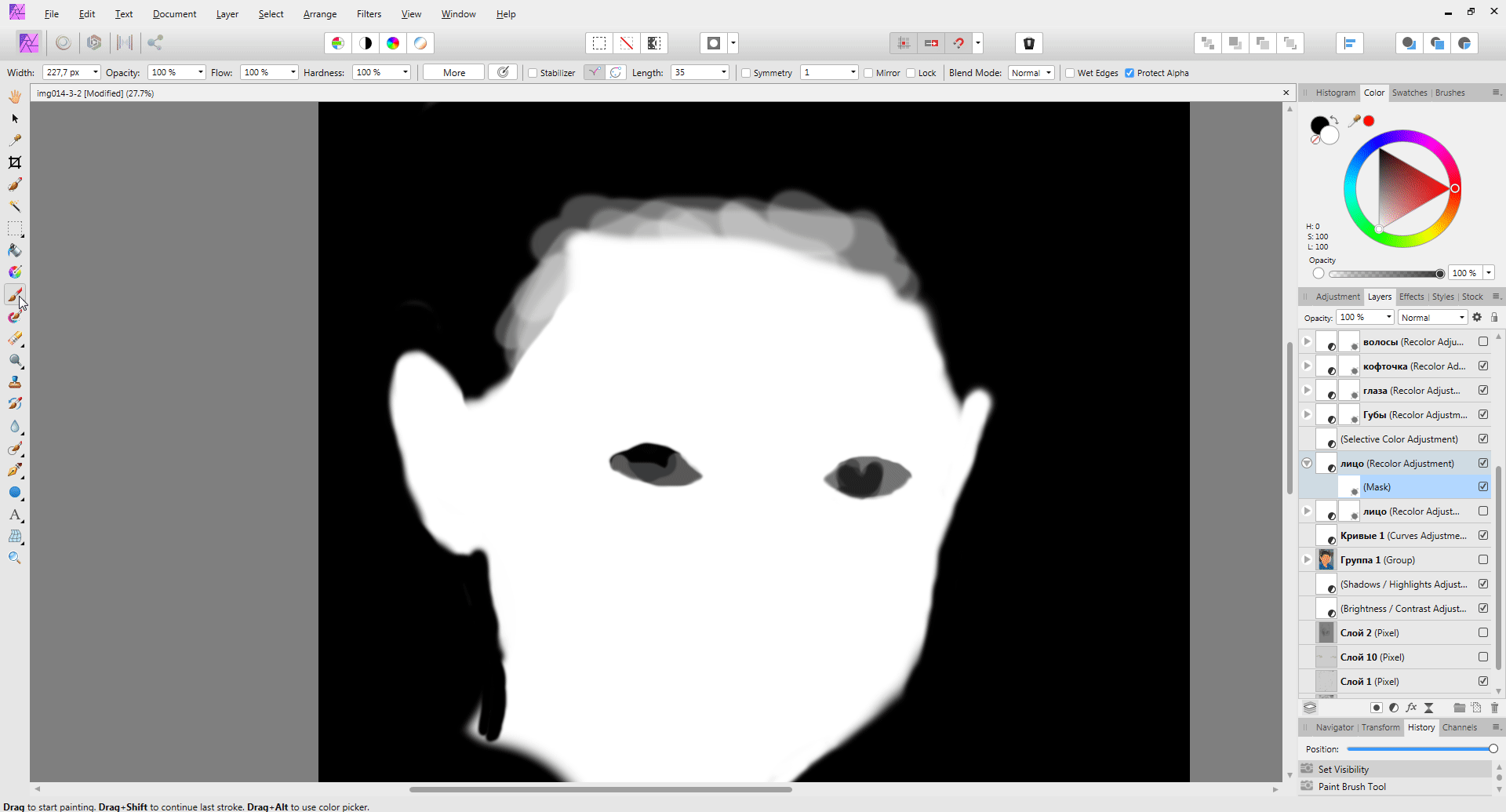
I create a layer → I create a mask → I fill it → I add an adjustment layer = the adjustment layer does not affect the lower layers.
I create a layer → I fill it → I create a mask → I add a correction layer = A correction layer affects the layers.
Is this a problem or should it be?
-
16 hours ago, TEcHNOpls said:
Are these pixel layers on the top? If so, remember that adjustments work only on pixel layers inside a group if they are grouped together.
16 hours ago, TEcHNOpls said:Are these pixel layers on the top? If so, remember that adjustments work only on pixel layers inside a group if they are grouped together.
After PS, this logic explodes the brain. I am used to grouping work stages into groups so that you can easily see the result or go back to the stage below. It is necessary to understand why this is done in the AP and how it can be used.
-
Adjustment layers do not work after grouping.
-
I reset the program settings. It all worked.
-
The brush does not draw in the mask. Maybe I'm doing something wrong?
-
2 hours ago, Pattou said:
Thank you Mark... finally an answer to one of my questions
1. Ok
2. I read you but I often end up with files of more than 0.5 Gb and sometimes > 1Gb with complex non-destructive editing (duplicated layers, live filters, masks, etc.). This is quite huge but I understand that it can not be changed. Since I am dealing with APh, I have not used Ad£$e PS but I will try to find some time to do the same editing in order to compare file sizes.
Cheers,
Patrick
The same file opened in PS and AP.
1. Layer with original image
2. Curve
3. Levels
4. Duplicate black mask layer
5. Vector rectangle shape (with visibility disabled)I think this is a good result.
-
34 minutes ago, JET_Affinity said:
Of course the tool should display its path as dragged, as in most every other program with a similar tool. By the same rationale, as soon as you mouseup after creating the path, it would be selected. You would expect it to be displayed so long as it is selected, regardless of whether it is painted.
JET
I think so too.
-
2 hours ago, Mark Ingram said:
There are 2 issues here.
1) When we save a loaded JPEG, we don't save it at it's original compression level, this is a bug we can address.
2) The size of afphoto files can become large. There is no bug here, afphoto files are designed for fast load, fast save, and fast editing. It is not designed to be an efficient image format.
2. There are no questions to .afphoto. It is normal that their size increases in comparison with Jpeg.
1. Yes, if this is fixed, it will be fine. And if you add a quality selection dialog box (so that the user can specify the right one himself) it will be absolutely good. And if the output window of the quality settings will be selected by the user in the global settings of the program
[X] Keep in original quality (Do not ask when saving)
[ ] User settings (Ask user when saving) -
41 minutes ago, GarryP said:
I don’t see any reason for any kind of temporary “shadow/dotted” curve or anything like that.
If the user wants to see the curve when they draw it they should make sure it has a stroke colour, and if they don’t want to see the curve when they draw it they can remove the stroke colour before they start drawing.
Max N said that they couldn’t see the curve after they had deliberately told Designer that it should – in essence – not be seen. That’s not a software problem, it’s a workflow problem.
If you want to see the curve make sure it has a colour, if you don’t want to see the curve - for whatever reason(s) - remove the colour. That sounds quite simple to me.
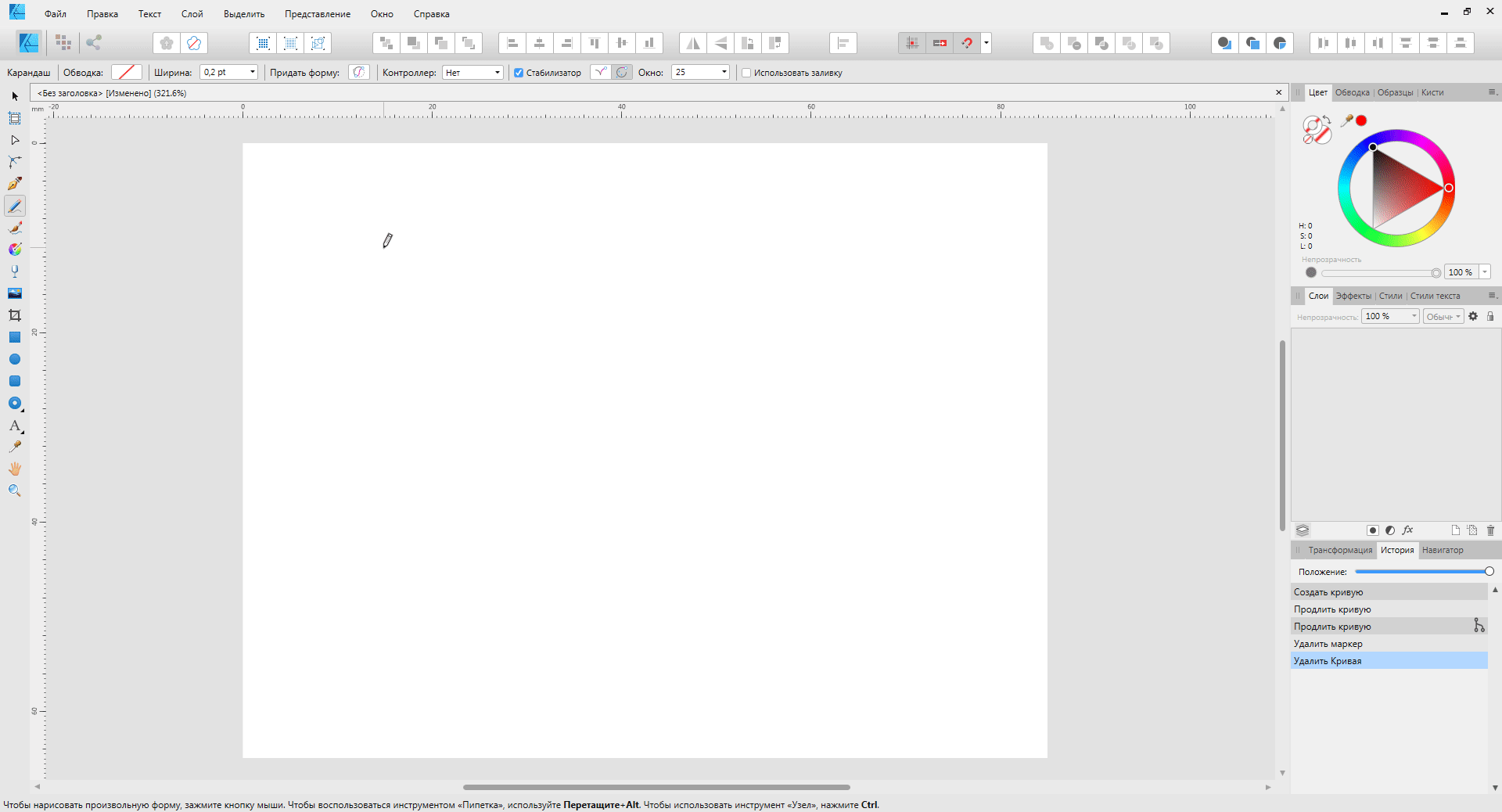
Designer does – or should do – what you tell it. If you tell it not to use a colour for the stroke of a curve then, when you draw that curve, you will not see it and I don’t think anyone should be surprised by that.When I draw a curve without a pen fill, I see it.
When I draw a curve with a pencil, I don’t see it.
Baseline data alone, the behavior is different.
-
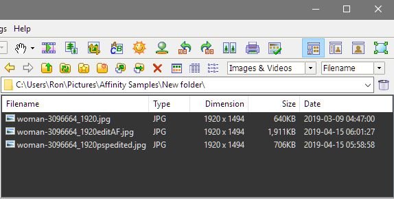
25 minutes ago, Ron P. said:
I can confirm that. I made a simple HSL adjustment in AF, then saved and file size increased from 640KB to 1911KB. Done the exact same adjustment in Paintshop Pro. File size only increased to 706KB. So what is going on with AF?
FIles renamed in Windows Explorer.
The difference is noticeable at high resolution. I used the file 5472x3648 px. The AP saves the default 100% quality settings. -
-
-
11 minutes ago, GarryP said:
Without putting a lot of thought into it, I cannot come up with a situation where I would not want to be able to see what I was drawing either. It does sound like a strange thing to want to do, but I’m no expert.
However, I do think that Designer should accept what the user tells it to do, and if that means drawing something ‘invisibly’ then that’s probably what it should do.
I don’t use the Pencil tool myself much so there might be some good reasons why the current behaviour is actually useful in certain cases.
According to my assumptions, the user indicates that he does not want the line to have a stroke after it is drawn, and not that he should not see what he is drawing.
Perhaps the line is needed in order to start the text along it. Then I don't need a stroke, but I need to see what I draw. Drawing a line with a stroke first, and then deleting a stroke does not look very logical, in my opinion. -
38 minutes ago, GarryP said:
I believe Designer is working as I would expect it to in this case.
You have told it that you don't want to see the curve - you have deliberately removed the STROKE colour - so it's not showing you the curve when you are drawing it.
If you want to see the curve while you're drawing it, set a stroke colour before you start drawing.
You can always remove the stroke colour afterwards - it's the same amount of user interaction, just the other way round.
I believe this is correct behaviour.If you want to see the FILL of the stroke while using this tool you can check the "Use Fill" checkbox on the context toolbar.
Maybe I'm wrong. I do not work much in AD, and could not imagine a situation where I would like to draw blindly.
-
1. In the folder I create two identical files 1179 Kb
2. Open the file 2.jpg
3. I change one pixel of the image.
4. Press Ctrl + S
5. I receive a file weighing 7236 Kb (7236/1179 = 6.13 ...) The file size has increased 6 times!
I prepared the file for uploading to the site and I needed to make a minor change. I can't use fast save
1. Ctrl + S
Total: 1 second.
To just save the file I have to
1. Ctrl + Alt + Shift + S
2. Choose a format
3. Choose quality
4. Set the location and save the file.
Total: 15-30 seconds.
Formally, there is a quick save tool, but I cannot use it.
I can offer several options on how to make the tool more usable.
In the global settings of the program, the user selects the toolkit itself.
1. Keep in original quality (as original)
2. As specified by the user as - (field for entering quality)
3. With each save, display a dialog box in which the user himself will set the quality.
4. Save to the highest possible quality (with increasing file size).The tool will work as the user needs. And the user will be happy as this cast
- Rick G, Ron P. and Frozen Death Knight
-
 2
2
-
 1
1
-
7 hours ago, Rick G said:
Not really, it was quite different
This is the industry standard and deviation from it. My specialty is automation technology engineering. I well understand that the loss of 10 seconds in the operation does not look scary. But within the framework of the technological process, the operation can be repeated millions of times, and this is no longer 10 seconds of losses.
AP is a replacement for the PS (industry standard). In many ways, AP is superior to PS. But there are little things that can slow down the process and I pay attention to them. Perhaps this is obvious to me as a result of my education. Perhaps for the average user is not so obvious. I sincerely wish that the AP would develop and become better, so that new users (during the test period) were faced with a minimum amount of inconvenience, and saw more advantages. Then the market share of AP will grow and, with time, the AP will significantly push PS. -
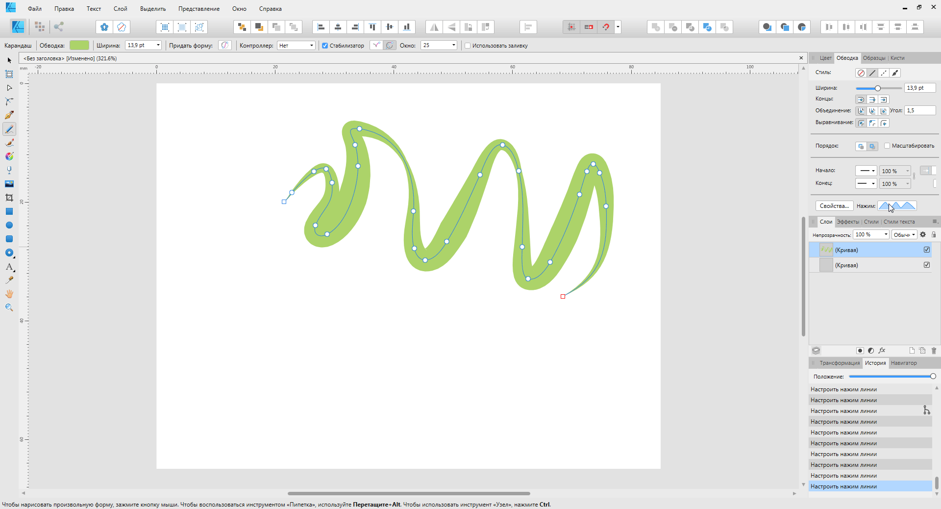
Pressure curve. The point is spontaneously selected.
-
Different reaction to the lack of stroke in the pencil and pen tool.
If you do not select the fill, during drawing you don’t see what you draw. After the drawing is finished, the curve turns blue. It would be correct if the curve in the process of drawing was already painted in blue. -
54 minutes ago, Rick G said:
Hmmm Never bothered me. Rather than get rid of it, they might make the default text disappear once you start editing. That would not be such a great leap in programming
Imagine if windows would add to the folder name that it is a folder with files.
Which option will be more convenient? Top or bottom?
Here the user who switched from PS to AP sees the same picture. It is not necessary to write on the folder that this folder, on the archive in the title, too, it is not necessary to write that it is an archive. This is obvious in understanding and inconvenient in perception ..
-
1 hour ago, Rick G said:
Is that not indicating what kind of layer it is?
Right, points. When I opened the AP for the first time and saw this ... Why do I need so much obvious information? When you see one word, it is clear that this layer is immediately. When you see a sentence, you have to ponder it, read. And when there are a lot of layers with long names, it becomes hard to find the right one. It's like on the door handle of the car the inscription "this is a door knob" seems to be true, but why do I need it?
This information is obvious, does not carry additional semantic load. When we choose from the drop-down menu from short names, then we understand everything. The long name in the layers panel only brings in some visual chaos. Short layer names look neater, while remaining equally understandable and functional. -
19 minutes ago, Alfred said:
I agree that there are too many words. It’s obvious that ‘Vibrance’, ‘Levels’ and ‘Curves’ are adjustments.
In the English version there is only the word ‘Adjustment’ but in your screenshots I see two different words: ‘коррекция’ and ‘корректировка’. Google Translate tells me that ‘коррекция’ means ‘correction’ and ‘корректировка’ means ‘adjustment’.
"коррекция" and "корректировка" - translated correctly. So it should be. But these words are superfluous. They do not carry (important) semantic load, but they visually overload the interface.
-


Does not save to network drive. Stable version saves.
in [ARCHIVE] Photo beta on Windows threads
Posted
The problem appeared with the version 1.7.0333. Perhaps one version before.
There is no problem in the stable version.