user_0815
-
Posts
242 -
Joined
-
Last visited
Everything posted by user_0815
-
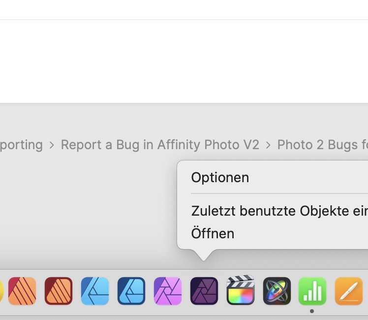
The list of recently used documents does not show when right-clicking on the App Symbol in the dock. This is the way I usually launch documents that I am currently working on. I've been seeing this since 2.0 and currently using 2.0.4. Please see screenshots attached comparing to Photo V1 where the list shows as expected. I am aware that V1 and 2 are separate apps and have each their own list of recent documents.

-
16GB is fine. That’s what I’ve been using for the past 6 years on my 15“ Intel MBP. In my personal Tests I came to the conclusion that swaps began when the file size approached 1GB. But the limiting factor for speed was cpu (on live filters) but not RAM. V2 seems to be a bit more smooth and M1/2 even more so. IMHO 16GB on a M2 will be no issue.
-
If I'm not mistaken, drag the B&W adjustment on to the label of the Background layer. Then you can collapse it into one single row (see the little arrow on the left side on the bottom image). Whether a new adjustment layer (like the B&W) will be added on top or as child-layer can be defined in the Assistant settings. The assistant is in the tool bar.
-
For such cases I usually make a Fill Layer (or pixel layer) in the colour which the object should be. Set it to "colour" and it will take on that colour. In this particular case, the the brighter candle already has the exact hue as the darker cylindrical candle. The difference is in brightness and contrast. IMHO whith the levels adjustment, I would adjust the dark, mid and highlights until it matches the "look" of the other candle. Set it in "Luminosity" blend mode and fine-tune the saturation with an HSL layer.
-
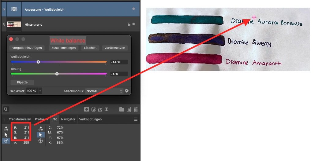
In Photo it can be done as in most other apps. But as Conrad Hoffman says, the green-magenta slider doesn't move when using the picker. In that case, place an info-point on a neutral area and adjust to equal R G and B values (in the screenshot that is RGB 211). Keep in mind, not every colour correction is white balance. In most cases there is colour contamination where light bounces off objects and mixes in (or other non-neutral light sources). That means, a neutral grey/white reference needs to be free of such in order for the WB-picker to give accurate results. In your first example, you'll need to know whether the paper is pure white or not. In my experience the auto-Levels works good to get a neutral looking image. (In the top tool bar.) For nasty colour-casts I still prefer the fill layer in Divide blend mode. If it needs to be super detailed, colour balance or selective colour are the tools of choice.
-
Two different methods come to mind. 1. Use the levels to lift the underexposed background up. Pull the slider from the highlights side down. I would make a rough selection of the background first because it can over-brighten the subject rather quickly. Paint back any missing shadow or smoothen the transition with the mask. 2. Use divide to remove the background tone. Select the colour of the background, add a fill layer (it will have the selected olour) and set it to "Divide". Here too, you can paint back any shadow or detail you need. Method 2 works best if the subject is underexposed in the same way as the background. Otherwise you'll need to edit both independently. Levels.mov Divide Fill Layer.mov
-
how to disable export preview?
user_0815 replied to sb101's topic in Feedback for the Affinity V2 Suite of Products
The preview is a useful feature but can get in the way. I searched for an on/off toggle when exporting several large prints in Designer with different ardboards. On export, the dropdown to select the artboard does not respond for a few seconds due to beachballing for the preview. (MBP M1 Max 64GB) -
I also use this tool sometimes. Being able to select multiple colours in one go would be useful indeed. For adjusting certain colours (brightness, hue, saturation) I use the hsl adjustment. It can target several colour ranges at once. But it depends on what needs to be done. Out of curiosity, what is your use-case for these selections?
-
Perhaps because that rectangle is a path but not a shape? Placing the rays inside a path would be what we see in the second image. for ease of use I‘d use a separate rectangle shape as a mask for the rays (group them). Let it snap to the rectangle where you want it to cut off. IMHO that’s an easy and precise way.
-
Bleed settings in Photo too
user_0815 replied to mykee's topic in Feedback for Affinity Photo V1 on Desktop
I'd like to support this request. -
Sometimes these are also a bit confusing. However, the way it works (I think) is that you can only "add" outside a curve (but not on top) regardless color or transparency. In your case, use a donut for the outer ring and it will work. An ellipsis is considered an entire (closed) area, even if you only use/see the outline and also after it is converted to a curve. In opposite, the inner part of a donut is not considered as part of the shape/curve. When using an ellipsis, there is also a button to "convert to donut".
-
For 2. you can use the X key to toggle background/foreground while using the picker. It will apply the colour to whatever you toggle to. For 3. press the "alt" key. Now click-and-drag to pick a color.
-
Vielleicht liegt es an den Bildfarbräumen. Prüf mal das Exportergebnis wenn das Kästchen „Farbräume umwandeln“ aktiviert ist. Ich vermute dass das Hintergrundbild einen anderen Farbraum hat als das Profil im Export.
-
This is an issue I also have with placed images. Usually I put white rectangles where the borders show up. Not very elegant but I haven’t found a better solution.
-
I'm using an M1 max and 1.10.4 as well. Photo works fine here except under one condition where I get this kind of beach ball. It is when I have an open document with a placed document inside, which is linked (not embedded) AND that linked document is open at the same time. (In other words: A document that contains a linked document which is also open in a separate tab.) Just a guess, but I think it tries to constantly save changes, which uses up the cpu. When I close the linked file, there is no more beach ball.
-
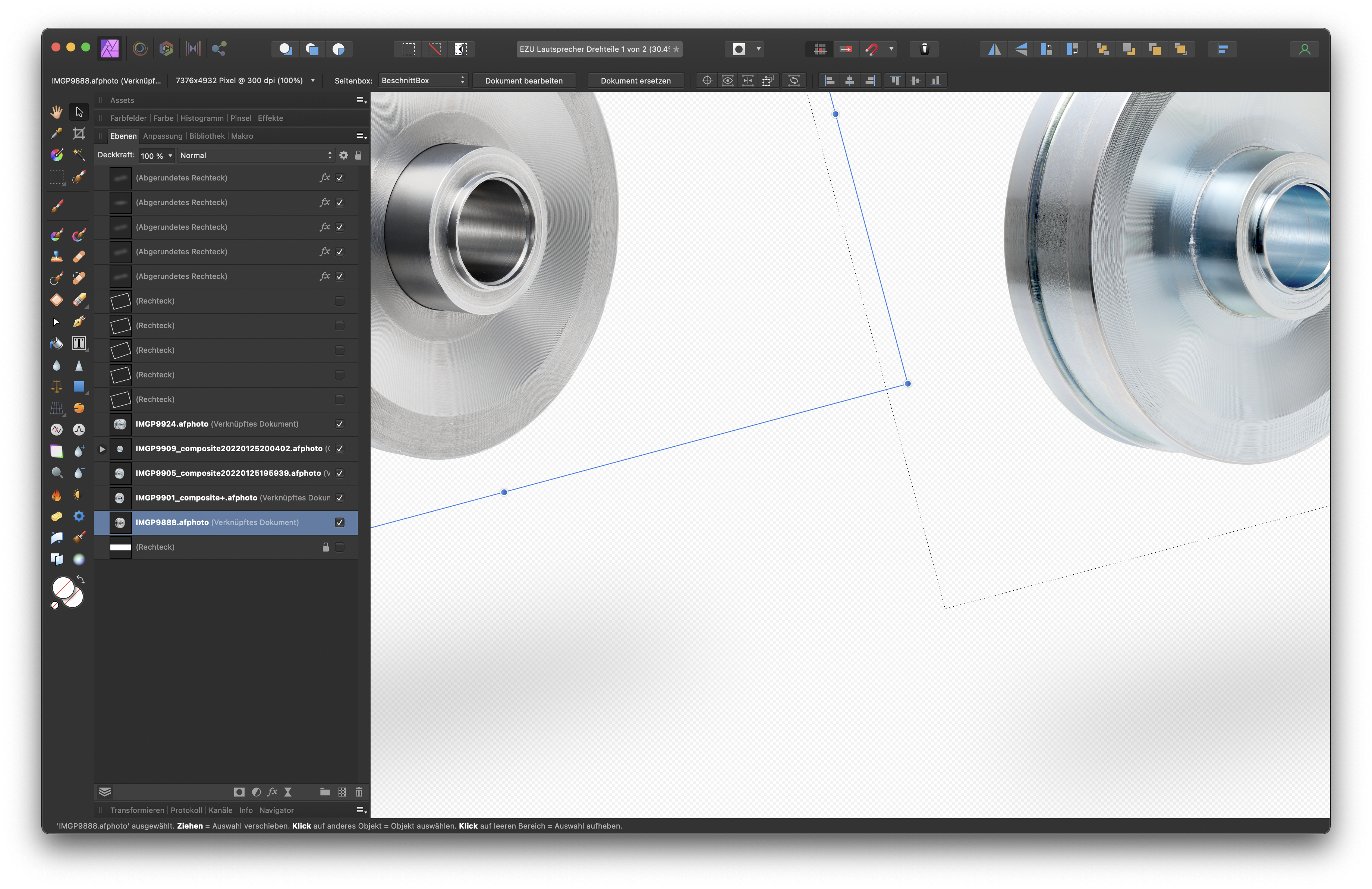
I'm having a similar question. There are lines around placed images in a larger Photo file. They also show up on export. Is there a way to avoid it?
-
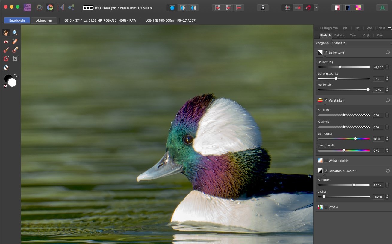
It's important to turn off the default tone curve in the assistant. This will preserve shadows and highlights at the extremes (but also reduce contrast wich you can add back later). I've recorded the basic steps in this video. Of course, also try the brightness and saturation sliders etc... But at the raw stage I usually just bring my values in the ball park (avoid clipping) and do the details later. duckyduck.mov
-
That's a giant monitor! 😳
-
Good to know! I wasn't aware that I'm not up to date... 🤦♂️
-
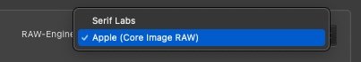
It seems that there is data in the raw file which the Affinity raw-engine doesn't handle correctly. If you are on a Mac, you can switch to the Apple Core Image RAW in the assistant. I don't know how that is on Windows. I'm not aware of any other settings to try out. To get rid of that pink, you can do a HDR or a Stack (from the File Menu), but that will skip the raw editing and the highlight recovery.
-
Ah ok verstehe. Das hatte ich auch in meiner Broschüre und keine Lösung gefunden. Daher hatte ich die Datei dann auf Einzelseiten umgestellt und die Bilder über Doppelseiten eben auch auf jeder Einzelseite manuell platziert.
-
Raw developer
user_0815 replied to NicholasG's topic in Pre-V2 Archive of Affinity on Desktop Questions (macOS and Windows)
In such cases where I am not sure about enough shadow detail, I do not add (or even reduce contrast) in the develop persona. Then later in the .aphoto file, I add contrast or move the black point as needed. This preserves details gives me more room for adjustments later on. -
Hm, colour management is a never ending story. AFAIC there are three places in Photo to alter ICC profile settings: (1) In the app settings -> Colour. Here you can set the default profile you want to work in. If an image has no profile, Photo will use this one. If an image has a different profile, you have the option that Photo automatically convert it into your chosen profile. (2) In the document settings. I have described them already (3) In the Layers panel you can add a soft-proof layer. This will give you a preview how it will look if you apply (not: convert) a different profile.
-
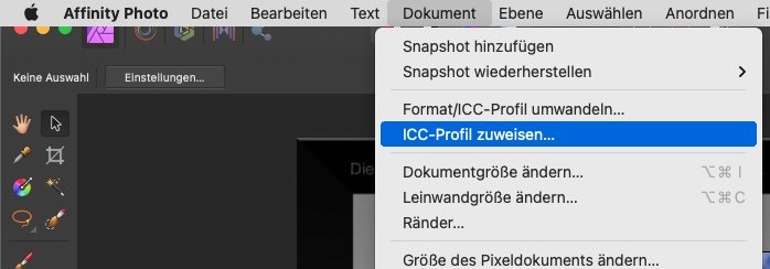
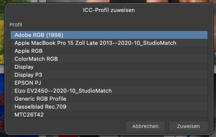
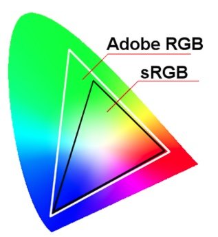
You can apply the AdobeRGB Profile and watch how the colour changes by doing these steps: 1. Open the image and select the menu "Document" > "Apply ICC Profile" (DE: ICC-Profil Zuweisen) 2. Select the profile you need – in this case AdobeRGB and click "Apply" (Zuweisen) The moment you click, you will see how the colour changes. It should get more saturated. However, this will not show the correct colours how they are intended because Photo will now read an sRGB Image with the AdobeRGB profile. The correct way would be to "convert" (umwandeln) the profile from sRGB to AdobeRGB. This option is also in the "Document" menu. But you will not notice any colour change because Photo will try to keep the look as close to the original as possible. It will read the sRGB image and convert it (in the sense of translating it) to AdobeRGB. Since AdobeRGB is larger than sRGB it is to be expected so see no relevant changes in the colours here. (Which means that the sRGB colours are all present in AdobeRGB.)
-
I'm not an illustrator but form a photography perspective I would see these points: Most important is a shadow underneath. Large and soft like in the original image. If it's too hard, it takes too much attention. The contrast of the individual elements is very different. The white roof is too bright and takes the most attention. I'd darken it and keep the line beteween the roof and the blue body brighter. Lighten the ladder as in the original. Those three elements on the Bumper need more highlight accents to make them less flat. Same for the blue vertical bars in the windows and the lights top left and right (they look flat but they have a gradient in the original image). Also the housing of the three-dot-light in the middle needs a shadow. The text and the dog on the panels are too bright and stand out a lot. The entire subject is lit from the left side, so it is slightly brighter left than right. You already added a highlight to the top left. It would be better visible if the roof was darker. (But the red rear-lights seem to have the highlight on the top-right instead of top-left.) You could also add the reflection on the blue hood above the window. Whether I'd add wheels or not would depend on the height of the horizon. A lower horizon indicates looking rather down. In this case I wouldn't see the wheels. A higher horizon indicates a lower perspective looking straight or rather up – making the wheels visible.