jclounge
-
Posts
33 -
Joined
-
Last visited
Recent Profile Visitors
1,258 profile views

-
Affinity 2.x colour picker doesn't work outside of the document viewport within the app. With Affinity 1.x apps, I used to use the colour picker as a colour "clipboard", where I could "copy" the currently selected object's colour by picking it from within the colour panel itself, and then "paste" the same colour to any other object I selected. That was nice, but now it doesn't work. ALSO, even though the Affinity 2.x apps have permission to "record" the screen, they still can't colour pick anywhere outside the app either! Affinity 1.x apps on the same machine still work 100% properly in both of these regards, so this is not some limitation of my macOS version or anything.
-
 Megnusin reacted to a post in a topic:
Photo and Designer: Seamless tiles and infinite canvas
Megnusin reacted to a post in a topic:
Photo and Designer: Seamless tiles and infinite canvas
-
jclounge reacted to a post in a topic:
[AP] Paint brush color picker should use color picker's source setting
-
jclounge reacted to a post in a topic:
[AP] Paint brush color picker should use color picker's source setting
-
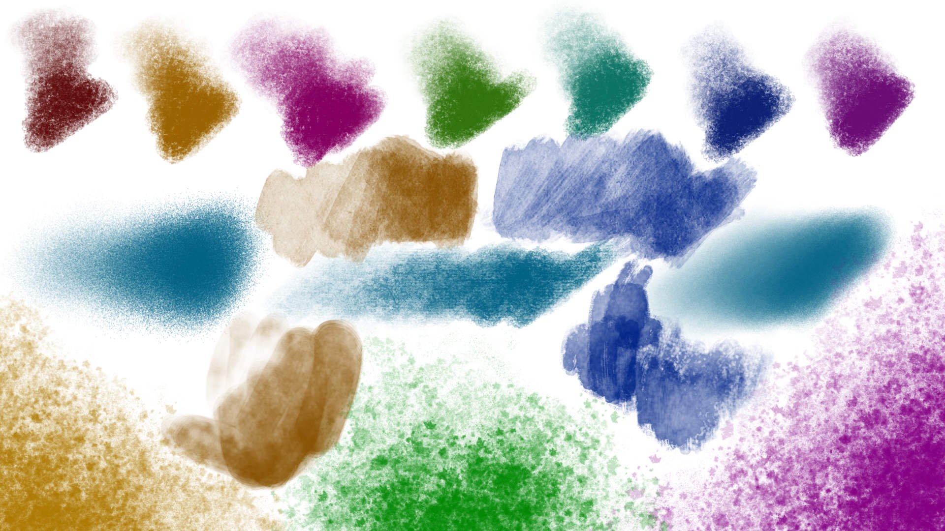
Yeah, 100% agreed this should be fixed. There's this interesting paint program called Realistic Paint Studio with a nice colour engine that allows drawing of very rich looking colours easily, and I just worked out how you can achieve pretty much the same effect in Affinity Photo. The trick is to explicitly add a white rectangle background behind your painting layers (even if the document background looks white already), and add one or two brightness/contrast/curves/saturation adjustments on top of everything to really darken/deepen the colours (see attached images for the difference between normal painting and this way of painting). I reckon it looks pretty good and it almost works really well, except for this exact problem that the colour picker shortcut modifier picks the deepened (global) colour instead of the underlying paint layer colour, even though the dropper tool has been set to use the current layer! It makes it basically impossible to paint this way except for just toying around. The colour picker tool has "current layer" mode with good reason, and the equivalent shortcut modifier should either honour the same setting or also have a separate setting of its own! This is a bit like that other bug where the brush "wet edges" setting keeps changing away from what you set it. Not quite exactly the same, but the same theme of simple bugs where tools don't respect the mode that the user has chosen, making it impossible to work the way you want to.. UPDATE: I also found ways to make this work in Krita, Artrage, and Rebelle. For the programs that don't have adjustment layers, you can do a similar effect by making a mid-grey fill layer with colour burn blend mode above your paint layers (change its opacity to taste). The colour picker modifier can be made to work correctly for ALL of those programs, but still won't work in Affinity Photo!

-
jclounge reacted to a post in a topic:
[AP] Paint brush color picker should use color picker's source setting
-
jclounge reacted to a post in a topic:
[AP] Paint brush color picker should use color picker's source setting
-
jclounge reacted to a post in a topic:
[AP] Paint brush color picker should use color picker's source setting
-
jclounge reacted to a post in a topic:
[AP] Paint brush color picker should use color picker's source setting
-
 jclounge reacted to a post in a topic:
Brush keeps changing when switching between tools
jclounge reacted to a post in a topic:
Brush keeps changing when switching between tools
-
Brush keeps changing when switching between tools
jclounge replied to jclounge's topic in V1 Bugs found on macOS
Ah I see, thanks Chris! 😊 -
Chris B reacted to a post in a topic:
Brush keeps changing when switching between tools
-
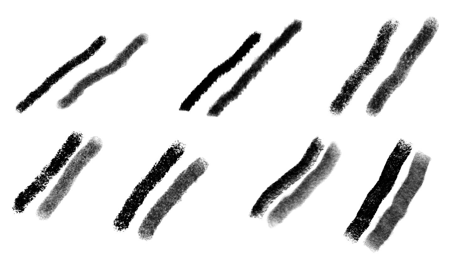
This is in both mac and windows latest versions. If you select a brush, then draw with the brush tool, then choose just about ANY other tool (e.g. eraser, clone, hand tool, etc.), then go back to the brush tool and draw again, the brush stroke now appears very different. I'm not sure if it's correct before or after the tool swap, but it's certainly different, especially with noticeable with e.g. Dry Media brushes. See attached image for what I mean, each pair of strokes is done with a single brush, but just switching to the hand tool and back to the brush tool between each stroke changes its appearance dramatically. This was with a mouse on the mac, but it also happens with a tablet on the mac, and also on a windows pen tablet pc. I'm still struggling to find a basic drawing program that just works reasonably well, and Photo is pretty close but this is a total show-stopper. Amazingly I have now discovered that the free Krita appears to be the very best behaved drawing program around is almost usable! The eraser pen nib works, you can configure all the shortcuts and modifiers to your taste, it manages to both zoom and pan with my tablet's touch input, it doesn't seem to crash yet, it's pretty fast, it has a liquify tool, and a decent brush engine that works consistently, etc. EDIT: Actually Krita just crashed, *sigh*. Cheers, Jules
-
Square.Mike reacted to a post in a topic:
Photo and Designer: Seamless tiles and infinite canvas
-
Scaling bug with layer as global clone source
jclounge replied to jclounge's topic in V1 Bugs found on Windows
Sorry I meant to clarify that I'm particularly talking about the second half of the video where he builds up the tree from a template ball of foliage. He clones different parts of the foliage and stamps them around the place. Also he uses different brushes for the cloning shape as he goes along, which makes nice rough/leafy edges no matter which part of the foliage the clone is coming from. -
Scaling bug with layer as global clone source
jclounge replied to jclounge's topic in V1 Bugs found on Windows
Interesting! Can you please tell me a better way to do something like that technique in the video? Edit: I'm particularly talking about the second half of the video where he builds up the tree from a template ball of foliage. -
If you create a new layer and paint something smallish in the middle of it, and then create a global source using that layer, when you then go to clone that source onto another layer it works except that the scale is massively stretched (depending on how much of the canvas you initially painted into inside the source layer). One workaround I've found is to make sure to paint a little bit of scrap material into the extreme corners of the global source layer first, then the dodgy stretching doesn't happen. I'm trying to do something close to what's shown in this video, seems like a pretty good workflow: https://www.youtube.com/watch?v=rWEPFWkqM68 Cheers, Jules
-
jclounge reacted to a post in a topic:
Lock transparency
-
jclounge reacted to a post in a topic:
Lock transparency
-
mr_lunch reacted to a post in a topic:
Photo and Designer: Seamless tiles and infinite canvas
-
JQL reacted to a post in a topic:
Photo and Designer: Seamless tiles and infinite canvas
-
StuartRc reacted to a post in a topic:
Project Brush Assets Monster Club [Mixed Source] 5
-
StuartRc reacted to a post in a topic:
Vegetation Brushes Set 1
-
Amazing brushes once again, thanks Stuart!
- 1 reply
-
- 1
-
-
- project brush
- raster brush
- (and 1 more)
-
Lovely brushes, thanks Stuart!
- 22 replies
-
- 1
-
-
- leaves
- vegetation brush
- (and 1 more)
-
Sorry for replying to an old thread, but I ran into this issue too. To the devs: Could there at least be a "Paste with same physical size" option in the edit menu? Ideally there would also be a preference setting to always do this by default.
-
Aammppaa reacted to a post in a topic:
linked tints and shades of a global color
-
lepr reacted to a post in a topic:
linked tints and shades of a global color
-
linked tints and shades of a global color
jclounge replied to befehr's topic in [ARCHIVE] Designer beta on macOS threads
Actually you can make a colour be a tint of a global colour already, but sadly not shades of a global colour, not sure why this feature was sort of half-baked like that. First create a global colour, then apply it to an object, and then go back to edit the colour of the object and it should appear as just a tint slider. Xara does a far, far superior job of managing colour dependencies, where you make 'named' colours, and then other colours can be based on the named colour in various ways, including things like inheriting hue and/or sat and/or val, and then whatever you decide not to inherit, you can override. Moreover, you can then make other colours depend on that modified colour, and so on. It also covers tints and shades of course, and you can even do stuff like inherit say red and green components, and modify just the blue, etc. What I'd really like is if AD could do everything that Xara can do in that regard, and one extra feature to also be able to make a colour based on another colour but with a relative hue+saturation+value offset to it, so you could make automatically analogous shades, etc. Basically the same as Xara but with a 'relative' option instead of just 'inherit' or 'not inherit' would be awesome. :-)- 5 replies
-
- 2
-
-
- global color
- tint
- (and 2 more)
-
Petar Petrenko reacted to a post in a topic:
Designer 1.5 - Edit in AF-photo
-
Designer 1.5 - Edit in AF-photo
jclounge replied to Eisbar's topic in Pre-V2 Archive of Desktop Questions (macOS and Windows)
I don't buy the argument that it would be heavier or more complicated to maintain. Clearly the two apps are using the vast majority of their codebases the same as each other. They can both load each other's file formats, and can both even edit things that only the other app can create, as if they created those things themselves. If they are supposed to serve such different purposes, then why would they ever need to be so tightly compatible? It's plainly ridiculous to pretend they are hugely different in their purposes. Until I see any evidence otherwise, what looks far more likely is that it's a coldly calculated marketing decision. Plus, having two separate apps has certainly not made either one very bug-free, and has caused issues between them where there should be none. I would bet that it is in fact harder to maintain the apps separately because it means keeping track of all their arbitrary superficial differences, and expending time and energy deciding on just the right balance of differences to force people to buy both apps. If they were combined into one app, I would wager that the 1.5 release would have arrived around the same time, with just as many features, and far fewer bugs due to less duplication of effort and dividing of focus. -
Designer 1.5 - Edit in AF-photo
jclounge replied to Eisbar's topic in Pre-V2 Archive of Desktop Questions (macOS and Windows)
I stumbled across this issue recently too. When are Designer and Photo going to be merged into a single app the way they probably always should have been? It's a bit annoying having some tools/options here, other tools/options there, breaking compatibility like you have just done, etc. -
Has there yet been any progress on enabling pasteboard visibility to Affinity Photo?
-
BUGS: Brush velocity & Mixer Brush Flow
jclounge replied to outdoors's topic in [ARCHIVE] Photo beta on macOS threads
Is there yet any way to make the Paint Mixer Brush respond nicely to pressure?