Search the Community
Showing results for tags 'ux'.
-
 Hi Not only is this not getting fixed since January 2019, but now there's also a lag when I open the cog wheel. I have the feeling the thread is too hidden in the beta archive: Kind regards Manuela
 -
 I have realized this few weeks ago: I purchased Photo (and Designer) few years ago yet I use it pretty much never. (One might say I am an ideal customer.) The reason being I can't do *hit in it. I suspected (and still kinda do) I have way too little patience and I didn't blame the application, thinking "it is for people who use it professionally" instead. But recently I shared this impression with a friend of mine, who has CGI (3d mostly) as a job, and he laughed and said he's the same story: purchased Affinity Photo but couldn't befriend it. I am not a professional myself. Usually I just need to crop an image, maybe insert a text or slap one part photo over another. Maybe I am not the target user...? Recently I learned SketchUp in matter of minutes, and I am doing sufficient progress in Blender. While Blender has a very questionable UX and some very inconsistent aspects of work, I was able to make just enough progress simply by looking around the UI to get hooked before I had to go looking-up howtos. So today I gave Photo a shot again, and I failed again. If any of you Affinity guys care how you are (possibly) losing future customers... (Note that I don't seek a particular how-to here, that's not my point.) I have a texture of a wooden cladding, I want to create a bump map from it. So I created a selection of area that I want to use in the resulting bump texture, now I want to preserve the selection somehow so I can bring it back later. I know I could save it into a file and insert it when needed. But there must be a better way Maybe I can store it as a layer? Layer / Duplicate Selection (Ctrl+J) - OK, this looks promising - click - nothing... No feedback whatsoever. Was a layer created somewhere? (In that case some kind of a layer manager should reveal itself.) Am I somehow in a "wrong" mode that prevents doing that? (In that case I shouldn't be allowed to click the item in menu or I should get a warning message.) OK, I am too stupid for layers. A channel? Select / Save Selection / As Spare Channel... Okay, maybe we're on to something. Click. NO FEEDBACK AT ALL. Again? (I couldn't find anything resembling Object from Selection. Also I couldn't figure out how to display the layer manager, there has to be one I guess...?) At this point I am not sure if the application is bugged somehow or if it is only a matter of bad UX and an impatient non-pro user, but I am already running out of patience. This was supposed to be a 7 min job, 4 of those dedicated to cleaning up the selection/mask. Another, a minor one, example that just popped in my head: I have an image in clipboard, and when I start Affinity Photo mere Ctrl+V or Shift+Insert should be all the application needs to figure out what I am trying to do. Affinity Photo does nothing, and has me chasing menus instead. Edit? File? OK here it is, but really, Ctrl+V yet the app does not know what I want to do? Now I am back to looking for an alternative for an alternative to Photoshop, knowing I have Affinity Photo installed but I can't do *hit in it. I am convinced the Personas concept is simply a bad idea, and the app can't even do updates, instead it keeps asking me to download an installation archive. And every time I submit and click the Download button I am praying this update brings the functionality of (optional) updates instead of manual download+installs. But I suspect only the next gen of Affinity will have that, and given my experience with this generation I doubt I will waste the money. I bet most of the people on these forums will defend the UX, but maybe there are significant numbers of users who give up without even leaving a note. Cheers
 -
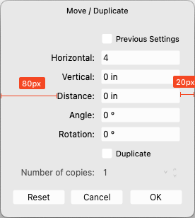
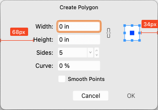
 Love these two new features a lot, but the contents of both of these input dialogs are not centered; it makes the app feel cheap...
-
Hello people. I created this project using the affinity designer. Hope you like it https://www.behance.net/gallery/86462907/WhatsApp-Redesign
-
 There it goes, my inspiration that is, out of the window, and I lost it trying to change who knows what shortcut key... again. As a professional in video, animation, 3d and audio I have used many many applications over the years, and find Affinity package a real refreshing leap forward. However, I must admit that the preferences window across all three Affinity apps (Photo, Designer and Publisher) is one of the most useless I have ever encountered. I am not afraid to switch and learn applications and am ready to customize the new ones I learn to my own best practices, and the preferences window is my friend or it should be, but Affinity's is not at all. Please let me try to explain what I find is wrong with and suggest some changes which I did not think a lot about, but seem much simpler to use. Let's start: 1. The preferences window uses a unique visual paradigm, completely different from any other dialogue I have encountered in the rest of the application. It has a header with Back/forward buttons, "home" button (with an odd icon and a drop-down menu) and search bar. No other panel, toolbar, manager, assistant or any other window in Affinity uses this paradigm or at least my humble knowledge of the app does not bring any into the mind. I doubt that this is good. For instance having tabs, like some other windows would do the trick no need for back/forward buttons, no need for home button, no need for drop-down menu, just 7 simple instantly accessable tabs. 2. search bar is a sneaky red herring! It is in fact dangerously useless! I'd like to change a shortcut for brush size in pixel persona? typing any of these terms does not help me to find where to do it. It seems that this search bar is good for searching only a couple of dozen words which does not make any sense at all, either you make every single preference item that can be change searchable or get rid of the search bar because the way it is now is frustratingly useless. 3. I will not go in depth on my thoughts about "General", "Color", "Performance", "User Interface" and "Tools" pages as I do see some benefit of "bite sized" preferences pages even if some items on them seem to belong to another page, and the number of these pages could actually be decreased. (for instance half of the "Tools" preferences could easily belong to "User Interface" tab) 4. Checkboxes, since they have really powerful results would benefit from tooltip help with a more verbose description of what they do. 5. "Miscellaneous" could easily be renamed to "factory resets" or something on that line, as that is what it does. 6. And now I come to my nemesis, the "Keyboard Shortcuts" page. Where to start?! a) there is a search bar on the upper right, that is as we said a sneaky trap, and a red herring. It does not help us here, and will take us "home" probably finding nothing of interest. b) we need to use these two fiddly drop-downs. The first one could easily be replaced with beautiful Draw, Pixel and Export icons cutting the number of actions for picking persona to edit to only one click (or even better none.. read on). The second one is really unintuitive as its items partially overlap in different personas. It took me a while to get the idea that this second one is contextual to the first one (as the list changes "behind the curtain")... I got it only after learning my way a bit around the app so I recognised that some items belong to some personas. c) a quick overview of other buttons and check boxes in this upper region of Keyboard Shortcuts page; "Apply to all" -what? to all what? I had to dig through the manual to see what it does, and all it would take to fix it is to call it "apply shortcut changes to all personas" without this information there is no way to know that there actually are some connections possible between personas. As if the for instance, brush size in pixel and draw persona must be separate. "Ignore Modifier—Lets you create shortcuts using a single letter designation instead of using keyboard modifiers." says the manual, and I still do not get it. Does it allow me to pres only the letter in application without modifier keys and get what I want? No, as Ctrl+S is stil "save" and "Ctrl+Shift+S" is stil Save as. Does it filter out the input of Modifier keys while assigning new shortcuts? No. So what does it do? Maybe a better explanation in manual would help, and a more verbose checkbox title or tooltip. "Load/Save" what? it loads and saves what? a file obviously, but what does that file contain? All shortcuts, or only those in focus? Maybe "Load Shortcut configuration" or something on that line would be better. to be continued...
- 44 replies
-
- 22
-

-

-
I recently got a 4K 32” external monitor for my laptop and this obviously caused me to work differently than using my laptop display, namely, as screen size increases, one must sit back further from the display. Doing that, the Affinity UI is barely legible to me. I feel like I’m trying to tap on a grain of sand using a needle. I already have the UI Font preference set to Large but it’s not nearly enough. I don't want to use Display Scaling resolution in system prefs as that negatively impacts performance and I want to use the maximum number of available pixels. I know this is not a trivial thing to address, but I’m hoping / praying the AMAZING devs fundamentally address the UI in version 2 of the Affinity Suite in terms of functionality and customization, and this would include being able to resize the entire UI, including font, it's size and letter-spacing (critical for legibility), as well as icons, Studio panels' buttons and icons. Please consider engineering a responsive UI just like modern websites which can resize any and all elements based on the device used for viewing via CSS. That way users can create profiles for desktop and laptop UI preferences. Larger displays can use an enlarged UI and laptop displays can use a more compact version. Thanks for your consideration and all you do. Happy new year and God bless and heal the world!
-
Please, Please add a progress bar when opening a document/saving. I don't understand the logic behind having the words on the top right corner instead of having a modal window in the middle of screen with a progress bar showing the progress of the task. Your UI/UX logic baffles me...
-
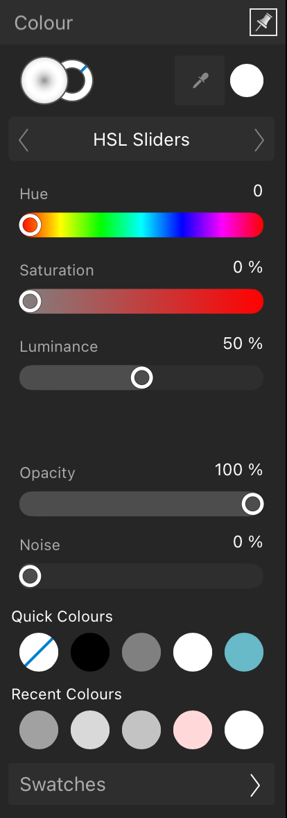
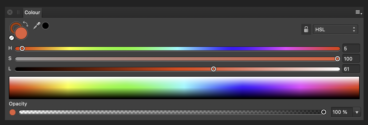
 There are instances when you want to have better control over the tools that you have at your disposal. e.g. Colour selection, sliders, stroke weight, typography, history, layer properties. I suggest a button to extend the panel into a larger and/or wider interface for more precise control. Just for consistency's sake, both images are of the HSL Slider UI in the colour selection tool – but this can be applied to more UIs like stroke weight. Ideally, hitting some button would expand the panel from: Into something like:
-
The Apple Pencil is the default precise input tool for iPad. However, Affinity Designer implements a deadzone for the Pencil that acts almost like a finger. While this helps with finger input, trying to use a precise input device (Pencil) in a manner that is less precise (Finger) is frustrating. This comes up as a hindrance when trying to select nodes on the canvas amongst other nodes while zoomed out, adjusting handles when transforming objects, using sliders, or doing precise work with stroke input tool. Yes, you can zoom in to mitigate but the precision of the Pencil should not require this.
-
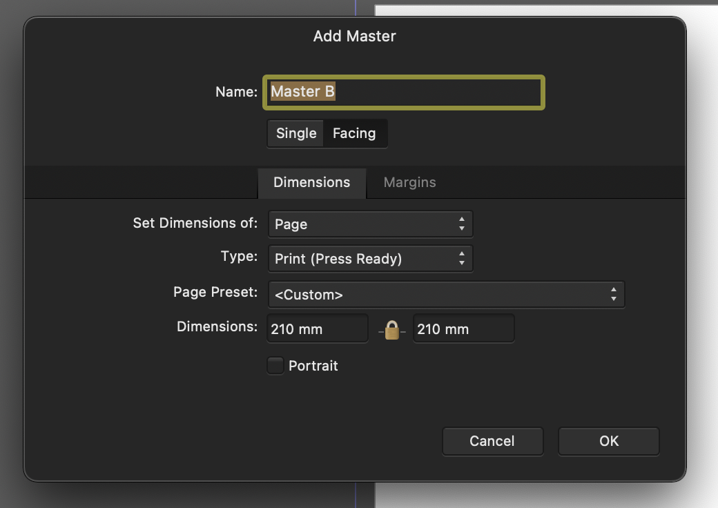
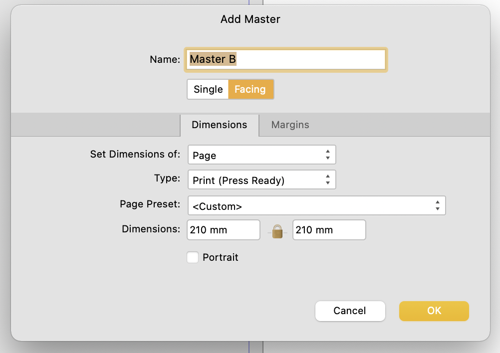
 I noticed this a couple days ago and thought it was a bug. So raised it in the bugs sub forum initally, but have since removed it. I first came across this in the New Master Page Dialog when you have dark theme on MacOS selected either in app or at an OS level. The visual feedback for the selected state of Single or Facing page toggle is ambiguous with the dark theme, but is reinforced through OS accent colour in the light theme. Dark theme: Relies on pushed button metaphor, yet the control - to me at least - looks/looked like a segmented control, suggesting that Single is highlighted. The context informed my opinion as the Dimensions Tab below is lighter and selected. I assumed that Lighter = selected. This "pushed button" metaphor is fine where there are more than two options using it and where one option has more than two choices. As seen in the preferences pane (below) the control with three options shows clearly which is selected. Not only does the wording of the context help but the selected option is the odd one out. From this I can infer which choice is selected in the control above which only has two options. However, when light mode is enabled (see below) ambiguity is reduced as the selected choice is reinforced through accent colour. TLDR: Could the colour accent used in the light theme be applied to the Dark Theme too please?
-
 Please consider rephrasing this sentence: (Task for an UX)
-
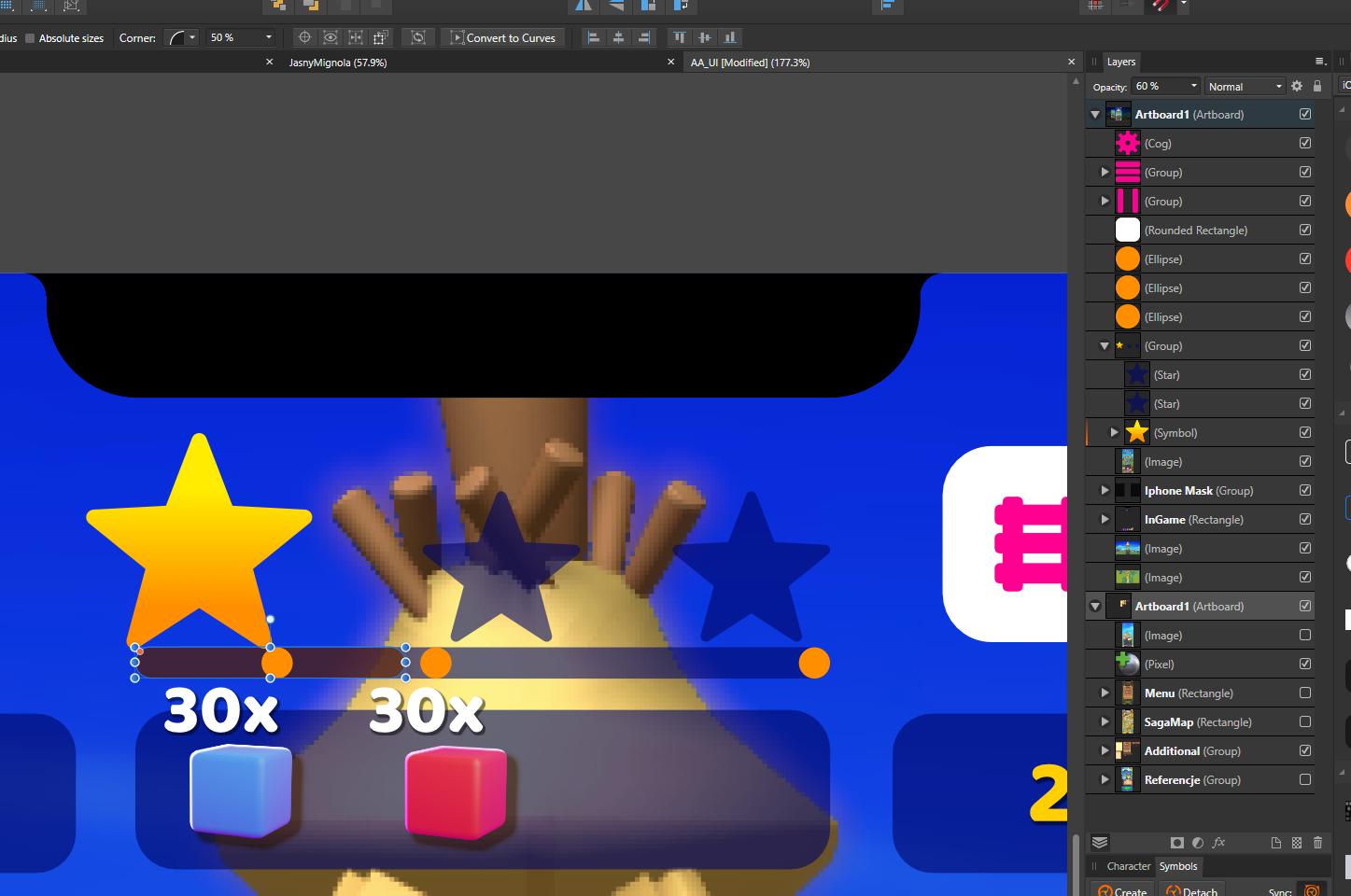
Hello, Fellow UI designer here, just wanted to suggest a few tweaks to the layers panel, 1. Add an even smaller thumbnail setting and maybe even a no thumbnail setting (Not for me but I think some people might like it). The UI is already scaled quite bigger than I'd like and wastes a lot of space from the actual view window. 2. Add the ability to copy paste things from the layers panel, for example: If I hold down CTRL and drag a layer it should let me make a copy of it. It's different than duplicate because it allows me to put the copy anywhere I want directly. 3. Lock icon in the layer itself, it's annoying having to click the layer and then going up and click the lock icon, I already use the shortcut to lock thing but still, annoying. Maybe make the icon appear alongside the checkmark icon as you hover the cursor on top of the layer? I hope you address this in the upcoming updates! Thanks.
-
 <RESOLVED! - look at next post> I will start from usual - love Photo Designer. Love it and use it on daily basis. It is one of a things that make my work in it so much less fluent: this is when I click on group - exactly what I expect, group is lighten up on layer mennu, just as it should. but I need something deeper. So I clicked more (on screen, because I see my object and I want to move it to another group, or see where it is hiding. Aaaaand... nothing, no idea. Sometimes it gives pale blue hue to parent group, but not always. Even if - it is bit too delicate to see. Should it or should it not open hierarchy and expose an object will be debatable (I wish it was, but think some people can disagree, but stronger feedback will be welcomed. Thanks!
-
As I found in this thread, very useful feature of both designer and photo is off by design. And when it's off it works partially, just enough to work as broken. I understand there is group of people who wants this off (I imagine huge imported technical documentation or something like this) But as a user more focused on UI /UX /illustration with quite managable hierarchies I propose to turn on this by default. Just a thought.
-
 Tell me if the designer will develop in the direction of UI/UX or his main direction of illustration?
 -
Hello World, Here's what I have done so far by creating a design system using Affinity Designer. I also have attached my Affinity Designer source file. Feel free to download and play around with it. I have developed a UI Design based on this using HTML and CSS. If you are interested you can sign up with the coupon code Here is the link: https://www.udemy.com/course/uxdevelopment/?couponCode=UX-DEVELOPMENT Regards, Hossein Finance App.afdesign
-
Zoom value (top left) still doesn't update when using zoom tool... There are still many more important bugs probably In sense of rendering graphic on retina while painting pixelmator or Ps still win. Saying that as fan I only wish this to be fixed. Looking forward, thank you! PS: Still adressing the same for quite a long time
-
I love Affinity on the iPad. The toolset, capabilities, and support is incredible. I would love to see the document browser improved though - I think it’s the main part that slows down my workflow, or causes confusion. The way Affinity stores it’s files feels unintuitive to me, I think it’s because it tries to be too smart. These are the primary issues I’ve identified that affect my workflow 1. I forget where a file is saved - mainly because of the Import vs Open from cloud options. 2. I forget whether a file is saved (linked with no1 - where it saves to upon hitting save because files do not auto-save upon returning to the document browser) 3. I have to open a file to export 4. I cannot bulk select, import, or delete files. To solve some of these, I’ve created the mockups below. Without too change to the core functionality of the browser, I think the best way to solve the issues above would be to reveal a little more meta data to the user through an info panel. No too obtrusive, and revealed upon pressing an ‘i’ button. The key meta data that helps solve no1 & no2: an icon & path showing where the file will save to & whether the file has been saved through pressing the Save button. If a file is new and hasn’t been saved yet, then Last Saved and Saves To can be NA. Being able to see these at a glance enables me to see what I can and cannot safely close, and locate from the files app. A little extra detail like file size helps prepare me for long load / save times. I know no one asks procreate for this kind of metadata, but then again procreate offers a different kind of experience by making all files save inside the app. I know where everything is. With Affinity, I never quite know whether changes are saved, and where my files are (because I forgot). Also multi select for bulk save, import, and close would just be ace! Open to thoughts and suggestions on how this affects your workflow!!
-
 Hey guys, Are you thinking about developing a software like Adobe XD? I know Affinity designer is awesome on making UIs but, I mean a software capable of making links and create some mockup to show functionalities like animations, links, transitions, etc.. I hope you consider it in the future!! ^^
 -
Hello world, Just created my isometric UX poster. Here is the timelapse. Thank you Here is the YouTube Link:
-
 Problems: 1) In the course of changing FX parameters, I will tend to touch an empty area on the screen (sometimes by accident, sometimes thinking to de-select the current object and move on to a different task, etc.). It instantly messes up my FX parameters. This is annoying. 2) de-selecting yourself out of the FX menu, or selecting a different object, is a pain because you have to select the move tool, then click on your new object, then click back on your desired FX. This is too many steps, and requires selecting a tool that you don't actually want to use (ex. move). 3) when you turn an FX on, the bottom bar does not automatically update to show the FX you just enabled. You have to hit the name of the FX instead. This is unintuitive. Solutions: 1) if you hit an empty area on the screen, the FX menu does not change parameters. 2) to edit a different object's FX, simply click that object to have the bottom bar / FX side studio menu change and reflect that object's settings. 3) if you turn an FX on, change the bottom bar to that FX's setting. Other thoughts: It other tools and studio interfaces in the program, you can tap an empty spot on the screen to de-select the current object. Or you can tap another object to select that one. Then, the bottom toolbar applies to that newly selected object. FX settings, however, don't work that way. I feel like I constantly have to second-guess what I'm doing when working with FX. "Will this accidentally mess up the parameters I just set? Am I working with the right object? Why don't I see the settings for the FX I just turned on?" etc.
 -
 This sounds silly but makes a very big difference to the feel of the app. When dragging & dropping I frequently don’t know if I’m actually doing it. Issue 1: I don’t know how long to hold the layer for. I need to know when I can start dragging a layer - however, Affinity offers almost no visual feedback Everywhere else in iOS, the item you’re holding ‘pops’ off the screen so you know the item can now be dragged, rather than scrolling your list. See the GIFs attached and let me know if you can spot the moment the layer goes from held to draggable. It’s possible in affinity, but so much more obvious in Procreate. Proposed solution: Have the layer ‘pop’ off the screen the moment it is dragable. Issue 2: I have a long list of layers, and I’m on a multi-touch device, I would normally hold the layer with one finger, and use my other fingers to scroll through the list to find the new spot for my held layers - but that doesn’t work here. (Try it in the files app, or procreate for comparison.) Proposed solution: make the layers palette respond to multi-touch.
- 1 reply
-
- 1
-
-
- touch
- multi-touch
- (and 4 more)
-

The gray(t) Affinity Wall
Joachim_L posted a topic in Feedback for the V1 Affinity Suite of Products
First of all, sorry for the bad pun in the title. But this is my feeling, when I start e.g. APu. Working area on the left monitor and most needed tools on the right monitor. The overall gray appearance between the panels makes it sometimes hard to distinguish them. We have three applications which have a "brand" colour of their own. Why not using these colours inside the applications? E.g. orange headers or orange overlines for the panels in APu? Just a thought. P.S.: I know I can use the Dark Theme, but personally dislike it. It is a matter of taste and I am used to it for over thirty years now.
-
I am sure this has been mentioned but I find the document loading feed back on the trio of the application very poor. Can you please consider using the progress bar dialogue you use when exporting, also on opening documents? At the moment it is very poor. Apart from that loving Affinity products and to hell with Adobe!!!
-
Maybe covered elsewhere? Right now I am making a bunch of icons on one page, so there are a lot of elements (layers). Unfortunately I did not plan well, making for every icon a new "parent" layer. Creating a "parent" layer and moving elements to them can be quite tedious scrolling and dragging all the time. So a kind of fly-out menu would be nice, where I can specify to which "parent" layer the selected elements belong to.