Search the Community
Showing results for tags 'ipad' in content posted in Share your work.
-
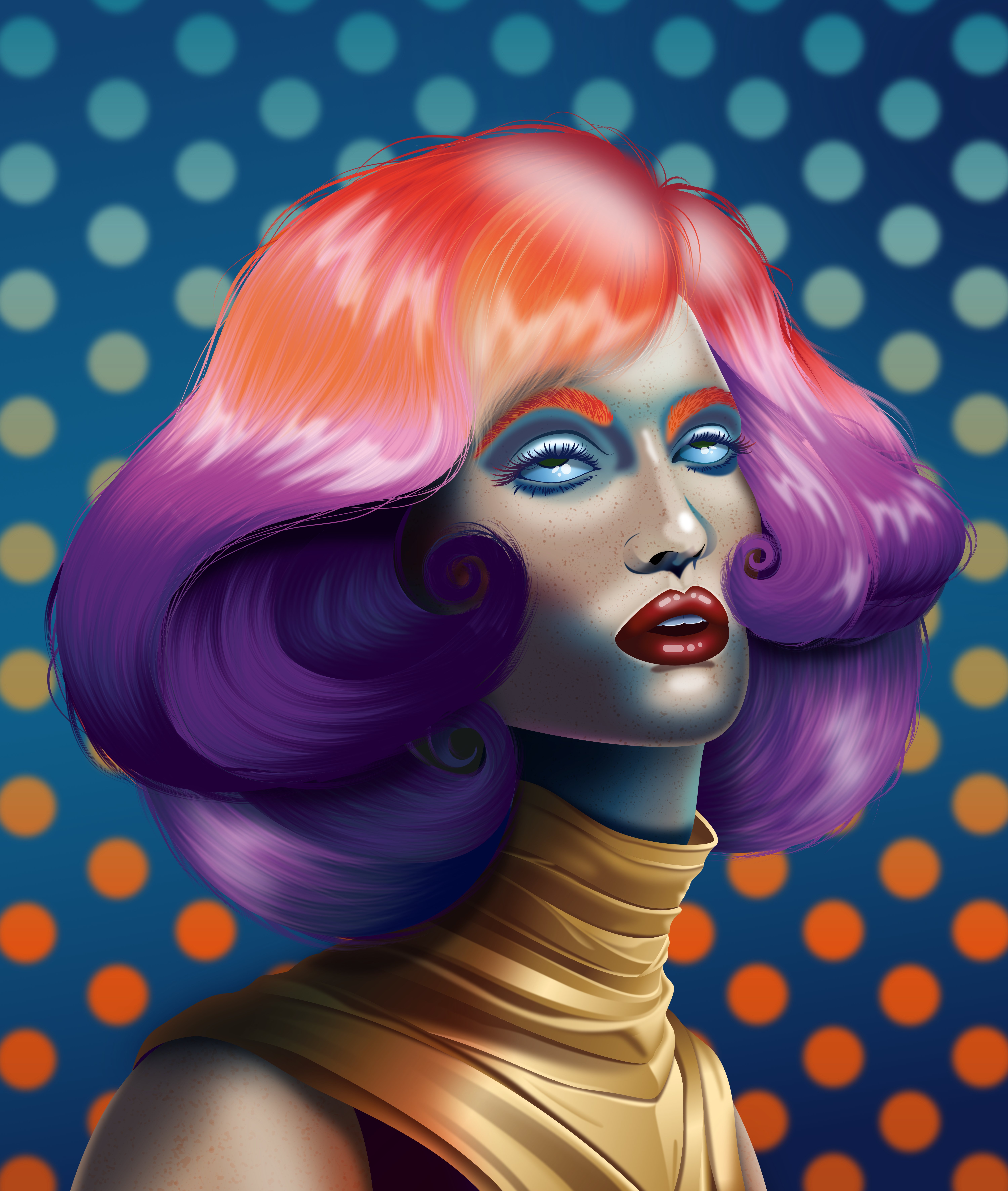
This started off life as a quick colour study for an oil painting I’ve been planning and wasn’t meant to be anything more, but - as usual - I started getting obsessed with adding the detail, and so here we are. I’ll still work on the painting, but I’m really happy with the vector version so thought I’d share. Hope you like her!

-
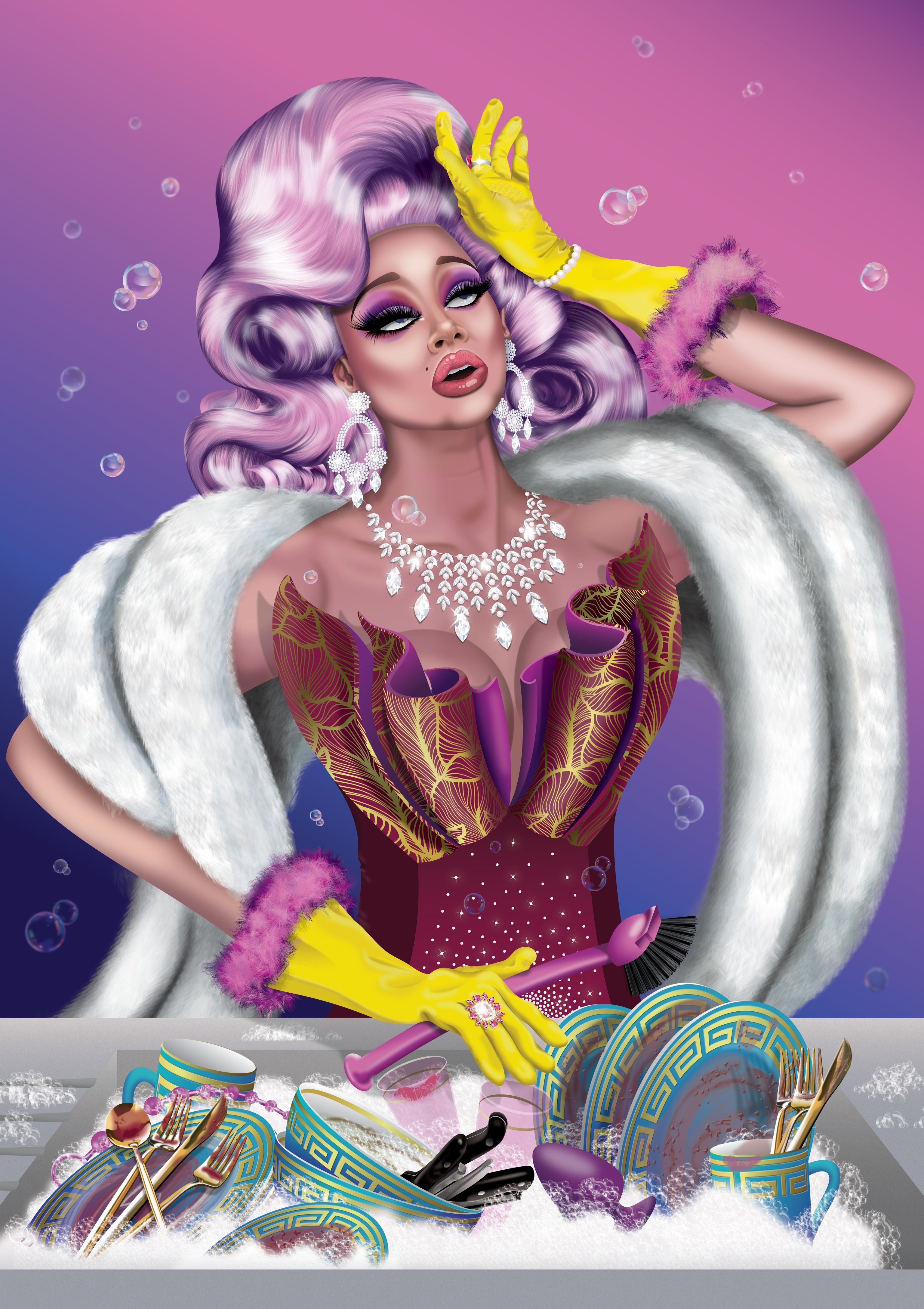
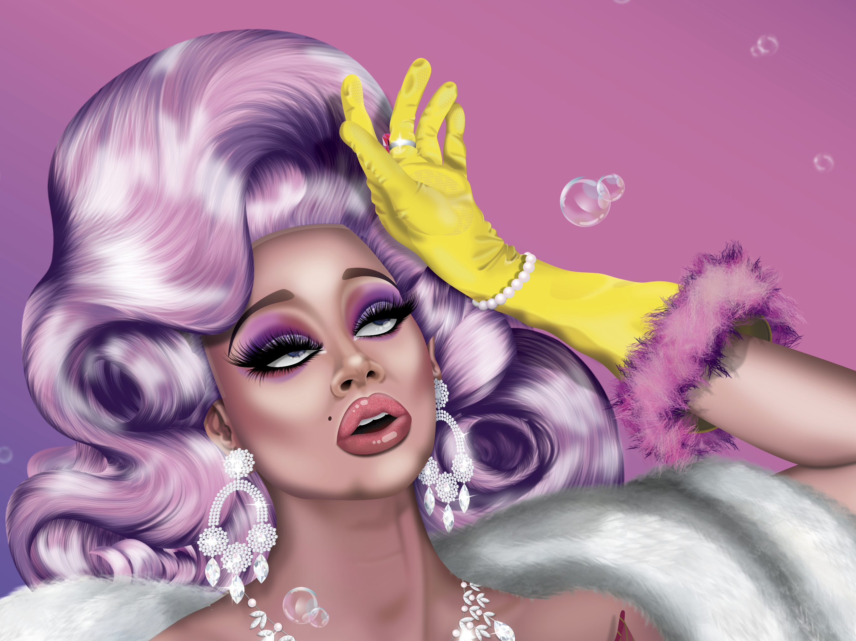
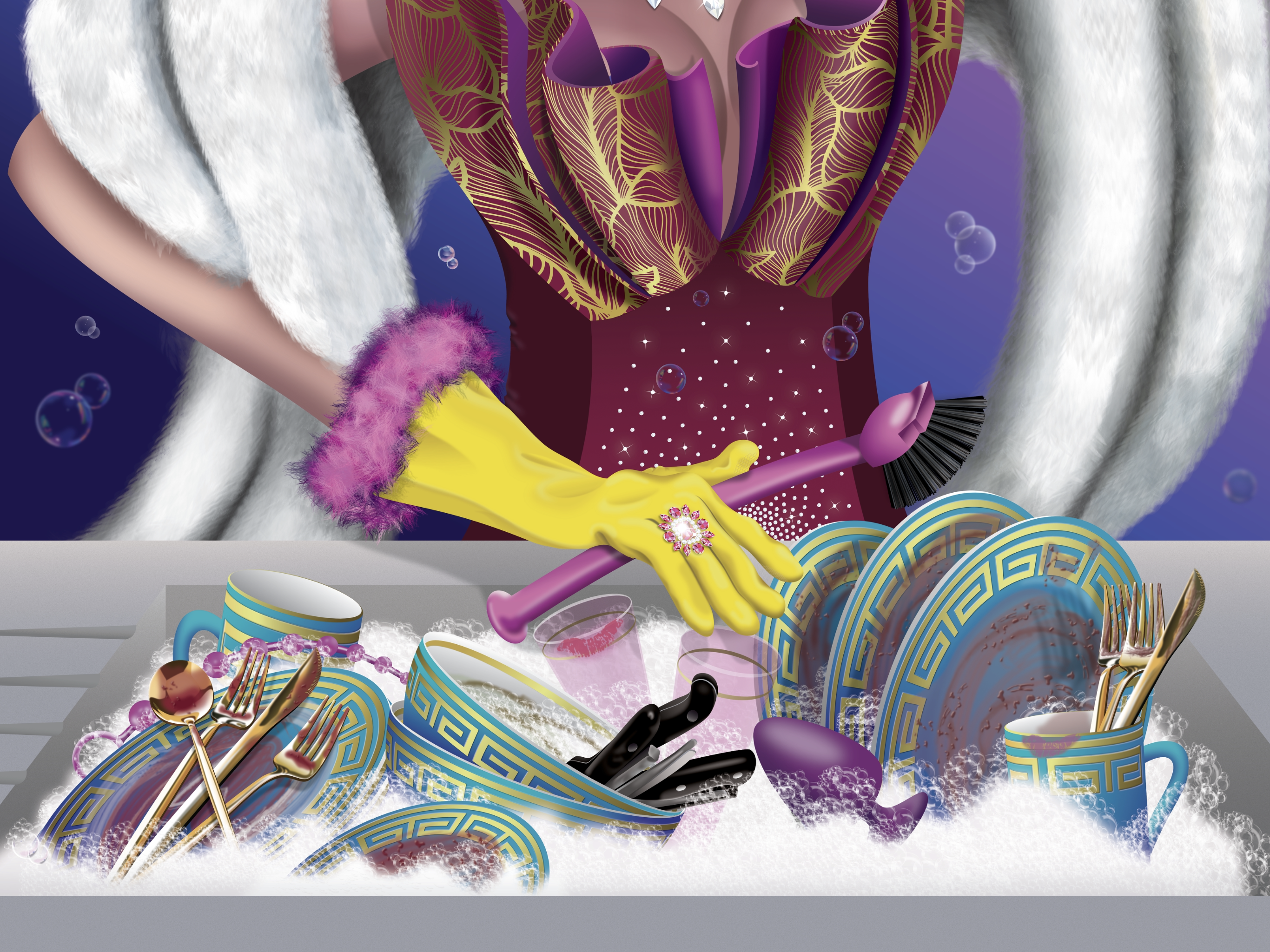
 I’ve been working on a series of pieces featuring ludicrously over-dressed drag queens doing the housework (my “Domestic Goddesses” series). Here’s the first: Debbie Does Dishes. Hope you like her! (Created on Affinity Designer iPad versions 1 & 2)
-
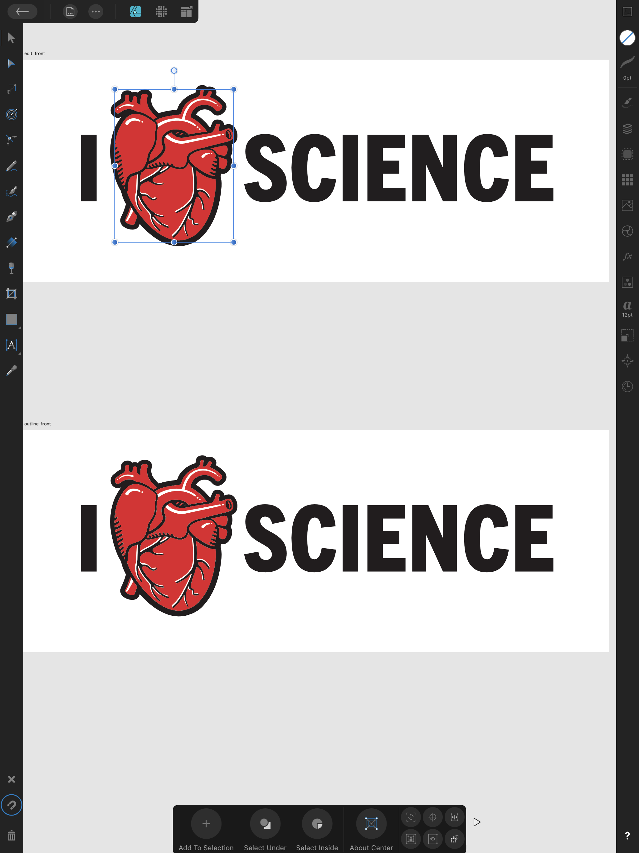
Had fun allowing the background to double as a color with this one. Although I have never done it myself, one of my favorite illustration production methods is screen printing. With each color applied separately, there are happy accidents like the plates not lining up exactly right that make every copy unique. Because I went even simpler by omitting overlapping colors, this piece had to be planned and executed differently than previous pieces I’ve done. I had to allow for contrast, details, and a light source within a very limited color palette of 3 colors (near black, orange, and grey) on a more vintage off-white base. This is true vector with one subtle texture raster layer over the top that can easily be replicated for any size. Happy Sunday, all!
- 1 reply
-
- 10
-

-
- affinity designer
- ad
- (and 3 more)
-
 Followed this tutorial on Affinity Photo iPad: My Version: Originals: can’t place the guy here, don’t have rights.. (I got that from my envato elements subscription)
-
Got the course from this site: https://kevincarden.gumroad.com/l/WlvZzB My Piece: Originals:
-
Specs iPad Pro (2020 Model) 12.9” iPad OS 15 Affinity Photo 1.10.1 Still learning… framing of composition to guide the eyes rim lighting atmosphere mood Grateful to have this on my iPad. Look forward to the future powerful updates Serif has in store. My Piece: The Originals:
-
affinity photo Folded Space (Sci-Fi) creation
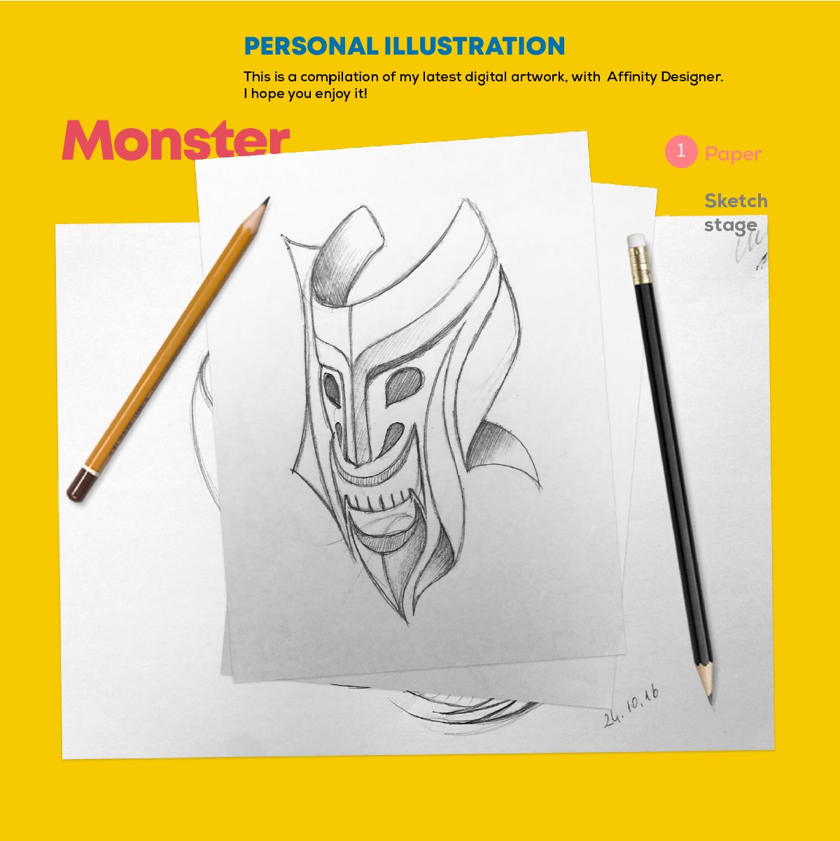
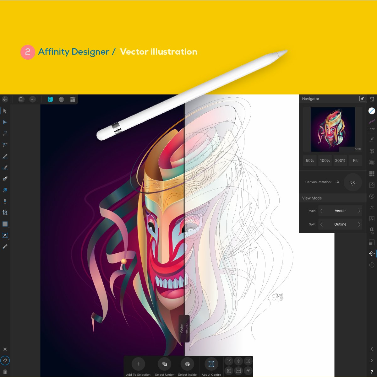
Affinity iPad Student posted a topic in Share your work
Still learning, mostly using these pieces for VR game design concepts. Created with Affinity Photo on iPad Pro (2020 12.9” model) beyond amazing app! My Creative Piece: The Originals:
-
Lots to do yet - including a circuit tree on her back, a pixel pattern kimono around her shoulders, a chrysanthemum in her hair, and an electronic prawn being held in her chopsticks, but coming along nicely I think...
-
Thought I'd add a quick shirt I did for work using Designer. I love the variable width tool for strokes. Is there a trick to matching up the two ends instead of eyeballing on the iPad? THX Stephen
-
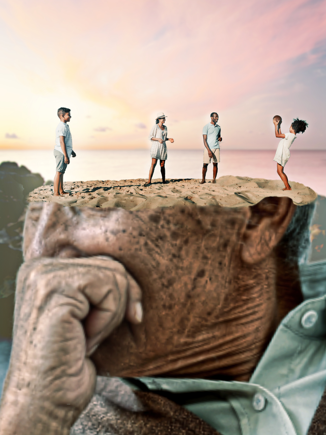
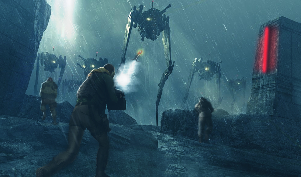
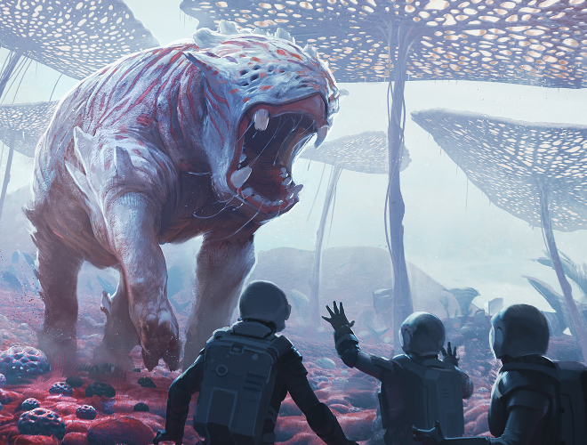
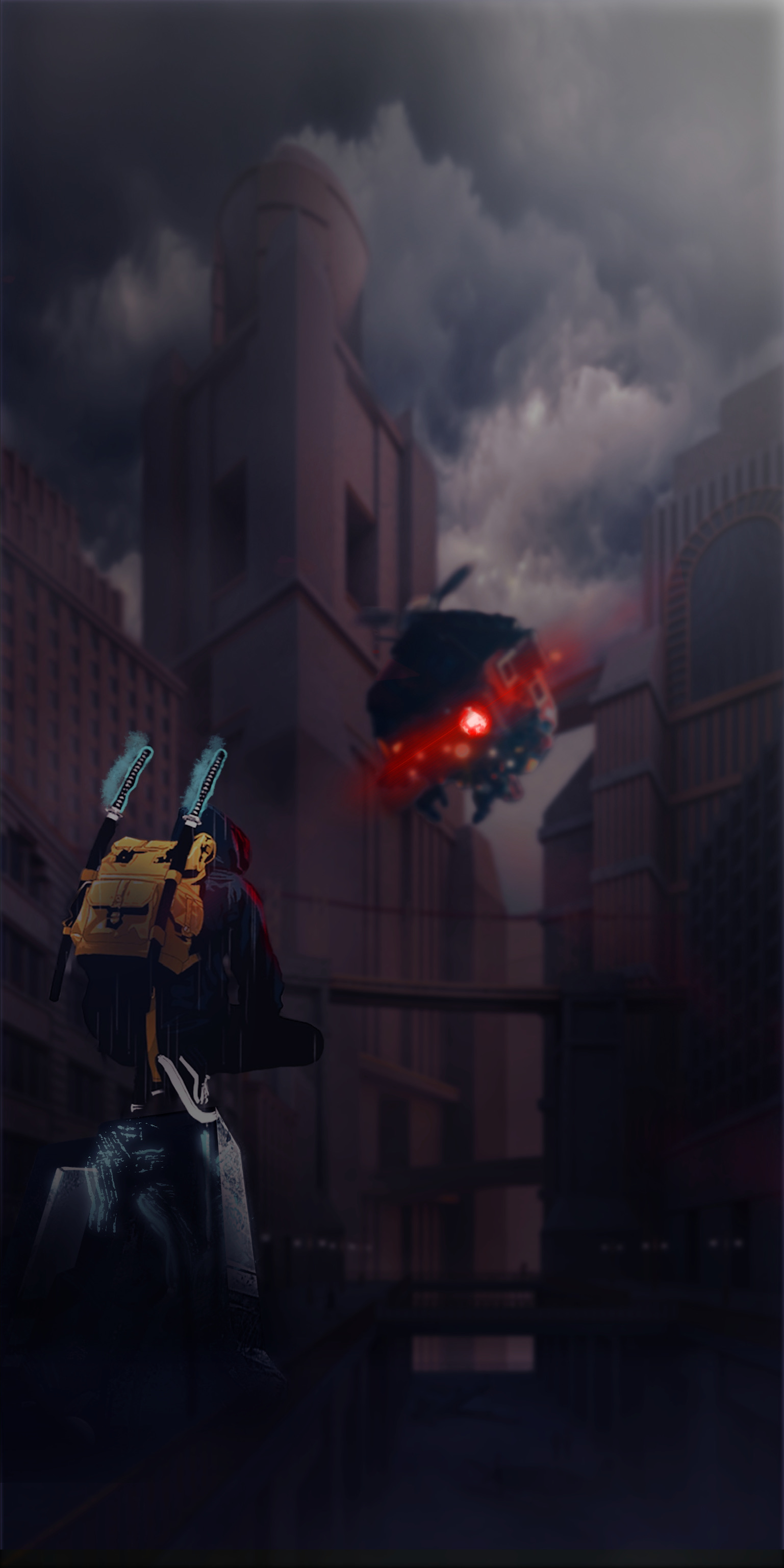
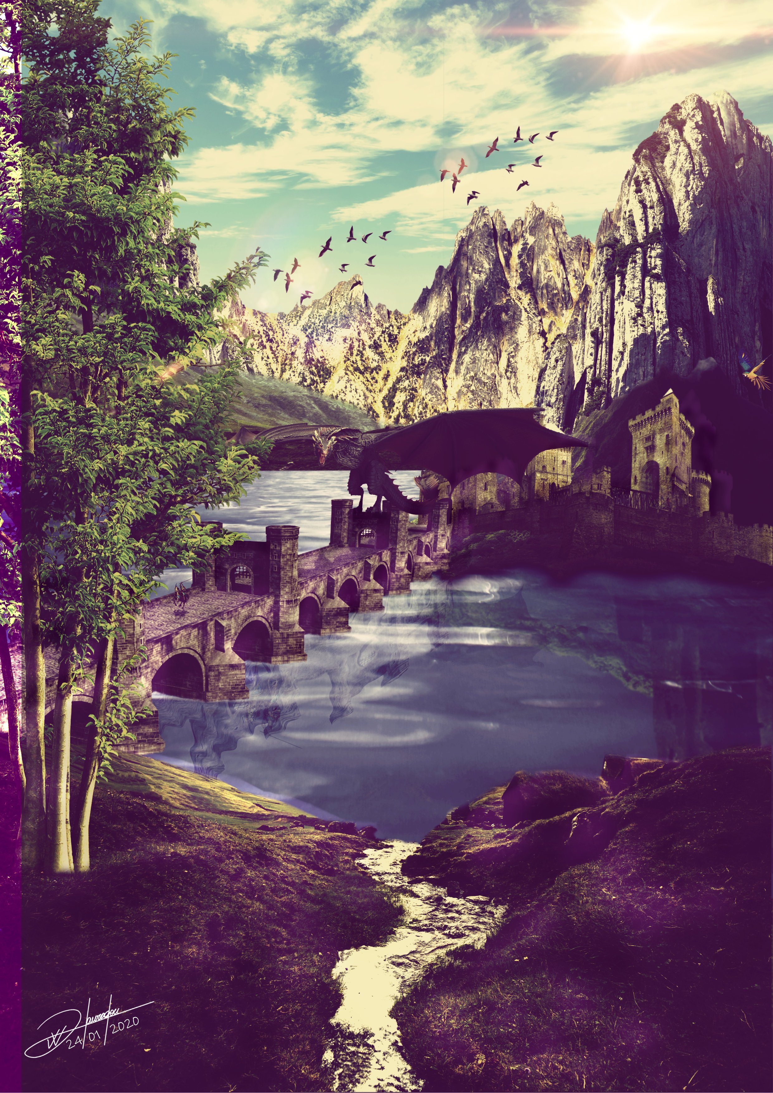
A game design I’m working on. I’m beginning to understand rim light concept somewhat. I feel the glow to the left of the guy is too much, could be because my senses not fully developed yet with lighting and how it should cast. Couple things I’m struggling with: 1. Perspective of enemy on right side about to shoot w/ red flare.. seems off. It’s closest to guy behind cover. 2. Borg cube in Blue, is supposed to be enormous.. yet, I have no idea how to maintain it’s enormity, while still representing it is part of the background. I thought adding some haze, decreasing contrast & adding motion blur would do trick. Doesn’t seem like it. At the moment, it seems to be sharing foreground with red flare enemy. I have no idea how to make this better. If you scroll down to picture below of manta ray & mountain, the mountain is humongous, but it’s part of the background & manta tag is foreground. I wish I could replicate this. Perspective is difficult for me. Concept: Originals:
-
I still have a long way to go, but I am proud of myself for creating this from scratch, after all these months of practicing and following along with tutorials -> finally a original piece from my mind. Man it feels good. Original Images
-
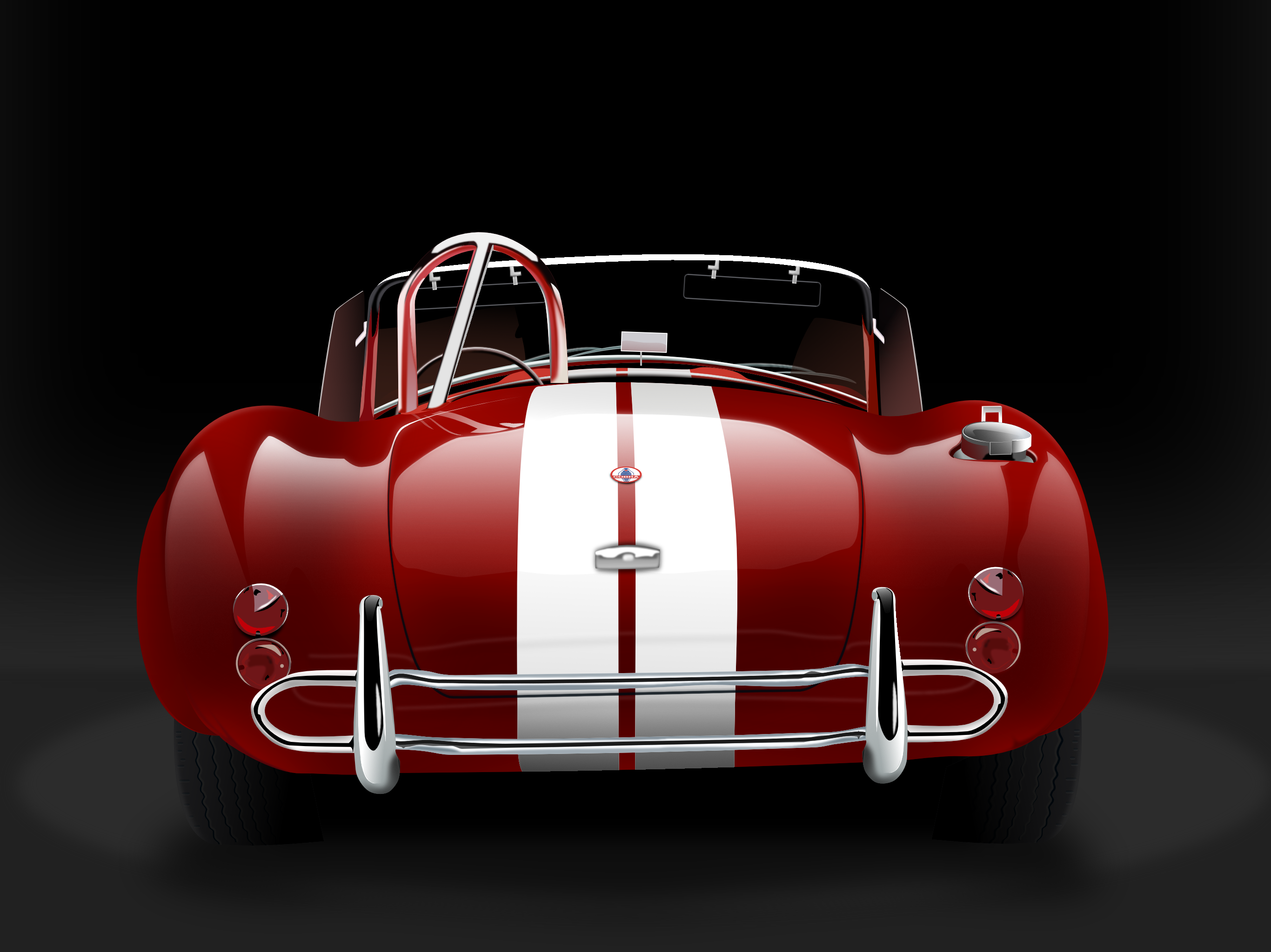
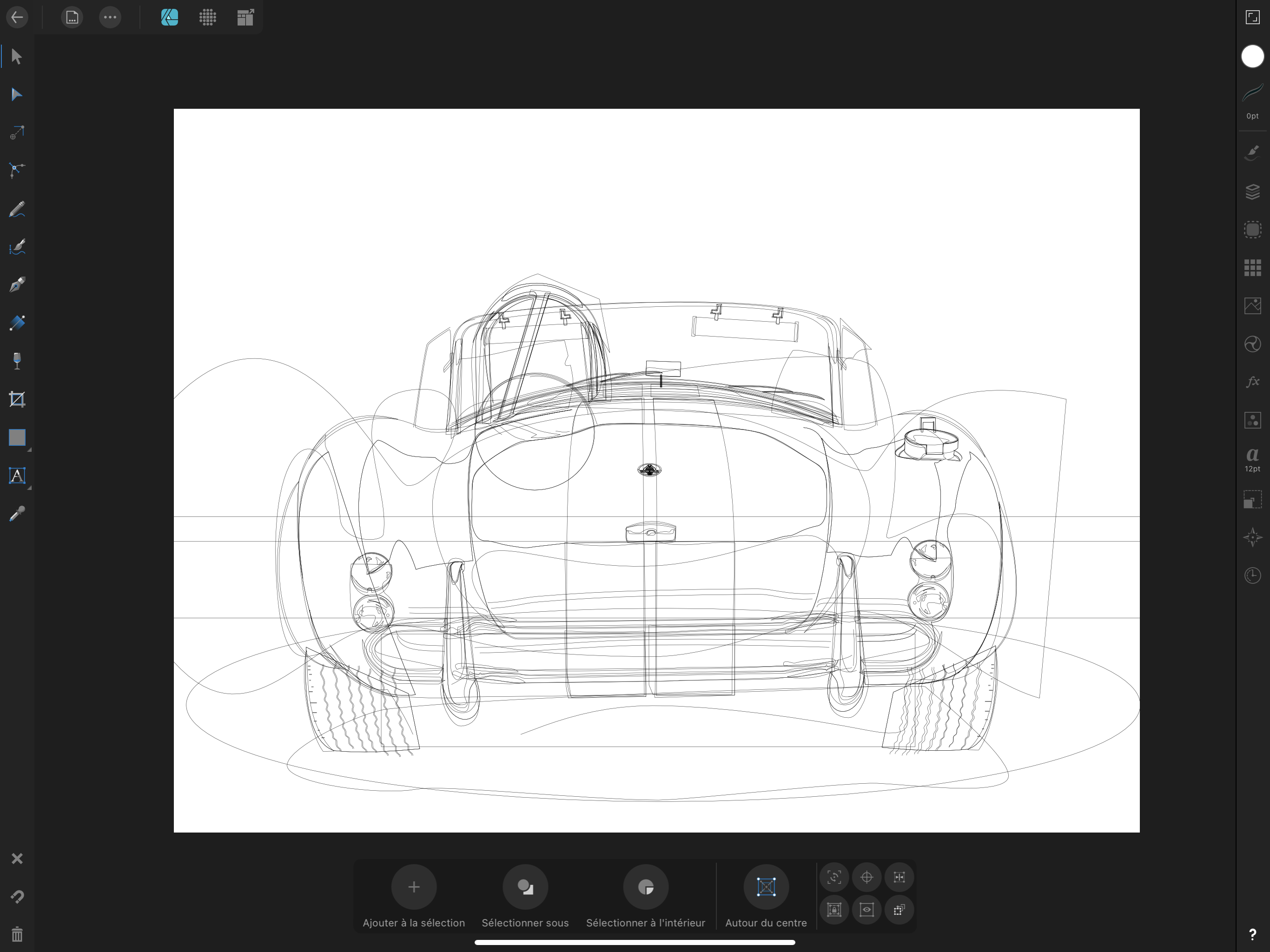
Hello, My AC COBRA SHELBY...on iPad !
-
Just practicing my lettering techniques and texturing effects.
-
 Hi, We are going to edit a photo from the ‘Botanical theatre’ series I took and posted on Instagram. This walk-through is created in Affinity photo for iPad but if you have a desktop version please give it a try. I think it shouldn’t differ so much. flower in Vysehrad by miresk -Original (download here) As I was reviewing the photos I got an idea to create something saturnine :) According to Merriam-Webster dictionary there are a few meanings. One of them is the following: Here is a result after a few edits that we are going to make together. By the way, did you know that Saturn’s rings are made mostly of chunks of ice? Brrr..I think that definition above could work for this image. Result 1. Perspective A photo we work with has a grid on the wall. As a first step let’s change the perspective of this photo to create a bending wall effect. Something that looks like if we were inside a well. Click the three dots to expand the menu and select Projections -> Equirectangular Projection. Move around the photo until you are happy with a perspective. We want one flower to stand out in the final composition so keep that in mind. 2. Tracing with pen tool Now after we applied the projection we can use the pen tool to select a few tiles on a wall. We will later use them as windows that we can look through. Select Pen tool and click from one corner of a tile to another creating the lines until you close the first point. TIP: Select Edit Mode (1st icon from left at the bottom of the screen) to quickly adjust the nodes and curves. After you trace the lines Use fill (for example white) to see what you have already traced. 3. Download space images There is a cool feature called Stock where you can browse images available to download and use them in your work. I wrote ‘saturn’ in the search bar and found a photo of space I liked. Then I switched to Pixabay service and downloaded an image of Saturn planet. Stock images 4. Rasterise the layers We can hide the downloaded images for now as we are going to rasterise the vector layers created with pen tool from step 2. Select a layer, click on the 2nd icon from left top in Layers panel and select Rasterise. Do this step for each vector layer (white squares). If you know how to rasterise several selected layers at once let me know please 5. Merge selected layers and mask In this step we are going to select all pixel layers we rasterised. On iPad version of Affinity Photo you can do it by swiping a layer for example from left to right. When they are all selected, go to menu options as in previous step and click Merge Selected. We will get 1 layer from the objects we traced with the pen tool. Grab this layer and drag it onto a thumbnail of the space photo as displayed below. This will effectively create a mask, and we can look through the windows to universe. 6. Clean up the scene with the erase brush tool Bring the opacity of the universe background down and zoom in to parts where the flowers intervene. Erase these parts of the mask so the leaves can shine in the moonlight 7. Making it more saturnine We are almost done. It’s looking pretty good but Saturn is still missing so let’s make it visible and move it to top in the layers panel. I placed it at the top so it’s nicely aligned with the grid, rotated it slightly and erased the black parts of the image so only the planet itself is visible. Then I applied the Darker Colour layer mode which made some segments of the image noisy. 8. Final tweaks in Develop mode Select the background photo (wall) and go to Develop mode (lens icon at the top). There we can adjust many things like curves, brightness, colors etc. but I adjusted only Vignette effect to make the corners darker so the flower stands out a bit more in our final composition. And that’s it. I would like to see your version so please feel free to share it. Many thanks for reading!
 -

multi Adventure Awaits - Illustration (Vector + Photo)
SalfingerAndrew posted a topic in Share your work
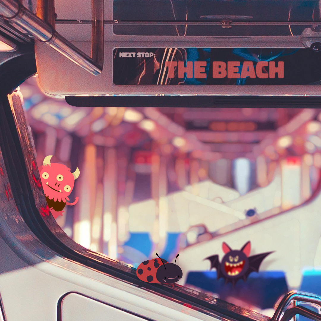
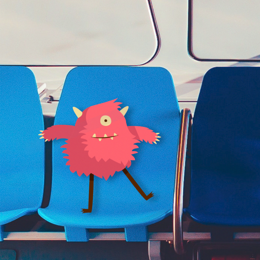
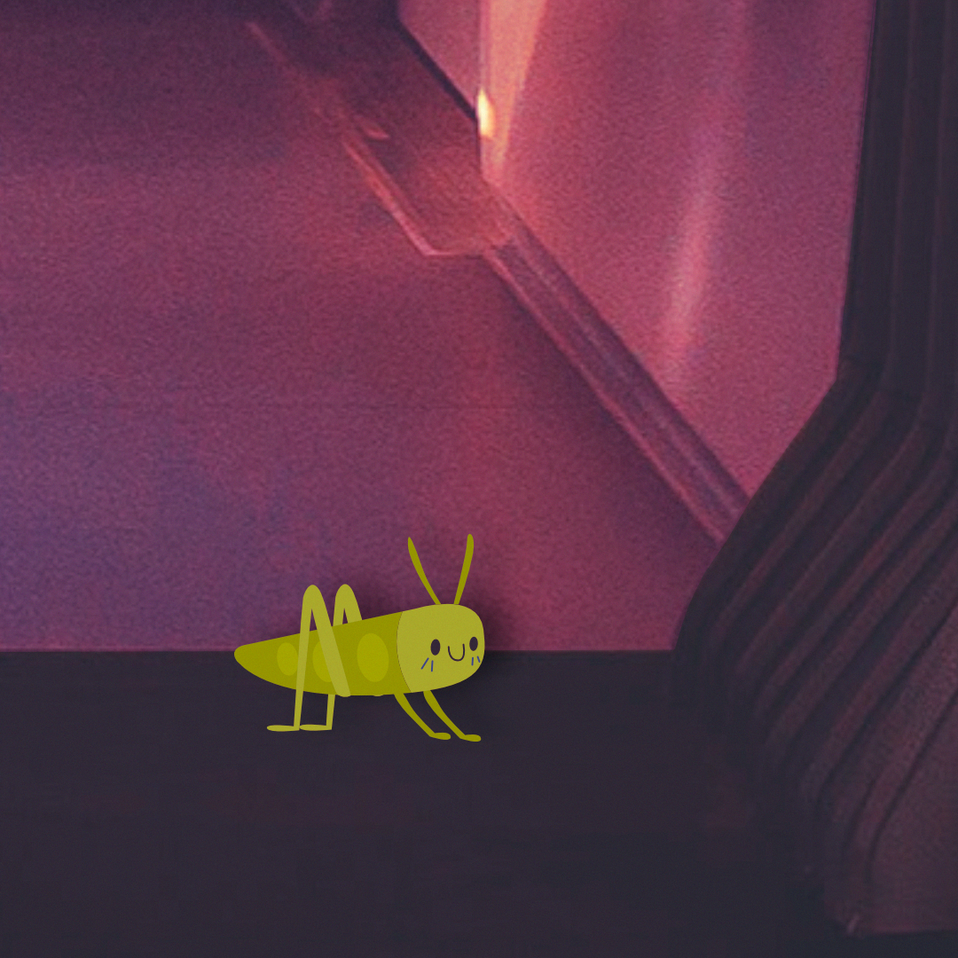
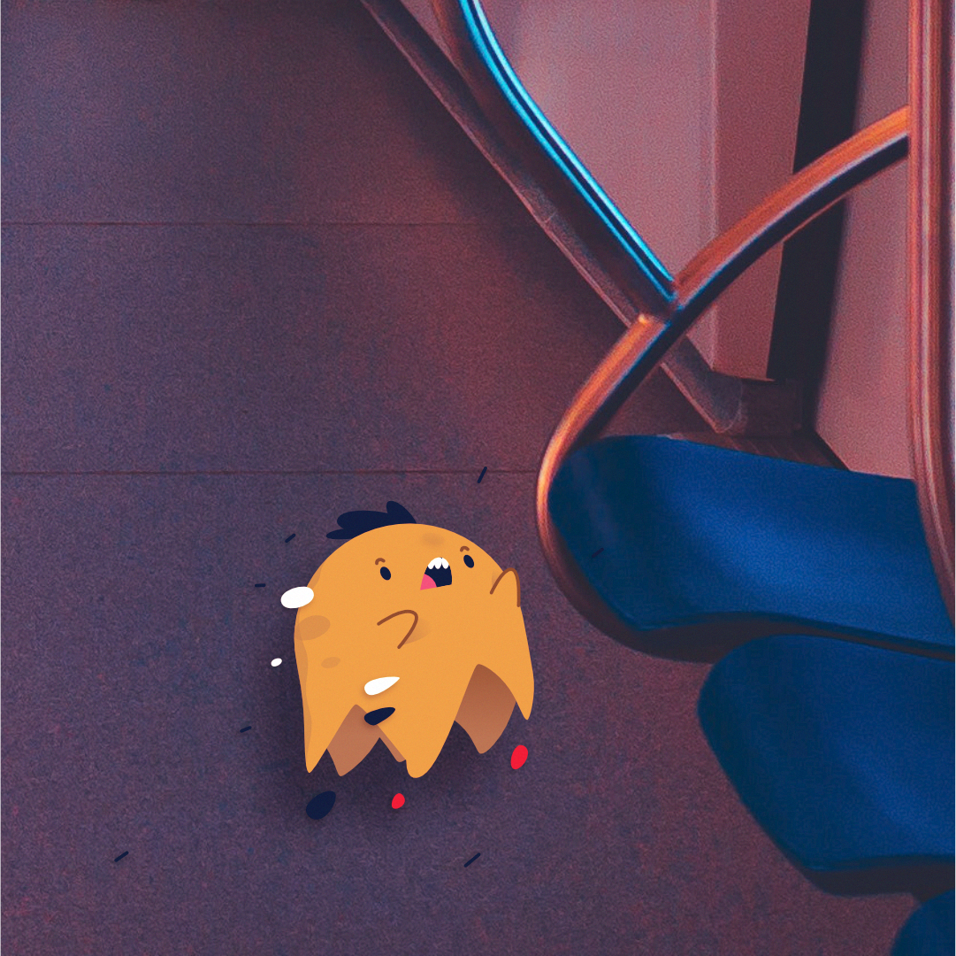
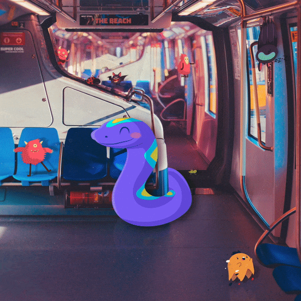
Hello everyone, Back with another illustration. Similar to “Light houses” this one is also a mixture of vector illustration with photography. The main vector objects (the monsters/creatures) where made in Affinity Designer then moved into Affinity Photo where I started with the background, removing all the people, followed by removing any text on the signs and labels around the train and replace it with my own text (a bit over kill since there kinda small to read and most people will never see it but was still fun to do) followed by placing the vector objects in, colour correcting the scene and adding shadows and other textuers such as dust and lens scratches. Overall the project was fun to mess around with and I’m happy with how it came out. Made with Affintiy Photo + Affinity Designer and made on the iPad Pro. Main image: Close Up: How it was made: Thank you for your time, Andrew.
- 1 reply
-
- 4
-
-
- train
- affinity designer
- (and 6 more)
-
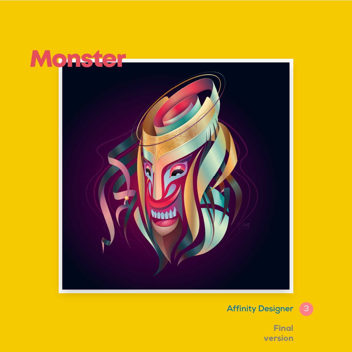
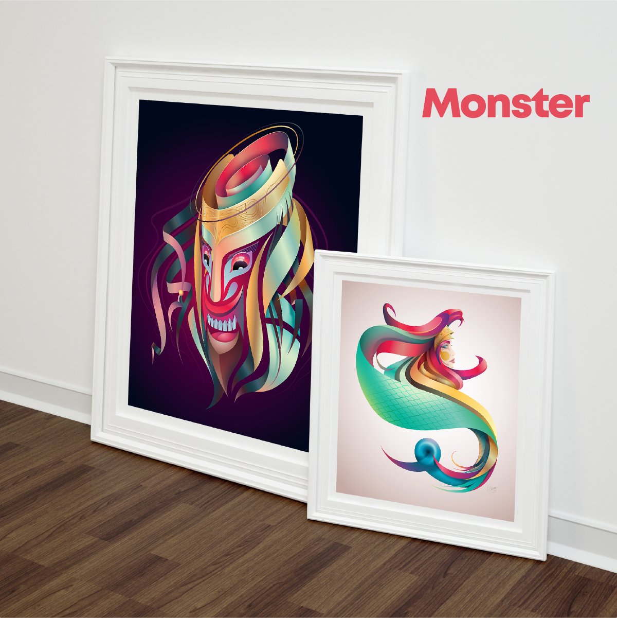
I’m intentionally seeking to learn from some of my favorite artists by attempting to emulate aspects of their styles. This particular exercise in admiration is based on the flowing ribbons and gradients of @serdarduran’s work. Created solely on Affinity Designer for iPad with Apple Pencil (including the sketch, which is a first for me).
-
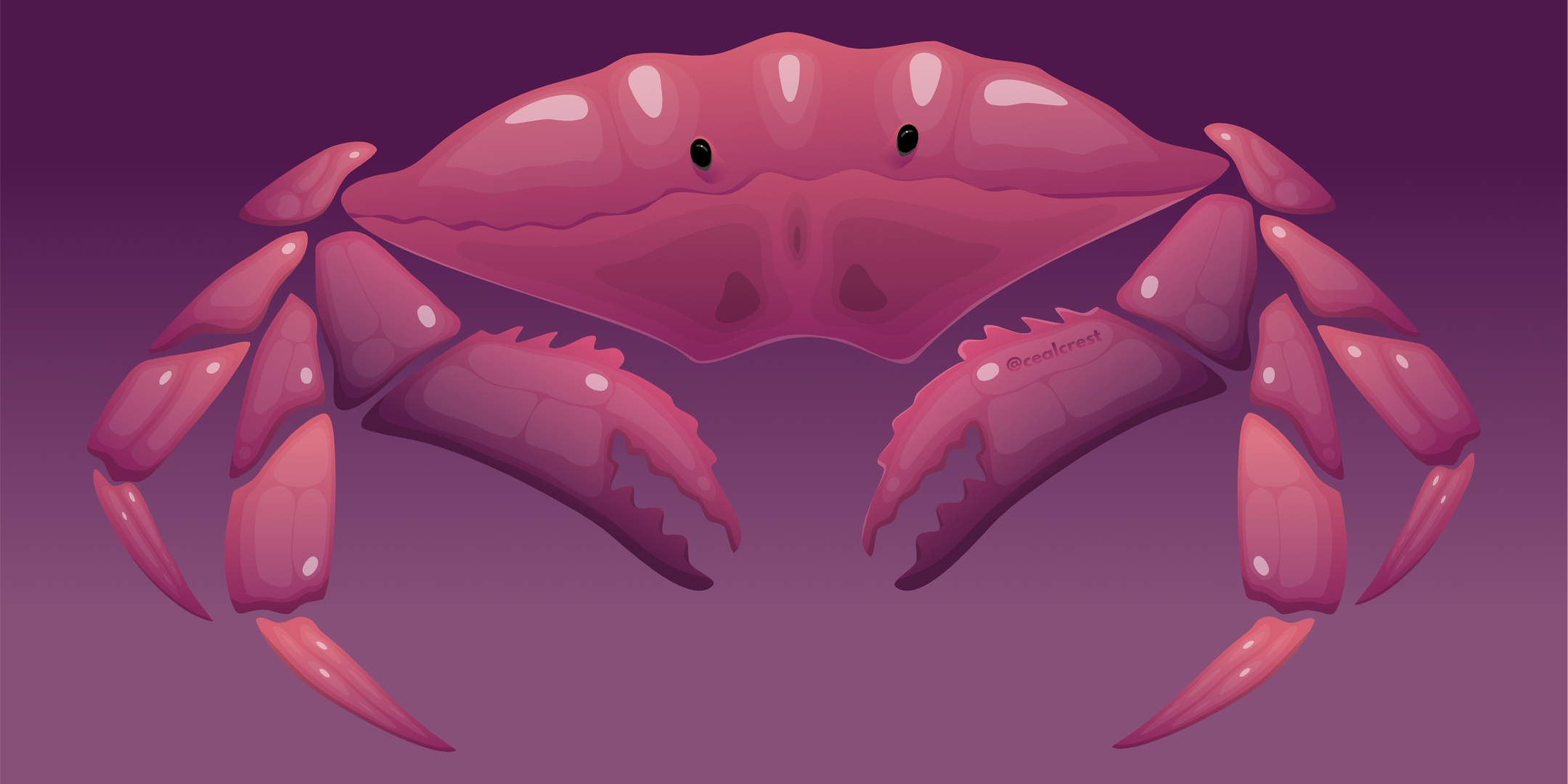
Independent commercial fishermen have lost a huge chunk of their market due to lockdowns around the world. Support local fishermen; eat seafood. This piece was inspired by Zutto. Found her amazing work through Affinity's Spotlight blog. (Yes, I’ve been mulling over her bubbly style for quite a while now; The date on that blog post is January 2019 😅) It was a little challenging to translate the more liquid style to something with very symmetrical, defined structure. It probably would have worked better if I hadn't done a head-on view of the crab so that the legs were overlapping. Ah well. Onwards and upwards. Drawn on iPad Pro with Apple Pencil.
-
I really didn’t know where I was going when I started this piece for fun, but one thing led to another as I got in flow. Very satisfying creative experience. Hope you enjoy!
- 3 replies
-
- 4
-
-
- illustration
- geometric
- (and 3 more)
-
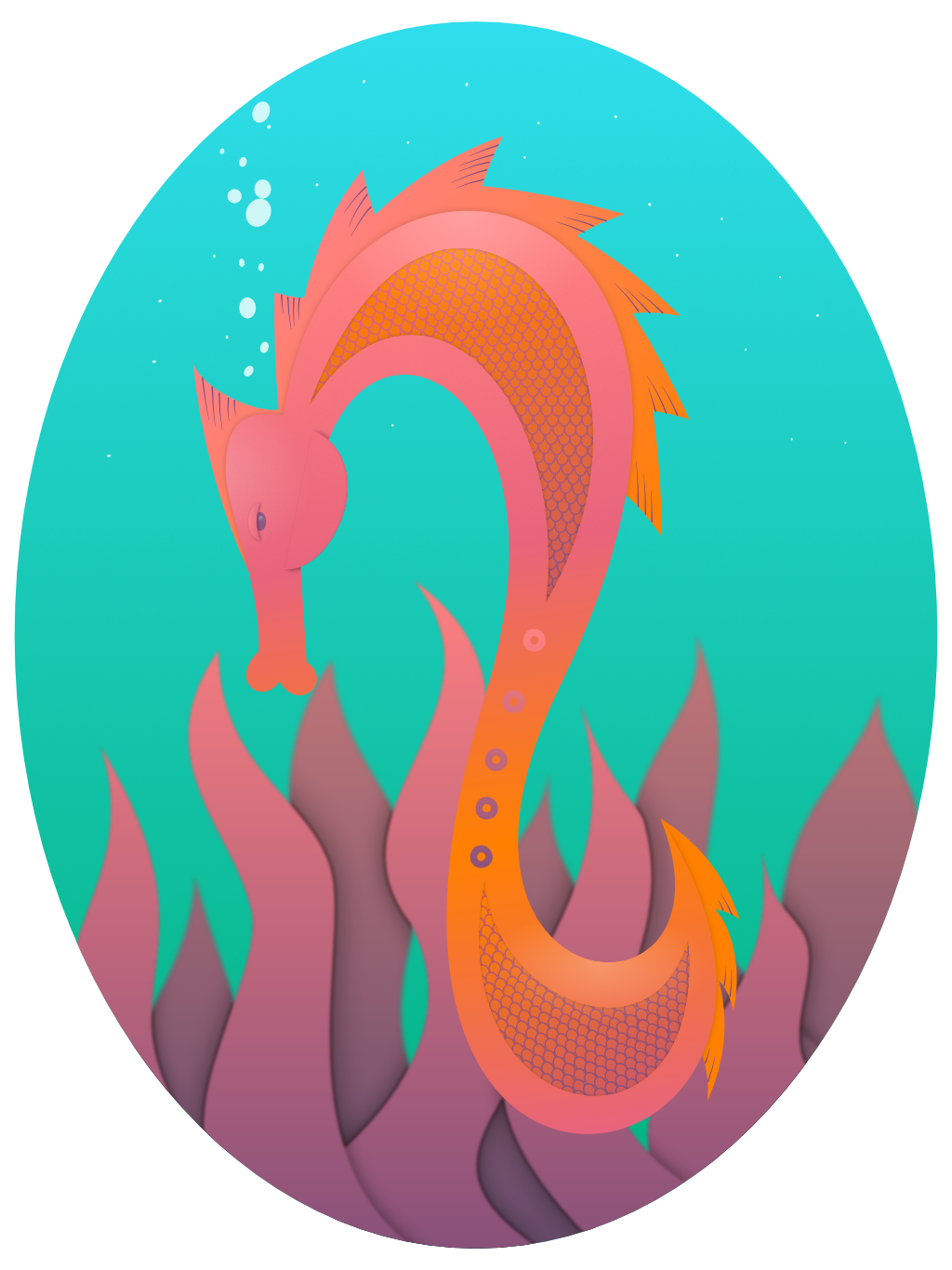
I learned a lot about using Affinity Designer for iPad with this piece. - To select multiple objects in the layers panel, tap the first item and then two-finger tap the last item. Those two items and all the intervening items in the same layer will be selected. This came in so handy for quickly selecting those hundreds of scales. Thanks to @DM1 for this one. - To add a gradient to a stroke, select the object (or objects or group!) and then open the appearance studio. Tap the stroke and then the gradient tool and drag it to position your gradient as desired. You can see the different stroke and fill gradients applied across the scales. Separate stroke and fill gradients gave me the most trouble though. Repeatedly the stroke would become unselected, or the fill would be selected instead (or vice versa if I was working on the fill gradient), or the gradient would disappear and I’d have to start over. These issues made adjusting the gradient quite cumbersome and a bit frustrating. - To snap nodes to each other, well I never did really figure out which of the little symbols it was... but if you turn on all the snapping options in the node tool’s context toolbar, your nodes will snap. This was great for aligning the tip of the tail. And I’ve been wondering about how to do this for a long time. - Oh and I found the in-app user manual which is basically a lifesaver. I wish I’d known about it sooner!
-
Getting up to speed with Designer on iOS. I’ll hopefully rig these two in Unity when they’re done - which is another thing I need to get up to speed on.
-
I wish you all the best for 2020.
-
A very simple set of shapes, and a first post of something I've done with Designer on iPad ... Feedback welcome.
-
A little experiment in keeping things black and white. The main outlines were vectors with detail added in pixel mode. Used brushes/pencil tools to do the vector lines, not the pen tool as I wanted a slightly loose feel, but not too much. In fact, I didn't really know what I wanted!