Search the Community
Showing results for tags 'brushes'.
-
 Hi friends, I have found that when I am using the vector brushes in AD, I cannot take the fill off. It seems that I have managed to do it once in while, but due to pure chance or trial and mistake, I would beg you to give me the ncessary info, in order that I may have control over this tool. Thank you so much in advance. Rosa
 -
 Okies, so this has been bothering me for ever since I got the app: when I go into the vexel persona, and try to do some painting, this is what meets me when I try to use the brush tool: And this might be perfectly normal for Affinity Designer, but just because I'm a noob and am used to Photoshop, I think this is weird. I am fully transitioning from Photoshop to Affinity Designer, and Photoshop doesn't display the brushes pixellated. So, I'm wondering: is this normal? If it's not, how do I change it? Thanks! PS: The brushes look just fine in the vector persona.
 -
The controls for brushes seem to have been designed to be as confusing as possible, and as akward to use. Making the controls more user friendly would certainly help sales to persons coming from other image programs, or having less experience, or less English language fluency. Take the Clone Brush as an example. The control should be on a panel that is always visible, or when made visible stays visible and can be moved around. The main controls needed are for the length (which everyone else calls size, you call width), width (not "shape!") hardness, rotation of the origin (in degrees, not %!!!) and circle or square (which is entirely lacking in Affinity), flow, and a check for aligned/non-aligned. Look at how easily they are visible in Photoline's panel--see below. And when you change them in Photoline, the example in the upper left shows you the change. (The triangle in middle left is the control for circle/square.) Or look at how easily Paint Shop Pro shows them on a toolbar across the top--the second example shown below. Also, PSP shows the outline of the location, size and shape from which one is borrowingon the photo, -that is much more usefull than a little "x" on the photo! See third photo below. You have an additional control which they lack, a rotation within the borrow. I don't know a good name for it, you have it within the top bar. It at least is already in degrees. But it is less important than the rotation of the borrow shape, which is only on the "More" dropdown. Affinity needs a clear, visible set of controls for the brushes. The panel should have a memory so that when one gets back to it the controls are where you left them. This is really important. If Lightroom had a decent clone, half on us would still be with it.

-
 I have been exploring colour popping in AP using the paint brush, and run into a problem. It is easier to do this using at least 2 brushes, one at 5 px or less to define the edges and then one or 2 larger ones to fill in the rest. However, if you change size by clicking on the brush size window at the top left, when you go back to the edit the new brush paints over the earlier application, and the "join" shows as a more intense shade (which ruins the effect). Is this a bug or is there another way to change brush size? (I don't have this problem in Pixelmator so it is not a generic issue to using painting for colour popping).
 -
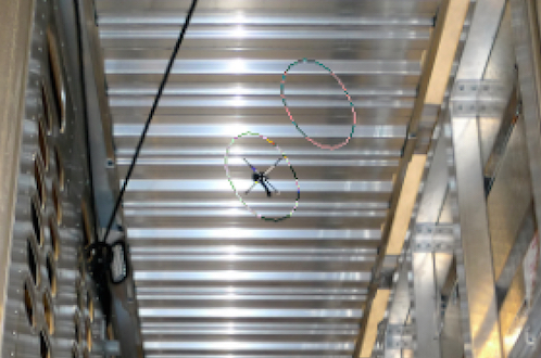
 Two rings or marquees (scrolling ants?) the outside indicates the size the inner one to indicate the softness / feather.
 -
I do find the icons a bit small so grabbing the dodge and burn brush is a bit hit and miss. Can I suggest a dock on the top or the bottom to place the favourite brushes? Also take a look at the brush HUD on Aperture. Conveniently placed at the bottom. Call the brush, select the mode (including contrast and a few others you don't list), then you get to the tool control panel (HUD) to adjust. Also as it deposits all the adjustments in your list of edits you can kill them and make further adjustments and modifications later. It is a slick interface and slips into the workflow well. I mention this as so far you are looking very like Photoshop but in fact you may well gather a lot of disaffected Aperture users.
-
Hey As an amateur photographer, I would love to suggest some options for the develop persona, that would make it really cool and easy to use for any sort of photographer. May I suggest (these features I have seen in other apps, but not many tbh) Some brushes such as a blur and soften and a sharpen brush, along with dark, lighten and saturate and desaturate. I have suggested these before but I really would love them and I think lots of other people will too. May I also suggest two slider options. slider for making the blues either stronger and darker or weaker and lighter, as well as one for greens and browns. I think these sliders would be so awesome and useful for me as an aspiring landscape photographer. Maybe you've had some ideas from these ideas, suggest them because as a user I say "the more features the better, just hide the complex ones, but make sure they're within one click. All this will result in a simplistic UI and beautiful options" Kind Regards GEEKIO (Pronounced: GEEK-IE-O)
-
If there were a way for AD to remember the brush setting? Sometimes I create a special brush that is specifically needed for the task at hand-like when I need 50% opacity in multiply mode, and some other special feature, if I continue to work then I have no way of going back and using this same brush because it wasn’t saved. Maybe this is something that is already implemented in AD and PS. I am just not aware of it. Any feedback would be great. Thanks
-
 Hi just started to betatest the affinity photo app lack of brushes other than round/ and I am somehow missing all the already installed typefonts, typefonts shows empty square
 -
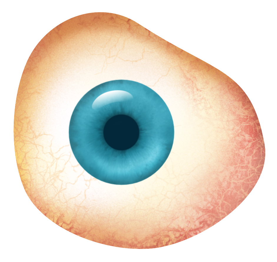
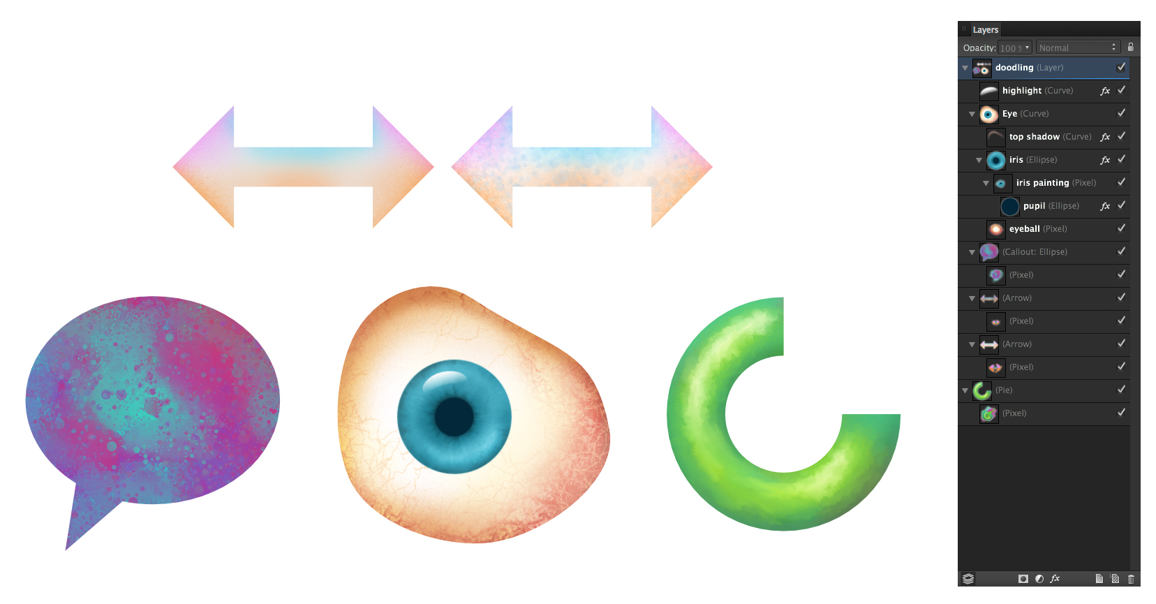
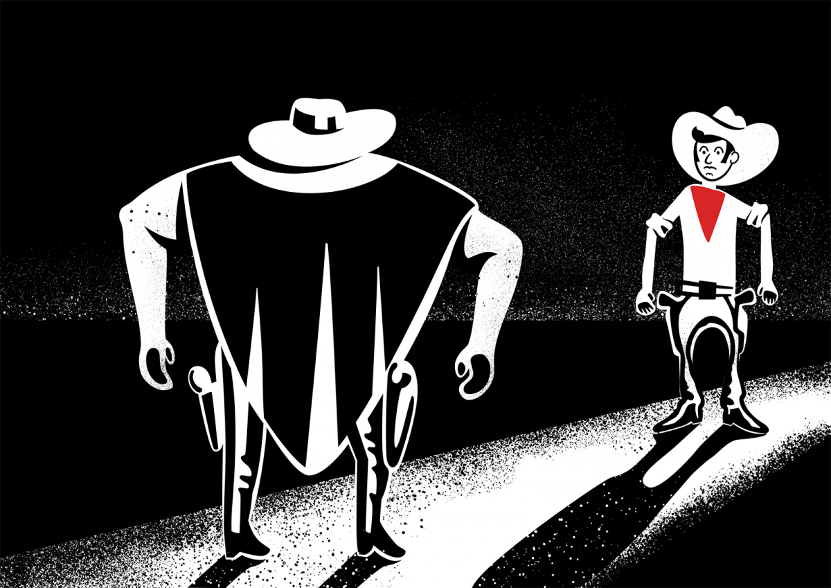
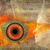
Hi all, just some doodling here trying out painting inside of shapes in Designer. Started playing with Paolo's blender brushes he so graciously created. When using them in conjunction with the smudge tool you get some really nice mixing abilities. In the call out shape for instance I painted a mixture of the 2 main colours then applied some "blending" using one of Paolo's spatter blend brushes. It just spatters using the underlying colour and doesn't put any new colour down. Changing the size of the brush changes the size of the texture it paints. For the eyeball, (I didn't start out to do an eye it just ended up that way) I used a mix of painting and blending especially in the white of the eye with the blood vessels and texturing... then in the iris I painted inside the circle shape laying in the colour in the general areas and using Paolo's blenders to really gave it a nice complex feel. I usually add a .01 gaussian blur to take the hard edge off the shapes. it tends to soften the paint work a bit but it's a reasonable trade off. On the donut-pie shape I was just playing with a nice painterly play of light and shadow. The blenders are great for adding that "painterly" feel with tons of control. Again by reducing the blender brush size the blend effect gets smaller and more precise. This is all in Designer, which for me is probably where I will spend most of my time. The fact that I can get these type of results in a "vector" app is incredible. The hardest part of all of this is knowing when to stop! :D
-
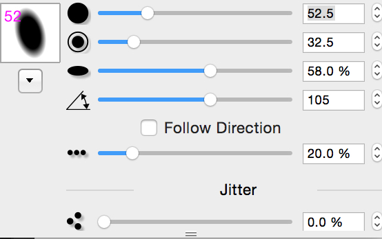
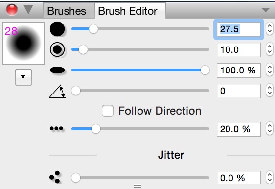
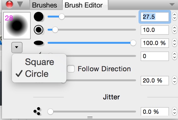
1) The source and size of the clone brush should show on the image, and if aligned should move with the brush to constantly show where one is borrowing from. 2) The clone control labeling makes absolutely no sense and is inconsistent. On the dropdown panel the size is called "size", on the top of the screen it is called "width"! Size is prefered. 3)Then what is called "shape" on the panel, and what doesn't show on the top at all, is really width. 4)Rotation is nonsensical: on the top it is in degrees, on the panel in % (?) And it rotates the applied area on the image: it should rotate the source area (if it isn't round, in which case it makes no difference). Are you trying to make this obtuse? Look at Photoline for how simple this can be: your basic controls are size, hardness, width, angle (of the source), and choose square or circle(which becomes rectangle or ellipse if width not equal), with the shape of the brush changing on the example panel as you change values. Then you can add more controls jitter. intermittent etc for rarer functions. Fred
-
 I've tried to load a couple different brush sets and get the error message that the files is not supported. I was able to drag and drop the same brush sets into Pixelmator and they worked fine. Am i doing something wrong? I followed the instructions in the help file to no avail.
 -
 In this video I will take a moment to explain how to use textures brushes and bending modes to dirty up your vector art. I will be demonstration all this while creating a HD title screen for a fictional tv or movie title screen design. click here to view the tutorial video Thanks for watching.
 -
Ok, so the tv series does exist but if it did I would not mind having shot at doing the title graphics for it :) If I can do this in Affinity Designer I can't wait to get my hands on Affinity Photo! :P :o ;) This was all done in done in Affinity Designer and you can learn how you can do it check out my video. on youtube https://www.youtube.com/watch?v=AlX6_MWE56Q
- 5 replies
-
- 6
-

-
- blend modes
- textures
- (and 1 more)
-
Hi all, here is my first AD drawing. It was very interesting experience and after few different approaches drawing is complete. Best, Greg
-
 Hi, Is there a way to change the default value for items such as the brush size, opacity and other? Regards, François
 -
 Is there any way to get PS/AI brushes into AD? Maybe I haven't tried hard enough but I would really appreciate some feedback in importing different brushes. Thanks in advance!
 -
 Is there anywhere I can find examples of the vector brushes, and what all they are capable of? The main webpage mentions them, as does the feature list, but I was looking for something a little more in depth.