Search the Community
Showing results for tags 'Usability'.
-
 Hello forum folks, hoping I can get some assistance with this issue and that I'm just missing something obvious. I'm working on a laptop (windows) and find that the majority of the UI (text, icons, etc.) is too small. Some of the fonts scale correctly to my system preferences, but most are microscopic. I have googled and it says there should be a UI font scale option or icon scale option under the User Interfaces section of the preferences menu, but I cannot see it (see attached - screenshot in designer v2). If I can't fix this, it's really going to limit my ability to work with any of the affinity v2 apps on this device. TL;DR: How can I scale up the UI for v2 apps on windows? Any help appreciated.
-
This file was destroyed, emptied by Affinity Designer v2.0.3! (see earlier post). Thank you for that. Stunning and jawdropping. Version 2 claims the file type is "not supported" - then your customers think that there is actually some content in the file that Affinity cannot read. So better to tell them that the file contains significantly less content than expected... You might add "It's not unlikely that Serif Software lost all your content and work, perhaps distracted by 'setting new standards', yet we remembered the filename! You could say we saved a percentage of your work. Zero is also a percent." Lost file thread:
-
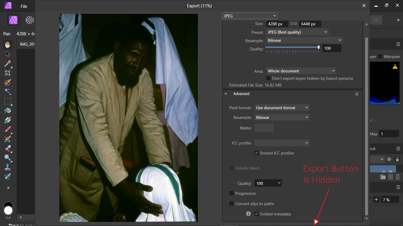
 Bought & installed Affinity version 2.03 on a Windows 10 laptop with a 1366 x 768px display. This appeared to meet the Affinity tech specs. Affinity version 1 had worked OK on this laptop. But, on first use of Photo 2, the processed photo could not be "exported" using the File... Export dialogue: The "Export" & "Cancel" buttons are hidden below the bottom of the new combined export dialogue. The height of the dialogue cannot be reduced by dragging & the dialogue cannot be repositioned to make these buttons visible. The trick of "Tabbing" through the various setting in this dialogue to reach the "export" button did not work because the tab sequence was not obvious. See the attached screenshot. Other dialogues in Affinity 2 may suffer from similar problems. At present, this means that Affinity 2 is not usable on this ordinary Windows laptop. This is a serious accessibility and usability issue. Please consider making these buttons visible. BTW. As is fairly common, the "display scaling" in Windows is set to 125% so as to make text readable on this laptop's small screen.
-
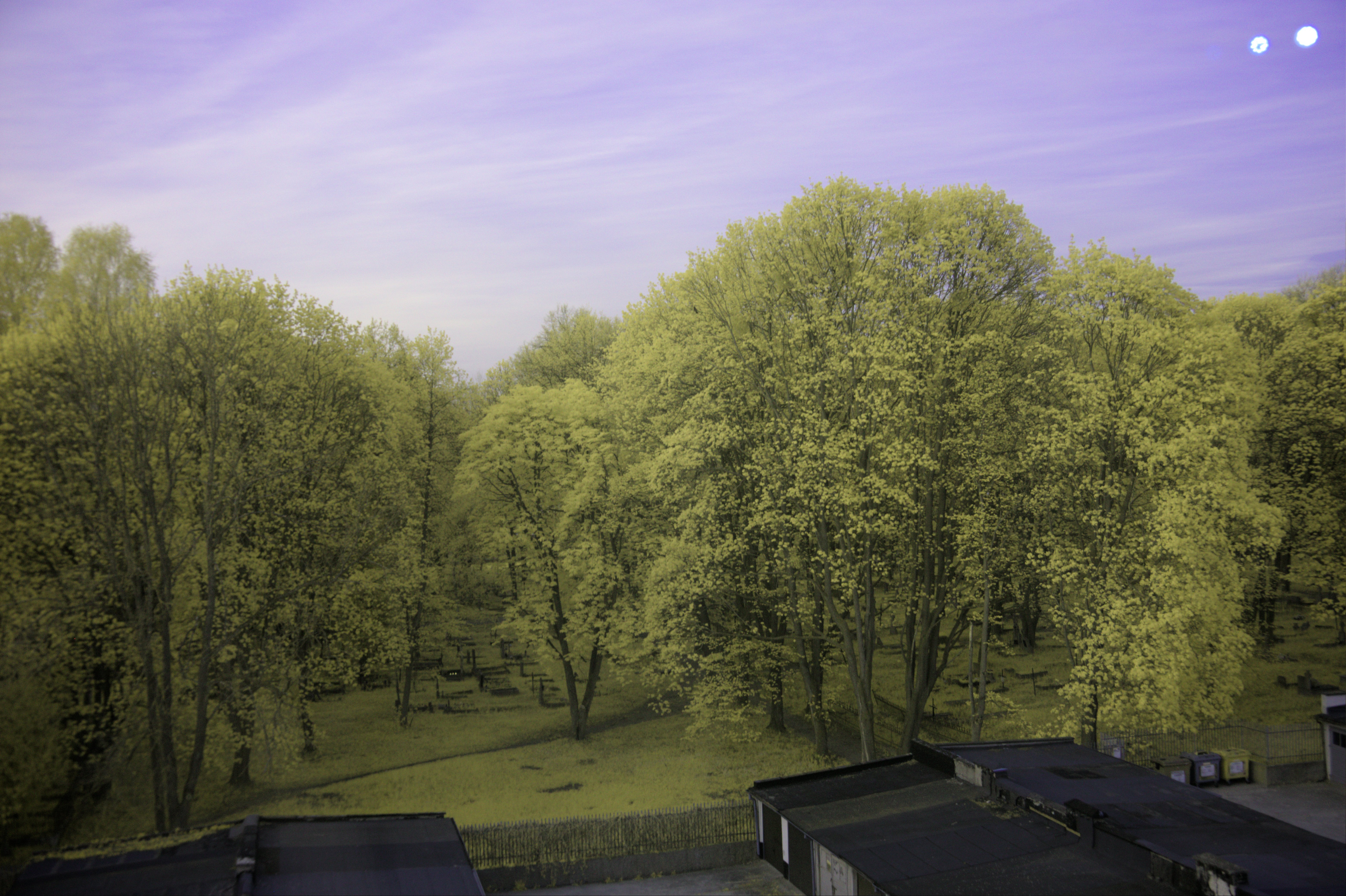
 When taking pictures in IR, if the photographer doesn't set the white balance in camera and intends to change it via Affinity Photo 2, they come across the issue where the white balance tool in the Develop Persona of Affinity Photo 2 does not have enough range to correct colour casts on the whites in an image. (even when using the picker tool, which extends it slightly) I've attached an example shot I took with an 'ultrablue' filter, the second image corrected using another software, and the first using Affinity Photo 2. There is also the original .RAF raw. The 'correct' white balance that I'm looking for is one where the white of the walls on the parking lot buildings (and the stickers on the recycling containers on the bottom right) is as close as it can be to neutral (no tint). Using the picker tool on the white part of the wall, the tint gets pegged at 100%, meaning it does not have enough range to fully remove the colour cast. This is a huge issue, as the user cannot properly set the white balance in a lot of pictures. Moreover, even if the user does set the white balance in camera, and it is closer to the intended one but still needs adjustments, when enabling the white balance adjustment in the Develop Persona, it oftentimes gets worse due to the range being less than that of the camera's. My suggestion to this issue is: add a checkbox that would enable an extended range of values to be edited. (This would also help people who white balance old negatives.) DSCF6517.RAF
-
- 1
-

-
- affinity photo
- white balance
- (and 4 more)
-
 My co-workers have (loudly) noted an annoyance in the gradient tool. It always defaults to fill. When you happen to put a gradient on a large number of strokes, it is exceptionally annoying and disruptive to have to go up to the toolbar and select stroke each time we activate the tool. It must be quite simple to implement that last selected mode is remembered the program session out. I just remembered this when I read this related entry from another customer, so it is a problem (and it IS a problem that needs to be solved in multiple places in all applications):
 -
 It would be nice if loading a file could be cancelled. For example I just clicked on a 11GB file on a slow network ressource, and there is no way to interrupt it, trying to quit photo leads to a message: "At least one file is currently being opened. Please wait for files to load before quitting the application.". There could be an "x" in the "Loading 1 document"-status bar which interrupts the loading. Imagine you click on a 100GB file (these are satellite images).
-
 Open color panel Create a shape Adjust fill color Activate stroke colour (with pointing device or press x) Press G for gradient Draw gradient you are drawing the gradient on the fill (have to select stroke in toolbar) Could Designer please automatically select stroke or fill in the gradient tool based on what is currently selected in the color panel - stroke or fill Thx
 -
Please consider rephrasing this sentence: (Task for an UX)
-
Another usability issue - a usability classic - objects look too similar. In a complex drawing this really is annoying and confusing. Node handles look almost exactly like smooth nodes. When you are looking at many nodes it just starts to blur together and I have made many erroneous clicks due to the visual similarity. Changing handler size in preferences is no fix. Could you please adjust the colour of the nodes or make some other change to the handles so they stand out? I think you have to choose another color - and if could be personalized it would be perfect. Extreme example with all nodes selected just to show how it turns into a show of identical bubbles...
-
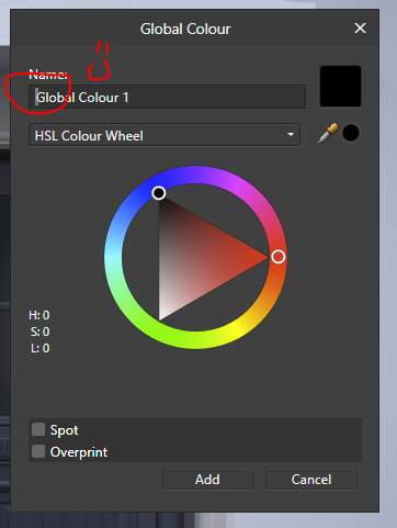
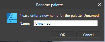
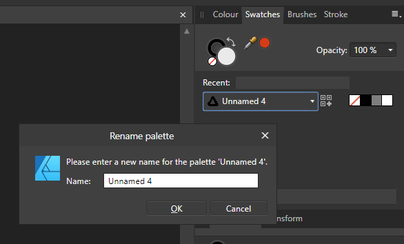
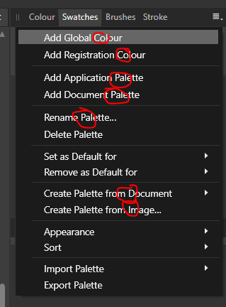
Consistent behavior wanted pleased What works as expected and how it should be done Add Global colour - you are presented with a dialog with an active cursor in the input field and you name the colour as the first thing Issues Select Rename palette - a dialog appears but there is no cursor in the input field Select Add application palette and it is created as Unnamed x - you have to rename it (through the tiny studio menu) and the dialog that appears... you guessed it.. has no active cursor Why is the first letter in so many words like Document capitalized? I gave up highlighting
-
 Can we have the Zoom functions ("Zoom In/Out", "Zoom to Fit" (especially important), "Zoom to Width", etc.) as optional features to add as buttons to the toolbar? Since all the functions have moved into a submenu ("View > Zoom") with the recent releases I notice I spend a lot of extra time to trigger those options just by having to navigate into that submenu. Personally I'm not a fan of this change (this was more efficient in the older releases). (Note: I'm very bad at learning and using all the strange keyboard shortcuts. I know this would go faster. But I need a quick and direct way to trigger it via a mouse operation. )
 -
 The more I tinker with Affinity Photo, the more I run into bad, but quite easy to fix traps. Some of them are caused simply by the fact that a tool behaviour remains stuck the inappropriate positions, so that they block editing in later stages of the project. Here's two: 1) Recently I found out that selection-tools stubbornly remain stuck to their previous Subtractive state even if the user wants to create a fresh selection. The operation fails, although the user has picked the appropriate tool and also has performed the expected motion. Here one badly needed an exception to the rule – selection tools have to create a selection if the tool can not find anything to subtract from. Others suggested that Affinity should beep or show a dialog and by that inform + CTA the user that the tool is in the wrong state – but that would be horrible UX. At that point you could also abolish your assistants too. Don't make me think, don't ask for pointless decisions and action if there's exactly one expected behaviour: Making a (fresh) selection. 2) Today I saw another thing which is even a lot nastier as there's not even a suble visible indicator. One may hide selections (hide the marching ants), which is great. But that hidden state even remains active when the user wants to create a new selection. Such really may not happen. There's absolutly no workflow imaginable where this made sense, this is just a trap and nothing else. A hard to understand trap – imagine you had a selection hidden and go to lunch, afterwards you pick a selection tool and run into what's shown in the GIF. Selection tools always have to revert to state=visible whenever a selection is dropped. Is there anyone in charge, exclusively for little usability-killers of that kind? It would well be worth it.
 -
I apologize if this has already been posted (either I'm doing something wrong, or the search function in the forums is very limited), but the "Vector Crop Tool" is not listed in any of the menus. My biggest gripe about this is that I can't even assign an external keyboard shortcut (through the Mac System Preferences) for this tool.
-
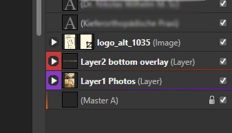
 It would be a great help, if colour coding of layers coud be better visible. For example like this:
-
Changing name of duplicated master pages only works with final RETURN, not by clicking outside, like in Windows explorer Topic umbenennen.mp4
-
In the develop persona I can choose to display clipping warnings (blue for shadows and red for highlights, and even colour clipping warnings). Please add those to the photo persona. Super easy change, super useful addition. Or have I missed them?
-
 I really like the responsiveness and immediate feedback about symbols in Affinity. But managing them is not as easy as it could be, much of that happens because of the lack of some functionalities in Symbols panel. What I'd love to see in an updated version of the Symbols Panel: List view Custom categories to groups symbols Search bar Ordering options: manual, alphabetical Easier renaming: select one, double click the name, and when finished, press tab to rename the next one Features to manage symbols in the artboard: Contextual menu to replace a selected instance of a symbol in the artboard by another one on the library Option to, when cmd+click on the symbol, do not select it's layers, but the whole symbol. (This is useful when you want to select a symbol inside a complex hierarchy of groups and layers, but do not want to edit the symbol.) Other advanced features Ability to nest symbols inside symbols Ability to override nested symbols Well, this is what I'd like to see regarding symbols. I hope that this adds something to the discussion about the roadmap.
 -
Hi there I love this app (Designer) so much I hardly use Illustrator anymore. AD is so intuitive and powerful. Thank you for that. My number one feature request is the ability to use Adobe's shortcuts. AD is here very uncommon while other apps - up to MS Word! - use the same basic keyboards, such as SHIFT+ ENTER for a new textline without making a new paragraph (this shortcut works even in CMS-Texteditors such as TinyMCE or Redactor or CKEditor). Could we talk of an "industry standard", here? Yes, I think so, this goes far beyond Adobe.) There is also a confusion about when using SHIFT to proportionally scale something and when not. ALT (Option) has been the standard for scaling from the center ever since. ... So my pledge: Please either change them to the well known standards, not only used by Adobe make keyboard shortcut prefs that can be changed thoughout and saved integrate a preference for that in which one can choose "Adobe" as possible Shortcut set. Thank you very much - this would be insanely great. Alex
-
Dear Affinity Mobile Team, Hello and congrats for a great mobile application which bundles lots of useful functionality, which we're so far only used to from desktop apps! Unfortunately, I've to admit that trying to use the provided functionality in a productive way resulted in a frustrating experience pretty quickly... I don't want to be too negative about it, but you have some obvious usability flaws in the app which somehow cause an unpleasant feeling about wasted potential Let me name a few (using a IPad Pro 10.5): The tool menu on the bottom edge of the screen It is randomly subdivided in parts. Why? The subdivision is most of the time unnecessary (for an IPad), as all the menu entries would fit my screen. The navigation arrows are tiny Often needed features are on separate pages. This is very frustrating... Modifier keys These keys are hidden on the last page of the tool menu. Sometimes i need to click three times on that tiny arrow to get the mod-keys (which are disabled by default!?). The associated functionality (on desktop apps) is bound to mod-keys because it needs to be available super fast and is used all the time (in parallel to other other tool options). The position in the bottom middle part of the screen does not work at all. Did you watch the tutorial on mod-keys? It is obvious that this position doesn't make sense by looking at his hand while he is tying to hold the buttons while painting. Put them on left border in a separate area, always available (as in Procreate) Undo/Redo The position on the right side of the screen does make sense for left-handed people. As a right handed person, that's where I hold the pen. Pressing buttons with the exact same hand is pretty interruptive. Layer Menu Layer selection via swipe is ok, but why in two directions? A swipe to delete-/or sub-menu is counter-intuitively missing on the other hand. This is by now a standard paradigm in mobile user interface design. Ignoring such things is really pissing off people. Please have a look at Procreate, they doing a more than great job with paying attention to these subtleties, what results in a very smooth workflow (also counts for positioning of UI elements like a configurable mod-key on the left center of the screen) Selections Very good job on selection tools! But using the selection once created is cumbersome. Switching personas continuously to be able to access features in different sub-/context-menus is very annoying and time consuming So far, I used the application for a few hours only but my list of issues goes on. These were just the things which jumped right into my face. Maybe, I just haven't figured out some of the usage concepts/ ideas yet. But for some annoyances it just seems that basic principles of modern, mobile UI design have been ignored. Reducing number of clicks to access functionality and the use common UI paradigms would already solve many of the frustrating points... Again, awesome job, keep it up! Looking forward for improvements
-
 how do you compare the usability or ease of use of Affinity Designer vs Adobe Illustrator. I'm assuming Adobe Illustrator is the competitor of Affinity Designer. And I haven;t used any Adobe products products yet.
 -

Next Update for iPad?
FOXHOUND_PHOTOS posted a topic in Pre-V2 Archive of Affinity on iPad Questions
I am using AP for iPad pro 2017 and sometimes i want to smash the pad against the wall!!! -Thanks, Affinity... The app is so EXTREMLY BUGGY, it is ABSOLUTLY NOT USABLE! Youre working on a pic for maybe 1 or 2 hours and you want to make a last selection or something else and then... CRASH! Every changes lost! I want to know WHEN is the next USABLE update release date????? This app is actual FAAAR FAR AWAY from a "PHOTOSHOP-KILLER"! You maybe got 2% of it! So... WHEN COMES THE UPDATE TO IPAD??????? -
Have just purchased a license for Win (works faster in a VM than Mac). Looks promising, thank you for that. Too bad no Linux support in your plans. Some suggestions, if I may. (01) Open file -> preview (01.b) Resize preview area (02) Simpler vector manipulations; now there are: (a) pen, (b) pencil, (c) brush, (d) node, (e) corner - i.e. Five (five!) different tools to do something that could be done with just two - (A) free hand (B) node editor. THAT could have been some major usability improvement. It takes more time to switch between these FIVE than to actually accomplish the task(s); I still could not find a way to join/cut nodes in less than 1 second. Lacking 18 years of practice, perhaps. Escape or double click to join the nodes while in the (d) node editor? That is a well tuned joke, is it not? Esc is being used as cancel, and double clicking within the space of a node rectangle on a 2560 x 1440px workspace might be a good exercise for those with "all the time in the World" at their hands. But you are publishing your product as if you are targeting professionals, are you not? We only have that much of our time. I have even purchased a MX speed gaming keyboard to get a 40% faster click per each key press, to save my time and do more. You want me to double click instead of single click for a node join operation? 1000+ times a day? Seriously? Why not just let the nodes join when these two ends simply meet plus the Shift key, for example? I.e. the respective coordinates if their rectangles are literally joined. I am doing roughly 1000 joins per day during a full creative day. Manually. It is impossible to do it with these ludicrous key combinations. I have tried. Escape and double click AND move to join afterwards? No join in the right click menu with two end nodes selected? Thankfully, there is the only way which is to add a key combination to join and break curves in the the node menu. Paired with the Wacom EK Remote, it becomes usable. Meaning the whole Product starts to make sense for a hardcore daily use. (02.a,b) what is the difference between the (a) pen and (b) pencil please? Yes I understand that "pen" is a free hand node editor whereas "pencil" is a free hand drawing tool in Affinity Designer. But it does not make sense, if any. The real question is - why have you made 2 different tools? It is confusing that (b) pencil may be used for a free hand drawing and (a) pen cannot. It also is not clear why did you need to over complicate things with 5 (five) tools instead of making versatile 2 (TWO) tools only - (A) free hand and (B) node editor. For example, you get (A) free hand the very moment a light/pro pen/mouse/finger touches the drawing surface to basically draw AND you get the (B) node editor when you are using eraser / hit edit button; Just use the node editor to cut/join/move/reshape/create new nodes/delete old ones. (02.c) Why do we need a separate (c) brush tool if it does not react to Wacom Pro Pen pressure levels? Why cannot you just change the size/pattern of the pen/pencil (A free hand) and get the brush functionality in it? Add pressure level recognition to the (A) free hand and you get the "real" brush! Just change the size/pattern of it in the stroke/brushes and that is it. (02.d,e) Why do you or anybody would need two separate (d) node and (e) corner instead of having just one (B) Node editor tool? Neither (d) node nor (e) corner cannot join nodes even with both objects selected even with holding Shift/Ctrl keys together or separately, I have even tried Alt as well. Neither could I cut the joints with either of these tools. I have tried right clicking as well. Maybe it was easier/cheaper to develop it this way, but it makes no sense from the user standpoint. It is NOT intuitive. It is anti-human. It is not usable. It is an anti-thesis of Usability. Yes, Adobe Ai is anti-human, too. It is not intuitive. It is not usable, contrary to the popular belief. And I cannot have it, legally. I mean I cannot install it without internet access. I cannot download it. I cannot reuse it offline after OS reinstall. If you want to sell your tool, the Software, your Product, it should be intuitive; a five year old should be able to use it, but the poor me with 18+ years exclusive vector experience AND patience need to guess how does this work for hours, use Google and Youtube and Vimeo search. I cannot use (d) node to create new nodes neither, I have to use (a) pen tool instead; and even then I cannot create a new node which will be an extension/addition of/to the selected node. Making hard copy manual a hundreds pages tome to show how does it work makes no sense. There should be NO NEED FOR A MANUAL, it should be intuitive. I understand that your business model is targeting profits from selling the manual. Well, your software costs USD 50, Manual USD 54 (no choice of delivery other than standard 5-7 business days). In this fast paced World who will be waiting for 5-7 business days before they will be able to use your commercial product which is unusable otherwise? Seriously? Why not offer DHL Express as an option? Why no digital download option? Yes I want to buy digital version of the manual because obviously - it is cheaper, it is faster, it is less weight and no paper management. Paper books are becoming a hard earned New World luxury. Solution? "Simple" but not easy. Price your tool, the Software, at USD 104 BUT MAKE IT (02.1) INTUITIVE and (02.2) include the manual in PDF download and (02.3) make 1 license per email for all three versions (Linux, Mac, Windows). At this day and age everyone can print anything within 24h, online, with international delivery and/or DHL Express:FedEx/Whatever and/or at home/office. Spare the forest, Gentlemen. How to make it intuitive? Please read the above points again and find a/the five year old/s and teach him/her/them vector drawing with your tool. I do realize that you are facing the legal problem(s) of not being able to hire five year olds for testing as for the tester role and you may be running out of available friends with five year old kids, then you may try first graders by providing vector drawing lessons in their public schools. By doing that you will acquire life long customers. How do I know? Believe it or not, I once was a pupil 18+ years ago. Adobe Illustrator was one of the most complicated tools that I remember. Nothing has changed since then in this regard. It did not make sense to use Ai back then, and it still does not. Same with Corel Draw. (Mind the price). So I was using the fastest vector designing tool in the World. And I was using it even after it was sold to a third party (Magix AG). I have been using it for over 18 years. Daily. And I am only writing this to you free of charge now because I can feel that there are the same people behind Affinity Designer as they were behind that fastest vector designer tool in the World. Behind the you-know-that-name tool, which is still the fastest in the World. I am spending my otherwise paid time to help you develop a better product because (R1) I once was that young person willing to learn vectors design and because (R2) I care about the younger versions of myself - passionate designers, who want to dedicate their tome to vector design and succeed with it. I also trust my feelings and I believe that this Affinity Team may build if not the fastest vector designing tool in the World, but the most intuitive one with the world class usability, which is not found anywhere else. Yes, Adobe Ai is a multi million dollar crap. Nothing personal, Adobe. Whether you would want to listen to this advice or just skip it is up to you. Skipping is faster, cheaper and easier. I have specifically posted it on an online forum (which is yours) so that you at least would not be able to ignore it. To survive current competition with Adobe, you need to do what they can't. That is: precision, user-centered simplicity/usability with low learning curve. Sounds simple, right? Then you will not need to survive, you will thrive. Due to their approach to their own users base, Magix's days are being counted (at least as with their professional audience), that is why I am here among many others - on the market. Corel Draw makes no sense. At their price. Still. Inkscape is too amateurish and is lacking precision, even though it is the only viable vectors editing possibility for Linux. Adobe Ai is over bloated, over complicated with no software ownership by a user. Other than that, they are great. For people working on the new proprietary projects which are and/or will soon become new IP registrations, having proprietary software running behind hardware firewalls is crucially important. I wish and hope that Affinity Designer will become that tool and will thrive. That is my New Hope. (03) When the new document's units are set to px, fonts/lines are expected to be in px as well [but these are still in pt, why is that?] why not let the user decide for all three while creating a new file? (Now it is only in the Preferences -> User Interface -> Show Lines in points, Show Text in points, regardless of what is set in the new file being created) (03.b) Save the objects/line/text units in the file, i.e. Document Settings (04) show 0px line as a 1px retina line (1/4th / ultra-thin) with applicable color to make it still visible but distinguishable from 0.1px/0.1pt line (04.b) currently there is no visual difference between 0.1pt and 0.1px lines, as one would expect 0.1pt line to be slightly thicker than the 0.1px one - like you do it in the Outline mode (04.c) make possible to set a keyboard shortcut for the outline mode AND for the Vector mode to be able to switch between the vector/outline to see what is what within ms of time (05) do NOT automatically change Line/object color (settings [checkbox]) which was previously set by a user - the same settings should be used as set by the user with a previous object (06) Show on the bottom the colors used in the current file as a one line of palette/swatches; (06.b) Save these colors in the file, show the same palette/swatches on the file load; sort by hex value or by time stamp of having being added by the user; (06.c) Allow to delete unused colors (setting[checkbox]) (07) Multiple object per layer (group = layer, SVG) (08) Multiple pages per file (09) Status on the bottom (09.a) selected nn object name(s) [rectangle, circle, star, group] (09.b) what has just happened (10) Three dimensional (3d) Mould tool [vector, raster] (11) Unlimited undo history [from the beginning of creation of the edited file] (11.b) Save undo history to file (settings[checkbox]) (12) Open/Edit/save template (13) Assets are great. How do I create my own assets? (13.b) Proprietary, with a possibility to be shared within a company (proprietary[checkbox].checked=true) (13.c) Publishable, with downloads/voting on your website - should not be too easy to publish to avoid accidental publishing of the proprietary assets (proprietary[checkbox].checked=false) (14) GPU / VRAM acceleration? I mean, I have a quad core i7 6700HQ 64GB DDR4 with NVIDIA GeForce 980m 4GB running on Samsung 950 Pro and need to wait (wait, wait?) while a vector 1pager will load and show up? I do realize that quad core i7 6700HQ is outdated (when you may get a 18 core iMac Pro with 128GB ECC this autumn) and DDR4 SDRAM is worse than ECC but waiting? Seriously? Come on... (15) While pasting the license code in Win version with Ctrl+V it only pastes into the first field which is 4 symbols long; the button "paste" is great, but the user has to make a separate mouse/pen move for this which is OK but Ctrl+V is much more intuitive and faster (Command/Ctrl+X/C/V combination is in human mind and muscles memory since QWERTY personal computing in 1983 / Apple Lisa) (16) The top menu when folding down should be left aligned NOT right aligned. Why? (16.a) Because people born in this part of the world were tuned to read from left to right, and the menu items should be positioned the same way in a single visual column - left to right, which also minimizes mouse movements to navigate within the menu. (16.b) When you want to make it better for your Israeli and Arab (right to left) users, you may want to keep it the same way AND to make the menu items actually be shown from the right to the left, i.e. the contents of the menus should have the same alignment as the menus themselves - right alignment in this particular case for the right to left users. (ZZ) New features requests manager with secure online access for buyers and voting by guys and gals - your verified end customers? (XX) Affiliate system to bring you more buyers? I would like to have 15% off every sale that I generate (like in Amazon) in exchange for a high profile Affinity Designer promotion by me/companies/affiliates. I.e. get a link with an unique affiliate ID for myself/company which will be hidden once clicked and saved as a cookie on the user's PC/Browser. Real-time stats and bimonthly bank transfers please (and/or as soon as hitting a certain minimum per transfer, such as USD 500, for example); the real gold is in corporate sales and these come from the trials, so you need to track my/market's trial installs converted to the sales, if/when you are serious about affiliate for software; (YY) ZenDesk for support, anybody? There are still people out there who prefer emails. No, emails are not "dead". Yes, emails save time. A lot. (WW) No reinstall limits for purchased license(s), please. Thanks. Yes, I run and rerun VMs. A lot. Until you will finally make a Linux version. (VV) The currency in your shop for any and every item(s) is automatically set based on the user's location (like on the eBay), however the user (me) does not have a choice to change the currency (like on the eBay) and some users (like me) do not use currencies of the location of their IPs, and sometimes are not toed to any specific location (it was 2017 last time I checked the calendar). I think that at this day and age this is a surefire way to piss your user off just by limiting their freedom(s). We already have zero freedoms in this World, why cannot I change currency for your wonderful, professionally designed and HQ printed WorkBook, for ones sake? This is about your profits, by the way. (AA) Promise not to downgrade / break / add stupid things please? (I.e. promise NOT becoming anything like Magix AG, anyone? Please. Please? Thank you. No, THANK YOU!!!). Well, yeah, promises are cheap, but anyway... DO NOT SELL AFFINITY DESIGNER except as to your end customers (like me and better than me). Precisely improve the product (and its precision) and sell more licenses instead. Thanks for paying attention. Keywords: Xara Designer Pro X9, 365 alternative Inkscape alternative Corel Draw alternative Adobe Illustrator alternative PS Top 5 Shop Usability Award 2015 Mobile Web Award 2016 - best in industry German Design Award 2018 Nominee Just a random nobody. You are welcome.
-
I read in an announcement that Affinity’s products now feature an optional white user interface. So I wanted to give Designer another spin. So far the black interface is a show stopper for me (don’t shout at me, I just hate black UI). However, in Version 1.5.5 I can only use a slider to choose between black and blackish. Am I missing something? Is this a hidden feature?
-
From the first day AP was released for Windows (even the beta) I was desperately trying to make AP work for me .... I wanted AP to be the THE (first real) alternative for PS (considering I couldn't find enough swear words for Adobe and their cloud policy). I was accepting and reporting all bugs you obviously had to expect from a sw that complex. I was trying to make the product better as quick as possible by generating test cases, videos to show bugs and even offering Serif my support in development and localisation. And seeing the sw that had great features, good customer support, a big crowd of (active) fans and users - what could go wrong to make AP the new PS in a long term? As you can see I'd do everything to make this baby mine. One can hardly approach a product more positively than I did with AP ... After all that time I see myself closing PS6 tonight working on a customer project and I'm asking myself: why do I still not(!) use AP? AP actually hast most (>95%) of the functions I frequently use in my daily work as a photographer. Even the plugins work in AP. Some functions are even more powerful than in PS6. Still I don't even think of AP when it comes to productive work for customers. And it's not because I'm used to PS ... not because it's a habit - there are very real reasons for it. Some of them I often mentioned before but serif keeps ignoring them up to the stage of not even bother to make any kind of comment. So I though I'd open this topic and bring my issues (again) to the attention of serif staff and other users ... maybe I'm not the only one. To find some good examples for my problems I decided to take a current project that requires stacking (where I feel AP is a lot easier with than PS). 7 RAW pictures that require alignment and focus stacking to adapt different areas of the picture. And what I'm describing now is not an exception ... things I describe are not necessarily reproduceable ... but it does not happen with ANY OTHER PROGRAM I use on my machine (just for those who already start blaming the state of my system as a scapegoat!). And whenever I start AP known and new things like that happen. I'm using lots of memory and disk space ... a still reasonably quick graphics card and processor on Win 7! After taking some time for reading the 7 big RAW files, aligning them and doing the focus stacking I get the processed picture. As well as a source list including all of my stacked single pics and the resulting pic. I add a levels filter and a curve filter to the file. Already after adding the curve filter the histogram is not displayed any more. I know this bug. It has been reported quite a while ago by me (and maybe other people) - apparently wasn't looked after. This does not always happen ... and is not clearly reproduceable, but since levels and curve setting are pretty useless unless you can see the histogram (except for those who do not know what they are doing) it is a bit of a bummer. Certainly knowing that it can only be solved by saving the picture and restarting AP. So I skipped this step and clicked on the first single stacked picture in the displayed list. First of all not even the focus did change to the newly selected picture I clicked on. 5 Seconds later AP completely disappeared and Lightroom was the active application (first I thought AP did crash, but it did not ... it just completely lost it's focus) ... so by clicking the task list I could get it back ... the behaviour interestingly was reproduceable. Now going to the develop persona and coming back to the photo persona the "source list" was reduced to one file called "untitled". Where did all the 8 files disappear to? OK, better don't ask. Now I want to compare the newly stacked picture with another similar picture I took. So I decide to undock the current window. Really a bad idea ... the new window does not resize but moves somewhere mostly outside the current working area. (Just as ONE example: when I do this in PS the new window resize to the layer size and displays with a certain distance at the top left corner of the workspace. PS comes with ready made presets for windows alignment. PS allowns a window to adapt to the picture size all the time. With AP it takes me ages to adjust this new window to the working area I'd like to have. And believe me I really tried hard to get it working or to adapt to this ridiculous user-hostile attitude - no chance. For those who did not get it yet: There is a good reason why the PS Window Menu has more than 25 additional commands for window adjustments - it's not because they had nothing else to do!) But many other things really set me up .... it's this lack of responsiveness of the UI (sometimes) ... you sometimes can drag sliders and they will not move ... or maybe with significant delay (seconds later). Sudden changes of focussed windows for reasons I don't understand (so you have to click in the window again you want to work in). Trying to confirm an action e.g. in a Windows UI manner (pressing Enter if you want to confirm a setting) and nothing will happen. Lacking "OK" and "Cancel" buttons so dialogs will remain open unless you find this tiny cross at the top. Settings I can't save (standard values in dialogs), paths AP will not remember (saving a picture where I loaded the original from). The export persona tries successfully to hide my user setting for standardised output format (bi-cubic,sRGB, JPG) as the last(!) entry in an extensive long list of useless "Standard" setting ... and it makes me search my standard setting for EACH picture I do export ... it seems to me like Serif is challenging my stamina and endurance in so many ways. I could go on and on on theses topics... my conclusion and answer to the question "why there's still no love" would be the following: Serif build an high performance Aston Martin Sports car ... but when you want to open the door you break your finger nails, the steering wheel is covered with nettles and the safety belt will come loose while driving. The gas pump nozzle is mounted in the middle of the roof, the bonnet occasionally opens while driving and it takes 15 switches 3 hooks and an armoured metal plate to get to the opener for the boot as well as many other obstructions. In a race against the Adobe Maserati it can easily keep up, is quicker in some curves sometimes even drives offroad ... But what car do you like to drive and will you choose to drive to work? Sadly Serif does not realise, understand nor care for these essentials at all! They can't stop celebrating AP won races (now on an iPad) ... and seem to forget that there a people around need to use the car on a daily base ... I'm not waiting for Affinity Publisher ... I'm waiting for AP to get a daily working horse! Cheers, Timo All descriptions refer to the latest final Version 1.5.2.69
- 25 replies
-
- 7
-
-
- Performance
- Workflow
- (and 3 more)
-
 Congratulations – Photo for iPad seems like an incredibly capable tool that finally opens up iOS for more professional work. My iPad Air is not supported, so here are my initial impressions based only on the tutorial videos (which do work fine on iPad Air). These are what I think are the most pressing issues that, if fixed, would get this thing even closer to perfection ;) Putting something like "Deselect" into a contextual menu isn't that great – I think if each Persona had a few buttons next to the Persona selector for quick access to very frequently used operations, that would be much more fluid. This would also solve having the "Develop" command being only visible when you have the Hand tool active and having to dive into a menu for toggling clipping preview, which is something that is often used in a "switch it on, change something, switch it off to check how it looks, switch it on again" type workflow. Maybe it's just the videos, but I didn't see any way to use a brush to paint selections. It would be good to have a setting that switches the Adjustment and Filter studio panels to a simple list or icon view, or, alternatively, add buttons to the Layers panel that show popovers with filters a iPhone-style sliding categorized navigation list. The current design seems to require way too much scrolling and also has very colorful icons that distract from the document. If I just want to add something fast, the current design is not great. Also, a "previous filter" item at the top like on the desktop version might be a good idea. Levels does not have any histogram whatsoever – if the intended use is to just use the scopes panel, some kind of indicator where the selected black and white points fall inside the histogram/waveform is needed for precise control, as well as a way to make the histogram/scopes bigger than they currently are. Quick access to clipping highlights also (which would actually make more sense as a global option that's available in the other Personae as well, excluding Liquify). Output levels are missing as well. Double tap to fit to screen is nice, but quick pinch to fit like in Procreate seems more fluid to me (it might just be that my middle finger is somehow abnormally long, but two-finger taps are often recognized only after the second or third try for me) Straightening seems a bit fiddly – it would be nicer to be able to drag out a line and then have the end points movable even after you release the touch. Basically with an "Apply" button instead of committing right away. Right now, if you get it wrong or wonky, there seems to be no way to cancel and no way to get it really precise. Similar problem with the Inpainting and Mask Refinement brushes – an "apply on release" check box would make this more convenient. If disabled, it would allow you to paint multiple strokes and then press an "Apply" button. Same on the Desktop – I can't count the number of times I've used one of these brushes, hit the screen edge and had no way to scroll the document without the incomplete operation being applied, leaving no way but to undo and repaint a potentially complex selection. The curves UI in Develop (and possibly the regular Adjustment, it's not shown in the videos) seems to be too small for precise adjustments. A button that pops it out over the full screen like Procreate does by default would be very nice. Also, like with Levels, there needs to be a way to see where a point falls on the histogram/waveform, numeric coordinate inputs and a clipping warning for it to be really useful. It would be much more useful if dragging on the layers would adjust Opacity instead of doing multi-select. Selecting could be implemented either by having an additional column with checkmarks permanently shown to the left of the layer name, or by having a "Select" mode that makes that column appear after press of a button like in many other iOS list views to prevent accidental selection. That would also be more intuitive for new users. A "Hide Selection" option would be very useful to see what selection edges look like after an adjustment. Goes for Desktop as well. This is nitpicking, but the square buttons in the Layers panel don't match the round look on the other buttons, like "Return", "Document Menu" etc. The Inpainting Brush "Inpainting in progress" overlay seems like it would get really annoying if you have to do a lot of inpainting because it would make your screen flash after every brushstroke. It also makes it harder to compare before and after since you get to stare at that blurry wall instead of before/after images in direct sequence. A smaller progress indicator like the non-intrusive "Marked as Pick/Reject" feedback popups in Adobe Lightroom or a global progress bar next to the Persona selector would be a lot less distracting. A lot of the Develop UI is really colorful and could distract from the image. I already mentioned the Adjustments previews as another case of this. In Develop, for instance, the RGBCMY sliders could just have their knob colored instead of half the slider (background of the slider indicating the percentage could be gray instead of R/G/B/C/M/Y), or maybe the colored part could just be a thin line like on standard iOS sliders. It's not clear from the tutorial videos if this is there, but a "double-tap any numeric input, slider or option to reset to default" feature would be great. On the desktop as well. Or alternatively or additionally, a "default" button in the popup calculator would seem like a good idea to me. Develop seems to lack an option for numeric inputs. This is essential for precise corrections. It would be nice if the popup calculators could do basic maths, like those in Flame. So something like "current setting * 1.5" would be really easy to do. History seems to have no "Purge History" button that would save storage space on complex documents, especially ones with a lot of paint strokes. The only way to do this currently seems to be to do a "Save as". Also, having the initial document state in the history list would be useful. And an option to use the great split-screen compare mode with history steps would be nice (though admittedly not essential). The size of the application bundle is extremely large, more than a GB. Anything you could do to reduce this would be greatly appreciated since storage is usually extremely limited on Apple devices, there is no way to use memory cards, and the images being worked on potentially get rather large, especially considering that they are saved with history by default and that 41 megapixel raw files are within the norm these days. Hope this feedback is helpful, congratulations on the spectacular launch! :)