Search the Community
Showing results for tags 'UI'.
-
 It's mildly annoying to be unable to control the stroke pressure exactly in Affinity Designer; wanting to somewhat align how thick the stroke is on two objects along a certain point is pretty much impossible. However, I've realized that there's a preexisting design paradigm for controlling properties of objects that exist within shapes but which have their own node points: that of the controls used for gradients by the Fill tool. As such, I'd like to suggest that, either via the stroke options in the context toolbar or as a tool in the regular toolbar, there should be a way to control the stroke pressure of a shape with a node-based system, operating as follows: With this tool active, each selected curve or other shape has a line surrounding it, representing the stroke's path. This line has nodes along it, each setting what the stroke pressure should be at that point along the line; this is shown as the width of the node's square shape perpendicular to the line, and can be adjusted either by placing one's mouse just to the side of the node and "pulling" on the symbol that pops up or by clicking on the node and manually typing in a value for the stroke pressure. By default, curves have just a start and an end node, which for closed curves is represented as a "fused" node, where half the node is the start-size and half the node is the end size; an arrow symbol might also be useful for matching this to the existing stroke pressure control system. As for how this works with shapes that have an inner portion cut out or distinct shapes that have been combined via the add operation, I feel that if a shape contains multiple distinct stroke portions, those should be controllable separately (admittedly, this is functionality Affinity doesn't yet offer even via the already-extent stroke pressure control method), and thus should have their own line with nodes.
- 1 reply
-
- 1
-

-
- stroke
- stroke pressure
- (and 2 more)
-
 Hi guys! Can you add the ability to create panels with two columns? (Like Adobe InDesign, Photoshop, Illustrator) Beg you very much 🙏
-
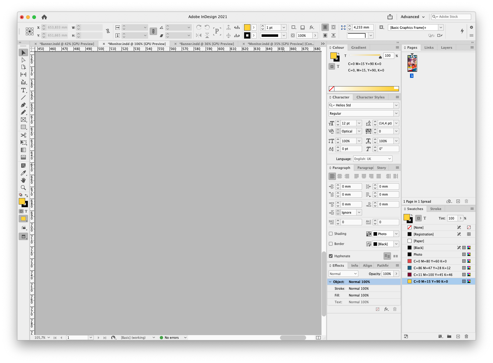
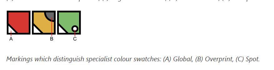
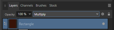
 Small UI bug when the Swatches Panel view option is "Show as list" and a swatch is set to overprint. This is how the documentation shows how the swatches should look: This is how the show in "normal" (?) mode, and it's correct: And finally, this is how the look like in "Shows as list" mode, we can clearly see the grey circles are not being correctly cropped and overlap the swatches above: Thanks!
-
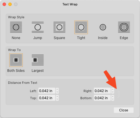
Affinity's light mode UI — in the document setup — has been giving me a headache for months. When you set proportional dimensions, the icon disappears, or becomes so light that you can't see it. And the anchor/rescale active states are reversed. When you chose rescale, the rescale option is greyed out and the anchor option turns white. Which is also wrong. I mentioned this to support months ago, but nothing came of it. Just pointing it out again because it's become highly annoying and time-consuming. The attached screenshot is what it looks like when you set proportional resizing and rescaling. Looking at it, you wouldn't have a clue.
-
Application? All (Designer/Photo/Publisher) Latest Version? Yes (2.3.0.2165) Reproducible? Yes Happen for New Document? Yes OS? Windows 11 (23H2) 10.0.22631, 11th Gen i7, 16GB RAM Hardware Acceleration? On What Happens? If the last thing you've 'touched' is any detached/floating panel, the default Windows keyboard shortcut to close a program, ALT F4, closes the panel instead. What's Expected? ALT-F4 should *only* close the program, never a panel or just a document. To Reproduce? Create new document. Have at least one panel detached/floating. Click on that panel. Type ALT + F4 Unusual Hardware? None Work Before? I believe this existed in v1.x Recent Changes? None Other? I mistakenly posted this originally under Feedback. I see that as the post author, I can hide that. Not sure if that's preferred or not. (Not trying to double post an issue. Rather, posting here as a bug report as suggested.)
-
 I frequently use my iPad with the folio case which props it at a slight angle. Interestingly Affinity Photo AND Affinity Designer seem to be reacting to this angle when trying to place photos. The whole interface flickers strangely and taps aren't always registered. The video demonstrates it in Affinity Photo but the behavior is also the same in Designer. Previous to 2.0 I noticed other features in Affinity Designer such as keyboard visibility that were delicately affected by the slight angle. I haven't determined if these are still issues but I haven't seen any other iPad app that has had issues with this angle. You'll notice the flickering only occurs while the iPad is at the slight angle, but not when it is upright. This is an 11in iPad Pro M1 running iPadOS 16.2 (a). I have noticed this in previous versions of the OS IMG_5679.MOV
 -

Layer selection hilighting
JariH posted a topic in Affinity on Desktop Questions (macOS and Windows)
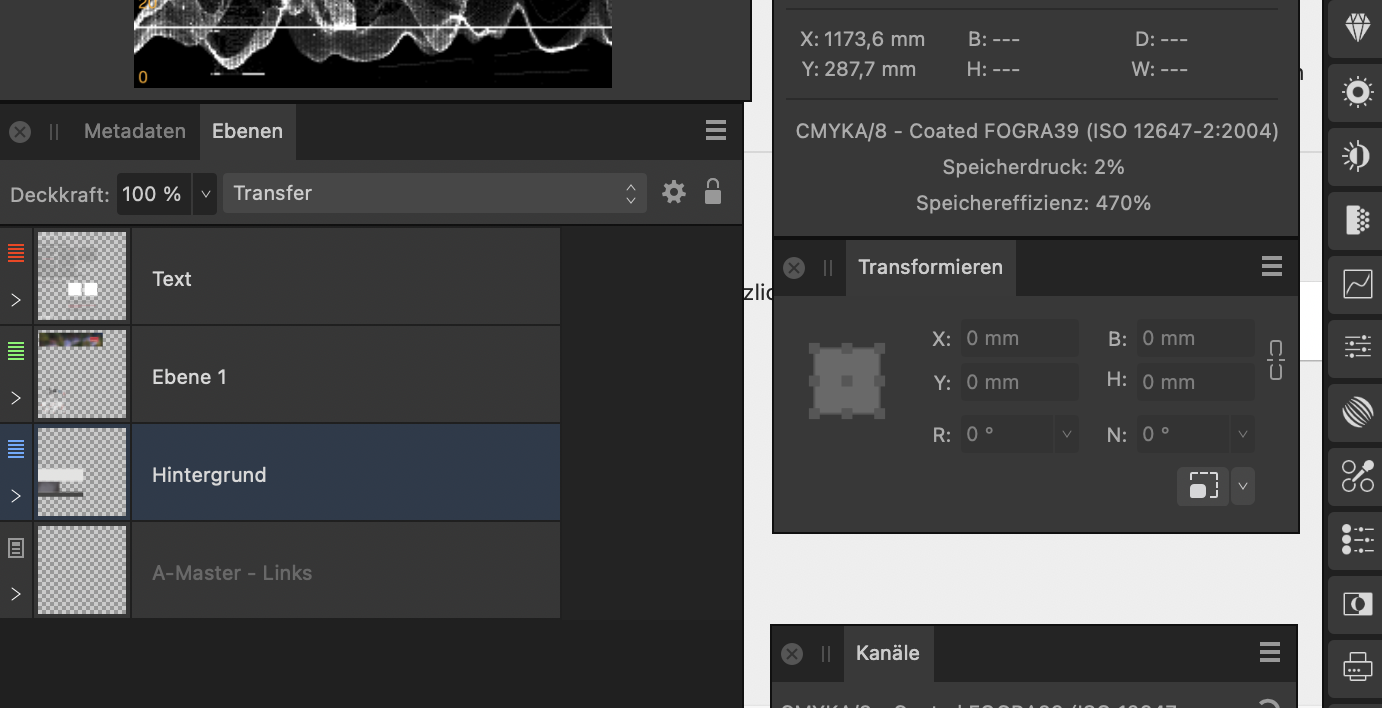
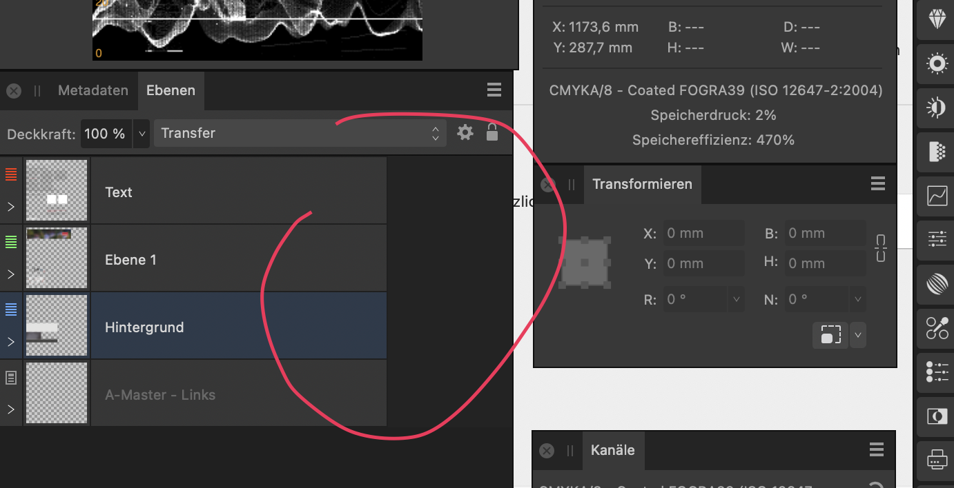
Hello Affinity Designer v2.3.1 Is there a setting for layer selection highlighting? Am I missing something? To me, logic says: when it's highlighted it's selected - But active layers are darkened. Affinity Designer UI does not look like this anywhere else. Which do you think are active layers? I hate this:
-
A small but frequently encountered issue that is quite annoying: A very common way to try various blend options (in both photoshop and Affinity) is to click the dropdown, select an option (so the dropdown menu becomes the active element in focus) and then use the mousewheel to flick through the options while looking at the results Quite often in affinity Photo (i think after an update) the dropdown box looses focus after selecting a mode in the dropdown list and you can no longer use the mousewheel to flip through the layer blend options. the dropdown element simply looses focus after an option is selected to get the dropdown to be active again, you have to click the dropdown box, then click the dropdown box again (open and close it, not selecting any of the options in the menu), then you can see the element gets a blue outline, and the mousewheel works again to flip through
- 7 replies
-
- 1
-
-
- mousewheel
- layers
- (and 2 more)
-
Anybody can post a translation suggestion for Japanese UI on this topic.
-
 Hello there, Find here my palettes that I have been using for 4 years for Affinity Designer and others. 😊 3M Film (PRO) 3M Film (PRO).afpalette : 223 colors (Art Design / Texture / Fabric) 3M Scothcal (PRO) 3M Scotchcal Series (PRO).afpalette : 578 colors (Art Design / Texture / Fabric) Blueprint Blueprint.afpalette : 10 colors, 1 gradients (Industrial Design) Bootstrap 4 Bootstrap 4.afpalette : 16 colors (WebDesign / UI Design) Brands Brands.afpalette : 75 colors from brands like Affinity, Apple, Google, Microsoft... (WebDesign / Logo Design) British Standard (PRO) British Standard (PRO).afpalette : 363 colors (Art Design / Texture / Fabric) Bulma.IO Bulma.io.afpalette : 18 colors (WebDesign / UI Design) Camo BME FR Camo BME FR.afpalette : 10 colors, 4 gradients (Map Design / Camo / Texture) FlatUI default FlatUI default.afpalette : 20 colors (WebDesign / UI Design) FlatUI 2 Japan FlatUI 2 Japan.afpalette : 19 colors (WebDesign / UI Design) Foundation Foundation.afpalette : 10 colors (WebDesign / UI Design) French Army (PRO) French Army.afpalette : 123 colors (Art Design / Texture / Fabric) GroundworkCss.IO Groundworkcss.io.afpalette : 22 colors (WebDesign / UI Design) Human body Bones Human Body Bones.afpalette : 6 colors (Art Design / Texture) Human body Hairs Human Body Hairs.afpalette : 75 colors (Art Design / Texture) Human body Intimity Human Body Intimity.afpalette : 25 colors (Art Design / Texture) Human body Skins Human Body Skins.afpalette : 26 colors (Art Design / Texture) Kube Kube.afpalette : 21 colors (WebDesign / UI Design) L'Oreal Skins L'Oreal Skins.afpalette : 66 colors (Art Design / Texture) Maps Elements - Fills Maps Elements - Fills.afpalette : 19 colors (Map Design / WebDesign / UI Design) Maps Elements - Gradients Maps Elements - Gradients.afpalette : 26 gradients (Map Design / WebDesign / UI Design) MaterialUI Material-ui.afpalette : 19 colors (WebDesign / UI Design) Old Colors (PRO) Old Colors.afpalette : 71 colors (Art Design / Texture / Fabric) RAL Colors Classic (PRO) RAL Colors.afpalette : 216 colors from RAL Classic (Art Design / Texture / Fabric) RAL Effect (PRO) RAL Effect (PRO).afpalette : 490 colors (Art Design / Texture / Fabric) RAL Plastic P1 (PRO) RAL Plastic P1.afpalette : 98 colors (Art Design / Texture / Fabric) RAL Plastic P2 (PRO) RAL Plastic P2.afpalette : 200 colors (Art Design / Texture / Fabric) SemanticUI Semantic-UI.afpalette : 15 colors (WebDesign / UI Design) SpectreCSS Spectre.css.afpalette : 7 colors (WebDesign / UI Design) UIKit Uikit.com.afpalette : 12 colors (WebDesign / UI Design) UPDATE 2023-11-21 03:00 : Blueprint Blueprint.afpalette : 10 colors, 1 gradients (Industrial Design) FlatUI default FlatUI default.afpalette : 20 colors (WebDesign / UI Design) French Army (PRO) French Army.afpalette : 123 colors (Art Design / Texture / Fabric) Camo BME FR Camo BME FR.afpalette : 10 colors, 4 gradients (Map Design / Camo / Texture) L'Oreal Skins L'Oreal Skins.afpalette : 66 colors (Art Design / Texture) RAL Plastic P1 (PRO) RAL Plastic P1.afpalette : 98 colors (Art Design / Texture / Fabric) RAL Plastic P2 (PRO) RAL Plastic P2.afpalette : 200 colors (Art Design / Texture / Fabric) UPDATE 2023-11-21 13:45 : 3M Film (PRO) 3M Film (PRO).afpalette : 223 colors (Art Design / Texture / Fabric) 3M Scothcal (PRO) 3M Scotchcal Series (PRO).afpalette : 578 colors (Art Design / Texture / Fabric) British Standard (PRO) British Standard (PRO).afpalette : 363 colors (Art Design / Texture / Fabric) RAL Effect (PRO) RAL Effect (PRO).afpalette : 490 colors (Art Design / Texture / Fabric) Bootstrap 4.afpalette Brands.afpalette Bulma.io.afpalette Foundation.afpalette Groundworkcss.io.afpalette Human Body Hairs.afpalette Human Body Intimity.afpalette Human Body Skins.afpalette Human Body Bones.afpalette Kube.afpalette Material-ui.afpalette Semantic-UI.afpalette Spectre.css.afpalette Uikit.com.afpalette Maps Elements - Fills.afpalette Maps Elements - Gradients.afpalette
 -
 Hello forum folks, hoping I can get some assistance with this issue and that I'm just missing something obvious. I'm working on a laptop (windows) and find that the majority of the UI (text, icons, etc.) is too small. Some of the fonts scale correctly to my system preferences, but most are microscopic. I have googled and it says there should be a UI font scale option or icon scale option under the User Interfaces section of the preferences menu, but I cannot see it (see attached - screenshot in designer v2). If I can't fix this, it's really going to limit my ability to work with any of the affinity v2 apps on this device. TL;DR: How can I scale up the UI for v2 apps on windows? Any help appreciated.
-
 Hi, I've got this: when working with picture frame I sometimes need to lock children and work only with the frame shape and sometimes I need to edit both the frame and the picture at the same time. I know, there is a tick button in the context panel that can be turned on and off. Is there a way how to add a keyboard shortcut to it? I can't find it anywhere. Or... Is there a way how to temporarily disable the Lock children functionality? Than you!
 -
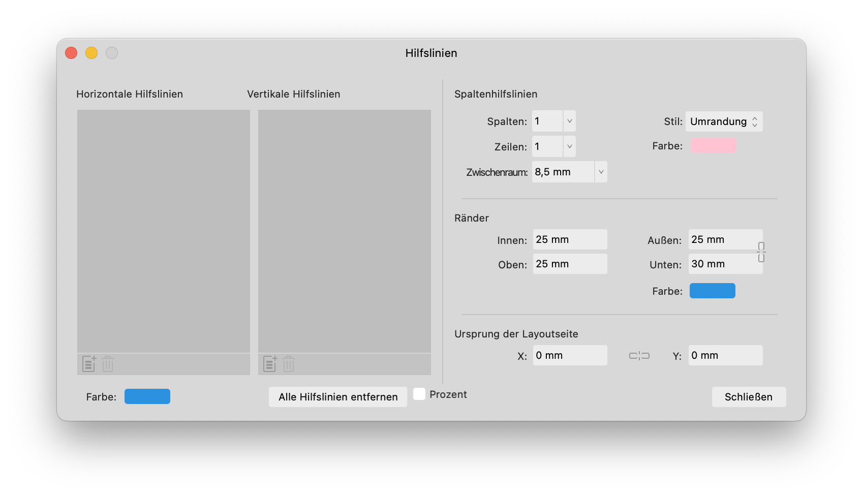
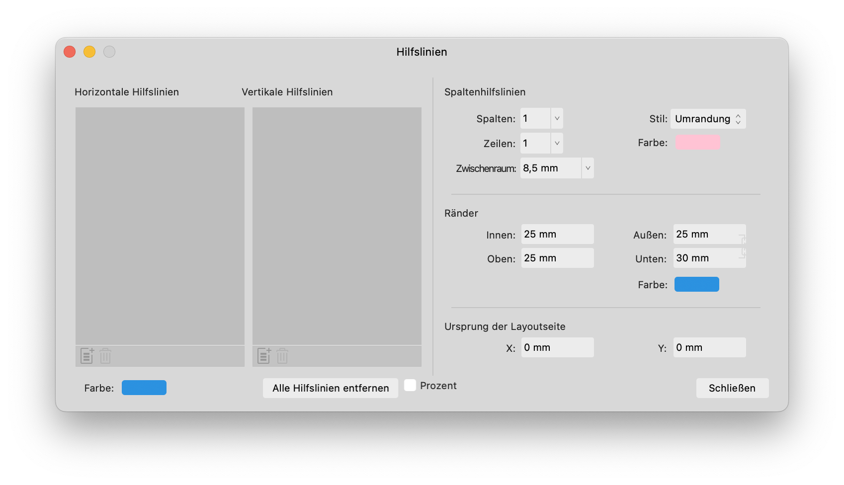
 FYI, there are some icons which do not change colour -> EDIT: are in fact transparent when switching to light mode... This is when no document is loaded. Bildschirmaufnahme 2023-08-20 um 14.35.32.mp4 ...this was fun... Also, in the guides window, there are (the usual) hidden lock icons when using light mode. (maybe because they are hardcoded in light gray to be seen in dark mode) They are also misplaced I would say.
-
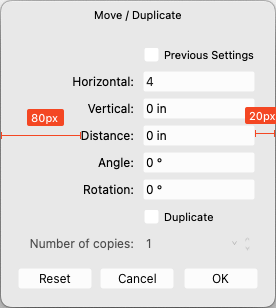
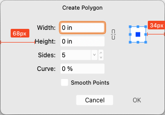
 Love these two new features a lot, but the contents of both of these input dialogs are not centered; it makes the app feel cheap...
-
Hello people. I created this project using the affinity designer. Hope you like it https://www.behance.net/gallery/86462907/WhatsApp-Redesign
-
 System is Windows 11. I can't stratch it.
-
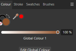
 Hello. When I want to change something's color that uses one of my Global Colors it automatically changes color tool to Tint. It annoys me because there is only one slider and nothing else and I must switch it manually to Wheel every time when I want to change color of certain object without changing the Global Color. Can I somehow change it to use automatically Wheel for example? If not - it would be a nice, user friendly function.
-
It would be great addition to the suite if while using any slider (on mousedown event): Pressing Opt/Alt interactively decreased granularity for larger increments Pressing Shift interactively increased granularity for finer increments User can change these in Prefs > Shortcuts Thanks for your consideration and all you do!
-
Maybe it has to do with importing my studio presets from the retail version, but ever since build 1730 I get a UI drawing bug with the layers panel. I use detached panels on a second monitor in all my affinity apps. See screenshots and video: Bildschirmaufnahme 2023-03-22 um 08.29.10.mp4
-
 When using the transform panel to select a point of origin for scaling, etc., the selected or active point isn't highlighted correctly. The top/left default is larger and solid white, but when you select any other point, the size of the point changes, but not the color. I believe the expected behavior is that both the size and color would change to indicate the selected origin, and that would work. However, I would love it if the highlight color (used here and other parts of the UI) was user selectable in settings. Hopefully this isn't a re-post; searched, didn't find the same issue. Thanks. Affects: v2 and beta, all three apps OS: Windows 11 (22H2, 16GB RAM, 11 Gen i7) Hardware Acceleration: Enabled (no change without)
-
 Hi there. When UI text setting is set to large font, the descendants of the letters got clipped on same panels (as in example, the layer panel) The issue appears in all three apps. Not terrible, just a little annoying.
-
I choose the large UI text feature due to my poor eyesight, but the container does not adjust height so the text is cutoff. It's sort of still readable, but likely a trivial fix. Device: Apple M1 Ultra 64GB Ventura 13.0.1 Apple Studio Display
-
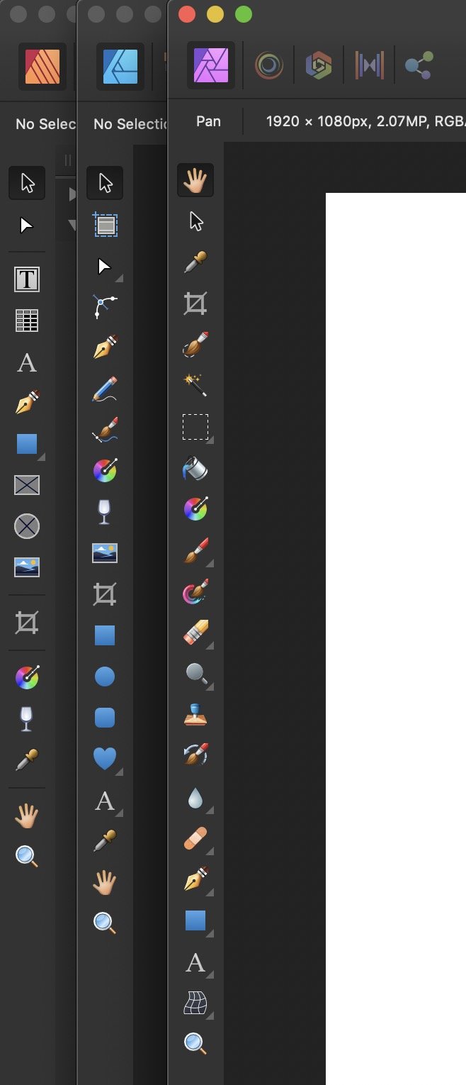
 This may seem like a small detail, but it constantly trips me up when opening new documents that the top default tool in Affinity Photo is for some reason the View tool (Hand, for panning around) and not the arrow pointer Move tool. This is different for some reason in Photo, whilst both Affinity Designer and Publisher follow the convention of most other tool-based graphics software that have move/select tools as the first default tool and the view/pan tool placed by the zoom tool. Seems extra strange since the View tool is probably the one tool I never use as it's so easy to pan around with middle mouse button or space bar. So if you don't have any good reason for this, please change the default top tool to the Move tool and move the View tool down like in your other software.
-
Kapture 2023-03-16 at 05.38.54.webm Howdy, the floating panels appear to act on their own accord in MacOS. Take a look at the bottom right corner of the attached video. Thanks so much! | Designer 2.0.4