Search the Community
Showing results for 'variable fonts'.
-

Apple font "SF Pro" doesn't render correct
kenmcd replied to PepGold's topic in V2 Bugs found on macOS
Expanded and Compressed are style attributes of the instances in the variable font. Affinity applications do not support variable fonts. As is typical with these Apple development fonts, there are intentional errors in the static fonts which will cause issues in any applications which use the style groups. So even trying to use the static fonts may also have issues. There are fixed static versions available on GitHub, and in various font groups. -
 Thank you so much for the quick reply! I never heard of variable or static fonts. Do you know where I get the static version from? Initially I got the Montserrat from Google Fonts.
 -

Variable fonts support
Jacob Williams replied to Athanasius Pernath's topic in Feedback for the Affinity V2 Suite of Products
I see that some formats don't support variable fonts, but maybe coding in export restrictions (e.g. can't export PDF or "export text as curves for font independence" forced on for SVG, etc.)? It's 2023 and I don't see why Affinity products can't have variable fonts. -

Variable fonts support
Shrinks99 replied to Athanasius Pernath's topic in Feedback for the Affinity V2 Suite of Products
What @DamienG is referring to are not individual kern pairs, but optical sizing: The practice of adjusting a glyph's geometry (in all they ways they mention above) to account for how it is displayed at different sizes. This actually is available with some static cuts of usually expensive digital typefaces which will specify their pt size in the name of the cut, eg: "Helvetica Bold 72pt", however variable fonts offer a much better workflow for this and more specificity. As far as I've seen most foundries have now opted for variable fonts when integrating optical sizing features. Inter v4.0 includes an opsz axis and you can see what it looks like here. --- As I have also mentioned before, those on this forum are not the arbiters of the workflows of others. If you don't feel the need to make use of the advantages that variable fonts offer that's great, don't use them. As a response to my first post in this thread, an employee from Serif indicated that they'd also like to see them integrated and given that they don't share their roadmap publicly as far as I'm concerned that's pretty much the end of this thread? They'll probably be implemented eventually? I'd also love to see them sooner rather than later but given my experiences developing software it's likely going to be an "it will happen when it happens" kinda thing. 100 points from me if it happens in a 2.x release! -
Those are the overlaps and looped corners used when creating fonts from multiple masters sources so the different styles interpolate properly. When Google Fonts uses their tools to build the fonts, they leave these overlaps in. Their position is that applications should handle this properly. To support variable fonts, the application must handle this properly. Almost all browsers now handle this correctly. Other desktop publishing applications handle this correctly. Static fonts in the original font developer repository usually remove the overlaps when they are generating the fonts from their font editor (they just check a box to remove the overlaps on export). This is why the static fonts from the original Montserrat repo have no overlaps. Affinity must fix this to be able to eventually support variable fonts. Variable fonts never remove the overlaps as they are required for correct interpolation.
-
 The current official download from Apple provides SF Pro as a variable font. Affinity does display the named instances of this variable font in the font variant dropdown, but that still is a single font file. Apple uses CoreText for font rendering, which does support variable fonts. You may not be able to manually tweak the parameters of a variable font in Pages, but it does render correctly because the underlying text layout engine knows about variable fonts and applies the correct glyph spacing for each named instance. As far as I'm aware Affinity uses a custom text layout engine, which apparently does not apply the correct font properties of variable fonts.
 -
 Some of the variable font families available on the Google Fonts site are pretty impressive, such as Recursive, Roboto Serif and Roboto Flex. Roboto Flex has a whopping 12 variable axes. Within Google's fonts browsing page they recently added listings for the number of axes a variable font family contains. Most have just one axis (usually weight). It seems like more of the recent additions have 2 or more axes.
 -
 +1 for RTL and variable fonts.
 -

Variable fonts support
Kim Slawson replied to Athanasius Pernath's topic in Feedback for the Affinity V2 Suite of Products
Please consider a timeline for implementing variable fonts across the Affinity suite. I have, but for this, entirely jumped ship from Adobe. -
Variable font support, please!
kenmcd replied to Rooobert's topic in Feedback for Affinity Publisher V1 on Desktop
There are currently 258 variable fonts available from Google Fonts. All with free open source licenses. Even if you only counted the pre-defined instances within those variable fonts that is the equivalent of a few thousand static fonts. And there are others in GitHub which are not in GF. Adobe Source Sans, Source Serif, and Source Mono. And Source Han Sans VF which is the equivalent of the 45 CJK fonts in the one TTC file, or separate static files. Science Gothic (based on classic Bank Gothic) is nearly done (will be in GF) and includes weight, width, slant, and contrast axes. Inter, the font you are reading here, is currently being upgraded to include an optical size axis (beta fonts available now). Playfair Display is currently being upgraded to variable and includes weight, width, and optical size axes. And there are many more available now, or in-process. There are even a few color variable fonts available, and more in development. Lots of variable font options available now.- 9 replies
-
- 1
-

-
- variable font
- variable fonts
- (and 3 more)
-
 As said above, nothing comes with the Affinity applications. They simply use what you have installed on your system. Therefore, if you are using fonts supplied by Adobe, that require a subscription, you will need to find replacements for all of them. Edit: Google Fonts may help in finding replacements. Whatever source you use for them, make sure you acquire and install the Static versions of the fonts, not the Variable versions. For Google Fonts, the downloads will have a separate Static folder with the fonts you need to install.
 -
I don't think it's a software developer's fault for people not knowing the ins and outs of exchanging files. I'm using the latest versions of Affinity Designer, Adobe Illustrator and CorelDRAW. But if someone requests art files from me I'm not going to simply click the "save" button and blindly email him what I have. I always ask what software they're using as well as the versions of that software. Then I provide files down-saved to the versions of software they're using. I also try to be careful about using certain kinds of application-dependent effects and features in artwork if I want that artwork to be able to export to non-native environments. There are certain features I want incorporated into future releases of Affinity Designer. Support for variable fonts is very high on that list of "wants." I know good and well art files made in a future version of Affinity Designer that allow variable font use are not going to be backward compatible with older versions. That has been the reality of all vector graphics applications going back 30+ years.
-
There are fonts derived from Computer Modern that you might consider installing. For example, CMU available at https://www.fontsquirrel.com/fonts/computer-modern If you have a choice between a Variable and a Static version, make sure you choose the Static one.
-
 In some point I think I'm right what I did writing here. As I said - people have been doing incredible things with computers for more then 30 years without Variable Fonts, so, what some is thinking here on the forum that they can't work with Affinity because they not supporting these fonts... There are 10000 fonts out there, both free and cheap commercial that can make good typographic... Time will tell when Serif Labs is supporting Variable Fonts, but probably not before 3.0 release...
 -
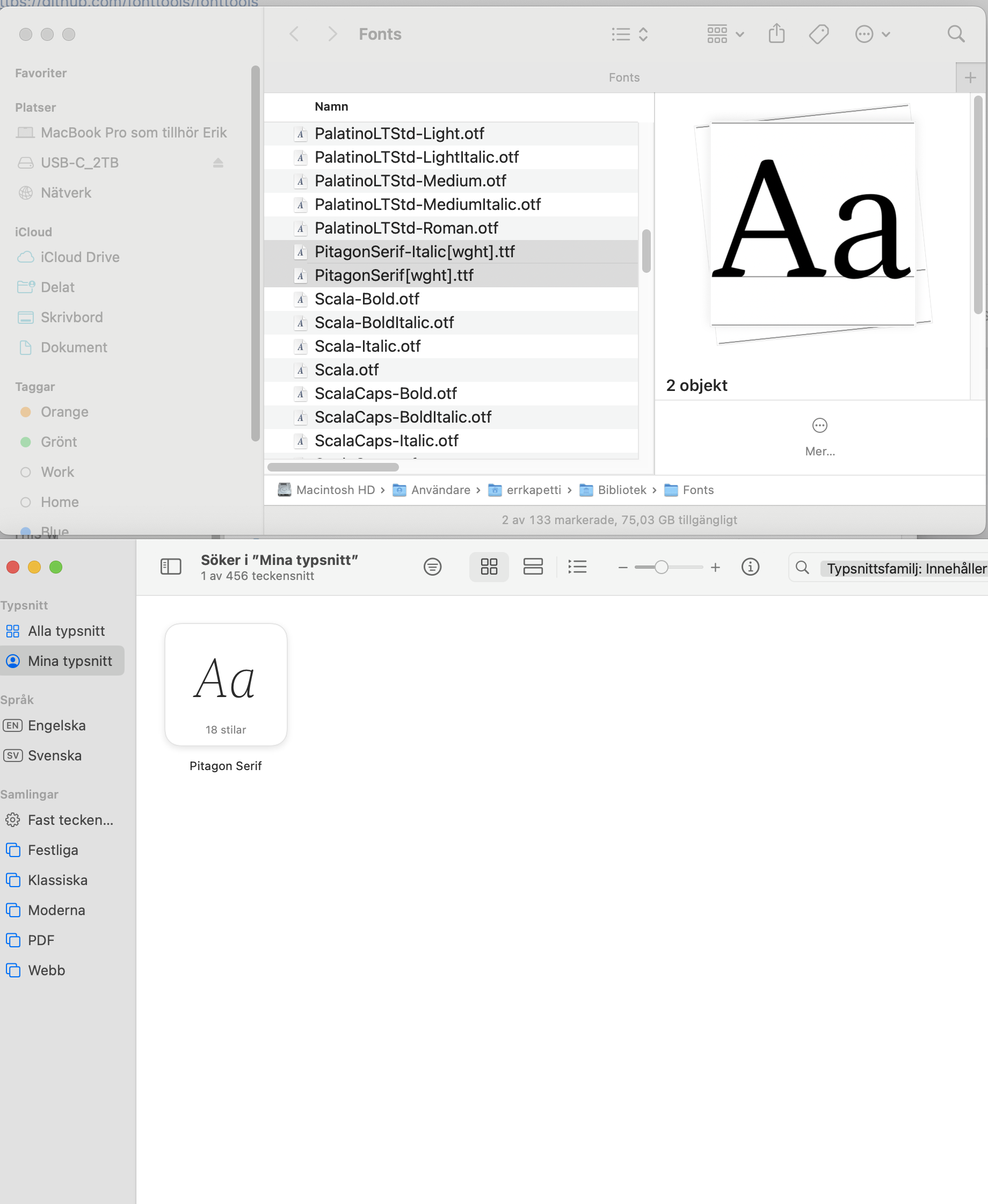
Just discovered something regarding Variable Fonts into Affinity Publisher. I was keen to test Variable Fonts and downloaded some from Fonts.com to test in Vectorstyler. But, when I switched to Affinity Publisher I hade this fonts available , but, in the font Pitagon Serif there's only two TTF-files installed, but, in Publisher I have all 18 different weights plain/cursive...? How is that working?? How do Publisher know the other 16 weights? See screenshot. Have someone any clue?

-
 Thank you for this first quick response! We use on both platforms exactly then same true type source Karla and Chakra Petch. This Karla has as it shows in all static and variable an ellipsis charakter U+2026; I checked out with FontForge (fonts attached). So again the question: why does Affinity change the font to ARIAL only in the windows version? And: why does Affinity change the underline? Where do I find the switch "Use typo metrics"? On the other side it is on you the programmer to solve differences on platform changes. A source file, as I sent to you must be directly interchanable between the platforms. Your files should be totally platform independend. There checks should be implemented. Where do I find "fixed leading"? --- on the other side it is on you to have the same "auto" function on all platforms. It is not to be loaded to the user. You can explain this to me using the document files I attached before. ChakraPetch-Bold.ttf ChakraPetch-BoldItalic.ttf ChakraPetch-Italic.ttf ChakraPetch-Light.ttf ChakraPetch-LightItalic.ttf ChakraPetch-Medium.ttf ChakraPetch-MediumItalic.ttf ChakraPetch-Regular.ttf ChakraPetch-SemiBold.ttf ChakraPetch-SemiBoldItalic.ttf OFL.txt Karla-Italic-VariableFont_wght.ttf Karla-VariableFont_wght.ttf OFL.txt README.txt Karla-Bold.ttf Karla-BoldItalic.ttf Karla-ExtraBold.ttf Karla-ExtraBoldItalic.ttf Karla-ExtraLight.ttf Karla-ExtraLightItalic.ttf Karla-Italic.ttf Karla-Light.ttf Karla-LightItalic.ttf Karla-Medium.ttf Karla-MediumItalic.ttf Karla-Regular.ttf Karla-SemiBold.ttf Karla-SemiBoldItalic.ttf
 -
Then it is very likely (almost certain) that you still have the Variable version of those fonts installed. You need to remove that version, and download/install the Static version instead.
-
Glyphs with internal overlaps render incorrectly
kenmcd replied to Vozka's topic in V1 Bugs found on Windows
Another workaround is to use the OTF fonts if available. OpenType-PS (.otf) fonts do not use components so they will not have overlaps (for now). To support variable fonts, text rendering engines must support properly rendering overlaps. So apps which support variable fonts have already dealt with this issue. Typically when font developers export their fonts from their GlyphsApp, or FontLab source files, they select "Remove Overlaps" as one of the export parameters. So the fonts they provide in their repo generally do not have overlaps in the TTF files. Google Fonts takes the original source files and uses their own tools to build the fonts for GF. That does not include "remove overlaps" (fonttools can do it but it is not 100%). Overlaps is not the only rendering issue they have to contend with. There are a number of other issues where the rendering in apps does not work properly. And that includes Adopey, Apple, and others. Bugs. All the time. They have made the decision to not modify valid fonts to work around various app limitations. Otherwise you end up with a bunch of non-standard franken-fonts. So until Affinity supports variable fonts, the easiest workaround is to use the OTF fonts. If it does not need to remain text, you can merge the shapes too. -
There might be some individual variable typefaces that seem gimmicky, but that's a subjective judgement. I, for one, utterly detest the Arial typeface. I think it's harshly ugly looking, especially when set next to a far more "neutral" sans like Akzidenz Grotesk or Helvetica. That's my subjective judgment on it. My hatred for Arial is extended by all of its horrible over-use. It's the default font in many applications. In the sign industry Arial is perhaps the most misused and abused typeface there is. So many hacks out there just love artificially squeezing and stretching it to force-fit it into a tight space. That makes an already ugly typeface even more ugly. The tyranny of that typeface (and poor quality graphic design in general) helps fuel a growing anti-signs movement in many city governments. Variable fonts can help fight some of that problem. I have a few "work horse" variable typefaces in my collection that come in very handy when I'm working with very demanding space limitations. A single variable font file with weight and width axes can yield many thousands of possible combinations. The results look far more graceful and professional than taking a stock, static font and artificially distorting it to squish it into a space.
-
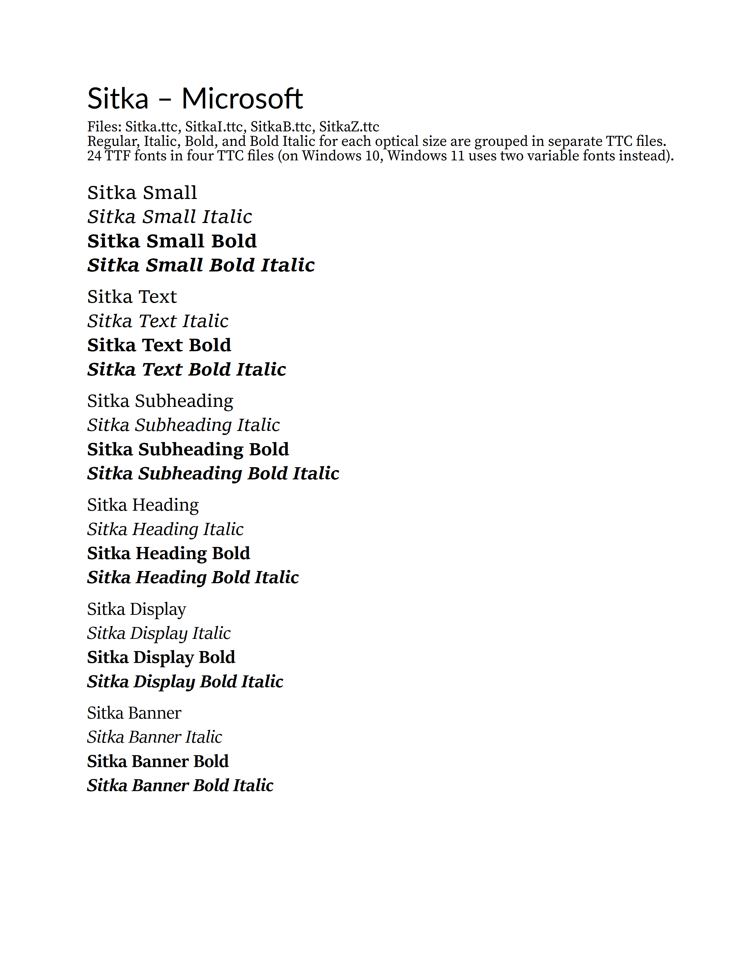
Wanted to see what would happen with the Windows 10 Sitka fonts (4 TTC files). Six optical sizes with two weights, Regular and Bold, plus the italics. The optical sizes are: Small, Text, Subheading, Heading, Display, and Banner Six R/I/B/BI style groups - one for each optical size. On Windows 10, Sitka comes in four TTC font collection files - grouped by R/I/B/BI. So all Regular styles for the six various optical sizes are in Sitka.ttc. All Italic styles for the six optical sizes are in SitkaI.ttc. All Bold styles for the six optical sizes are in SitkaB.ttc. All Bold Italic styles for the six optical sizes are in SitkaZ.ttc. I suspected that this may confuse APub, and it did. First, when I pasted the correct working text from LibreOffice into APub, all of the various Sitka font optical sizes (groups) were changed to Sitka Small. Italic and Bold still applied - but all optical sizes were now the just Small font styles. So I selected each of the other optical size four-line R/I/B/BI groups and applied the correct family/group - Text, Subheading, Heading, Display, and Banner - with the intention to use the Bold and Italic buttons to finish the corrections. But noooooooo... The Bold and Italic buttons instantly turned the family/group back to Small. So for example highlight some Sitka Display text and press the Italic button and you now have Sitka Small Italic. So I used the Font Style dropdown to apply all the correct styles, and that seemed to stick - the PDF output is correct. But do not touch a Bold or Italic button or it will all return to Small. Affinity wacko style group handling strikes again. The image below is APub Export to PDF, and then exported to PNG from PDF-XChange Editor. Note: This is on Windows 10 where Sitka is supplied as four TTC files. On Windows 11 Sitka is supplied as two variable fonts, Regular and Italic. Hmmm... let's see how it does with the Recursive TTC file - four families, eight weights, plus italics - 64 fonts... that should be fun.
-
Also, wherever you decide to download your fonts from, make sure you get Static fonts, not Variable fonts. At Google Fonts, for example, the download will usually contain both kinds, and you need the ones from the Static folder for use with the Affinity applications.
-
 Blambot probably has a few options, and Google Fonts (particularly ‘display’ fonts) might offer some possibilities. The Affinity apps support standard .otf and .ttf font files, so almost any font file you find should work, it doesn’t needs to be a ‘Serif font’ (.affonts are just Serif’s packaging of standard fonts exclusively for distribution to the Affinity apps via the Serif store). You may occasionally find that a standard font file doesn’t work as expected, but this is often down to the font itself rather than the Affinity apps. The only real caveat is that the Affinity apps do not currently support variable fonts, which are increasingly becoming far more common today. FYI standard .otf and .ttf font files are installed on the desktop (macOS and Windows) through either a font manager app, such as Typeface or FontBase or via the methods provided by your operating system.
 -
 When will variable fonts be finally supported???
 -
 Hi and welcome to the forums. Lexend and Readex Pro are presumably variable fonts; however, variable fonts are not supported by Affinity programs. If you want to use these fonts, you need the static versions, if they exist.
 -

Variable fonts support
A_B_C replied to Athanasius Pernath's topic in Feedback for the Affinity V2 Suite of Products
I’m not so sure. Take the Mac versions as an example. I could be mistaken, but far as I understand, the Affinity apps do not use Core Text on macOS, but are based on a custom text layout and rendering engine that reads the raw font data directly. So handling variable fonts would have to be done by that custom engine. If the Affinity apps were to use Core Text, they could also provide variable font support. As far as I remember, the Mac operating system started to include variable font support in version 10.5. Though “support” certainly meant something different then, compared to what is possible today. In general, I would also support the request made in this thread. While I used to be sceptical about variable fonts in the past, my mind has changed since. These fonts are highly useful design tools.