Search the Community
Showing results for 'group text size'.
-
 As the same works with Image Frame, it would be nice in the future, to think about doing the same for Text Frame, we need it on right click, text menu and as Keyboard Shortcut. I'm someone working with 3 Screens, and mostly keyboard, so I need more shortcuts for almost every possible function. Bildschirmaufnahme 2024-04-26 um 19.33.38.mov
 -
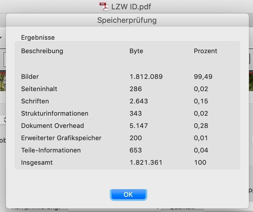
 This maybe a misunderstanding. Especially with high quality / low compression the file size differs massively with a little change of compression. Have a look at this website with interactive comparisons of various motives, compression rates and resulting file sizes. Though it is for Lightroom it may explain the principle of the non-linear change of file size though Affinity may use different methods / algorithms for resampling or compression. Accordingly a comparison of your image, extracted from the apub.PDF + exported at different qualities (100%, 98%, 95%, …, 70%) influence the resulting file sizes quite differently: At the high end, 10% less quality results in a 50% smaller file size. Also the Exiftool reports a different compression / quality estimation for the two JPG files after extracting them from their PDFs. While it is an estimation only it obviously notices a quality difference in this two files of same motive and nearly same megapixels: And regarding subsampling Exiftool reports different methods for ID/APub: ID: YCbCr4:2:0 (2 2) APub: YCbCr4:4:4 (1 1) Comparing the PDF data in Acrobat it appears the different file size is caused by the image with 99% of the file size, which again seems to indicate different qualities / compression rates: I am not aware of such a low limit for single files, if their is any it is far above 2 MB. Possibly it is related to the number of posts you did in the forum. For certain file types (.e.g. JPG) it also may help to upload them as ZIP to prevent the forums / server software to do any changes (e.g. recompress, strip profiles).
-
 I have been trying to warp (perspective) a group of images in AD2. When I try it only wants to move the background of the image. If I rasterize the group it destroys the resolution of the images and it still doesn't work. If I copy and paste to AP2 it pastes rasterizes with the destroyed resolution, but I can change the perspective there. Is there a way to do this without loss in AD2?
-
Publisher (2.4.2) sometimes crashes when selecting text by "painting" that continues from one text frame to another. No error message. hardware acceleration is ON Windows 11 / 23H2 / 22631.3527
-
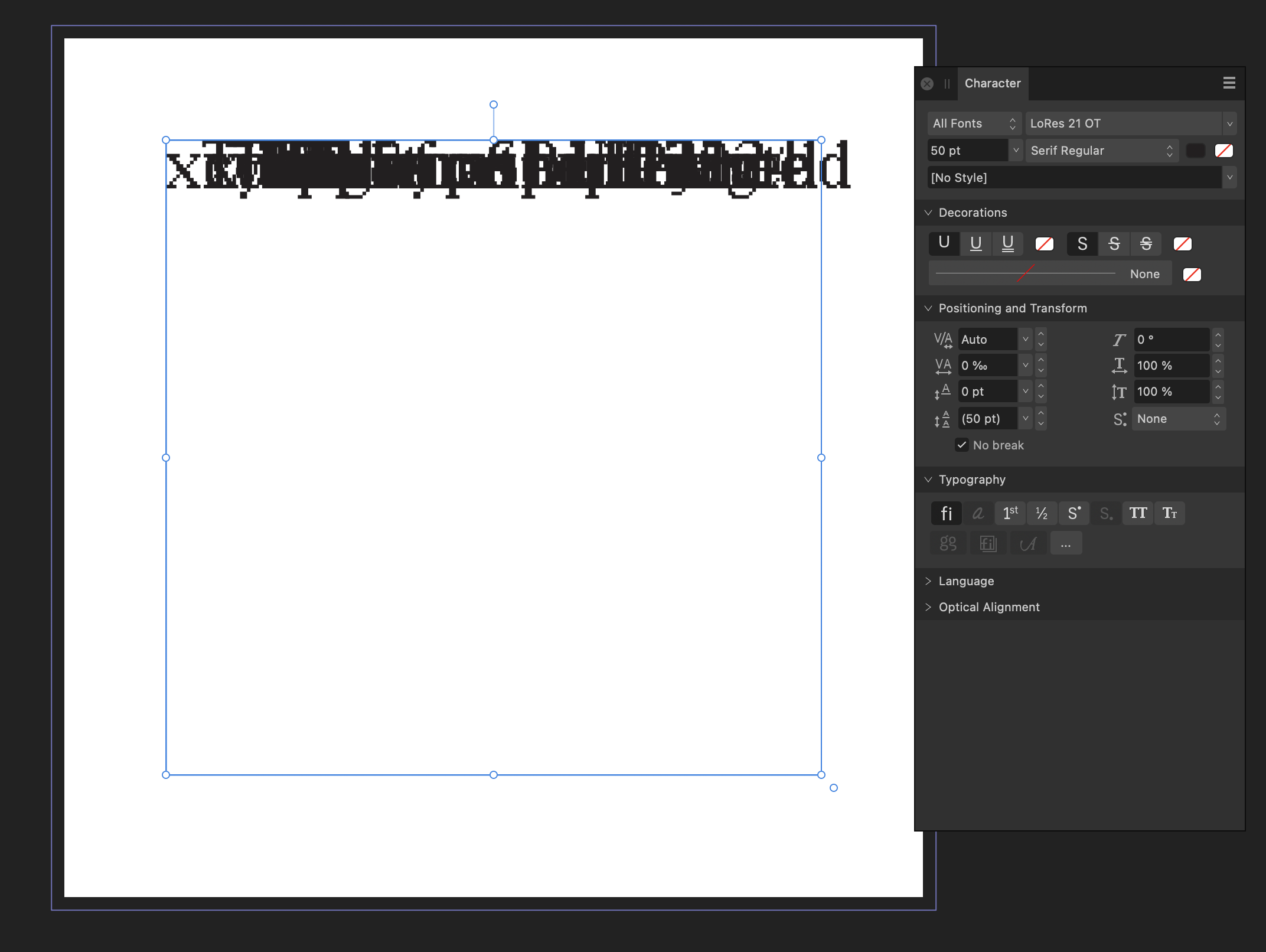
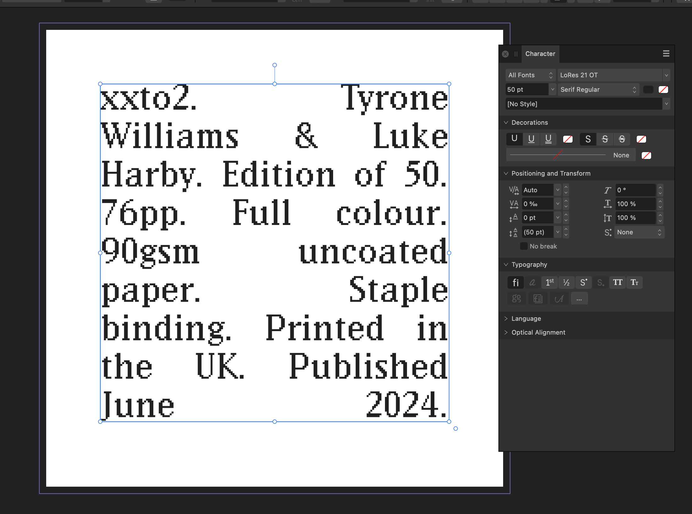
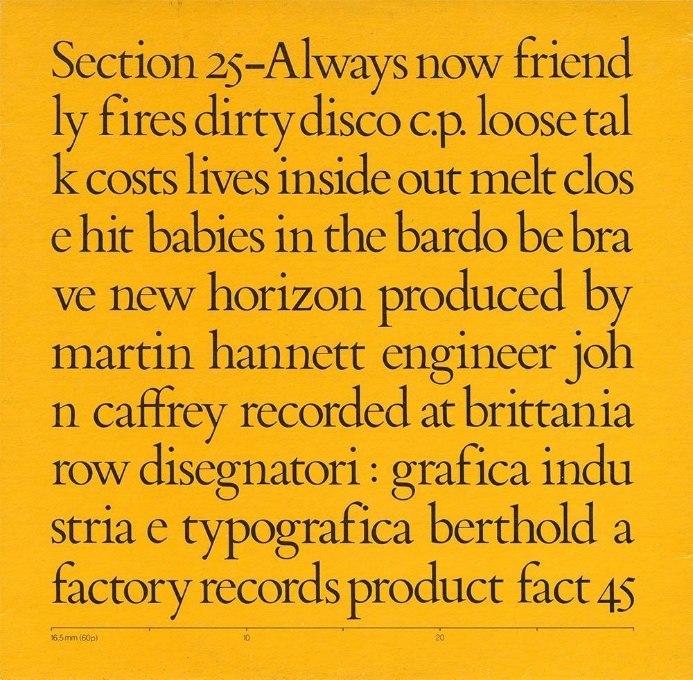
 Hmmm, apologies on reviving this thread (link added by moderator) I am trying to break words in the middle so force them to be aligned with the text frame. When I choose the No Break option (bottom of Character panel as described above) it seems to move all my text on to the top in a single line. Screenshots attached. The effect I am trying to achieve is the third screenshot yellow album cover (which can also be found here) https://slack-wise.tumblr.com/post/744138651865382912/section-25-always-now Any help greatly appreciated.
-
 I am creating a paperback book in Affinity Publisher, and wondering if I need to convert my text to outlines when I export my PDF to send to the publisher. Should I embed the fonts when I export? Or should I convert to outline? Thanks, ~Brian
 -
 In Affinity photo 2 I create a group that contains a pixel layer, when i exit the photo to the main interface then go back to reedit the photo the layer group has become a pixel layer, the group is gone. it happens randomly and not to every photo. Not sure if it is something i am doing or not doing but would appreciate any help. Thanks in advance Harley ipad pro m2 latest os updates latest app updates
 -

force wordbreak (split for visibility)
MikeTO replied to lharby's topic in Affinity on Desktop Questions (macOS and Windows)
No Break and Justification cannot be used together - it will do exactly what you're seeing. You're asking Affinity not to break the text and keep it all on one line. Do not use No Break. You want to tell Affinity to break between any pair of characters and not add a hyphen which is something word processors and page layout apps don't normally do. There is a way to do this but it takes a bit of work. There are two ways to do this. First the hard way: add a Zero-Width Space (U+200B) between every character which will treat every character as its own word so Publisher will break anywhere. But adding that ZWS is tedious. I'm sure I could use grep find and replace to make this easy but that would require thinking harder, and I haven't had my second cup of tea. The easy way is to change the Justification settings. First, replace all the spaces between words with a Third Space (Text > Insert > Spaces and Tabs > Third Space). You could also use a quarter space or an en (half) space if you want less or more space. You can insert one of these spaces, copy it to the clipboard, and then use Find and Replace to search for regular spaces. If you paste the clipboard into the Replace field then you can replace the regular spaces with third spaces. Then go to Paragraph > Justification and change the first row of options from 80/100/133 to 0/0/0. Cheers -
 Is it possible to create such construction, using initial words? Text: Text, text: Text text text text text.
 -
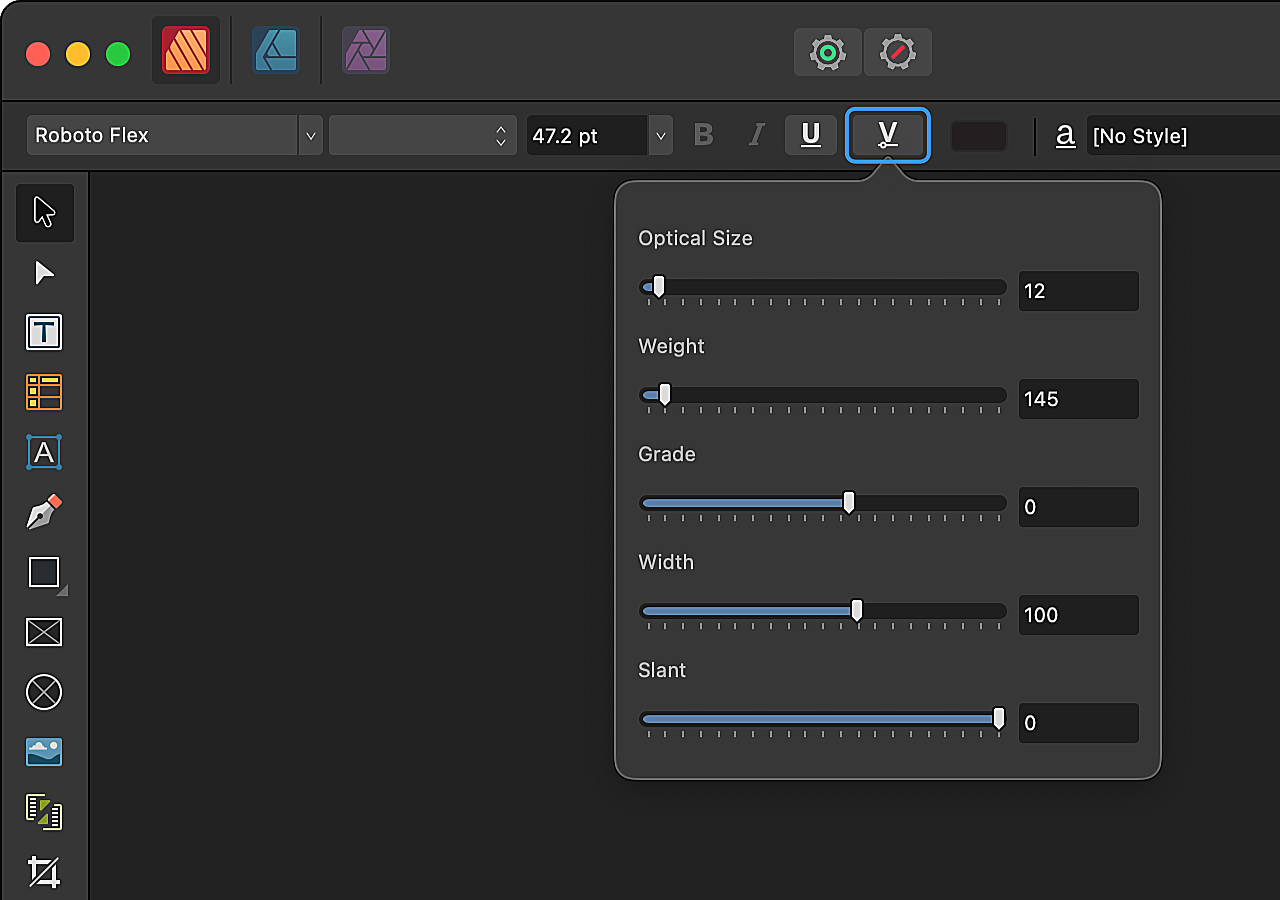
 Affinity Designer/Publisher/Photo Beta 2.5.0 (2415) When opening a document which uses fonts Affinity Designer tries to load the fonts to display them. The fonts may be missing (deactivated), in that case macOS implicitly sends a font request to external applications, such that font managers can automatically provide the missing fonts if they're available. This works correctly for static fonts and variable fonts that use one of the named presets. For example when using the variable RobotoFlex-Regular in a document (without changing any variable parameters) Affinity will correctly request RobotoFlex-Regular on reopen. If any of the parameters of a variable font is changed, such that it doesn't match with any of the named instances, then the Affinity apps do not send a font request. This means that font managers do not have the opportunity to auto activate the missing variable fonts. For example: Activate variable Roboto Flex in a font manager Open a blank document in Affinity Designer 2.5.0 Add a text block and use Roboto Flex Adjust the weight axis to 415 (this doesn't match with any named instance) Save and close the document Deactivate the variable Roboto Flex in a font manager Reopen the document => Font is missing (expected), but also no font request is sent so the font cannot be auto activated by macOS It's a bit hard to verify/reproduce this, as the font request happens behind the scenes in macOS and you need a font manager to capture this request. Font requests are typically sent automatically when a font is loaded using an NSFontDescriptor. For example loading a font using a descriptor with a font name NSFontDescriptor(fontAttributes: [ .name: "RobotoFlex-Regular" ]) will look for any available font with that name. It seems like Affinity loads a font differently when axes are adjusted. (Note that this only applies to missing, deactivated fonts. Activated fonts are correctly loaded on document reopen.) If any additional information is needed I'm happy to help.
 -
Variable fonts Apps: Affinity Designer, Affinity Photo, Affinity Publisher Platforms: All You're now able to use variable fonts in all Affinity apps, providing a plethora of new typographic design possibilities. As well as providing predefined font styles, such as light, bold and condensed, variable fonts give you fine control of specific design aspects known as axes of variation, or just axes for short. To try out variable fonts in Affinity, apply one to some text and then: - On desktop, click the Font Variations button on the context toolbar (or on the Character Panel). - On iPad, tap the arrow to the right of Bold/Italic/Underline/Strikethrough on the Text Panel and then tap Variations. Variation settings on desktop. Variation settings on iPad. You'll see settings for each axis that the font designer has made individually adjustable. Axis' slider being dragged. Many variable fonts allow you to adjust their width and weight axes, and possibly italic, optical size and slant. These five axes are common enough that they're defined by the OpenType specification. All manner of other axes may also be adjustable, such as: - the height of ascenders and depth of descenders to better fit your chosen line spacing. - the stem terminals, to choose between straight and swelling. - the width of counters, which are enclosed and partially enclosed spaces within glyphs. For examples of other possible axes, check out the axis definitions that are available for variable fonts at Google Fonts. You may see fewer axes in Affinity than are mentioned by a font provider's marketing. For example, Google Fonts lists 13 axes for Roboto Flex and Affinity exposes five of them. This is because we respect font designers' ability to specify that an axis should be hidden. This is part of the OpenType specification and means that software isn't meant to provide an interface for such axes. Why would a designer do this? Well, a variable font might adjust an axis internally based on your choices for other axes that you can directly adjust. For example, observe how counter widths change when the weight axis is adjusted in the animation above. Variable fonts and PDFs PDF doesn't support variable fonts. So, when you export a PDF of an Affinity document that uses a variable font, we create a static instance of the font with fixed settings. We've taken steps to ensure static instances of fonts are well named. You should find this minimises the need to identify the original variable fonts if you later import or place the resulting PDFs.
- 128 replies
-
- 49
-

-

-
 Hello, I am fairly new to Publisher but I'm a convert over from InDesign. I have some questions relating to data merge. Is there a way I can map images to a document using data merge? For example: I have a CSV File that looks somewhat like this... images/file1.png, images/file1.png, images/file3.png, images/file1.png, images/file5.png, images/file7.png, <WHITESPACE>, <WHITESPACE>, images/file2.png So on and so forth. It would essentially be a grid of values of varying sizes in each different file. I may have file1.csv look like the above, which would be 3x3. file2.csv may be 50x50, etc. I need to be able to merge in such files and have say, the images in question map to the page. General question - with data merge - why does it seem to insist on creating many pages, say, 10 pages, if I have 10 records across in my CSV file? Essentially, I have a computer program that I wrote that outputs values into a CSV file and I wish to quickly be able to map the values from said CSV file out to a document using Publisher, with having to manually intervene as much as possible, at least for the central component of what I'm trying to do here. If this is not an option, instead of displaying images, I would display whatever characters may come back in a CSV, say, 1,3,5, etc. But I can't have the comma splits like this to show up on the page, I would want all "cells" to be within grid squares. At the end of the day, whatever I do, needs to essentially be in a fixed grid, but I prefer to display what I'm doing via custom images, rather than plain text in a grid. I hope this makes sense. Thanks.
 -
 Big problem, surely a bug?: Any gradient on any object will render all selection boxes invisible in the entire Affinity suite. It happens 100% of the time, on all files. I can select objects, but there are no visual cues in the Document View window. I've had the problem since I bought Affinity in December last year. It took me a long time to figure out what was happening. I haven't found any solution on Google or in existing forum posts, so I decided to write my first post here. I hope someone can help. Please read my explanation and watch my screen recording. * Recipe: Just add a color gradient to any object, e.g. text or a picture frame. After that, no selection boxes will appear when selecting one or more objects. I can still select objects with my mouse or using the Layers panel (Right Studio). I can see in the Layers panel that one or more objects are selected. And if I use, e.g., the move tool, I can easily move them. But there are no selection/bounding boxes around the selected object(s). This obviously makes it difficult, confusing and frustrating to edit files with many objects and layers. Please note that removing the gradient will make the selection boxes reappear! In short: Any gradient on any object will render all selection boxes invisible in Publisher, Photo and Designer (in both 2.4.2 – the newest version – and 2.3, which I installed back in December). * Screen recording (50 sec) using a new demo file: The demo file has two text frames and one picture frame, all having solid fill color. When I click on and select one or several of them, a selection box appears. So far, so good. As you can see, if I then change the color of one of the objects (the blue text) to a gradient, the selection boxes disappear. As you can see, I can select any of the three objects, but there is no box or outline around any of them. In the last step in the video, I remove the gradient on the blue text and select a solid color instead. Since there are no gradients in the document anymore, the selection boxes are again visible. 1. What Application are you using? Affinity Publisher, Photo and Designer 2. Are you using the latest release version? Yes, 2.4.2 (also happened in 2.3). 3. Can you reproduce it? Yes, 100% of the time on all files using any of the three Affinity programs. 4. Does it happen for a new document? Yes (see demo file and screen recording). Machine, operating system and extras: macOS Monterey (12.7.3) on a 5K iMac (Intel) with 16GB of RAM and plenty of internal storage. No additional hardware, just standard keyboard and mouse. No font managers or display managers. Hardware acceleration? I tried both ON and OFF. The problem persisted. Note: My iMac is working well and I don't have any issues with other programs. I did a fresh install of macOS Monterey in December, just before I bought Affinity. I have very few third-party programs installed: just Affinity plus Firefox, FileZilla and Stellarium (planetarium). Irrelevant background info: I've been following Affinity and cheering for them since 2018. I finally bought the V2 Universal License in December 2023, and I have spent the last few months testing the software and watching a lot of YouTube videos. I've previously used Adobe's software for editing photos, making illustrations, and designing books, but I decided to switch to Affinity. I like many things about Affinity! Sadly, I can't use Publisher for designing books (the text justification is absurdly poor, even with the Norwegian hyphenation dictionary correctly installed and activated). But I really want to make it work for my upcoming wall calendar as well as posters and other "simple" projects. If Affinity is able to show which objects and layers are selected also when using gradients, Photo and Designer will become very useful to me as well. I like both the features and the performance of Affinity. Screen_Recording.mov test.afpub
 -
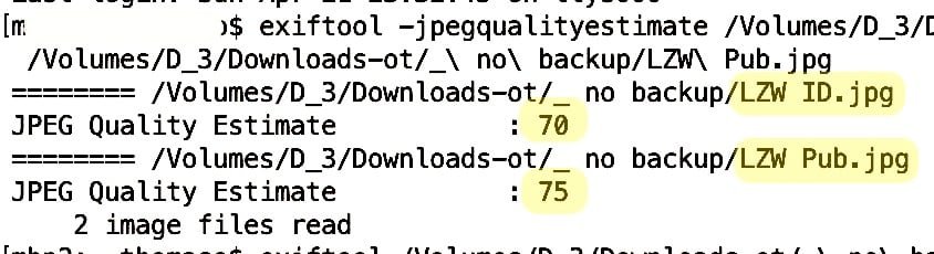
 As I wrote, the size of Publisher's PDF is 13 MB, so I can't upload because the forum's maximum file size is 2 MB. But whatever you compress, etc., InDesign makes about 15-75% smaller PDF files (in this comparison).. it's a fact. 🙂 a few percent difference in image quality (compression) does not explain such a big difference. LZW Pub.pdf LZW ID.pdf
 -
Vergissingen in spelling?
MikeTO replied to AvdB-Netherlands's topic in Affinity on Desktop Questions (macOS and Windows)
I took a look at this, too, as I've been looking at such Dutch terminology lately. The Dutch spelling dictionary spells "kramp-achtigheid", "menta-liteit", "ontstaans-geschiedenis", and "levensbeschou-welijk" without hyphens which is why they are flagged. If they are also correct with a hyphen you can just use Learn to add them to your custom dictionary. Similarly, it spells "Mensverheer-lijking" as "Mens verheerlijking" or "Mens-verheerlijking". I couldn't get it to flag "terug-gevonden" and "ge-nomen" as spelling mistakes but as I've said before, the macOS spell checker is flaky. Both "terug" and "gevonden" are in the Dutch dictionary so perhaps if you right-clicked the word then it wouldn't even offer the Learn and Ignore options because it really is valid. The spell checker just does this sometimes and you have to ignore it. URLs are often flagged as mistakes by spelling dictionaries so just choose Ignore for those. If you have a character style applied to all of your hyperlinks then you could set Language to None for them to avoid them being spell checked. Good luck. PS: I'm just pasting this text here in case one of us wants to try it again. Typing words in another language from a screenshot isn't fun so I don't want to do this again: kramp-achtigheid terug-gevonden ge-nomen lingen schoon-familie menta-liteit ontstaans-geschiedenis levensbeschou-welijk Mensverheer-lijking -
 You will need to either: Perform a Spell Check operation and Learn or Ignore those words; or Apply Character Text Styles that specify a Language/Spelling of None; or If the word is actually properly spelled in some language other than your User Interface language, Apply a Character Text Style that specifies the proper Language/Spelling, so the correct dictionary is used. Or some combination of those. "J.G" and "H.V" could be Ignored or Learned (#1) or set to None (#2). But "linger" seems like a legitimate word whose Language is simply set incorrectly.
 -
Apart from to bit depths also profile embedding (vs. image conversion) may matter, especially if you compare the PDF file size with a few images only where the embedded profile(s) may be larger than the image size(s). Here an Affinity comparison with 1 tiff + 1 jpg but identical sRGB profile for images + document:
-
 Hi I've been sent a Word article to go in AP newsletter that has a hyperlink that is text, not the URL u3a - Festival 2024 When I paste this into AP, I just get the text Is there a way to put the hyperlink in that way, or do I have to paste https://www.u3a.org.uk/events/festival-2024 (which I'd prefer not to have to do) Thanks
 -
The simplest would be to increase the baseline grid. As Pšenda mentioned, your setup of your saved text styles is relevant: If they all base on a common base style it can be sufficient to change the leading for their base only. In addition, leading can be set as an absolute value or relative to font size. So the workflow to increase leading across the entire document obviously depends on your way how the used styles were created and saved.
-

Complex construction with initial words
Alfred replied to anto's topic in Affinity on Desktop Questions (macOS and Windows)
When you say ‘create such construction’, are you perhaps referring to the styles (i.e. black bold italic text up to and including the first colon, red italic text up to and including the second colon, and black roman text thereafter)? -
Must admit I had to do a bit of reading up on this subject!😀..I am sure it is going to be a fantastic new feature and looking forward to using it! 1. Many of the Variable Fonts appear to exhibit 1 or 2 axes so tried to download ones that have 3 or more variable options 2. Mixed Fonts could require access to style to get Variable to be recognised 3. Had 1 Crash while scrolling or selecting font (bit vague but did not observe exactly what was going on!) (Crash report attached) 4. Like the idea of a reset to default values. Would be practically impossible to control with so many options and many fonts installed. 5. Think might uninstall non VFonts of the same name in future! Testing W.I.P Installed Source Serif 4 (weight 400 | optical Size 20) Y Geologica(weight 400 | Cursive 0 | Sharpness 0 | Slant 0) Cursive not sure what it does! shows on list + Slant and sharpness missing Roboto Flex others testing Saira (Weight 100 | Width 100) Y Source Serif 4 (weight 400 | optical Size 20) Y Noto Sans Display (weight 400 | Width 100) Roboto Serif (Weight 100 | Width 100 Optical Size 20 | Grad 0 ) Grad no show Advent Pro (Weight 400 | Width 100) y Literata (weight 400 | optical Size 12) y Playfair (weight 300 | optical Size 5 | Width 112.5) y Pathway Extreme (weight 100 | optical Size 8 | Width 100) Recursive ( Monospace | Casual |weight 400 | Cursive 0 Slant 0) Google Popular Open Sans (Weight 400 | Width 100) had to go into font and select style to get this to display Montserrat (Weight 100) Inter (Weight 400 | Slant 0) Roboto Condensed (weight 400) Roboto Mono (Weight 400) Oswald (Weight 400) Noto Sans (Weight 400 | Width 100) Raleway (Weight 100) Nunito Sans (weight 100 | optical Size 12 | Width 200 | YTLC 500 ) Playfair Display (Weight 400) DM Sans (weight 400 | optical Size 9) Noto Serif (Weight 400 | Width 100) Couple of No Shows on the Variable lists looks ok so far (Added these to favs so can easily source them) Noto Sans Display has 72 variants Google Popular Open Sans (Weight 400 | Width 100) Montserrat (Weight 100) Inter (Weight 400 | Slant 0) Roboto Condensed (weight 400) Roboto Mono (Weight 400) Oswald (Weight 400) Noto Sans (Weight 400 | Width 100) Raleway (Weight 100) Nunito Sans (weight 100 | optical Size 12 | Width 200 | YTLC 500 ) Playfair Display (Weight 400) DM Sans (weight 400 | optical Size 9) Noto Serif (Weight 400 | Width 100) On my travels in the internet I came across a few tools and featured information that is useful: 1. Axis definitions: https://fonts.google.com/variablefonts#axis-definitions This helped interpret the abbreviations 2.Sort of Font analyser: https://wakamaifondue.com/ so you can see font parameters by dragging the font onto target 3. Font Testers: Loads but I liked these https://v-fonts.com/ https://www.axis-praxis.org/specimens/__DEFAULT__ https://play.typedetail.com/ 4. Google Font links Google Fonts with 365 of 1623 families https://fonts.google.com/?vfonly=true https://fonts.google.com/?vfonly=true&sort=popularity https://fonts.google.com/?vfonly=true&sort=date 5 V-Font Links https://v-fonts.com/ https://v-fonts.com/licenses/ https://v-fonts.com/licenses/free-for-commercial-use https://v-fonts.com/licenses/bundled 6. Some Stuff with free stuff! https://uncut.wtf/ https://www.fontshare.com/ https://anrt-nancy.fr/en/fonts https://www.typotheque.com/ https://typotheque.luuse.fun/ https://www.theleagueofmoveabletype.com/ https://www.losttype.com/ https://www.tunera.xyz/ https://www.design-research.be/by-womxn/ https://fontesk.com/tag/variable/ Crash while editing VFonts.zip
-
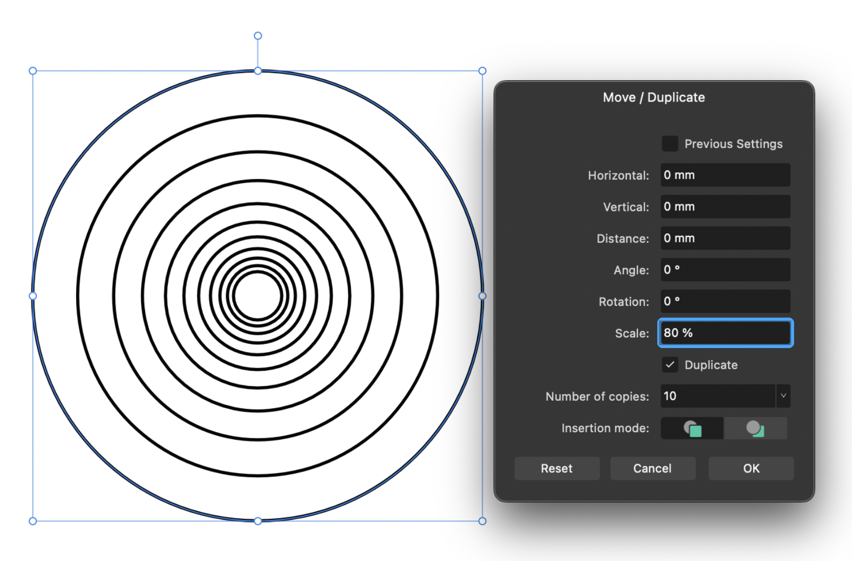
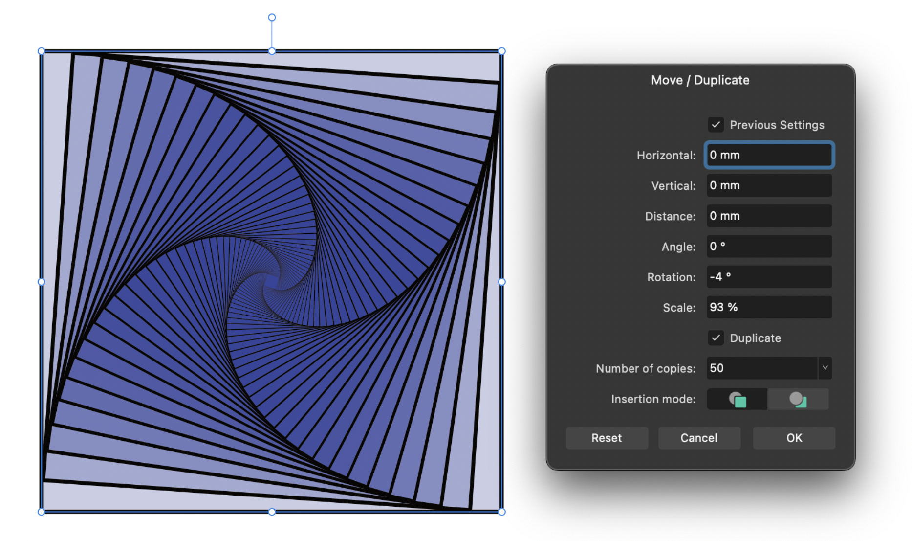
 Apps: All Platforms: macOS and Windows There were a few requests from the previous beta we have now implemented in 2.3. As a reminder the move data entry dialog is initiated by hitting Return while in the Move, Shape, Picture Frame or Artboard Tool. 1. You can now choose duplicates to be created in front or behind the original using the new Insertion mode options 2. Scale has now been added, to quickly resize an object by a given % 3. Properties of the object being transformed can be adjusted without dismissing the dialog The scale %, when creating duplicates, will also apply to every subsequent duplicate - a very simple example shown below with 10 copies of the same circle being created, each one at 80% the size of the previous. You can of course combine that with other transforms, such as below a square being rotated and shrunk on each duplicate. As mentioned you can also now adjust the properties of the object being transformed without dismissing the dialog. E.g. below I have changed the colour of the shape as well as changing stroke width to “scale with object” while keeping the current move data entry settings live. Another minor thing to mention is we have also changed the ramp on the ‘Number of copies’ slider to make it more useable at lower values (i.e. the first half of the slider now just goes from 1-50, with the remaining half from 50-1000).
-
A jet engine may have axes throttle cooling intensity direction vector air volume reverse thrust … etc The pilot, however would want only throttle, direction and reverse thrust, right? They wouldn't want to make the pilot remember to adjust the cooling and air volume controls, and neither would they want the pilot able to tweak them in a way, that may damage the engine. It's the same with these additional hidden axes in a font: When font size is increased on a serif font, the stroke width - to - size - relation axis may need to be adjusted for optically pleasing typography — however, also the size of the serifs needs to be adjusted in unison, so there is another axis changing with size. Instead of making the user tweak everything manually, the font designer may expose only one additional axis called "optical adjustment", that then influences how the other two react to font size. A font is a product and thus has to meet expectations, here: aesthetics. A finely tuned orchestration of all axes is what makes a font great, and that's what is important to font users at the axis interface level. De-tuning a font may be interesting for artistic purposes, but I think we can agree, that that's advanced use. Showing all axes by standard would be overwhelming and a disservice to the user. Maybe an option to switch on hidden axes can be provided — but remember: as soon as you'd adjust the official axes, the setting of all associated hidden axes would get recalculated and thus reset, anyway.
-
Apps: All Platforms: macOS, Windows and iPad A new QR Code tool is now available from the shapes flyout in the toolbar, making it easy to add a QR code to your documents. After creating or selecting a QR Code object you will find a 'Payload' option in the context toolbar. Here you can type whatever URL you want the QR code to link to when it is scanned. In addition to URLs you can use other syntax as detailed below to have the QR code trigger other functions when scanned by a device: SMS Payload structure: SMSTO:number:text message Eg. SMSTO:07513123456:Hello mate! GEO location Payload structure: GEO:lat:lon:height Eg. GEO:40.71872,-73.98905,100 WIFI credentials Payload structure: WIFI:S:ssid;T:type;P:password;; Eg. WIFI:S:MyWiFiSSID;T:WPA;P:MyPassW0rd;;
- 78 replies
-
- 32
-
-
-
Feedback/Usability wise, it would be nice to have an option to easily create a border with some text around the QR-Code. Here is an example of such a result; Of course the user could create such things manually but it is time consuming.