Mark Oehlschlager
-
Posts
634 -
Joined
-
Last visited
Everything posted by Mark Oehlschlager
-
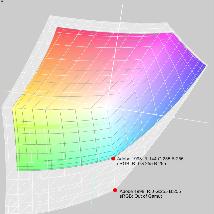
@vincentlepes Right, and just to illustrate the point, below is a comparison of the difference in size of the color gamut between sRGB and Adobe 1998. Here you can see that what appears to be maximum Cyan in the sRGB color gamut is only about 55% of what the larger Adobe 1998 color gamut can express. You can also see that RGB values are relative to the color gamut in which one is working. The apparent color that is described by R:0 G:255 B:255 in the sRGB color gamut is described by the RGB values R:144 G:255 B:255 in the Adobe 1998 color gamut. The apparent color that is described by R:0 G:255 B:255 in the Adobe 1998 color gamut lies outside of the sRGB color gamut and therefore is unable to be displayed. Assigning the smaller sRGB color profile to a file created in the larger Adobe 1998 color gamut will preserve the original RGB values of the artwork but alter the apparent colors by scaling the original Adobe 1998 color gamut down to fit the smaller sRGB color gamut. Color shift will be apparent. Converting a file from the larger Adobe 1998 color gamut to the smaller sRGB color gamut in general will change the RGB values of the artwork in order to preserve the apparent color from the source file, particularly for colors where the two gamuts overlap, but then comes the question of rendering intent for conversions (indicated in application Preferences: Color) which governs how out of gamut colors will be treated. "Relative Colorimetric" will scale just the out of gamut colors to fit within the smaller color gamut while preserving the appearance of colors that fall within both color gamuts. "Perceptual" will scale all colors down proportionately to fit within the smaller color gamut, such that the human eye perceives "correct" proportional color and value relationships in the conversion to the smaller gamut. "Absolute Colorimetric" will preserve the appearance of all colors that occur in the overlap of the large and small color gamuts, but will clip the out of gamut colors from the larger space to the closest color in the smaller space.

-
@Dan C In summary, Assigning a color profile preserves RGB numbers and remaps the apparent color to the larger or smaller target color gamut, whereas Converting to a color profile changes the RGB numbers and attempts to preserve the apparent color of the source file in the new file with its larger or smaller color gamut. Correct?
-
I've seen some very nice product mock-up template files built in Affinity Photo making use of embedded files that allow for the substitution of new art in the embedded files. See the video below. The problem is that what is possible to build is limited to flat plane objects (e.g., posters, book covers, iPad screens) because while there is a Perspective Live Filter to distort flat planes, there is no Mesh Warp Live Filter that would allow designers to wrap embedded files around curved or cylindrical shapes like wine bottles. Is there any chance we might see a Mesh Warp Live Filter within the next few point upgrades? Please?
- 27 replies
-
- 12
-

-
Check out this YouTube video for a quick insight to how you might achieve the effect you want to achieve: Otherwise, apart from reading through the electronic Help files, do a keyword search in YouTube for "Affinity Photo Perspective"
-
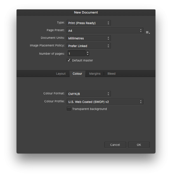
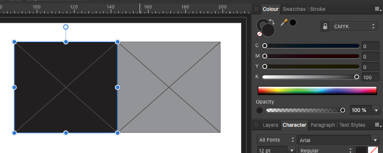
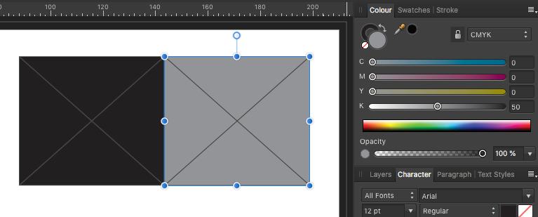
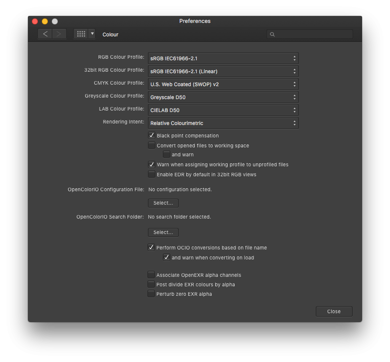
Four quick screenshots while setting up a new Publisher document on a Mac. For what it's worth, I include a screenshot of the application preferences.
-
@Petar Petrenko Are we talking about a Publisher document that has been set up from the beginning as a CMYK document? Are there any placed or pasted objects in the Publisher document that were created in another application in the RGB color space?
-
@Lagarto Yes, I get correct CMYK readings for the default color swatches.
-
@Lagarto My basic swatches remain true to the document color space. I'm not sure what is causing trouble for @Petar Petrenko .
-
@Lagarto This from the Publisher help file on the Color Panel:
-
Clicking on the three default Black, Grey, and White swatches in all three Affinity apps for CMYK documents, I'm getting the following: C 0, M 0, Y 0, K 100 C 0, M 0, Y 0, K 50 C 0, M 0, Y 0, K 0
-
Line spacing (which most software interprets to mean the distance between baselines) is usually expressed in points. A typical type specification like 12/14 Garamond for body text is understood to mean 12 point Garamond with an extra 2 points of leading for total interline spacing of 14 points. Letterspacing or kerning is traditionally expressed in 1000ths of an em (the body size of the type used, e.g. 12 point Garamond). I don't understand the 0/00 symbol in the Publisher character panel, but the values one plugs into the kerning field are in fact 1000ths of an em (i.e., for 12 point type, with your cursor inserted between two letters in a word, if you enter 1,000 into the kerning field of the character panel, you will insert 12 points of space between the letters). Postscript: Just in case there is any confusion in the matter, also remember that the letter forms in a digital font all fit within a digital bounding box with small margins (side bearings) between the letter form and the bounding box. This prevents neighboring letters from touching. Moreover, fonts are designed to have prescribed kerning (spacing) between specific pairs of letters, encoded in kerning tables within the font. So, in addition to whatever letterspacing changes you make between letters (adding or removing space), the side bearings of the letterforms will be included in the resulting space.
-
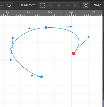
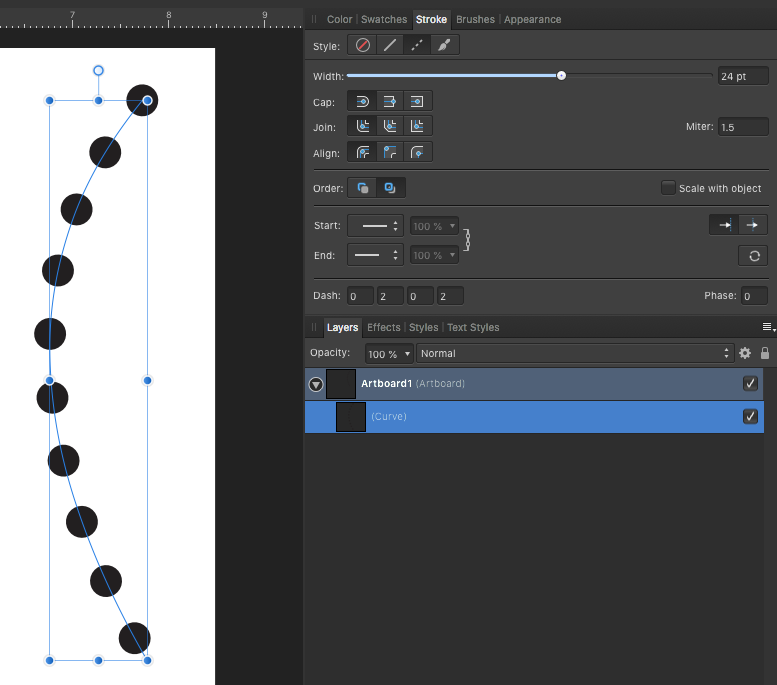
Well, here's what I discovered through trial and error: Notice in my screenshots below that it's possible to select three node on a curve where the resulting Selection Box fits to the selected nodes but NOT the curve. However, if I click the "Selection Box From Curves" button, the Selection Box now fits the curve described by the nodes. I have no idea how this might be useful or relevant.
-
I would begin a careful trial and error investigation in an attempt to isolate the problem. 1. Start a new Designer document and fill a shape with your color formula, just to eliminate the possibility that this is at all connected to your application preferences or some other application specific issue. (I don't expect there to be a problem there.) 2. Working with a copy of your PSD mock-up opened in Designer, delete all of the layers and artboards except the front cover artboard and it's child layers. Does the problem still exist? 3. Isolate the orange rectangle by dragging it out of the artboard group. Does the problem still exist? Anyway, you get the idea. Eliminate surrounding groups and layers until the color problem disappears. Then slowly include more and more of the source file layers and groups (via copy and paste of layers from duplicate file) until the color problem reappears. Good luck.
-
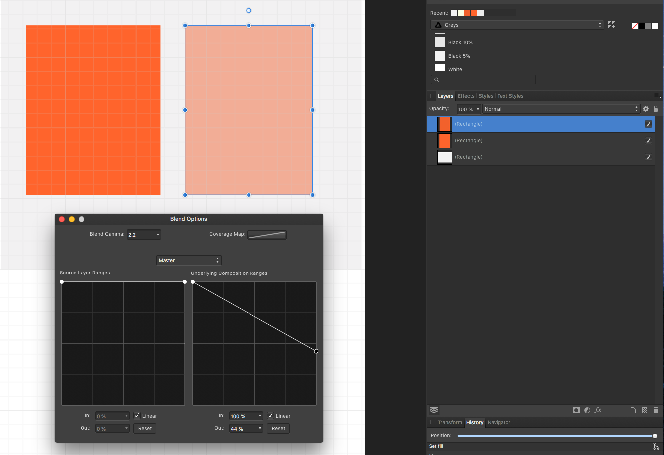
@vincentlepes First, after you paste the Hex values into the Color Chooser, make sure to tab out of that field to make the color value take hold before you close the Color Chooser. But second, even though your two orange colors have slightly different formulae (Check the R,G,B, and the H,S,L values), I assigned those formulae to two separate shapes in Designer and got similarly saturated oranges. I don't know why the orange in your Designer document looks lighter and less saturated. I see that the orange shape is a child of an artboard with a grey background. Your video doesn't reveal any layer blend modes applied, but is there a hidden layer Blend Option applied that makes the orange shape semi-transparent? See attached screenshot.
-
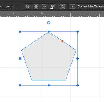
@Roger Lievens Are you talking about the Cycle Selection Box button that reveals a selection box that is tight to the vector object? See attached screenshots.
-
@Flaz The short answer to your question is to go to the menu command Document > Convert Format/ICC Profile ... , then select the CMYK/8 Color Format category, then select the CMYK color gamut profile recommended by your printer. In the U.S. the most common default CMYK profile is U.S. Web Coated (SWOP) v2. Finally, click the Convert button.
- 35 replies
-
- 1
-
-
- affinity photo
- convert
- (and 2 more)
-
@James Ritson Very grateful for your excellent tutorial videos. Having just watched the episode on Zoom Blur, I'm reminded to request that a layer icon be applied to those layers with Blend Options applied. Either that, or that the Blend Options be made part of the Layer Effects group so that an "fx" layer icon gets applied when Blend Options are applied. It would be helpful to the user (especially when a file is shared in a group workflow) to identify which layers are being affected by Blend Options. Thanks.
-
Affinity Designer does not offer support for true vector brushes where the brush tips are actual vector shapes. However, you can create a greyscale PNG file with a circle shape, and import that into a custom brush that can be colored. See the attached image showing how to configure a custom Textured Intensity Brush based upon your own custom greyscale PNG. I guess the other alternative, if your just after regular dotted lines, is to work with the dash settings for Strokes. See the attached image below.
-
What happened to the ability to import or place .docx text files?
-
I don't know. Maybe it is insensitive to market tools to Venezuelan designers who've been cut off from their tools and their means of expression while the U.S. Government is actively working to foment a regime change in that county. Maybe it is "unsportsmanlike" or "impolite" to draw a contrast with Adobe here. Nevertheless, I'll bet Venezuelan designers who are suddenly without tools and without access to their work would be pleased to know there's a solution.
-
@Jowday What's significant here is the difference in business models: Adobe forces one to rent tools, which is problematic for a number of reasons, arbitrary political developments being just one glaring example of how artists can be cut off from their work product and tools. Serif offers a perpetual license to a toolset. This is the point that needs to be hammered home in marketing material.
-
Publisher for iPad
Mark Oehlschlager replied to Jim Monson's topic in Pre-V2 Archive of Affinity on iPad Questions
To my knowledge, Publisher is not yet available for iPad, only for Mac OS and Windows desktop machines. This may explain the unusual message you are receiving, although it would be clearer if the message accurately explained that Publisher is not available for the iPad currently. By the way, remember that the file format for all three Affinity apps is the same, and a document started in one app can be opened in either of the other two. So, you could begin a document in Publisher on your iMac, save it to a cloud storage service like iCloud or DropBox, and then open it up in Designer or Photo on the iPad. -
@VectorCat I did not download the package of filters from the link above. Instead, I launched Photo, created a new document, created a layer group containing a placeholder shape, applied the Perspective live filter to the group, then copied that layer group and then pasted it into a Designer document. Lo and behold, the Perspective live filter came across in Designer and was functioning. I was even able to distort live text. The display rendering, however, can show some blurry anti-aliasing. In addition to using copy and paste to move a layer group from Photo to Designer, you can also save your Photo document and then open it in Designer. As another alternative, from within Photo, you can also select the menu command File > Edit in Designer... (Remember that the file format for all three Affinity apps is the same.) One crucial live filter that is missing, however, is the Mesh Warp. This is the filter you would need to convincingly warp art and text around cylindrical forms like bottles and cans.
-
If you're working strictly with Affinity apps, probably the best workflow would be to use the Perspective and Mesh Warp tools in Photo, then manually trace the results in Designer for a vector shape. Not ideal.
-
Color Space is explicit and clear. Neither Pixel Format nor Vector Format would indicate anything about color to the user.