Jowday
-
Posts
2,109 -
Joined
-
Last visited
Everything posted by Jowday
-
Then I can tell first time visitors that they are gonna loooove the divide blend mode and the export preview in release 1.9 👉 Ridiculously easy method to remove colour casts with divide blend mode Removing colour casts from photos is probably the most common task in a photo editing workflow - so this blend mode is a great helping hand. Next step for Serif could be to built in right into some "Remove colour cast" tool - making it even easier to use. Build a UI for it.
-

Add Background Color to Page
Jowday replied to user099's topic in Feedback for Affinity Publisher V1 on Desktop
In this case I would personally prefer to make a coloured rectangle and then set the "do not print" attribute on it. It is was possible. Or even better have a "simulate paper colour" option. Make it clear to the user what the feature does and what scenario it should be used in. -
Add Background Color to Page
Jowday replied to user099's topic in Feedback for Affinity Publisher V1 on Desktop
Wouldn't you get that reminder from changing the default color from white to say grey, manually, as a layouter? -
Could you also share the PDF output from Publisher like you did with the InDesign PDF? There is indeed the possibility that Publisher does something the wrong way.
-
Add Background Color to Page
Jowday replied to user099's topic in Feedback for Affinity Publisher V1 on Desktop
Yes, it is a little peculiar that you can tick 'Transparent background' but not configure the page color if you don't tick it. It is a little half baked that you cannot change the default white now it is there and used by the program anyway. I would prefer to be able to set the background color here (and/or) from the swatches panel like in InDesign. You don't have to use rectangles on ALL pages though; configure one on the master page(s). -
Smells like a regression in 1.9. Serif will probably ask if you can share an example file for investigating the problem - if the problem is not already known to them. Please have one ready - it will speed up the proces if it is indeed a bug (and it looks like it is).
-
Para style for first lines
Jowday replied to pcdlibrary's topic in Feedback for Affinity Publisher V1 on Desktop
It (line styles) is actually a pretty nifty feature in Adobe InDesign: https://creativepro.com/line-styles-indesign/ -
Sigh. Generalizations like this doesn't make the world of 2021 a better place to live. Or make Affinity a better product. Or give Serif more insight into market demand, scenarios, use cases, marked trends, regional differences etc. etc. etc.
-
Affinity Designer: No noise
Jowday replied to Pyanepsion's topic in Pre-V2 Archive of Desktop Questions (macOS and Windows)
They are both right this time. But different programs. 🙂 For starters, the noise algorithm in Designer is different, I believe. So you wont get that coarse harsh noise in Designer. The noise algorithm in Designer builds a finer grain and I hope Serif will add other types of noise in the future. So... tutorials for Photoshop are better suited for... Photoshop and for general inspiration. In this case you can achieve the color and transparency effect in different ways but could add the noise using some pixel brush with low opacity or even better using a bitmap layer with the desired texture under the shape. That will give you the freedom to separate the texture and noise from the FX meaning you can adjust its strength separately. -
I kind of did - but took a closed look at Designer and re-read the original posts. 🙂 I would still prefer the colour to have a hint of blue in it. But very subtle. Blue still represents “selection”.
-
Affinity Designer: No noise
Jowday replied to Pyanepsion's topic in Pre-V2 Archive of Desktop Questions (macOS and Windows)
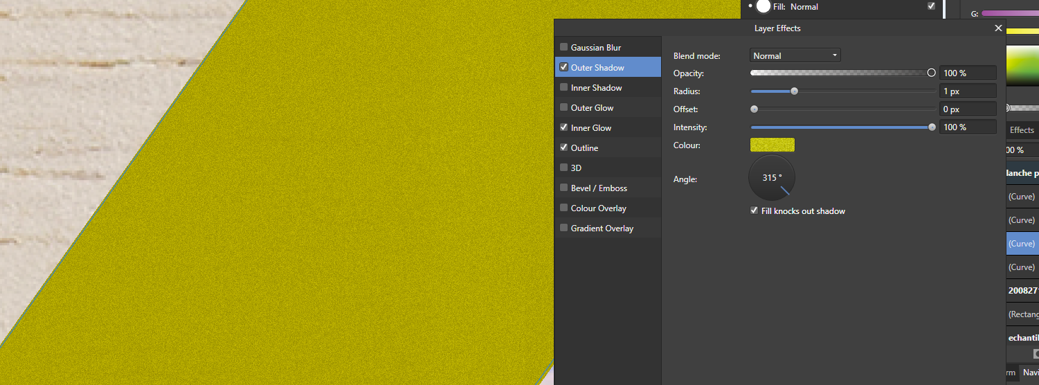
It is there but not before intensity is almost maxed out and opacity gets closer to 100%
-
blurry png exported
Jowday replied to josev's topic in Pre-V2 Archive of Desktop Questions (macOS and Windows)
I feature requested output sharpening in Affinity a short time ago. Otherwise all I can suggest is: -
Boolean "Merge" Tool Please
Jowday replied to Boldlinedesign's topic in Feedback for Affinity Designer V1 on Desktop
Merge is in illustrator a "pathfinder" - an easier way to perform several steps - than all manual: The Merge pathfinder is similar to that of the Trim command when applied to two multicolored shapes. When applied to three shapes, two of them being the same hue, the Merge action joins the two yellow shapes and trims the outline of the other blue polygon. In a professional setup where time is money and the shortest path is always the preferred one such features are greatly appreciated - not to mentioned understood. Such tools are invaluable when working on huge illustrations/project where the user makes many, many, many adjustments and shapes. It is also totally meaningful that the software takes many operations out of the workflow so the creative can focus on being creating. Not focus on moving bricks around. The whole point of using a computer is that such tools and features can help and assist the user. We need more than tools like glue, knife and scissor. A computer can combine their work into one single TATJING. It seems that these features comes at a premium price in other products, though. Fine. I have the premium products too. But they would make sense in Affinity as well. To me at least. I fooled around enough with scissors and glue in First Grade. -
(Especially) if Serif use the opportunity to re-think some workflows and to add some of the often requested features to especially Designer - and of course add more in the coming minor updates towards 3.0 - I think I can say that quite a few are standing by with their credit cards thinking "We want to help" 😀 If 2.0 is just a another minor step like the last many updates I'll wait - but a significant step up from 1.x to 2.0 would of course justify a paid upgrade. Nothing else would make sense. 🙂 And after listening to quite a few passionate fanboys arguing for years against new features, improved usability or higher ambitions in the 1.x lineup they can even stick to 1.9 and never look forward. Win win!
-
Fundamental concepts and faster horses…
Jowday replied to a topic in Feedback for the V1 Affinity Suite of Products
Another ridiculous, pointless comment and another self-humiliating sad emoji from you. But this time you really made it clear that you do not understand a thing. Obviously you are isolated from where the action is in the corporate world. And the rest. What is the point with your emoji responses and anti anti anti posts? You have to know something to say something. You are not contributing. Just making pointless noise. Serif can't use your noise either. Any progression requires input, discussion and often someone opening the window pointing at the the new trends. Figma is all over the place out there and many other new tools as well. I am involved in two huge projects now - HUGE - involving many specialists of whatever kind. Microsoft Project, Visio, Adobe CC and certainly Affinity... hahaha... is not involved in any way. Nor mentioned. Not even when we get SVG's. We do have licenses for them. No, a lot of tools that support workflows, teams and teams from DIFFERENT COMPANIES to work together and share live during Microsoft Teams meetings are dominating. They replaced software used for decades in a few years. Simply because they support workflows: every kind of workflow, not just sharing or working on same document live. But also creative workflows. The biggest hole humans ever digged for themselves is the one you are sitting in and staying in, @haakoo and people like you were demolished and forgotten again and again by creative destruction for as long as there were humans on this planet. And you are inviting Serif to sit with you down there in the hole believing that makes you a friend and partner. This is the last comment on you and your posts I will make. EDIT: And now - like before - the kid will add laughing or sad emojies to my posts like a 5-year old. -
Yeah, kind of. 🙂 Two colours... Not if it causes confusion - or is difficult to see. In this case often very difficult. We are not supposed to provide the solution; that is what a user experience designers are for. In this case Serifs use of colours is certainly not non-standard though. The contrast ratio is just too small. So we are dealing with a usability issue caused by a classic accessibility issue; too low contrast for they eye to decode or identify something clearly.
-
Yep - but that is how it was made by Serif. Not how it should be.
-
Select sublayer, collapse the lentire ayer, Windows dark theme (Windows and Affinity): Okay easy to identify in this microscopic cutout - but not on the entire screen with many document and ui elements visible: Notice the swatch and layer panel side by side - inconsistency - one selection is blue and another not.
-
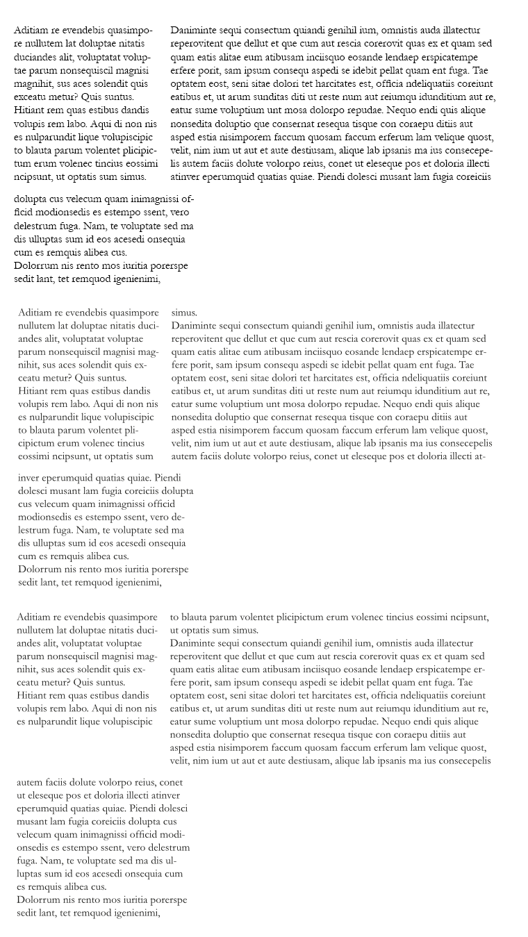
Just a quick unscientific example of how the paragraph composer in InDesign CC 2021 helps with its even most basic default settings. The document was quickly created in InDesign without any tweaks - just default settings. Then saved as IDML and opened in Publisher 1.9, beta 452. First row InDesign Second row Publisher, default settings, as is Third row Publisher with "prevent widowed first lines" ticked 1. Notice the tightly composed and well balanced boxes of text (inDesign) 2. Notice the widowed first line in second box (Publisher) 3. Notice the sudden white blank area in box one bottom part - entire lines moved - no balancing of content performed (It looks horrible) (Publisher) You can waste half your life tweaking, fixing and "debugging" layout in simple or buggy software. I retired PagePlus and skipped Publisher for some minor documents made in a professional context (I used PagePlus just to try some other programs and add spice to my work life). Ten years later I just haven't got time for unnecessary tweaking or software shortcomings. Publisher is not a candidate for my work until it actively helps me. Deadline close, knee deep in minor issues like 2. and 3..... no thank you. Never again. So before Serif makes their own paragraph composer engine - I'll pass on Publisher. But I cannot imagine they won't. I would be delighted to participate in the work if I was them. It is not just adding buttons and straightforward to understand features to the product. Trying to add aesthetics, balance, automatic solving of classic minor issues and "layout wisdom" to software sounds more interesting than much I have tried and heard of for a long time. And... it can really really be seen when it works. Pages just look... natural. Pleasing.
-
Yep - this is a rudimentary usability scenario: no input data changed in the end whatever the user actually did - no action needs to be taken. Many modern programs make this check when you change content and edit it back (not undoing). There is simply no need to save. Otherwise: Unnecessary action is taken by program code The unnecessary action taken by program code can lead to confusing scenarios like this one (that is why you never want code to run without a reason, you can't predict everything that can and will happen either) The terminal and computer as a machine days are over 🙂 The machines work for us now.
-
https://www.rockymountaintraining.com/adobe-indesign-whats-the-difference-between-the-single-line-composer-and-the-paragraph-composer/
-
I hope they have just a few solid ones. They should have a lot of experience and knowledge and algorithms from the companies 25 year long history and from PagePlus. Not backing from users. Customers. Existing and potential. Supply and demand. If there is a demand out there - Adobe will know - users will seek the features where they are. Not sit and refresh this forum.
-
Divided or Sliced Portraits
Jowday replied to Digbydo 2's topic in Pre-V2 Archive of Desktop Questions (macOS and Windows)
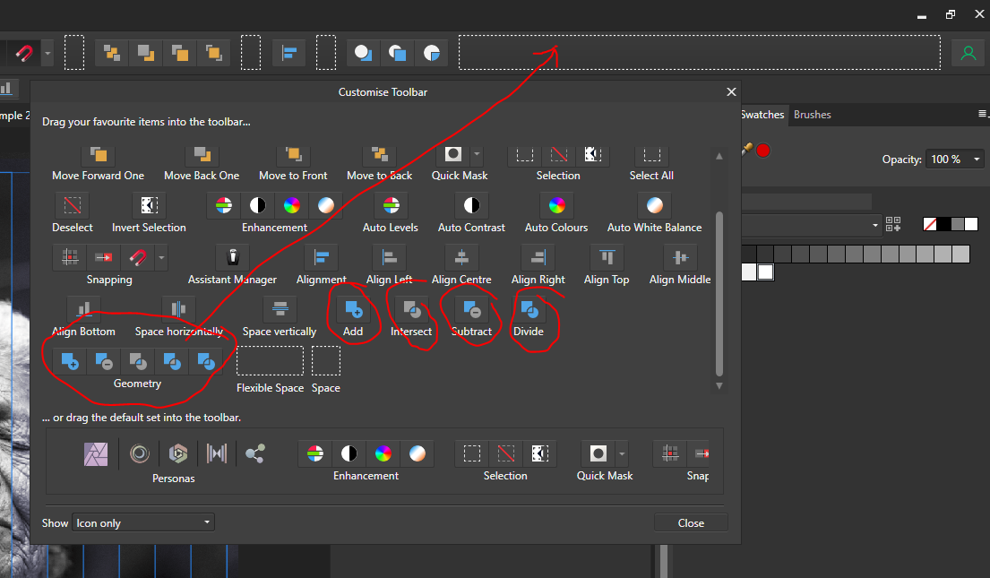
When working with the vector shapes (rectangles, whatever) you may want to use boolean operators on them. Boolean add or subtract. In Photo they are not available on the toolbar unless you right click it, choose 'Customize toolbar' and drag the Booleans (Geometry) group to the toolbar.