
woefi
-
Posts
410 -
Joined
-
Last visited
Everything posted by woefi
-
the statement reads as "nothing changes regarding v2" (pricing , licensing, updates) ...until the next major version (v3?) is released. So, we are maybe one or two years safe?
-

Questions on Canva acquiring Affinity
woefi replied to kaffeeundsalz's topic in Customer Service, Accounts and Purchasing
Joke or scam, but definitely not real. -
Photo v2.4 Screen Glitches and Abnormalities
woefi replied to rcsilber's topic in V2 Bugs found on macOS
curious if there is even a difference between your beta (which there were two release candidates) and the actual release version: Could you check the "build number" of them both? (under My Account) release build: 2.4.0.2301 last beta (RC2): 2.4.0.2301 This would mean, it would have to do with other parts of your system, maybe corrupt preferences? Did you also wipe the preferences before reinstalling Photo? -
DWG and DXF Export
woefi replied to Ash's topic in [ARCHIVE] 2.5, 2.4, 2.3, 2.2 & 2.1 Features and Improvements
Although this is off topic in this thread, I say I would appreciate this addition... -
Ce n'est toujours pas une pipe...
-
I think, it would be necessary to differentiate what kind of AI you (or the OP) mean: I'm not entirely sure I need an image drawing robot (except maybe a bit of picture extension in AfPhoto when you just need a little bit more room going from landscape to portrait...) But I would really benefit from workflow additions powered by AI, like: finding missing linked images when the image folder was just moved a little in the file system's hierarchy (AfPub) repeating tasks already done several times (working with multipage documents or complex illustrations) and so on... Computers have always been an artificial extension of our drawing hand, and to get work done more efficiently so you can concentrate more on the "creative" side of your work. (I definitely don't want it to hallucinate anything I can dream of by myself)
-
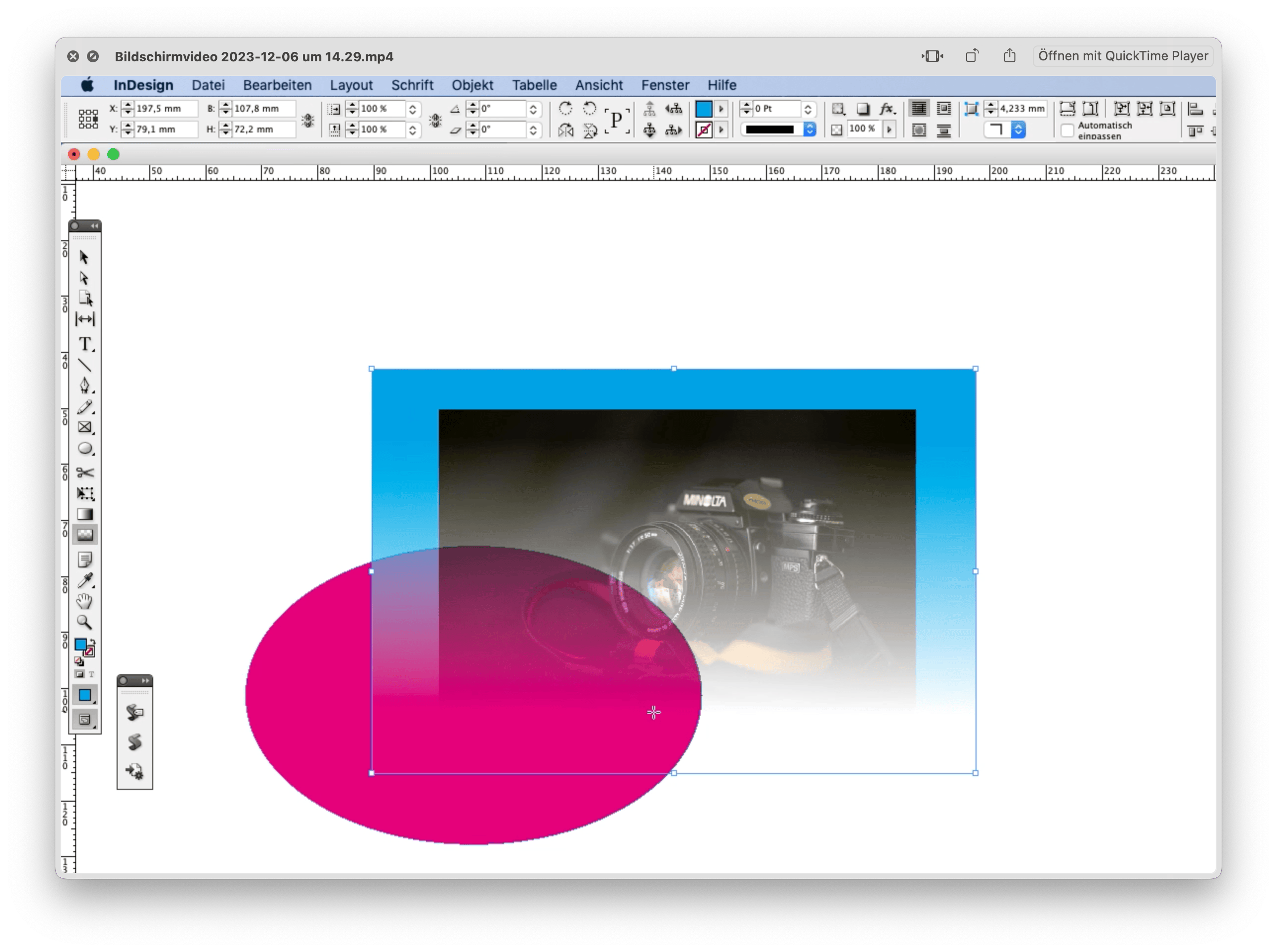
Transparency Tool and Photos Inside Shapes
woefi replied to bobbybosler's topic in V2 Bugs found on macOS
Or is it? Bildschirmvideo 2023-12-06 um 14.29.mp4
-
'Move by Whole Pixels' doesn't work when option-dragging
woefi replied to Hicksdesign's topic in V2 Bugs found on macOS
Thanks, Walt! I just realised, I was always "cloning it wrong" because I ALWAYS used <option>, like in my old Illustrator days 🤯. Strangely it always worked, but as you explained it also disables snapping and so you had to release <option> midway and this always felt incorrect. So now that I know to use <CMD>, it was the first time in 5 years of using affinity apps, that I saw it behaving just like <option> did in illlustrator. (mindblown...) -
"mind the gap" toolbar 🙃
-
Wow, thank you! I always looked for this in the "edit colour" box... EDIT COLOUR looks the same as CREATE COLOUR but without the overprint checkbox why would they hide it there?
-
Absolutely! Normally I would have completely ignored these overprinting colours and would have instead requested adding the missing feature "set object-based overprinting to fill or outline" but... I see the long list of things I want to be added to the Affinity apps (just for feature parity with Adobe CS5 in terms of print production) and then I restrain myself and accept that it will take them a little bit more time to get there... (I am very confident, though, as the Affinity team is at least very transparent what they are currently doing.)
-
What is still not possible, yet: To set/unset a colour to overprint _after_ it was created.
-
macOS file preview
woefi replied to ronnyb's topic in Feedback for the Affinity V2 Suite of Products
I too, would like to see better support for macOS's QuickLook Preview function. Maybe it shouldn't be a pixel preview but instead a crude, lowres, PDF version? Whatever is technically possible... I'm not sure I know any such examples (as I don't use modern adobe apps for comparison). Anyways, here is a link to Apple's developer documentation: https://developer.apple.com/documentation/quicklook- 1 reply
-
- 2
-

-
Set default palette Affinity Designer
woefi replied to Federicocentrocopie's topic in V2 Bugs found on macOS
I think this is not a bug per se, it's just "as designed" at this point... But, I too, want the app to: A) preset a custom colour palette, the app should start a new document with (and pre-define it in the templates) B) have the app prioritize an existing document palette (which was saved in the AfDesigner/AfPub file) Use cases would be: (A) Starting a new screen design (Banner/Website/Icon) it uses MY predefined palette of (global)RGB colours, maybe called, say "Webdesign RGB". (A) Next, when creating a business card for my client XY, I choose the corresponding template and change the colour palette to my predefined "Client (XY) CMYK" (B) And every time I re-open these documents, the right palette in the swatches panel is already pre-selected so I can work right away. -
Good catch! My old Acrobat Pro (v9) does not display this info Can you repeat this with AfPublisher if you have it installed? I'm beginning to think it may indeed a localisation bug (german) in AfDes but is linked to the system language not necessarily the program language.
-
I would like all to be specific in which program the error occurs. I'm still having issues in Designer. Publisher is now (mostly) fine. So Yesterday I had to quickly export a Print PDF from a Designer document and the resulting PDF did wrongly include "US Web Coated whatever" instead of the correctly set "Generic CMYK". So when you checked it in Adobe Acrobat you saw that all the colours were cross-converted (0/100/100/10 became 3/96/80/5 or something like that) My Workaround for now is to finish the job in Designer and then open the file in Publisher just to export the PDF for the offset printing firm. (Most of my print jobs are Publisher files anyways... I use AfDesigner mostly for logos and info-graphics, which I then link in AfPub)
-
Maske mit einem weissen Pinsel bearbeiten geht nicht.
woefi replied to Dirk_Vau's topic in V2 Bugs found on macOS
eventuell: Mischmodus: Multiplizieren? weiß multipliziert nicht... -
@Johannes FYI: I think I found some sort of fix: (your video shows the english version but your name suggests that you may be german speaking?) Prerequisites: This was not a fresh install and I had several betas installed this year (I think it has to do with the preferences) I had my language set to "Standard" which is "german" in my operating system. I had the same problems like you showed in your video I changed my program language to "english" and restarted the app -> some things improved I changed it to "german" and restarted the app I changed it to "Standard" (which should be german) and restarted. -> Now The list is sorted right and it remembers the right profile in the document*. I repeated this for all three Apps (AfPub AfDes AfPhoto) * -> BUT: I'm still having difficulties with the MAIN program setting for the default CMYK profile: sometimes it works, sometimes it does not stick...
-
Quite possibly though it seems somewhat odd... THIS!!! If I change my language from "german" to "english" (not US, and there is no United Kingdom either...) then the profile stops reverting in Designer! ...and the list is sorted right – which is an indication that this is somewhat linked.
-
Next thing I see: Both in Designer AND Publisher if you change the CMYK profile in settings, then it always reverts back to US Web Coated SWOP after closing the app... Man...this gets weirder... I have to downgrade back to 2.1.1, I have real work to do...
-
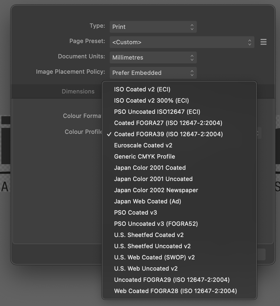
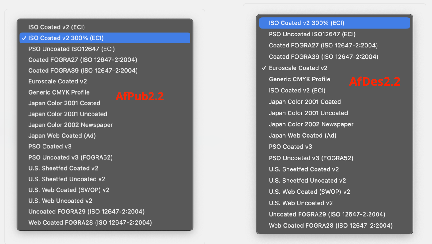
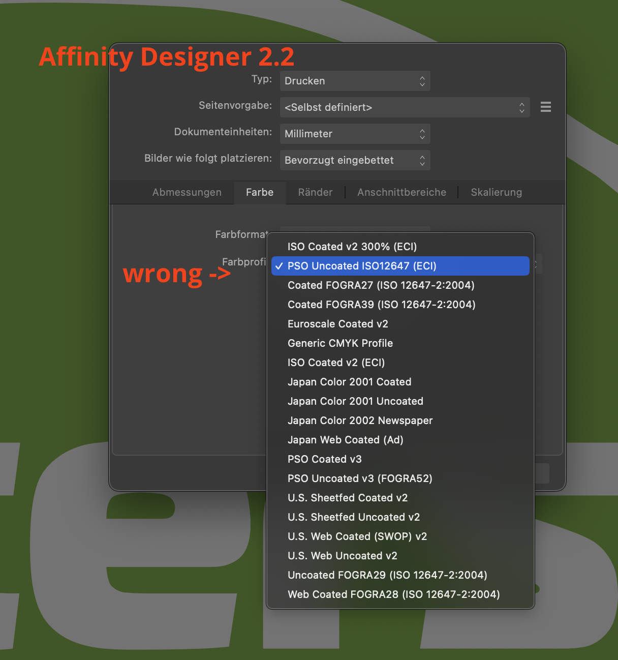
To clarify: The bug seems to be in Designer 2.2 mac the ICC-list "Text" does not match the underlying list "objects" the second from above in Publisher corresponds to the second from above in Designer, but is labelled differently to me it started with a project using "ISO Coated v2 300%" right after the update. edit: maybe a localisation bug just for non-english versions? I'm using it in german.
-
is this Designer or Publisher? (Note: it is working in AfPub, the problem is with Designer)
-
Designer 2.2 : Transparent UI Element when no document open
woefi replied to prophet's topic in V2 Bugs found on macOS
-> Obviously you are not seeing the video but instead just a still picture. Are you browsing on Windows? Seems to me that some browsers have problems playing videos from MacOS screenrecordings which are usually ".mov". I usually drop my screen recordings onto Handbrake to convert to MP4 before posting here. Just to check on this off-topic forum/video-issue: Are you able to play the video in this linked bug report: -
What I'm seeing is: Affinity, Publisher works right (and has the list in alphabetical order) Affinity Designer doesn't work (and the list is not sorted properly)
-
Yes, today I totally ran into this trap when I tried to "quickly finish up" a 99% done job which was a leftover from yesterday... As it turns out after tearing out almost all my hair: AfDesigner has a problem with the list of ICC-Profiles. It displays them in the wrong order. So behind the curtains it selects the one underneath. AfDes22 2023-09-19 um 17.22.20a.mp4