Wosven
-
Posts
4,130 -
Joined
-
Last visited
Everything posted by Wosven
-

Export with bleed
Wosven replied to Kris123456's topic in Pre-V2 Archive of Desktop Questions (macOS and Windows)
I'll repead myself again: but it's usually small modification about 1 option you usually do, so it's easy to check, or if it's more important modifications, you save it as a new preset. -
Sometimes, it's difficult to determine if "What looks good is simple" = minimalist design, or if the option was "What is good is fast" = minimalist design. Awards are about the content, not the design, and it's normal for texts. Or editors wouldn't be able to choose good texts from manuscripts or poorly formatted .doc
-
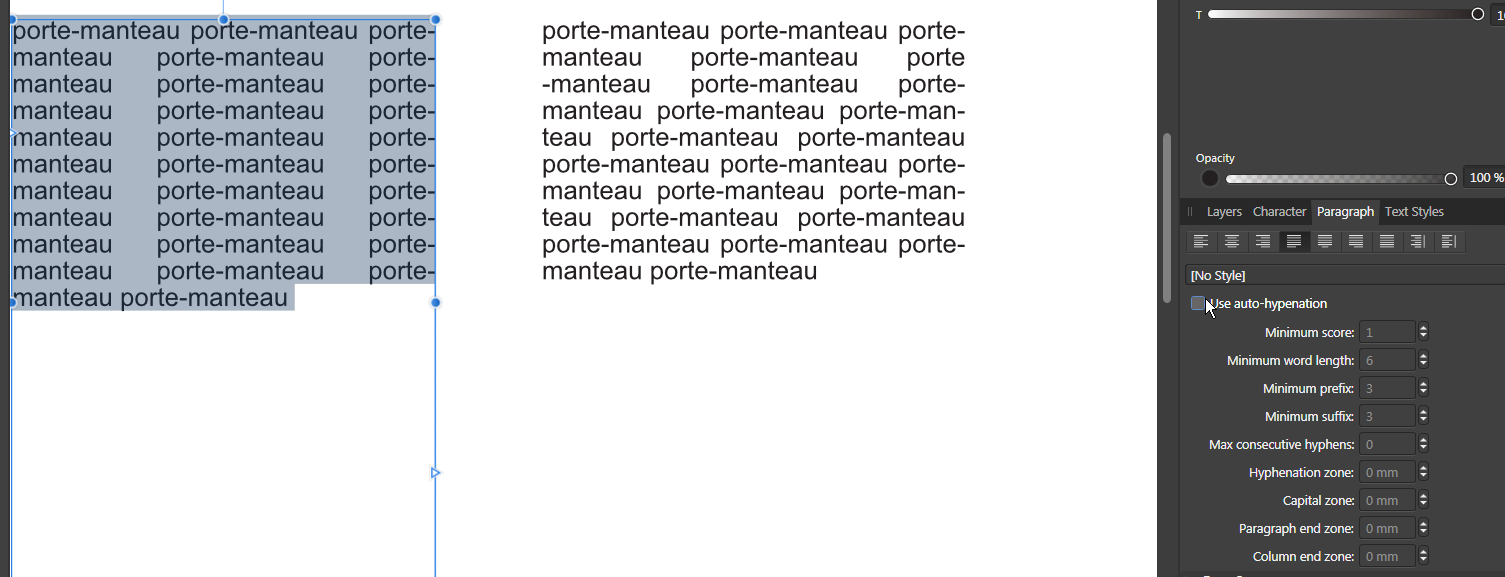
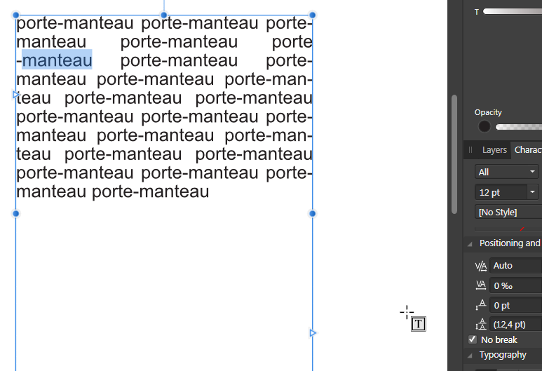
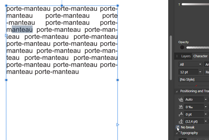
In CSS, you have no wrap (white spaces property) and no hyphen options. It would be nice to have the 2 in our layout apps or more options in the Hypention settings, since "no break" seems similar to "no wrap". In French, we have a lot of compound words, and the CSS hyphen: manual option for them would be usefull, instead of manually using "no break" on the characters (and not the hyphen itself/themselves). And APub doesn't seems to work like ID, the previous character before the selected ones on which you applied "no break" isn't breakable too, so you need to select porte-manteau instead of porte-manteau. No hyphenation in the paragraph style = CSS Hyphen: manual (Default. Words are only hyphenated at ‐ or ­ (if needed)). With Hyphenation enable: If we select a full word, the precedent character get the propriety "no break" too (the hyphen character in this case): What we need to do to get the expected result: I don't know if I should report this as a bug because it's different than other apps…

-
Export with bleed
Wosven replied to Kris123456's topic in Pre-V2 Archive of Desktop Questions (macOS and Windows)
It's simple: you usually save many presets depending of your different workflow. (1) To not clutter your presets list with variants you only use few times, you won't save those variants, that can be simply the option "all pages" set to "all spread". Depending of the stage of the document you're working on, you know which preset you 're using (for example in the beginning stage lower resolution and no bleed, no marks when sending PDF to clients and copyeditors, at the end print ready PDF with full resolution, bleed, etc.). It's logical when you export again your document at the same stage, to know which preset you're using. There are few ocurrences when you'll modify this preset (for example export to spreads for book covers or for small pages documents). You always do the same modifications for this type of documents but (1). It's important when you export again this document—and you can do this many times in a day—, to have the name of your modified preset instead of a blank name, and be able to check in a glance that it's set for example to spread instead of pages (the usual modification you would do to this preset at this stage for this type of document). If all is what you expected, you only need to export. In doubt or if it's not the preset you want, you reload the needed preset, do if needed your modification, and export. The important part in this is to be able to read the name of the modified preset. There are 2 ways to know which options of this preset are modified: you know all the settings, and can check in a glance which was modified. The app can append an "*" or underline the ones modified (it would be nice). When exporting many times a day the same document, it's most than usefull, it's a time saver. -
Don't you have a frame or rectangle on this page with a border that would show in the bleed area when it doesn't cover the full page from bleed to bleed?
-
Export with bleed
Wosven replied to Kris123456's topic in Pre-V2 Archive of Desktop Questions (macOS and Windows)
Usually, you save your most use presets and use them each day. When you modify one, it's mostly for a specific task, as for example in ID exporting to spread when exporting covers. Since it's a rare occurrence, it's easy to check this parameter when I'm using a modified preset if I'm exporting a cover (I don't want to save presets variant "all pages|all spreads", I've got enough depending of papers, web options, etc.), and if I'm not sure about the modified settings, I reload the original and unmodified preset. That's straightforward and an easy workflow. But it's important to get the original preset name append with "modified", since in the same day you can export for different purposes and slighty modify a preset (spreads|pages, lower resolutions for web PDF when asked for maximum size, etc.). Having the original preset name (+"modified" or "*") prevent you to reload the original preset and do again the needed modifications when exporting the same file more than once. -
House can have a good reputation for choosing books and making nice books respecing most of the typographical rules, but it doesn't means they do the best job all the time. For example, a few years ago, the printed version of a book that get a great prize in France had an digital version in which the last typos weren't corrected, (and some in the printed one), and some team than provided illegal digital version had a cleaner version without typos. Usually, they do better, but not always. It's when looking at details that you can see the quality. I've got older pocket books with better formatting that today's paperbacks, with finesse in the final product, like french ligatures. Years ago I stop buying poetry since the last 2 books I bought from the main editor for this sort printed on bad paper where the character were barely visible… This same editor print perfect hardcover books.
-
I don't know in other countries, but we have examples and books with rules from the Imprimerie nationale, and there are lot of old or more recent ones (with computer era) about the best way to make books, since a lot of old printers tried to establish rules or give advices, the same way as spelling and grammar do. Some books are references, and you can learn the rest from more experienced ones or now, roaming Internet that is a good place for. There's specific rules for scientific or research editions, for example, in which there's a lot of footnotes and references, and they need specific datas and rules. There seem to be rules for historical books with references and a lot of quote frm other books, and quote in quotes, for poetry and for theater play, etc. Even for cooking recipes, since there's always a similar pattern depending of the theme. I'm sure they didn't print from scratch and use rules they take with them from Europe. Most big newspapers have their how internal chart of rules for spelling or displaying some specific informations, for the copyeditors to adapt texts from authors so today's edition feel the same as yesterday's one, etc.
-
It's because books are made of booklets (the number of page you get folding a piece of paper), and those booklets can be of 8, 12, 24, 32.. or even 48 pages. On larger books, you keep the white pages at the end if the number of pages printed isn't a mutliple of the booklet ones. Sometime, you'll have to fit the text in a specific number of pages (the maker—fabricant—will have agreed with a printer a cost for the book depending of the paper, the way the cover is made, colour or black, etc.). With luck you'll have extra pages and can do a nice work, or you'll have to do your best to fit the text in… with smaller margins, smaller text, etc.
-
Our majors or older publisher try to keep those rules, and it's always a pleasure to look at those books. Some smaller editors do nice jobs too with their books. The lower they get, the lower their results. It's sometime a pain to read a magazine or a book when you want to take a pen and write down corrections you want to give te one who did the layout… or because the paper quality and printing is low. It usually depend of the budget of the client too. We can have time to do a nice job, or we can print PDF made by clients, and those are worst. Last time I did this with PDF for English, Spanich and French versions of the same text, I should admit the quality of the text formatting was in this order. There's nearly no education about formatting text in France, when we can have really good texts. It's a shame that teachers don't know better but spelling and grammar. It should be like for food: presentation is important too.
-
Books are different than articles, where you can rewrite and shorten text to fit the allocated space. You run text of a chapter from the starting page, usually not beginning at the top, to the last one that should be fill with at least 1/3 of text. End of chapters' page? The rule is to have at least 1/3 of the top of the page with text or more, or try to fit the few remaining lines, if they are less, in the previous pages. And have the chapter's opening pages on a right page. If you're talking about the special 1000+ pages book, the end of chapter text frames were aligned to the top. I'm not sure why this book was made this way, but since the client asked a really low price to remake this book, I suppose it was made like this in the beginning for not spending too many time on it. For now, the project is on stand by, I didn't get the text to play around.
-
Usually, you always have the same number of lines per pages, and text is align to the grid, not vertically. It flows better with long paragraphs, and need some work when they are short. By transparency, you should be able to check this in a book (same amount of lines). Last time, with a book with shorter paragraphs, I use a new layer with a colourfull rectangle on the bottom margin that I can display/hide easily on all the pages, to check that all pages had lines to the bottom, since modifying text can be tricky if it set to no widows and orphans. The only book I saw with vertical align was one of 1000+small pages, and the trick was to set a really small leading (±1/4 of the character usual leading, for example, if the character was set to 12 pts, the leading was set to 3 or 4 pts). There were few lines per pages and a small space between paragraphs too.
-
affinity designer AD Scrollwork on iPad Pro
Wosven replied to EngraverHand's topic in Share your work
Yes, really nice work and video. What is this soundrack? There're sounds so high it's painfull to hear, most are at the begining. -
Affinity photo: Divide blending mode
Wosven replied to joconnell's topic in Feedback for Affinity Photo V1 on Desktop
-
If you find it…
-
Affinity crashes always when opening pictures or templates
Wosven replied to Kons's topic in V1 Bugs found on Windows
Did you installed the latest drivers? -
Infos panel not acrive when opening an APub file
Wosven replied to Wosven's topic in [ARCHIVE] Photo beta on Windows threads
It's working fine in the last bêta ! -
It would be usefull. If you've only got 7 colours to find, you can do it manually, with a rectangle containing your colour, and another one half on it on which you test Pantone colours…
-
Should I buy designer
Wosven replied to Deathstrokexp's topic in Pre-V2 Archive of Desktop Questions (macOS and Windows)
With APhoto you'll mainly use pictures or brushes for painting. With ADesigner, you can use brushes too, some give a nice paint effect in the vector brushes panel, but mainly you'll use vector. It's a different way of thinking and building your work. I came from old school with real paint and brushes, and it take me time to be at ease using vectors (it should be perfect from the start, or nearly, you won't put a lot of strokes to correct some curves as you would do with paint or pencils). But it can be interesting, and can lead to completely different work, since it's another way of thinking. The second of your drawing can be done with vectors, for example. You'll use curves and have an easier way to modify them using the handles of the nodes, for example, being able to add and modify strokes, etc. -
Ahhh… Memories. I really love Vermeer and this painting. Student, I did a copy with dry chalks on a piece of cardboard (there's a bit of Scotch at the bottom right and we can see where it folds) and on my drawing board (carton à dessin) with oils but I can't find this one, perhaps I gave it. At the time, I didn't wanted to spoil expensive paper doing tests…
- 13 replies
-
- 6
-

-
- composite photo
- street art
- (and 1 more)
-
Should I buy designer
Wosven replied to Deathstrokexp's topic in Pre-V2 Archive of Desktop Questions (macOS and Windows)
Hi, We're not here to sell the apps but to help you if you have difficulties with them. If for now you can't find any reason to use Designer, and the demo version didn't convince you to buy it, don't. Perhaps later, you'll want to use it for a special project and buy it and get fun using it. You can also look at the art made with it in the forum or on https://affinityspotlight.com and decide you want it to try new ways to work. -
For more flexibility : Add a fill layer and sample the colour you want Add an invert layer above Group those 2 layers Put the group in mode Colour Dodge This way, you can add a mask if needed to lessen the effect on some parts of the image and modify the fill layer colour*
-
I like this easy way to edit a template, but we could have a second option "Open as new" with the right-click menu on Windows (and perhaps on OS X).
-
The problem is the macros use the result of formulas, instead of memorizing the formula to be able to apply it to other images.
-
It would be usefull if some parameters were saved in the file instead of at the app level: original folder folder for save as folder for export print/export settings (to not have to enter again list of specific pages and this damn option "all pages" instead of the "all spread" that is only used 1% of the time) … If the path doesn't exist when the file is on another computer, it can revert to defaults.