Wosven
-
Posts
4,129 -
Joined
-
Last visited
Everything posted by Wosven
-
 You can test it with those files: Logo.afdesign is the file with the logo as symbol (be carefull with the artboards, A4 is correct, the other ones dimensions aren't!), and it the one that is linked Presentation.afdesign is the presentation file where the file Logo is placed and linked. Logo.afdesign Presentation.afdesign
 -
Creating a palette won't give spot colours and the colours will be names "Palette 1", "Palette 2" instead of their real Pantone names. The objects wont have those colours applied.
-
I'm in luck today, I wanted to find a video about this, and the option is visible on the first page! Once you have selected your stroke(s), use this "Expand stroke" option, and to merge them, use the "Geometry > Add" option.

-
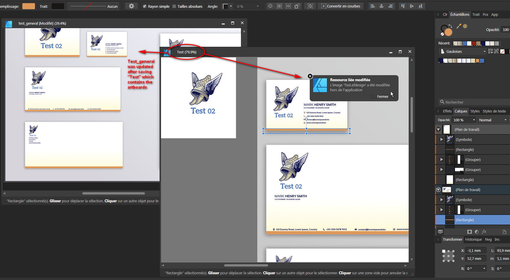
It's not what I understand. They want to test aternatives with different fonts and texts. And depending of this, perhaps they'll want to alter the drawing to fit better with the font(s). And depending the different uses, perhaps they'll need to adapt again to fit smaller sizes, simpler forms, etc. For this, using symbols and AD is better, since you can test on symbols and have different artboards for letters, business card, envelope, etc. It can be interesting to have all in AD, since it's easier to look at and move them, than looking at different size pages in APub. I used a general items view we can find on some sites, but it's interesting to have artboards as symbols too… (not the easiest to manage). If we've got APub, we can keep on working in AD and place those artboards in another document, using a trick to get the artboards as linked files that will update easily*. Artboards as symbols: Artboards imported in another file and linked via APub: It's interesting this way, since we can have different "Test" files with symbols, and a different "General" file with the artboards imported. * Trick when placing Artboard in an AD document. If you want the artoards to update when the original file is modified: place your artboards in a new document (they'll be embedded). Close this document, and open it in APub. In APub, replace them and select "linked" option, or link them using the Ressources panel. Close the document, and open it again in AD: next time you modify the original document, the artboards will be updated.
-
You can link it in a APub file or try the Symbols in AD.
-
Hi, This is my file (my brain loves problems while having coffee… sometimes it gives good results, sometimes it mess everything) TR1_stripped_down2.afpub
-
Hi, The problem with your file, is that you don't have shapes filled with black, but you draw a lot with the pen, and it doesn't keep the stroke width and effects (pressure). You need to convert some of those (expand stroke) to shapes and merge them (this last one isn't necessary, it's to have less layers and objects). It would be better too if you drew the parts that are images to have vectors, the file' size'll be lower.
-
I just modified @Lagarto's file, since it was less messed up than mine (another main difference is that the second tabulation I used was a right indent tab), but didn't add it in his file.
-
affinity designer Some logos, need review
Wosven replied to Daniel Astudillo's topic in Share your work
Nice drawing (for me it's more drawing than logo, that would be simpler and with less colours). -
How do you export work correctly?
Wosven replied to Katie20's topic in Pre-V2 Archive of Affinity on iPad Questions
Hi, This post is in the wrong forum, a dupplicate is more appropriate here: @John Rostron There's a problem with your link- 5 replies
-
- 1
-

-
- affinity designer
- issue
- (and 1 more)
-
For the other logo you only need to hide the white parts:
-
Hi, You'd better convert those fonts to curves before inserting the PDF in your documents.
-
@walt.farrell, It was mentioned as a bug because there's invisible text frames and past proved that invisible frames with text can be problematic (preflight errors). The other post mentioned being able to add text in those frames by clicking inside with the text cursor, but the frame and the text remain hidden, and only typos are visible if it's checked to display them. But creating multiple single master page isn't the solution, or do we need for a bug to have 40+ single master pages in a document when 20 double ones can be difficult enough? I asked long ago that the double master pages need to behave as single ones when applied only on a left/right page. Perhaps using something like the crop tool for visual elements and "deleting" them for text frames? Using double master pages is important to keep the symmetry of your design (and it's best done with the 2 pages visible), and if for some reason you need to move or add pages to a heading in the publication.
-
It's possible to draw and divide in smaller vector with a dot for end of line, and expand the stroke and only keep the dots, but it's a pain and long and need the numbers… Perhaps some online tools like this one is better: https://custemized.github.io/Connect-The-Dots-Generator/
-
I'm not sure, since it can be a general property for those fields, not needing to be set for each one, if I remember how Qt or other script interfaces work.
-
Nice, I had the same approach but was stuck trying to get the equation to the same level as the numbers (x). Modifying the numbers was it! (and the pining offset and borders) Using this trick, it's possible to keep text on the grid. A full exercice would be to do full chapters, but I'll keep the idea for a really boring and annoying day TR1_stripped_down_alternate2.afpub
-
It doesn't depend only of you export options but also the way you create your cover. Try to avoid Layer effects and adjustements, transparency and keep to linear or radial gradient. The PDF export options will depend of your end need (web, press ready, etc.)
-
Same here, I disable this if possible to only have the leading applied to the whole paragraph. The mouse wheel wouldn't be a problem if the fields or panel where highlighted or get a colorfull border when they get the focus. For now, I try to keep most of the options collapsed but the ones I'm working on in the panels, to avoid inavertently modifying options when scrolling.
-
Wrong key short cuts
Wosven replied to design punch's topic in [ARCHIVE] Publisher beta on Windows threads
That's why I didn't add more than ) and = (it could have been a and z or & and é (keys 1 and 2)) -
No, it's a specific set of colours, I'm not sure it's usefull since it's not in our export settings at work. APub.pdf inDesign.pdf
-
Wrong key short cuts
Wosven replied to design punch's topic in [ARCHIVE] Publisher beta on Windows threads
That's strange, did you tried with simpler keys? I choose ) and = since they are near the backspace key and easy to remember and hit while working with the other hand, for example. -
Wrong key short cuts
Wosven replied to design punch's topic in [ARCHIVE] Publisher beta on Windows threads
If you want the shortcut to apply to all the types of brushes, check "apply to all" or similar. And I always have to set the shortcuts since in French, to type a [ mean hitting AltGr+5 and ] is AltGr+).
-
For example: use a black to transparent gradient on a new white mask. The result is a complete black mask instead of black to white, when we only wanted to add black on part of the mask. And being able to do it more than once if needed. If we had modes like multiply with the gradient tool, we could do this with a black to white gradient, and mask more some parts of the mask, use radial or different gradients for effect, etc. In fact, it would be nice to have the gradient behaving like a brush, with general opacity and modes of the whole gradient, independent of the internal colours opacity, and if it would work on a mask or on a pixel layer differently than on a vector object: adding a second gradient add more colour(s), instead of replacing the previously applied gradient. It can be an option for the Gradient tool, this way, previous works done with the gradient would stay the same, or it could be use the other way if needed. For now, we have to use the brushes to try to get the same results, without having as much precision. And the gradient keeping the last use colours instead of reverting to linear white to light grey each time you select another object.
-
Gradients
Wosven replied to Pashan's topic in Pre-V2 Archive of Affinity on Desktop Questions (macOS and Windows)
The gradients could have been deleted from the palette, that wouldn't be a problem when knowing how to use the Gradient tool to create new ones and add them to the palette, when knowing how to add olours to a palette, since it's the same way. But in this case, it seems the first step to learn is to use the Gradient tool. -
Hi, don't forget to search the forum, you'll find examples, files, discussions about this https://forum.affinity.serif.com/index.php?/search/&q=calendar