Wosven
-
Posts
4,130 -
Joined
-
Last visited
Everything posted by Wosven
-

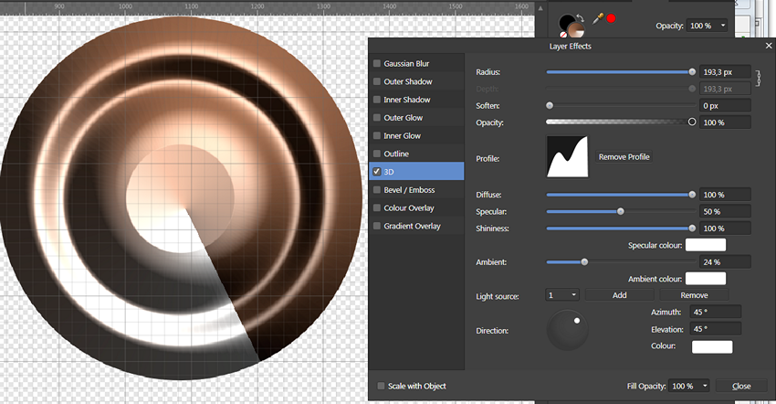
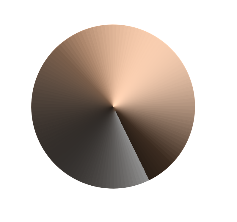
Layer FX causes banding (3D, profile)
Wosven replied to NotMyFault's topic in V1 Bugs found on iPads
Same on Windows, and unless using heavy Soften, the "plate" above is impossible to delete. It'll stay with different profiles, as if the profile was beginning applying about a third from the center. [edit] The problem with the "plate" is more dependent of the radius, but the banding is there also. And when exported [/edit]
-
Hi and welcome @anwstudiosllc, With luck, the spaces are here but it's a problem of font or other settings. Try selecting all the text and setting in the Character panel: Kerning to auto, and Tracking to 0
-
Could not identify the font
Wosven replied to photoshop's topic in Pre-V2 Archive of Desktop Questions (macOS and Windows)
Is it an old font, and which type? And did it was displayed earlier in some Affinity apps list of fonts? -
Add ability to scan directly in Affinity Photo
Wosven replied to RevTim's topic in Feedback for Affinity Photo V1 on Desktop
From memory —I don't have anymore big scanners around—, but only big network photocopiers/printers... it was a physical button (or 2 depending of model) on the beast, to scan with default settings and do the action(s). -
At least it's the snap options buttons, but I can't relate the "A" one to some icon on the desktop version.
-
Perhaps the iPad version?
-
Add ability to scan directly in Affinity Photo
Wosven replied to RevTim's topic in Feedback for Affinity Photo V1 on Desktop
Scanners can do this with a command line if apps are filled in the preferences. They can have by default buttons to scan and send by email, open by app... For this they should be connected to the PC that handle them, of course, not one dedicated partly to this and saving on a server folder, so people could access the files later. -
Since there's by design a bug with "new from clipboard", it would be usefull to have another option: "duplicate (current) document". With some choices: All layers Merge layers Selection Crop to selection It would help when needing to create a newfile with only part of the layers, to save it independently, or do some important tests without being afraid to modify definitely the original project. And it would keep the PPI and other propriety, without needing to modify the file like the "new from clipboard".
- 1 reply
-
- 1
-

-
Gradient tool overhaul
Wosven replied to phoenixart's topic in Feedback for Affinity Photo V1 on Desktop
And some other ones: If the Gradient Map Adjustement Layer and the Gradient Overlay Effect could pick gradients from the ones saved in the Swatches... -
Gradient tool overhaul
Wosven replied to phoenixart's topic in Feedback for Affinity Photo V1 on Desktop
Different need about this tool: Also, if the gradient tool could pick Foreground and Background/Stroke colors as default, it could be handy to create easily gradients/fills It would help in this situation too: -
Long ago, it was asked to add a Rotation/Angle field in the Gradient panel. With such value locked or not, it would answer your problem. The angle value already exist in the Effect version of the gradient, but it can't be locked.
-
@Pšenda, funny thing, I usually use rectangle inside and you outside, but same principle, and fast.
-
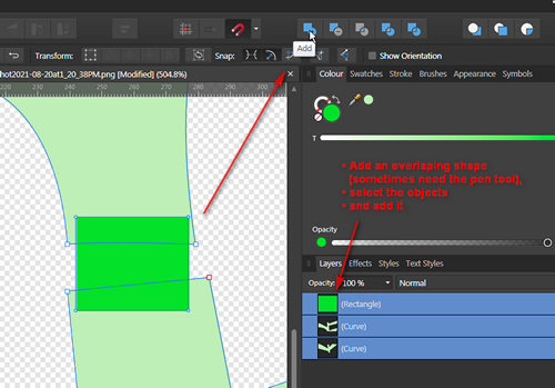
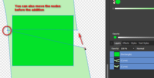
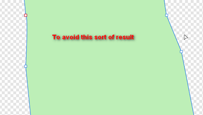
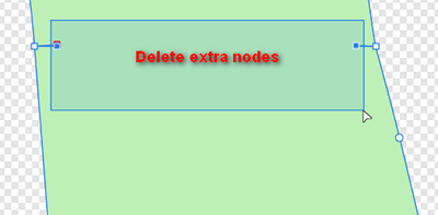
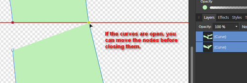
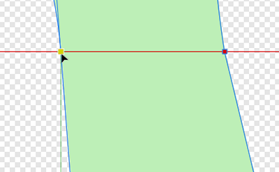
You can also avoid opening the curves: Add a third shape, with the pen tool if needed, and add them. Delete extra nodes You can also move the nodes before the addition: Or, if the curves are open, you can also move the nodes first, before adding them:
-
Merging layers causing blurring
Wosven replied to mrpixel's topic in Pre-V2 Archive of Desktop Questions (macOS and Windows)
@R C-R I had fun today reading the beginning of this thread and your replies that said nearly the same as I was writting in those previous posts. I had no time to read a lot, but it's funny. -
Create new documents: only portrait presets
Wosven replied to Oval's topic in Feedback for Affinity Designer V1 on Desktop
It's a bad example. Any app will keep the brush selected, whatever the modifications you apply. If you want to memorise those modifications, you usually create a new brush. It's similar to real painting. Depending of tilting, angle, medium used, the same brush will give different strokes. But in the end you've got the same in the hand. Brushes aren't selected in Affinity apps because they decided internaly to not used objects, but some sort of Pipette everywhere (but for paragraphes and characters styles). This means that when memorizing a brush, a style, etc., only the parameters are saved. They can be pasted on other objects, but there's no ID to link them to the objects they are pasted on. So there's no way to modify a brush or a style, and have those modifications applied directly to the objects on which it was pasted. On the long run, it's like a tool for children. There's no real interactivity. If you decide to modify a style/brush, you need to modify all the objects on which it was applied (vectors ones with proprieties). It's less problematic on "one shots" works, more when doing series (or you need to know from the beginning the exact result). In a certain way, it's like "travailler à l'ancienne" (working the old-fashioned way), with paper and brushes or other permanent medium. There's a lot of situations where it's not important... and as much when it is. In the end, it's like drawing: choose your tools correctly, or it'll take longer to finish a drawing using a Bic on a really large canvas. If not this, to be able to add presets in the right categories, with right icon for orientation. Imagine people creating adds the whole day. Presets would be nice, if it was possible to save them in the Print or Web categories, with according portrait/landscape icon. -
I would have answered it's a cross symbol, with a specific name probably. I think I aalready saw it in a font... about crosses, symbols? Not sure. Perhaps it was just a designer's fantaisy, he loves this shape...
-
Gradient tool overhaul
Wosven replied to phoenixart's topic in Feedback for Affinity Photo V1 on Desktop
Some of is ask for this... in different threads like this one: -
Merging layers causing blurring
Wosven replied to mrpixel's topic in Pre-V2 Archive of Desktop Questions (macOS and Windows)
You talked abour stair-stepped images first... The only ones I see like this today are when people send the logo from their web site, at only 72 PPI, when we need for print 300. When exporting a vector logo (we're primarily talking aboutt raster image), the raster result will depend of PPI. (Test with a circle in 1cm canvas exported at 72 or 300 PPI if you want). Just use the right brush. Since we're talking about blured images, it's the way the colors are calculated when there's non-full pixels when mergin that cause problems. A lot of people use other apps to paint and their resulting images aren't blured when they export their work. I don't remember complain about this, so perhaps the apps behave differently in this case than when mergin layers in AP. Perhaps something to study. Because when rasterized/merged, there's no half pixel mesurement? Do you really work at pixel level on an image, to use .xxx pixel size? Again, you seems limited by this, but all other apps use full pixels as mesures, and nobody complain... Yes, and that's why when merging, value (color/opacity) of resulting pixels will be calculated. But if you allow non whole pixel as mesure for a regular shape like a square, don't espect clean result (it's usually what we espect, if not, we add a blur effect). Perhaps you, but people posting here and in similar threads whan it the other way. They don't want blured images when merging, they want the app to manage it in way that'll keep sharp images/mergings. Not wasting time, hours working to get a final result completely unusable. -
Yes, the app need to convert — or not — some objects to be compatible. For example, in ID CS5, we were able to manage individual rounded corners, while the CS4 version only known a parameter for all the 4 corner of a frame. When opening CS5 documents in CS4, the parameter was ignored. To get the same result, you had to draw 2 frames (if they were applied to a text frame), one for the text, one object on which you manually rounded a corner. If the app was able to export to older versions, it should have done it (like it does when exporting to PDF). Opening newer documents in older version of the app would mean always checking with a PDF that everything is as it should be, and opening the PDF to try to get missing elements. --- On the same note, I updated to 1.10 at home, and worked on some files. And was worried that I wouldn't be able to open them at work with the 1.9.2 version (I'll wait a less bugged release for updating, since I don't have APub at work, and it seems updating to APub beta corrected the "impossible to save" problems for the 3 apps). But 1.9.2 was able to open 1.10 files.
-
Missing apostrophes
Wosven replied to John T's topic in Pre-V2 Archive of Desktop Questions (macOS and Windows)
Hi @John T, Perhaps some weren't apostrophes and weren't correctly diplayed in the font used or in APub? https://unicode-table.com/en/search/?q=prime https://unicode-table.com/en/search/?q=apostrophe https://unicode-table.com/en/sets/punctuation-marks/ -
Merging layers causing blurring
Wosven replied to mrpixel's topic in Pre-V2 Archive of Desktop Questions (macOS and Windows)
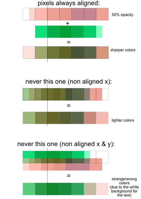
Yes. No more extra pixels when exporting and having our image at the wrong size and rebuked when send to the ones asking a specified size… Or having white lines appearing around, caused by 1/x th of pixel unaligned. If it's stair-stepped, you probably need more pixels in your image, good antialiasing can help, but not do miracles. The resulting borders or the lines drawn will have soft color... it also depend of flow, accumulation, spacing and other parameters. If you've got non-integer values in your brush size, you can't expect sharp borders. Those border will have lightly colored pixels, resulting perhaps of the average of background color/opacity + brush color/opacity. (What I did with my "big" pixels when merging part of a pixel with a "full" pixel.) About those, the calculation is only made before exporting, the result will depend of the PPI of the final image (and can be checked with Pixel view mode if at same PPI). But for example, if you can only create a square/rectangle on exact pixel values (coordinates), the result should be clean. For raster image, depending of the mode used, it'll add whole pixels, and calculate the resulting color of each pixel in its own way. It's like mixing paint: you always end up with a color, whatever proportions are used, never a half, a third, etc. of a color. Can they really exist? Affinity apps are the only ones where you need to display 6 digits after the decimal point to check there's no unaligned pixels. How all the other app manage this? They seems to round at the nearest pixel. To be picky, I would say it's the same with vector: there's no really straight diagonals... if we zoom enough, we should see pixel size stairs , not only in pixel view. But it's easier to see lines, and not display them as pixels when they are only mathematical datas. When merging layers, if one is unaligned, it's possible the result is blured because the app can't manage less than a whole pixel, and will then add (average) half/third... of the top pixel + the other part (to get an area of a full pixel) with the pixel below on the other layer. (Simple example where only the x value is misaligned, if we add a misaligned y, it's not the average of 2 but more colors. Another play with merging "giant pixels" : merging_pixels2.afphoto
-
They are really nice, I can only imagine some as color fonts, to get the guides in a light color, the characters in light grey, and perhaps the arrows red. (I've also seen ugly photocopies of photocopies given to children, where the lines were stronger than the pencil they had to use, and I would have never been interested to begin writing if I had such examples... Our mistress just took some time in the day to write a lower case, an uppercase and a word on 3 lines of our notebooks. She was one of the worste teacher I ever had — bruttish with children unable to learn —, but at least she gave good models).
-
Affinity Suite: New documents
Wosven replied to Pyanepsion's topic in Feedback for the V1 Affinity Suite of Products
That why this "own" list is of no use. If we want different presets for different uses, we, again, need to use prefixes to name them since they can't go in the right categories predefined... It's sort of giving a sandbox to users, so they won't mess the nicely organised presets... -
Affinity Suite: New documents
Wosven replied to Pyanepsion's topic in Feedback for the V1 Affinity Suite of Products
I don't think you can delete or modify those presets. Just create new ones, with, if thwy are ordered by size and name, a name to precede the default one. ("Ill check if this is possible once near a PC) -
Just missing...