-
Posts
81 -
Joined
-
Last visited
Everything posted by EZeemering
-
Also last May the falling pilots were featured again in a magazine. The original project involved medium res photo's but now they are up-scaled to hi-res scans. Which is surprisingly easy in Affinity as long as you use non-destructive layers. Also minor tweaks and colour corrections. So yeah, fallen pilots 2.0
-
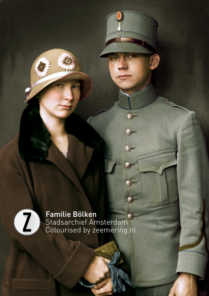
A really nice portrait of a Dutch brother and sister in the 30s. I'm still impressed by the quality of glass negatives. Also added some comparison shots for inspiration.
-
Thanks @Alfred If I may give a tip. Objects have a local colour. But colour fades in shades and highlights. If done correctly it will give more depth. You can take it even a step further to make the dark shade a tad cooler/warmer and the highlight the opposite. This image has one heavy light source. So the highlights will be bitten out and the shades will go near black (well, not black but colourless).
-
Yesterday my work was featured on Affinity's insta account as part of #100days100commissions. It's a great honour to be selected. A great initiative in these uncertain times. I kinda forgot about this forum but I'll post some more work soon.
-
That's what I basically do. I set the base colour through a variety of layers including gradients and normal fills. I never use the select tools because it gives jagged edges, so I paint on the mask layers. After the whole image is done with he base colours I start with the detailing. And that brings the image really to life. And that's where the colour theory comes in to play, how does lightning effect colours and etc. I've learned everything myself. But asking questions has never hurt anyone. It will speed up the learning process if you watch or listen to other artists.
-
To commemorate the 75th anniversary of the liberation of the Netherlands the Dutch Ministry of Defence asked to me colourise some photo's for their magazine. The magazine is all year round available in the stores. Also there's a monthly digital magazine with my work. Really cool project and very proud of it.
-
Hi Katerina. No, sadly you can't watch it. I tried streaming from my MacBook but the combination of working plus streaming made my cooling fans go crazy. So the stream ended up with a annoying high pitched tone and my Mac over heating. In the mean time I invested in an iPad. I'll try streaming from it someday. But some basic video tutorials should be doable. I think the most important bit to colourising is the basic knowledge of colour theory. Software; Adobe or Affinity are just tools. For the end result it shouldn't matter which tool you choose. With that said what helped my progress real quick, was looking for tutorials about colour theory, especially about warm and cool colours and colour values. And colour theory is universal so it does not matter if the tutorial is made by a digital artist or an oil painter.
-
The fallen pilots project got published last weekend in the largest Financial newspaper in the Netherlands. Pretty stoked about it!
-

Colour adjustment layer
EZeemering replied to EZeemering's topic in Feedback for Affinity Photo V1 on Desktop
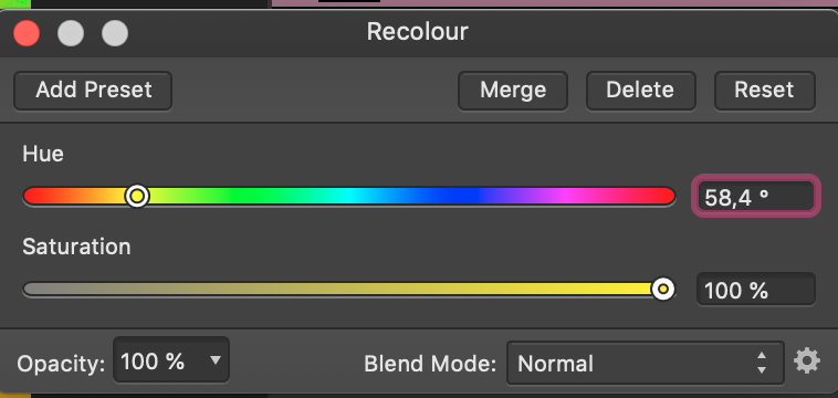
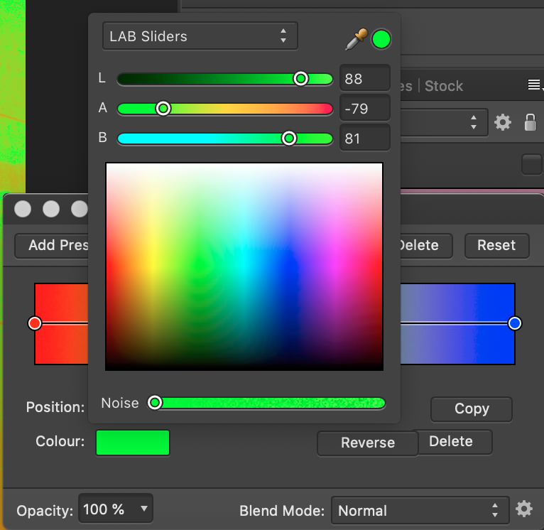
Somebody pointed out that the lens filter adjustment is doing what we want. You can pick the exact colour, but don't forget to set the opacity to 100%. -
Excuse me if it has been requested already. I could not find any. Currently the colour adjustment layer has only sliders, which is far from precise. I would like to see a more precise function like in the gradient adjustment.
-
A really, really quick one of my great uncle. Just 3 layers, blue, yellow and red. The source file is very poor, hence the pixelation.
-
-
Latest one. No filters used at all, it's all brushing. I've been studying the Dutch masters a bit lately, so the goal was to brush in the depth with colour. Pretty happy with this one.
-

affinity photo How to cheat at conserving an old painting!
EZeemering replied to Kasper-V's topic in Share your work
Interesting. It's just a brick wall behind it. Never thought of that. I wonder if they add an extra protection layer between the painting and the wall after they are done. Nice work on the painting. It must have been a pain with the mesh tool. Although I'm OK with the toning on the final, I agree with @firstdefence that the image could be toned down a bit on the composition to match the lightning of the room.- 7 replies
-
- painting
- restoration
-
(and 5 more)
Tagged with:
-
A quick one to get my mind off of all the military
-

affinity designer My first time with Affinity products, AD on iPad
EZeemering replied to Bentleg's topic in Share your work
I'm currently at that awkward decision point to decide to upgrade or not. My 2012 MacBook Pro is still solid for another year or so but I could use some extra power for bigger projects. And now with the Affinity range released on iOS the iPads also come in play. I might go for an iPad first and maybe later a new MacBook. How would you rate the power of the new iPads compared to (older) MacBooks in regard to the Affinity products? Would love to try some of my (Photo) work on an iPad lol.- 19 replies
-
- illustration
- photo realism
-
(and 2 more)
Tagged with:
-
So you gonna make a photo and insert a 3D model in post-op? I like the idea of story-boarding this way. It would really help out the model in the photo shoot. Please post the final image, I'm curious.
-
-
Yes this is badly needed. At the moment there is no way to invert colour negatives in AP with consistent succes. Each and every file must be done by hand and on eye. Which is not doable. The curve panel, but I imagine also the other panels, need the option to set the white and black points. Also there must be a way to save the edited nodes on the curve lines.
-
Cool, nice work. I used to do this kinda stuff for game skins
-
At work I still have the CC suit. And that won't go anywhere soon since the whole market is still focused on Adobe. But at home it's really Affinity only, apart from Bridge and Camera Raw.
- 161 replies
-
- subscription
- adobe
-
(and 1 more)
Tagged with:
-
There's a little colourising contest for those who like play or practice with Affinity Photo. Three photo's are available to choose from. The winner gets a book Details here at the Romanovs100 facebook page
-
Almost done, one more to go. The general response on the series was very good, but what impressed me most was the positive response from some of the family members.
-

multi Silent Ocean - Campaign (2018)
EZeemering replied to SalfingerAndrew's topic in Share your work
Great work! As scuba diver I can emphasize the problem. Although I really like the quietness of the sea in general (it's very therapeutic), once you come near a harbor the noise is unbearable. Especially motorboats are notorious noise polluters.- 22 replies
-
- maya
- affinity designer
-
(and 6 more)
Tagged with:


