project_2501
-
Posts
223 -
Joined
-
Last visited
Recent Profile Visitors
2,716 profile views
.thumb.jpg.2ac1b0424a6896c349d3d16eea40c7f3.jpg)


-
 Megnusin reacted to a post in a topic:
Slow startup (all Affinity apps)
Megnusin reacted to a post in a topic:
Slow startup (all Affinity apps)
-
project_2501 reacted to a post in a topic:
shortcut for align centre (vertical and horizontal)
-
Thanks - I finally found the items to add as custom shortcuts. Sadly it is two shortcuts not one but that's ok. Perhaps a Macro is the way to go?
-
I found this but again it doesn't seem to have Align on there: https://affinityspotlight.com/article/downloadable-affinity-v2-keyboard-shortcut-and-gesture-cheat-sheets/ And this official list has Align Centre but not Middle. https://affinity.help/designer2/en-US.lproj/index.html?page=pages/Workspace/shortcuts.html?category=operations&title=Keyboard shortcuts --- but even so the suggested option-command-C doesn't seem to work when I have selected two simple objects in Designer 2.
-
That's correct - I want to use one key-board based shortcut. If that isn't possible then just one click on the toolbar. On MacOS Cntrl-"arrow up/down" doesn't work, I also tried Option-, and Command- and they don't work. I have tried exploring the menu and help to find the associated pre-configured shortcut or a way to add my own - and find it - sorry that seems really pathetic but I tried for a while.
-
I very very often find myself having to align two objects so that one is aligned to the centre of the larger one. I am currently doing this with too many mouse clicks: select larger object shift select smaller object so both are selected go to the top of the window and select align vertical also clicl align horizontal then click apply This is at least 5 clicks not counting the key presses and opening dialogues. Is there a shortcut? Can I configure one? So that: I select two or more objects press the shortcut combination to align centre (vertical and horizontal) I'm doing this mostly in Designer but I expect the solution would also working Photo too?
-
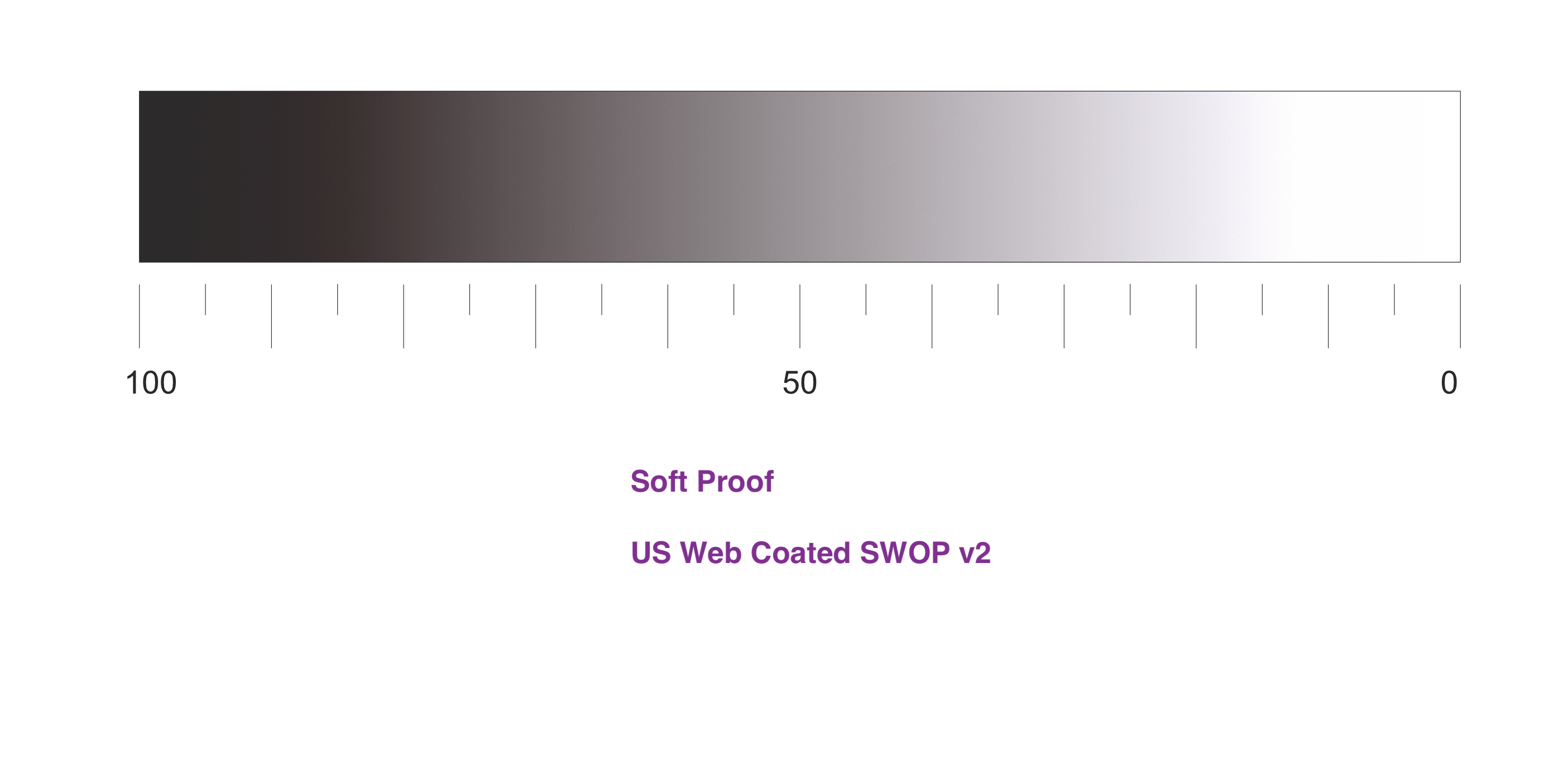
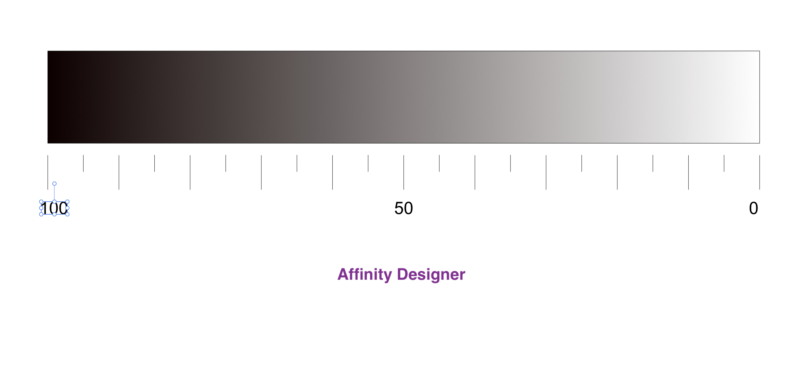
Just as an experiment I did a "soft proof" in Affinity Designer. I've never used that before. It clearly shows that any grey below 20% becomes invisible - according to the "US Web Coated (SWOP) v2)" profile. I have heard somewhere that this profile is most relevant to Amazon KDP print-on-demand. Is this therefore a good guide that I need to go to 25% or 30% grey?

-
project_2501 reacted to a post in a topic:
advice on grey-levels when printing with Amazon KDP
-
project_2501 reacted to a post in a topic:
advice on grey-levels when printing with Amazon KDP
-
Thanks @DuncanL - that's a helpful image. Can I check, the levels are 0% to 35% grey? Considering 5% then I can see them in my image and yours too.
-
project_2501 reacted to a post in a topic:
advice on grey-levels when printing with Amazon KDP
-
I've previously used Amazon KDP "print on demand" for book content which is pretty much text and black+white line diagrams. In that scenario, the accuracy of printing grey levels didn't matter. For my current project I am considering using light-grey as a background to some body text elements, programming code, a practice you see sometimes to make it easier to see what is code and what is prose. Image attached showing an example. The advice I need is on setting the actual grey level so that the Amazon KDP printing process doesn't lighten it to "white" making it invisible doesn't darken it, making the text hard or impossible to read I know there can be challenges with colour reproduction, but I didn't think this would be a difficult thing to get grey levels right. What sparked this doubt is that the grey levels, which I hope your displays can reproduce, were made invisible "white" on my office-class Xerox laser printer, one which is pretty good are replicating even colour images. I'm using a calibrated wide-gamut display to create and see the grey levels. I don't think switching to sRGB would affect grey levels much?
-
Cuando reacted to a post in a topic:
rethink UI for version 3 - user-centred design
-
Gripsholm Lion reacted to a post in a topic:
rethink UI for version 3 - user-centred design
-
Gripsholm Lion reacted to a post in a topic:
rethink UI for version 3 - user-centred design
-
Wouldn't it be nice if Affinity actually organised sessions where the many many diverse voices here could input into and shape the product. I'm sure many would do it for free - because the outcome is a benefit to us. If I were Affinity I would grab the chance to engage a highly engaged user base who are actually willing the product to be better. I recall right from the beginning rather arrogant interactions with some of their employees - back in 2018, approx iirc.
-
Isn't it tragic the general low optimism in Affinity's developers and their ability to listening to their users. Right from the beginning I encouraged them to adopt more open-source style practises such as being very open abut long-standing bugs, and sharing publicly their prioritisation of their to-do list so we can voice our agreement or disagreement. I feel Affinity started with such huge enthusiasm and good will from us, but that has been lost over time.
-
I recall when Affinity Photo was initially released and there was discussion about making it familiar to Photoshop users, but not being overly tied down by that ancient UI. Myself and some of the people in my network do feel that since then the Affinity Photo UI has not been ideal. I think for V3 Affinity should take the time to rethink the UI for all their apps - with some key principles in mind - for example: discoverability consistency and "no surprise" <- this is a big issue make easy and common tasks easy and quick self-explanatory as possible, minimise no need for a manual or documentation I believe the Apple HIG design guidelines from decades ago are still considered a solid foundation for good UI design. --- For example, there is no excuse in 2024 for having 2 "blur" options in the menu. If they are genuinely different for a significant and genuine reason, the UI doesn't make that clear*. The overall effect is that newcomers think either the app is wrong, or they are under-qualified to use the app. * non-destructive vs destructive might the be the reason, but what's the reason for both in 2024? Another example is the inevitable growth of "features" which have to go somewhere, and they end up being stuffed behind tiny undecidable "icons" squeezed into the layers UI. If you know what you're looking for, they're there. If you don't, then you're in for a ride.
-
project_2501 reacted to a post in a topic:
Affinity apps thumbnails/previews in Sequoia
-
project_2501 reacted to a post in a topic:
All afphoto, afpub, afdesign files showing icons not thumbnails
-
project_2501 reacted to a post in a topic:
All afphoto, afpub, afdesign files showing icons not thumbnails
-
project_2501 reacted to a post in a topic:
why are threads on the long startup bug now deleted?
-
deepblue reacted to a post in a topic:
All afphoto, afpub, afdesign files showing icons not thumbnails
-
norbinw reacted to a post in a topic:
All afphoto, afpub, afdesign files showing icons not thumbnails
-
BBG3 reacted to a post in a topic:
All afphoto, afpub, afdesign files showing icons not thumbnails
-
I underline what @norbinw said. And remember that other serious usability bug that hasn't been fixed in years and years - the 30 second startup - still not a priority it seems. My wife has gone back to Adobe after struggling with Affinity for 2-3 years. I still hang on to Affinity because I think it is so important to have viable alternatives, and can only hope Affinity is one of them.
-
project_2501 reacted to a post in a topic:
All afphoto, afpub, afdesign files showing icons not thumbnails
-
PaoloT reacted to a post in a topic:
Affinity Publisher - Simple Request : Book and Technical Typesetting
-
iY8Zaj4B reacted to a post in a topic:
Slow startup (all Affinity apps)
-
Slow startup (all Affinity apps)
project_2501 replied to Andrew Berth's topic in Desktop Questions (macOS and Windows)
Why do the following apps, large and small, open source and proprietary, not suffer this problem on MacOS? Mathematica MS Office LibreOffice Firefox SublimeText ffmpeg Python VS Code Lyx LateX DaVinci Resolve Adobe Suite Transmission Librewolf Android File Transfer Blender Julia Lang Ultra Fractal Zoom Wacom ... -
how many seconds to complete operation?
project_2501 replied to project_2501's topic in V2 Bugs found on macOS
I have reported this issue directly to Canva. Perhaps that will help with unblocking progress ? If the admins here remove this thread, then it will confirm what I have told Canva - that the admins here keep removing mention of this bug. -
Watch the video and feel the pain of how long it takes to complete the operation. Yes, this is a years old bug that Affinity refuse to fix. Early versions did not suffer this problem. It was introduced - and can be reverted. Other software - large, small, open source, closed, don't suffer this problem - Firefox, MS Word, Sublime Text, Visual Studio Code, ffmpeg, Da Vinci Resolve, ... This the latest MacOS with the latest Affinity apps from the Appel Store, on a 32GB MacBook Pro with M2 Max. Screen Recording 2024-09-07 at 16.27.17.mp4
-
 Westerwälder reacted to a post in a topic:
why are threads on the long startup bug now deleted?
Westerwälder reacted to a post in a topic:
why are threads on the long startup bug now deleted?
-
why are threads on the long startup bug now deleted?
project_2501 replied to project_2501's topic in V2 Bugs found on macOS
My wife, an experienced designer. has moved back to Adobe - even with their subscription model. One of the major reasons was the startup issue. I don't know how widespread this is, but I'd bet it is not an isolated case. Not fixing this issue, shutting down any debate, does not give the impression of a professional organisation you can trust into the future.