

gdenby
-
Posts
1,887 -
Joined
Posts posted by gdenby
-
-
Kimo,
"But from my point of view, i though i already had created a curve layer... more specific layer- curve, curse, curve , rectangle(color).
so in my head this should work, i should now have 3 curves with a compared layer of color.
or is it the first "layer" that's the issue?, since it a layer and not a curve. *(from what i understand from other forums it don't have a gender yet, and therefore it shouldn't matter)."Part of the problem seems to be based on terminology. "layer- curve, curse, curve , rectangle(color" is a set of layers. One may have a blank passthrough layer. But each curve is also its own layer. And then the color rectangle is its own layer. As a rectangle, it retains its parametric variables, but if converted to curves, it would just be called "curve" and its shape would then need to be changed thru node manipulation.
The issue is that the rectangle (color) layer is not nested within any of the curves and the topmost layer is a "passthrough" similar to a clear window in which the other layers appear.
To me, a problem w. the tutorial vid is that the fellow says he "merges" the curve/layers. The word "merge" is more often used when talking about pixel layers. Vector object are joined, or separated, or split using the "boolean" operations. In this case, the operation was add. When vector objects are added, a single object w. a single periphery is made, and all of them get the attributes of the bottom most layer in the stack.
If I understood the tutorial, the fellow had a bunch of loosely drawn shapes that he wanted to unify into a single silhouette. So he added them, and gave them a uniform fill. But then he placed copies of the original shapes onto the unified one, and added various color gradients and transparencies.
See an attached image:

-
The pen and node tools are in the same tool fly-out in Photo. But the tool shortcut is "p" in photo, not "a" as in designer.
-
What R C-R pointed out is correct. After going thru the video, it seems that the objects that are "merged," to use his term, are then overlaid w. the original shapes, which are then shaded separately.
All objects can have their own color, named the fill. the fill color can be a gradient. In some cases, it is simpler to make 1 object w. a gradient fill, and apply that fill to others, adjusting the gradient direction and extent as needed for each part.
-
-
59 minutes ago, dock said:
Using Assets seems to help a lot, although it's a shame there's no easy way to update those.
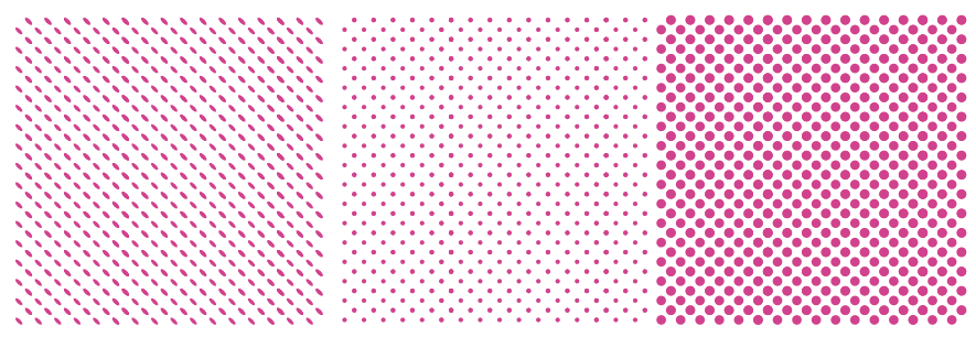
Before noticing the "transform each" in the beta version, I went through the trouble of making various dot arrays out of symbols, and saving those as assets. I used 10 - 12 symbols. I used the polygon tool, and made several differently ordered groups, such as all horizontal, or concentric. That way I can get various patterns where the polygon form rows that taper, of the color fades/changes.
A sample from 1
-
1 hour ago, Alfred said:
To do it exactly as in the video, instead of a rectangle you would use two diamond shapes which have been Boolean added to create a single ‘Curves’ object.
I couldn't follow most of what the fellow did. I don't use Inkscape enough, and the version shown is somewhat later than mine. I didn't see any reason why using diamonds was necessary in this situation. I supposed it might be to cut a bevel, but that seemed to me from what I could see of the vid that that wasn't needed.
-
Hi, dannys81,
Here's an Affinity method.
Have snapping turned on. Draw a circle/ellipse. If you like, position the center at the center of the spread.
Make the circle's fill none, and set the stroke to whatever thickness you want. Then draw a rectangle of desired size that spans the circle. Because snapping is on, you will see when the rectangle is centered on the circle.
You will notice it is positioned above the circle in the layer hierarchy. This is necessary for the next operation.
Select both, and use the boolean subtract widget.
Here is where the procedure appears to me to differ from Inkscape.
The rectangle is subtracted away, leaving 2 parts of the original circle. Using the node tool, select the 4 inner nodes, and then use the "break curve" widget. There will then be 2 straight line curves, and 2 arcs. Delete the lines.
My opinion is that it is not a good way to learn to use Affinity by watching other apps tutorials. I've been using various vector programs for about 30 years now, and it still took me at least 2 weeks just getting settled into Designer. It took me a couple of months to stop using keyboard short cuts I half remembered from other apps. Not all features are implemented thesame as in other apps, and some have not been written yet. I figure its better to practice w. what is at hand, so that I can add new skills as new tools are added.
-
Why not just make a blank document for each client, w. the clients required and preferred colors and swatches? Then, for each assignment, open the blank document, and resize it as needed for the current project.
-
Any vector that encloses an area can have both a fill and a stroke. The end points of the vector don't need to be connected, but the fill will be a straight line between the end points. The only exception is a straight line, which does not enclose any 2D space.
There are several problems when using unclosed curves. The obvious one is unexpected straight lines among the curves. The other is when the curves are used in boolean operations, such as add, deide, etc. Designer automatically closed the curves, which can lead to all sorts of odd fragmented shapes.
So it is best to draw a complete perimeter for each shape, or at lest one which is so close to complete that the gap is very small. One can then use the node tool widget for closing the curve, which will add the small straight stroke.
Then its just a matter of getting the shapes in a proper layer hierarchy so the upper shapes cover parts of lower ones.
-
Change the document set-up to mm/ Then you can do the entry in the transform studio as you like. The object position is for the chosen dot in the transform studio grid-lette.
-
-
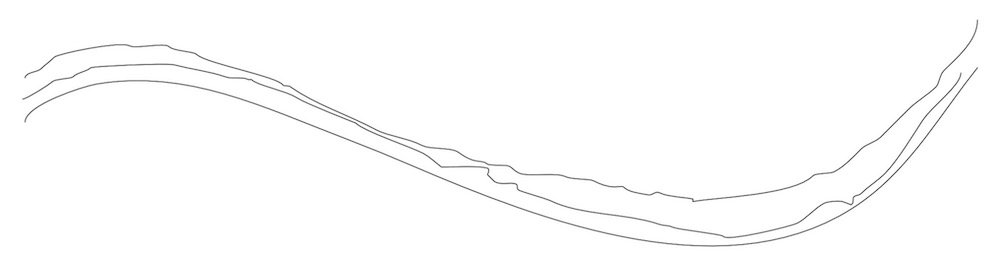
It appears to me that Affinity pencil tools tries to make smooth curves. The speed of drawing seems to set how many samples are made to place the nodes that define the curve. Attached, a line drawn swiftly. 2 more, moving slow and slower w. very arthritic hands.
-
-
Yes, the layer needs to be rasterized. One may then choose any color, and with the flood fill tool set to a tolerance of Zero, fill any pixel w. a different color.
If keeping the layer a vector w. gradient fill, adding the gaussian blur fx w. alpha protected will smear the colors, and eliminate a bright spot.
-
Hi, GarryP,
Nice work. A worthwhile re-creation of a pretty much useless document. I recall as a child of 5 or 6, watching a nuke test broadcast on TV. Not too long ago, I found the broadcast on yoo-toob. It showed how the troops were being saved from the fall-out dust by having the dust on their clothes swept off w. brooms. In event of nuclear war, a broom may be your best friend. Oh, and by the way, don't worry about inhaling the dust when it is brushed off.
While it is true that alpha particles decay quite rapidly, I'm reminded of something a friend of mine told me. Her father, a film of whom I saw, was a Navy doctor who was one of 3 who landed on one of the Pacific atolls just after a nuke shot. Upon seeing the geiger counter reading, he commented, "Well, we're dead." I think she said it took 12 years, during which time he became an expert on the effects of hard radiation on human tissue.
-
Ask the realtor what they want. Depends on what their printer wants.
I just looked at the manual for the Canon 80D. There are 2 L size .jpg. The larger is supposed to be a bit over 7 MB in size. So I wonder how it turned out close to 10. It is also of a size, A2, that is big enough for paper printing a wall poster. The S1 size might be more appropriate for either full web screens or a brochure. It is close to a US letter size page.
My guess is that the image should be reduced to something like 1500 x 1000. At that size, it would likely fill up most browser windows. It should be enough to print as a horizontal panel in a single folded brochure.
Note: if exporting from Affinity, it appears that .jpg is always set to 100% quality. 90% quality is close to as good visually, and can have a file size 30% smaller.
-
There is a user here, whose handle I forget, who does/did lots of screen printing, and I recall him saying that about 150 dpi is as high as one needs for t-shirts.
-
At what dpi are you saving the .png? The difference between screen resolution, 72 dpi, and common print resolutions, 300 dpi, is about 12X. 300 dpi is to high for t-shirt printing.
-
Hi, Cédric D,
Yes. Go to the stroke srudio panel, and set the stroke thickness, and pressure profile. Then use the pencil tool.
I have a number of stroke profiles saved as layer styles. That way I can vary strokes' weights as needed.
If drawing w. a mouse, one can select velocity as a controller for the pencil. It is fairly clumsy compared to using a tablet & stylus. Those, particularly an iPad and iPencil, can make extremely nuanced lines.
-
.jpg files are always smaller than .png files, even when the .jpg files are saved at 100% quality. For example, I have a PD historic photo on hand. As a 98% quality .jpg, it is 1.6 Mb. If I save it as 90% quality, a decrease in quality that is not apparent to my eye, it drops to 740 Kb. If I save it at 50%, while applying 50% smoohting, the file size is 200 Kb, tho' at 500% zoom, I can see the blocky compression artifacts. If I save either as .png, they end up at 2.5 Mb.
I don't know enough about .png to say, but it is a lossless format, while .jpg is not. .jpg uses compression routines, and data is thrown away as the quality setting is decreased. If I recall correctly, the file is also built in a way to allow all data to be stored compressed even w/o info being averaged or reduced.
-
Note, both apps have free trials, limited to 10 days from 1st use. try them in sequence.
I too think Designer is a better fit. I'm not a photgrapher, and much of APh is of little or no use to me. If you need to composite or crop images, it works easier than GIMP, so I'm glad to have it on hand.
-
16 hours ago, johnnT said:
Wow, Love this stuff, I'm going to go cry in the corner now.
What he said.
-
I used Bic's for lots of stuff during that time period, but stopped using the blue because it faded/discolored so badly. I switched to the black because it was a little more stable. I just now dug into my "archive," but none of the old pens were blue. All of the drawings I still have are in black. My recollection on the blacks was that while they were somewhat less likely to fade, and turn a purple-ish color, I would buy them by the pack because they varied slightly from batch to batch, just like the blues.
Looking on the web, I noticed the Wikipedia article on the ball point pen. There is a close up there of a bic ball w. blue ink. There are a couple of places where a good sample might be made. There are also links to the most common colors used as the dyes. Prussian blue seems to match well.
- AffinityJules and stokerg
-
 2
2
-
When I use Image Vectorizer, I usually export the vector in .svg format into my AD design work folder. Then, in AD, I use File/Open, and select the .svg. A new document is made w. no more size than the original, so I often resize the document larger. The .svg file will appear as a singles layer, w. all the component curve(s) within.


**his Gradient layer vs mine rectangle layer** Help!
in Pre-V2 Archive of Affinity on Desktop Questions (macOS and Windows)
Posted
Attached is a file w. some colored objects and others w. none. The colored objects are currently turned off. If activated, you can see how various areas become colored.
TryThis.afdesign