Kasper-V
-
Posts
472 -
Joined
-
Last visited
Everything posted by Kasper-V
-
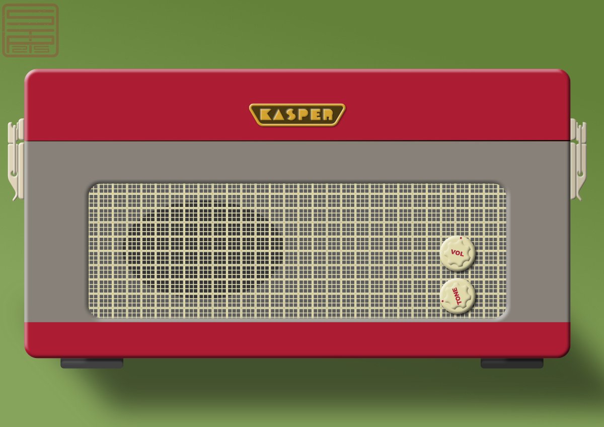
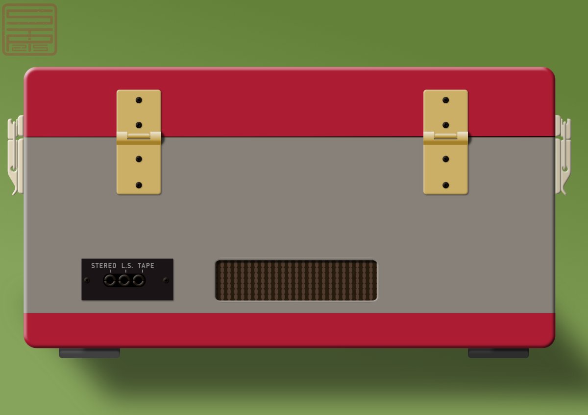
I'm old enough to remember these; in fact I'm old enough to remember 'pick-ups' that only played 78s and had to be plugged in to the wireless (or radio, for you youngsters). The design is based on the Dansette machines that became popular some years after WWII when we Brits wanted to play those new-fangled American disks at 45 or 33. The actual turntable/changer itself isn't based on the Garrard or BSR machines that were common n the 50s and 60s, but is a bit of a mish-mash of others. Front view ... and back view (v. boring!)

-
I've just realised I've been posting my NY greeting all over the shop but forgot to post it here! I can't even blame the usual NY Eve excuse as I was strictly dry because of meds ☹️ ... Ah well, here's hoping you've had a good new year so far and hope for the remaining 362 days. https://www.youtube.com/watch?v=u_w-AnqUaTE
-

affinity designer Wallpapers - Famous synthesizers and drum machines…
Kasper-V replied to sansnom's topic in Share your work
I'm a 99% acoustic guitarist (I still have tape recorders!) but I've always been fascinated by anything with knobs, switches and dials. You've made a fantastic job of these devices, and I'd never be able to keep my fingers off them if they were physically present. -
Brassica triffidus?
-
affinity publisher We’ve had a letter from a Mrs. Trellis…
Kasper-V replied to GarryP's topic in Share your work
For anyone new to MC, there's a handy instruction book, The Little Book of Mornington Crescent by Tim Brooke-Taylor, Graeme Garden and Barry Cryer, still in print. I read a friend's copy and I look at it in a wholly different way now. Mostly from behind the sofa ... -
Thanks! Glad you enjoyed them; that's what it's all about.
-
A couple of years ago I made one or two nutcracker pictures. This year I thought I'd have a go at the Mouse King, based on the character from Tchaikovsky's ballet (taken from the story by Hoffman). As far as I could, I used symbols for the two sides, and used pixel brushes to add textures to some of the vectors, clipping the pixel layers to their vectors. And a Nutcracker for comparison (quite different in style!).
-
Here's my Christmas greeting for 2025. Click on the link, not the pic. https://www.youtube.com/watch?v=WLYYlKpQ_q8
-
I've been very remiss -- haven't posted anything for ages! Here's a video I made in AD, animated in OpenToonz, of a 1960 recording by Sheila Hancock of Sydney carter's song. Click on the link, not the pic. (That's not Ms Hancock in the pic!) https://www.youtube.com/watch?v=7CV8dEuqW0U
-
Mesh warp tool controls is wided [2.3.1]
Kasper-V replied to earl_grey's topic in V2 Bugs found on Windows
I have the same problem with the mesh warp live filter in Photo (on a Windows 11 desktop pc). If I apply it then resize the image the mesh remains the same size and in the same position with respect to the top left-hand corner and the pixel layer is hidden. Moving the mesh back doesn't make the pixels visible; they only reappear if he mesh layer is hidden. I'm having to redo several hours work now. I have rasterised the warped layers to avoid the problem recurring, but this defeats the object of having an editable warp. Not a happy bunny! -
Live mesh warp in Photo disappears
Kasper-V replied to Kasper-V's topic in Desktop Questions (macOS and Windows)
Mystery solved! I resized the images -- the sources were all different sizes and bigger than the target app. The meshes stayed where they were and didn't resize. 😕 Also, Undo doesn't remove the mesh, only the changers made to it.
-
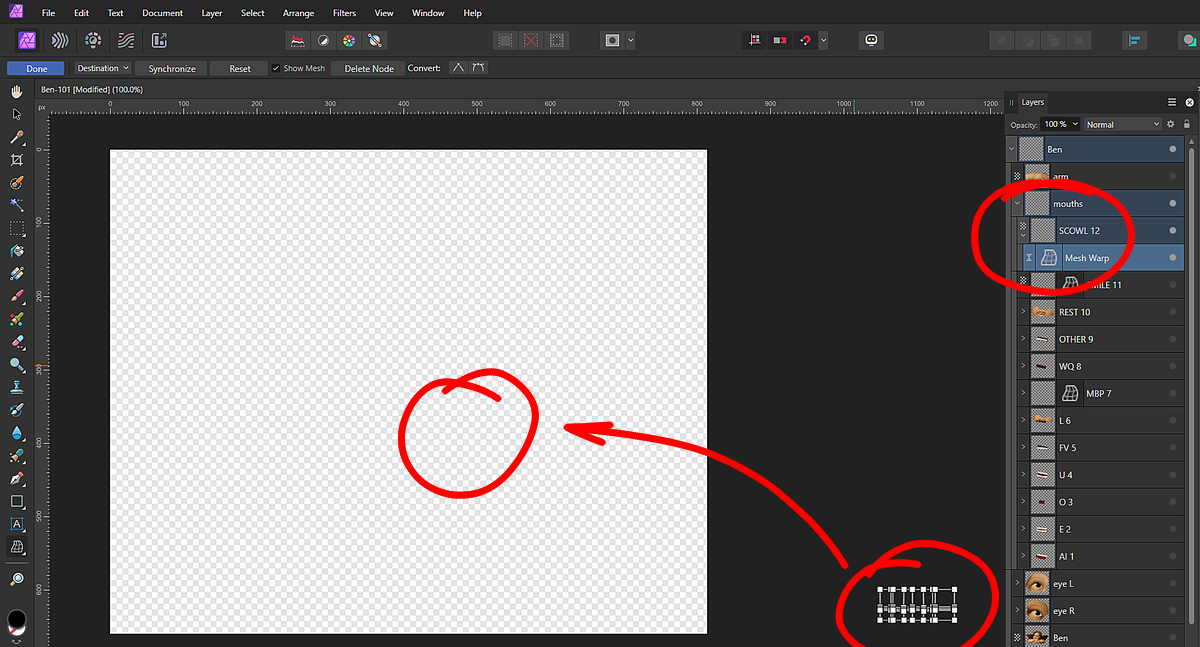
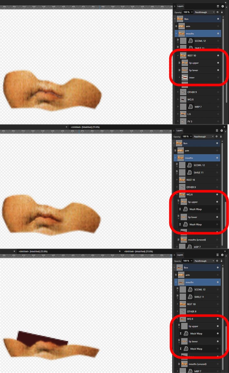
I'm preparing some images of mouth shapes for a video. Last night I put the upper and lower lips in groups (along with tongue & teeth) and applied a live mesh warp filter in Photo to each to form the various letter shapes, and saved everything. This morning I find the meshes seem to have disappeared! No nodes or lines appear when I try to edit them, and the warped image is not showing. When I turn off the mesh the original image is still there. What's happening? Can I restore the meshes, or must I delete them and reconstruct them? (If I do, I'll have to rasterise them, and lose the ability to edit later.) There are ten to twelve pairs of shapes for four separate characters, so you can see I'm reluctant to start all over again. The top image shows the default mouth shapes with no warp applied. The middle one shows the 'W&Q' shapes with the meshes turned off, and the bottom one shows the same with the upper lip mesh turned on: the image disappears (revealing the colouring for the inside of the mouth).
-
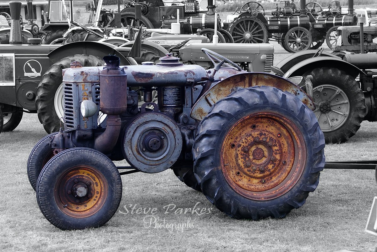
It's a Landini L25, built 1956. An Italian manufacturer. I do blur the background sometimes, but the colours were so bright it would still have distracted from the tatty one.
- 4 replies
-
- 1
-

-
- photo
- bedfordsteam
- (and 2 more)
-
BLACK - A 3D Street Scene done in Affinity Photo
Kasper-V replied to DelN's topic in Share your work
I'm glad I'm not the only one! And I'm glad you got this one, not me -- you've made a much better job than I would have done.- 1 reply
-
- 2
-
-

-
- affinity photo
- 3d
- (and 3 more)
-
Solly, much as I enjoy pristine showroom-condition restorations, I admit to a great liking for the 'lived-in' appearance: machines that look as though they're still in use. Indeed, there were a number of demonstrations including a sawbench, a carousel and other fairground rides, and steam ploughing.
- 4 replies
-
- 2
-
-
- photo
- bedfordsteam
- (and 2 more)
-
We spent a day at the Bedford Steam & Country Fayre last week, which is held annually at the grounds of Shuttleworth College, Old Warden, Bedfordshire. (It's the home of the Shuttleworth Collection of classic aircraft.) As much as I like the gleaming restorations, there's something about a tatty old machine that appeals to me. I selected this one on a new layer and desaturated the background to stop the colourful surroundings competing with the subtle tints of this old girl. Here's the original:
- 4 replies
-
- 7
-
-
- photo
- bedfordsteam
- (and 2 more)
-
affinity designer The labours of Herakles (Heracles, Hercules)
Kasper-V posted a topic in Share your work
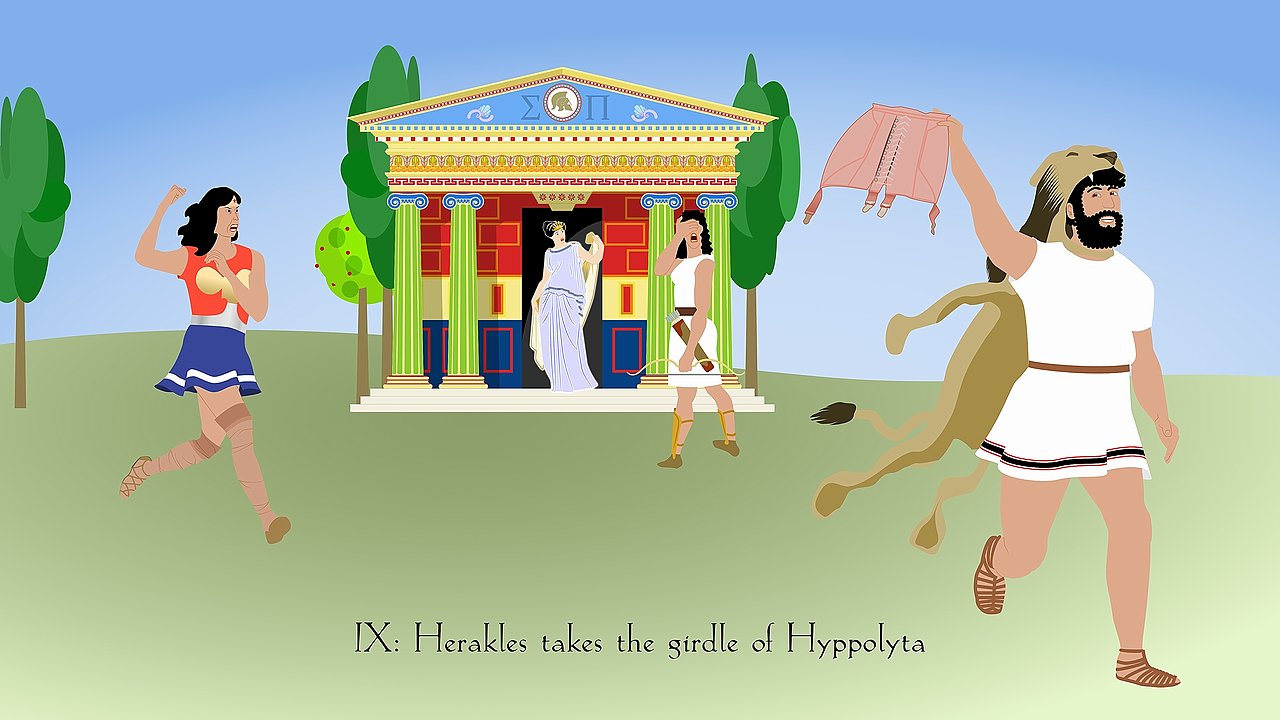
I don't know where these daft ideas come from, but when they arrive I just have to bring them to life! In the proper story, Hippolyta, queen of the Amazons (a female warrior race) was given a war belt, a kind of armour, by her father Ares, the god of war (Mars in the Roman pantheon). The ninth labour of Herakles was to obtain the belt, or girdle as older translations have it, so that Eurystheus, king of Tyrins, could give it to his daughter. You can look up the rest of the tale for yourselves! And before I forget, I'm not planning to do the other eleven labours, though you can see the hide of the Nemean Lion that was Labour #1. I'm a great believer in saving myself a lot of effort, so I modified the temple I made for my weather house here:
-
I'll try them out -- I like halftones.
-
I noticed a small raisin lying on the kitchen worktop this morning. I tried to pick it up for disposal -- and it started to walk away! It turned out to be a red-spotted black ladybird. I put it on the garden flowers, where it can make itself useful.
-
I might do The Iron Maiden, @Archangel!
-
Very interesting stories. hanks for the videos, @William Overington.
- 13 replies
-
- 1
-
-
- steam
- locomotice
- (and 2 more)
-
The FIREMAN, dammit!
- 13 replies
-
- 1
-

-
- steam
- locomotice
- (and 2 more)
-
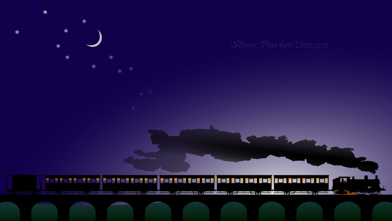
@jmwellborn He didn't start out tiny! I found a photo and selected him out, giving him a black overlay. He's shrunk fro 598 px high down to 67. I realised early on in the project that I needed footplate crew; in silhouette I couldn't fit in the foreman too.
- 13 replies
-
- 1
-
-
- steam
- locomotice
- (and 2 more)
-
@William Overington Thanks for the info and videos, William! My loco is slightly earlier of course, before the NSR was gobbled up by the MR. As much as I love scale models and model railways, I've got enough bad habits already without adding another! But I'll carry on drawing them. ☺️
- 13 replies
-
- 1
-
-
- steam
- locomotice
- (and 2 more)
-
Steam buffs will find plenty to criticise here! The loco is North Staffs Railway no. 11, built 1907; the carriages are Victorian and the brake van is . . . well, I saw one at Foxfield Rly but couldn't find my photo, so I put in what I could remember, based on some other railways' examples online! (The constellations are real; no prize if you can recognise them.) With fiddly elements like these, I like to make them up BIG as separate files and place them, reduced, in the final composition. This keeps the fie size down and also means I can re-use them later in other projects. The engine, for example, is one I made earlier: see link below.
- 13 replies
-
- 8
-
-
- steam
- locomotice
- (and 2 more)