Kasper-V
-
Posts
472 -
Joined
-
Last visited
Everything posted by Kasper-V
-
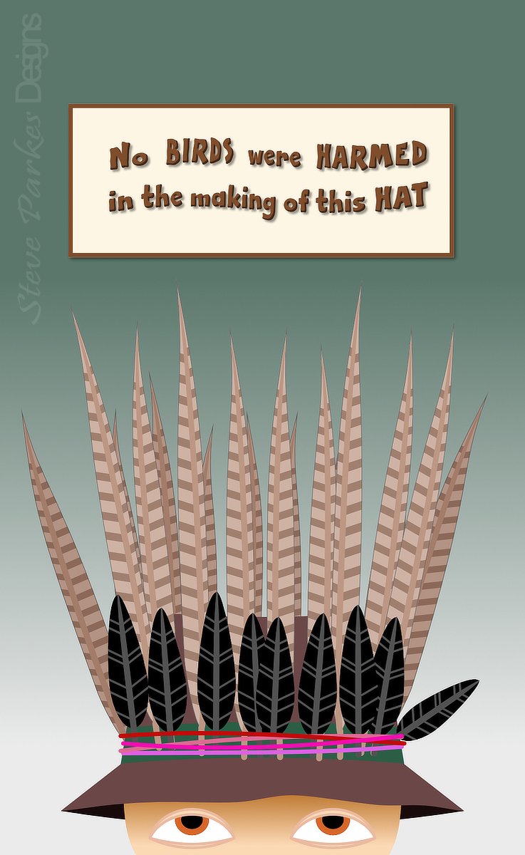
Prompted by Facebook. One of my folkie musician friends often adorn his hat with feathers to perform, usually pheasant and crow as in this case. He also includes the notice on the back of his hat. All done in Designer; the feathers are symbols, one for each bird. (Symbols are a great way of making lots of fiddly things, especially when you're as lazy as I am!)

-
Back in the fifties our neighbours had a tinted plastic magnifying screen that fitted over the front of their tv and made a 12-inch picture look like a ... slightly bigger distorted picture with colour fringing.
-
Nice work, nice 50s/60s feel to it. We only got TOL in black & white over here!
- 7 replies
-
- 1
-

-
- affinity photo
- composite
- (and 3 more)
-

Car Poster - Vintage Automobile Show Poster, Paris
Kasper-V replied to GaryPF's topic in Share your work
Very nice work, Gary. I love this style of poster. Have you recreated an existing one, or is this your own design? -
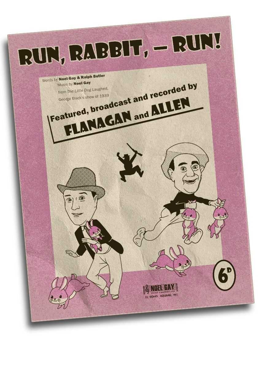
It was written in 1939, so it's certainly the right period. And you're thinking of Bud Flanagan singing Who do you think you are kidding, Mr Hitler?, of course (theme song to BBC TV comedy Dad's Army, for those who don't know). There are quite a few songs from the period that are definitely NOT going to be sung next week!
-
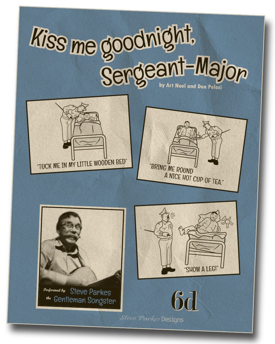
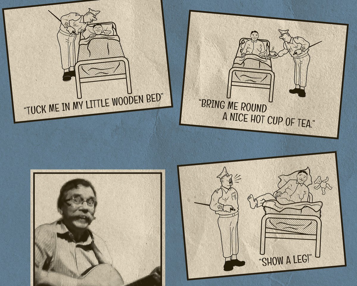
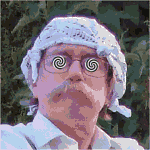
Here's another sheet music cover: Kiss me goodnight Sergeant-Major. It was a popular comic song in the Second World War, and was recorded by various artists including Arthur Askey and the Billy Cotton Band. (It was also the title of a collection of humorous songs published in 1973, not a few of which were not suitable for children -- or grown-ups!) The eponymous sgt-major owes a lot to the late Bill Tidy, but the rest is mine own. As with the Rabbit one, the half-tone was done in Photo, while the rest was done in Designer. The three cartoons are placed from separate .afdesigner files. The photo (yes, that's me) was taken by a friend a few years ago. I did most of the line work with the Pen using my mouse, but I also did some with my small tablet (great for drawing but a pig for clicking, dragging etc.) A couple of texture layers give an aged effect to the paper. The original is A3 size, and some of the detail is a bit indistinct at this reduced scale (note to self: remember that next time!) so here's a slightly bigger version of the inserts.
-
I've been learning a few songs for the upcoming VE Day celebrations and I thought I'd have a go at making a sheet music cover or two. For those who aren't old enough to remember this one, rabbit wasn't rationed in the Second World War, so if you could catch one you could eat it! Bud Flanagan (R) and Ches Allen (L) here set out to rescue the bunnies before the farmer can 'have his fun'. A word of warning: Never, NEVER pick up a rabbit by the ears! The original is A3 size, but I've reduced it to 1200px high for display. I used a couple of paper textures from Frankentoon to make it look aged, and added an FX gradient outline to age the paper edges. I'm not a brilliant draughtsman, so I used some photos and cartoons for reference to draw the characters. I used a Live Filter in Affinity Photo to make the half-tone fills from grey (so I could stick to just two colours). The Noel Gay logo I copied from a real one using the pen tool and the nearest font I have. And finally: 6d -- sixpence -- was 2.5 pence in decimal money; it was worth about £1 to £2 in today's money, depending on which currency converter you use. Oh, and if you're not familiar with the song, you can find F&A's recording of it on YouTube.
-
Worth a read if you can find them, though the 'science' isn't valid these days.
-
My first thought (apart from 'WOW!') was of James Blish's Cities in Flight novels from the 1950s.
-
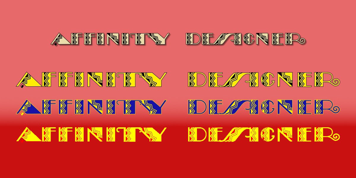
It looks good (though I say it myself!) but ... it's almost illegible! the three lower lines have a yellow overly FX and various blend modes.
-
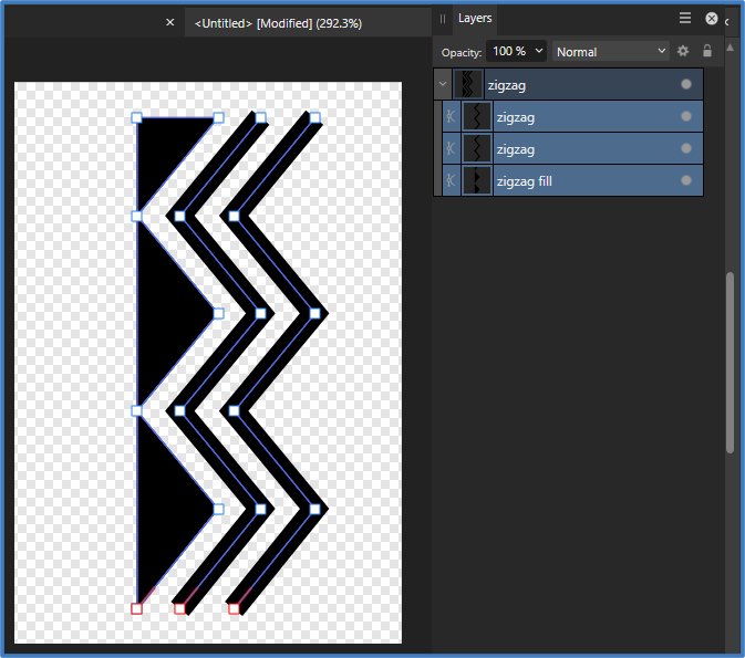
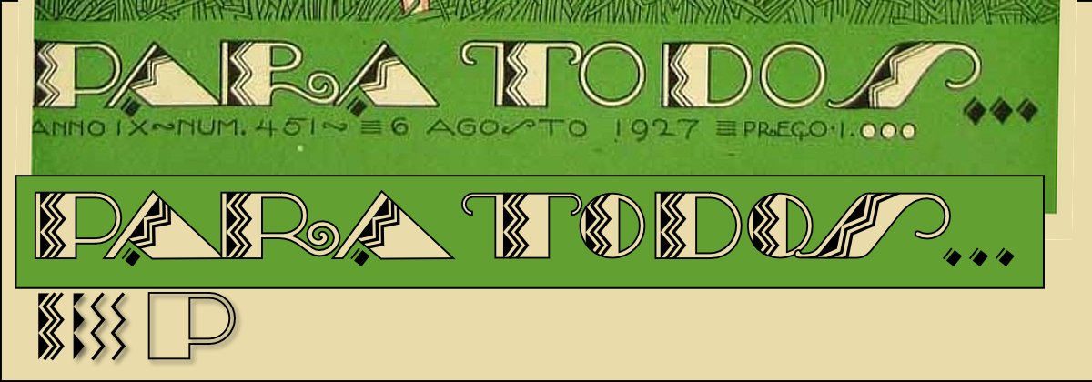
I recently discovered the work of Brazilian illustrator José Carlos de Brito e Cunha, thanks to a YouTube video by Pete Beard. I'm trying my hand at copying some of his fantastic design elements, and here's an example. I've had a go at reproducing the lettering on this 1927 Para Todos ('For Everyone') magazine cover. Carlos' letters were hand-drawn of course, and so not quite as consistent as a letterpress typeface. Also, I thought the R was inelegant and the O's ... well, wimpy, so I've 'improved' them (or not!). Being hand-drawn, Carlos was able to balance the spacing between them; I've only made a small change with 'OD' and 'OS'. Feel free to criticise! The zig-zag fill is made up of the shape and lines at the bottom, which are clipped inside the letter outline. A little bit of inspired guessing helped with the A and S. The letter shapes are made from rectangles, donuts, segments, and a spiral expanded-stroke for the tail of the R. The S also involved a bit of juggling with extra nodes to get smooth curves top & bottom. This is how I made the zig-zag fill. I started with a rectangle, converted to curves (Ctrl or Cmd + Enter) then added four nodes to the right-hand side. I selected every other one and moved them to the left, holding down Shift to constrain them horizontally. Next I drew a vertical line with the Pen tool, added nodes and moved some to match the first shape. Then I copied the line and spaced all the elements till they looked OK. Finally I grouped them (Ctrl + G) and named the group: I know from experience that by next week I shall have completely forgotten what it is!
-
"When the hounds of spring are on winter's traces..."
-
Well I think you've done a fantastic job, Xanadu!
-
Ahem! The long one is the minute hand; the hour hand is the short one!
-
My grandfather once told me that when he started work, leaving school at 13 (during the First World War) he'd often be given a penny and sent out for five 'gaspers' by an older workmate; he'd be given a ciggie in reward on his return. As he didn't smoke, he'd keep them in an empty packet till he had five and keep the penny.
-
Thank you. Consider me bowed!
-
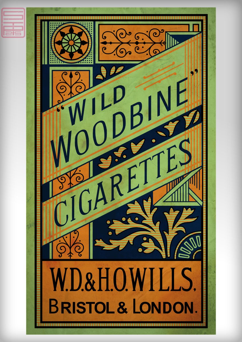
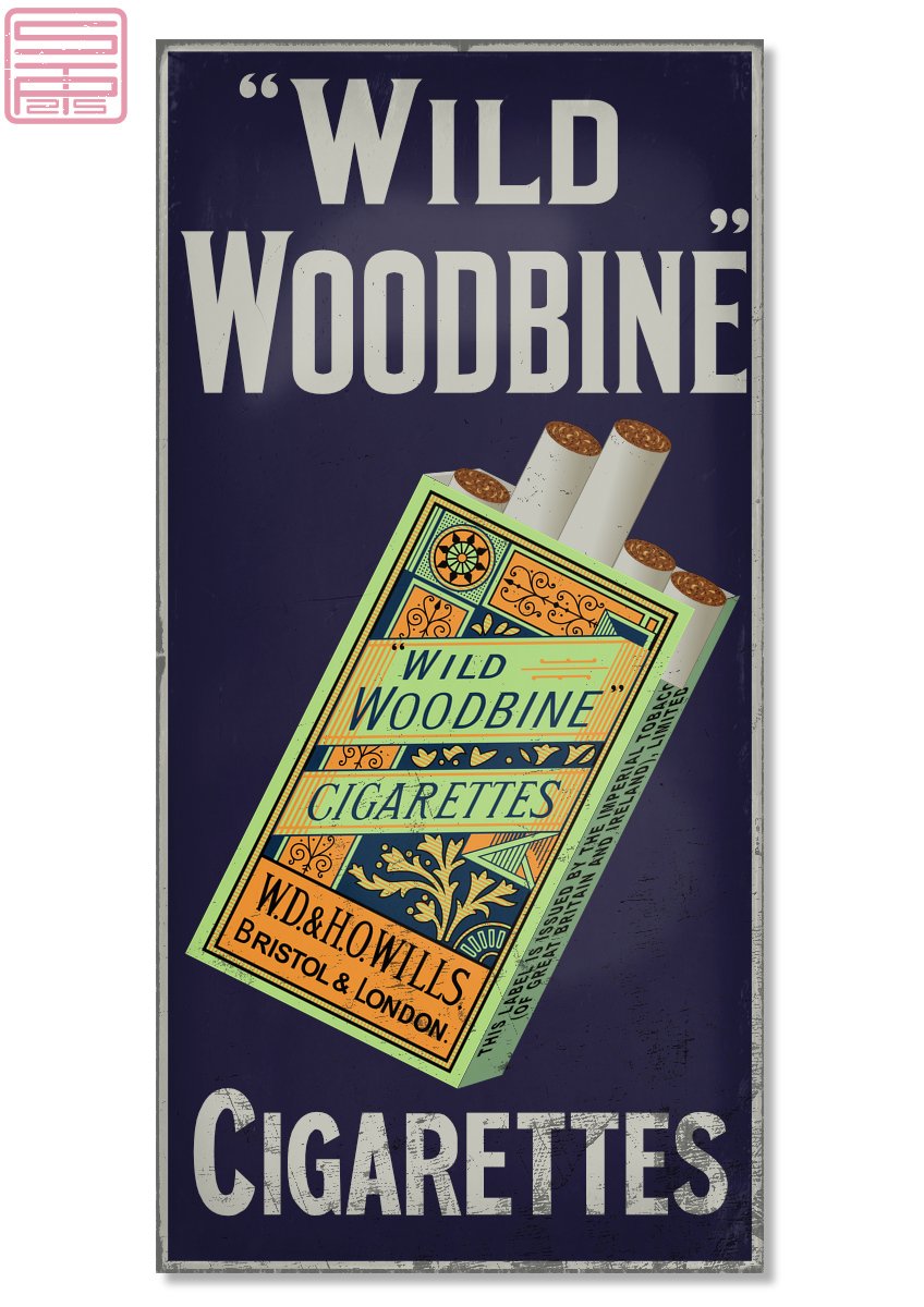
Nine years or so ago I posted my attempt at copying an attractive cigarette packet design. Now I'm a bit more experienced, I've had another go, along with an enamelled metal advertising sign. There are small differences between this and the one I made before. The design must have been redrawn at least once since it came out in 1886, but I haven't found any pics with dates. I called this Art Deco last time, but it predates that by forty or fifty years! Maybe we'd call it a Mackintosh-y rectilinear Art Nouveau? The artwork is all vector, and I added two or three pixel layers to add some wear-&-tear textures.
-
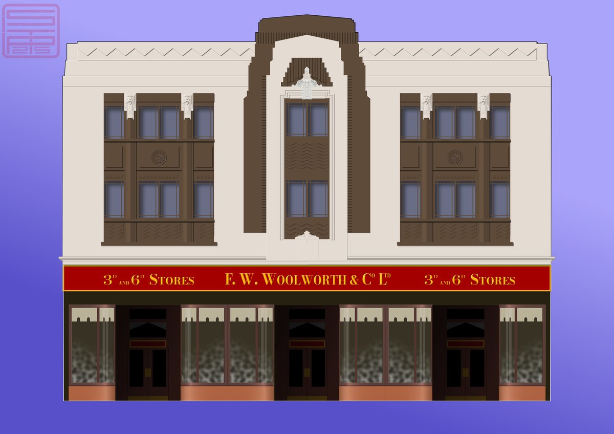
I couldn't find a suitable image online to use as reference, and I didn't fancy trying to make up the myriad small objects that might have been on display; I was more interested in the stonework. I could have made random changes to all the windows, but . . . too much trouble! (But you're welcome to have a go yourself 😁)
-
I used some of my own photos, with help from Google Street View and photos I found online. Correcting for perspective was not a big problem, but allowing for parallax was!
-
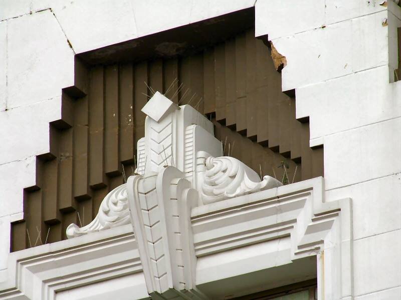
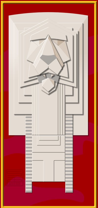
'Woolies' opened their 46th store in England in my home town Walsall in 1915. I have happy memories (though no earlier than the 1950s!) of the old shop floors and fittings before it was modernised several times, and it eventually closed when the chain folded. The top half has the modern two-tone paint job, but the ground floor is as near as I can make it to the original. This was a challenge (read: pain in the backside) because of all the fine detail and all in the same flat colour. For the upper part, I made up the left-hand side, then the left half of the middle brown & white section, then the left-hand window panels; the windows are a single symbol. After that I copied and flipped them all and joined them up. The lower windows are all copies (not symbols) of the leftmost one, and the doors are also copies. For the window 'displays' I went into Photo and used Perlin noise with a gradient mask against a dark background layer. All the lights are off because I couldn't find a detailed reference picture! If you can't see the four tiny lions' heads, here's one full size:
-
And thank you too, Alfred. But you're quite right on both counts. The only time I've seen one is when it was brand-new straight out of the box -- they didn't stay that way for long. Now if I'd made the reels transparent, you wouldn't see them! Let's call it artistic licence ☺️. My tape reels -- I've still got a few, though my machine is more modest than the one above -- are a bit scuffed and scratched and quite visible, in fact.
-
First of all, thank you, KarinC! I find it convenient when there are lots of fiddly bits and pieces in a job to make some things separately as afdesign files. It's a simple matter then to use the Place tool to add them into the main afdesign file, usually when everything else is finished. If you're not familiar with placing linked or embedded files, I think looking it up in Help will explain it better than I can (I do ramble on and digress!). This is the knobs panel. It's big because the actual tape recorder afdesign file is A3, for when I'm tempted to print it. The two spools are each in their own file.
-
No, we're still going strong, Ldina. Well maybe 'strong' is a bit too ... strong! Thanks for the compliment.
-
affinity designer 1950s record player / phonograph
Kasper-V replied to Kasper-V's topic in Share your work
No, you don't see it nowadays. It was used for talking books, and some greetings cards had an acetate recording on card. I believe people serving abroad in the Forces were able to record messages to send home too. -
The record player was a bit of a challenge but lots of fun (especially when I stopped) so I decided to do a tape recorder too. A lot more fiddly with all the bells and whistles! My uncle had one of these, a Spectone model with a Collaro Transcriptor deck and their own valve (tube) electronics. It cost around £80 in 1960, which is over £1,500 today -- only rich uncles could afford them! I did quite a bit of on-line research (I'm a bit of a nerd) and this is the result. Like the record player, it was made almost entirely with shapes, many converted to curves and manipulated. The tape spools and control-knob panel are separate files linked with the Place Tool. Any questions? Right: on with the show!