Old Bruce
-
Posts
15,517 -
Joined
-
Last visited
Everything posted by Old Bruce
-
Index page numbers
Old Bruce replied to NMB's topic in Affinity on Desktop Questions (macOS and Windows)
I must ask, how is the reader going to find the information from the index? -
Make a Symbol for your label, then use that Symbol 20 times on your page. When it is time to change some information on the label you just need to change one symbol on the Master Page and all the pages will update. Untitled.afpub Untitled.afpub
-
Most emphatically no. I would make a text frame for the caption and group it with the photo and then apply the text wrap to the group.
-
@Alessio Principe, Here is my take on your template, not saved as a template though, you can alter it if you want. It is to show how master pages can work together, so it is more complex than yours. One big change I did was to link the two text frames from your Master A. more complex.afpub
-
Welcome to the forums papiertigre, I think that is a great handle you have chosen. Affinity Publisher on its own cannot use Symbols which would solve this problem. If you own Designer and Publisher then it is quite simple. If you own Publisher only then it becomes more complex, using Publisher's Data Merge would solve it if you have access to a Spread Sheet application that can output .CSV or .XLSX. Do you have access to Publisher and or Designer?
-
Adobe Bridge Equivalent
Old Bruce replied to Niki Park's topic in Affinity on Desktop Questions (macOS and Windows)
I use my Mac's Finder to organize and tag my images and occasionally the Canon application DPP4 for culling my Canon raw files. I have always used the Finder to sort and organize my photos even back in the day when I had the Adobe CS applications including Bridge. Your computer's file system can be your friend and is fairly future-proof. -
Fonts
Old Bruce replied to Miguel Teixeira's topic in Affinity on Desktop Questions (macOS and Windows)
You can look for the Static versions of the Variable fonts and install those instead of (meaning remove the Variables from your computer's fonts). -
After pressing return you should be able to see two sets of little triangles(Red Arrows). A Green for the start and a Red for the end. And a New Paragraph symbol (Green Arrow) if you have Text > Show Special Characters checked. I used Centred for the Alignment for the paragraphs. This makes the words centred between the two little triangles, dragging them will move the text keeping it centred.

-
I am unfamiliar with the Panasonic camera you are using. Perhaps there is some colour balancing going on inside the camera and this is what is making the JPEGs it is saving look odd/off/wrong. My experience is in using an IR filter on my unmodified Canon and the camera saves as raw files, not JPEGs. Your additional removal of the UF filtering could be the cause, could be part of the cause. I don't know what your reference to "My Pictures" is. There could be further processing going on there, I honestly don't know. Try some pictures saved as raw in the camera.
-
@Alessio Principe, In addition to Oufti's excellent suggestion I would go a step further and make a Master Page and name it Grey Background consisting of the coloured background rectangle only and apply that Master page to all my Master Pages. Then it is a simple matter of going to that one Master Page (at export time) and turning off the grey layer. Automatically all your pages will have the grey layer removed for printing or export or whatever.
- 11 replies
-
- 3
-

-
- photophobia
- suggestions
- (and 3 more)
-
The problem with the doubled text frames may be down to using 2 page spreads on single pages. Could be other things too.
-
Alter colour on image
Old Bruce replied to pioneer's topic in Affinity on Desktop Questions (macOS and Windows)
The face doesn't bother me anywhere near as much as these feet do. It looks like they are jumping or on tiptoes. I would make a mask for the face and use an HSL to bring down the saturation, and maybe for the lightness down a bit too.
-
One thing could be that a Master Page had its header moved/promoted to the Actual page. Lot of ways that could have happened. I watched your little video and have to ask, how many Master Pages do you have?
-
Use the Layers Panel.
-
This is one of the reasons I dislike emojis. They can be uninformative and or confusing and or misinterpreted to the extent that written clarifications and explanations are required [not enough coffee emoticon] + [moderate nicotine fit emoticon]
-
Be aware that all the visible and invisible light will hit the tiny sensors which make up the large sensor. And all the tiny sensors still have their Red, Green (x2), or Blue filters on them. The tiny little individual sensors in the actual camera have a colour filter over them. One will have a Red filter, two will have Green filters and the fourth will have a Blue filter, times however many "pixels" your sensor has. Your modified camera has had its High Cut and Low Cut filter removed, this filter fits over the entire large sensor and removes the Infrared and Ultra Violet* light. The UV light will go through the Blue filter quite easily, the IR light will pass through the Red filter quite easily. If you use the 680/950 filter the light from the scene will hit the filter and only IR light will pass through to the lens and sensor. The UV filter I am not sure about, is it a High Pass or High Cut filter, meaning is it letting only UV light through (High Pass) or is it filtering out the UV light (High Cut)? What are you wanting? The IR light will be captured by the Red sensors, the UV light will be captured by the Blue sensors. *not Ultra Violent (stupid Otto Korect™)
-
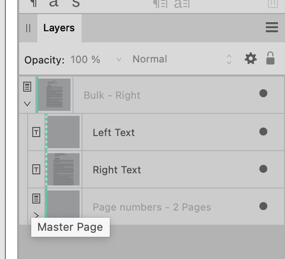
You can hover the cursor over the Actual page you are interested in and it will show the applied Master Page in a tooltip. You can look in the Layers panel and see the little icon for the Master Page. We can use multiple Master Pages on one page. One thing I do is set up a Master Page for the page numbers and headers and apply that to my various Master Pages so I use use just one Master Page. Or you can apply a second Master Page to an Actual page* by choosing to not Replace Existing Master Pages. * Right click on the Actual Page in the Pages panel and choose from the context menu.
-
I am slightly curious as to how the assets were built or are invoked so that this sort of thing happens.
-
Preset output receipes
Old Bruce replied to biomed32uk's topic in Feedback for the Affinity V2 Suite of Products
What are "preset output recipes"? -
I won't ask why you wanted to scan a cheque. But yeah, more numbers are better. [larcenous youngster emoticon] [smiley face emoticon]
-
Make two Paragraph styles. First one would have [Name of the first part] typed into the Texte: field before the \# . Also choose 1,2,3 instead of I,II,III in the numbering. Or are you just wanting no numbers but the Names to automatically increase? I don't know of any easy way to achieve that.
-
Actually in my experience (unilingual Anglophone here) majuscule is as you describe it, a separate letterform. Again in my experience, it will look like a capital letter but it is not a capital. I cannot recall actually ever needing them.
-
Affinity Suite: Align
Old Bruce replied to Pyanepsion's topic in Affinity on Desktop Questions (macOS and Windows)
Distribute with a gap of 0 units. -
I used File > Open. For the SVG you could try using the Layer > Geometry > Separate Curves command and that will give you several smaller curves which you can select and recolour using the Colour panel. The EPS opens fine here and I could select the various letters with the move tool and, again using the colour panel, change them from Black to whatever colour I wanted.