h_d
-
Posts
1,629 -
Joined
-
Last visited
1 Follower

Recent Profile Visitors
5,960 profile views


-
 Sadly no. The Affinity suite does not vectorise raster images.
 -
 h_d reacted to a post in a topic:
Colours in Publisher
h_d reacted to a post in a topic:
Colours in Publisher
-
Alfred reacted to a post in a topic:
Colours in Publisher
-
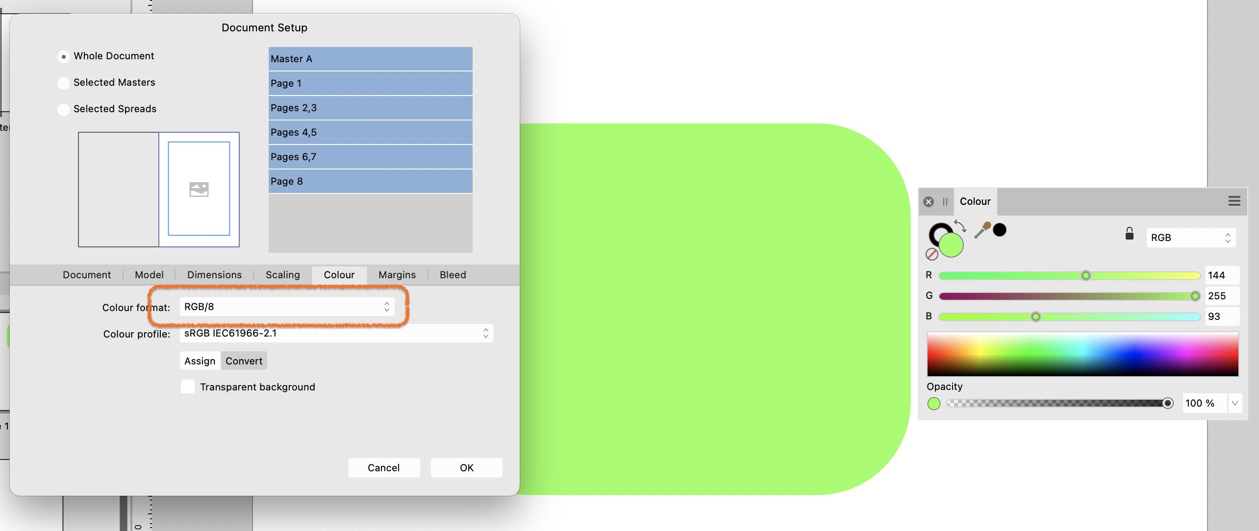
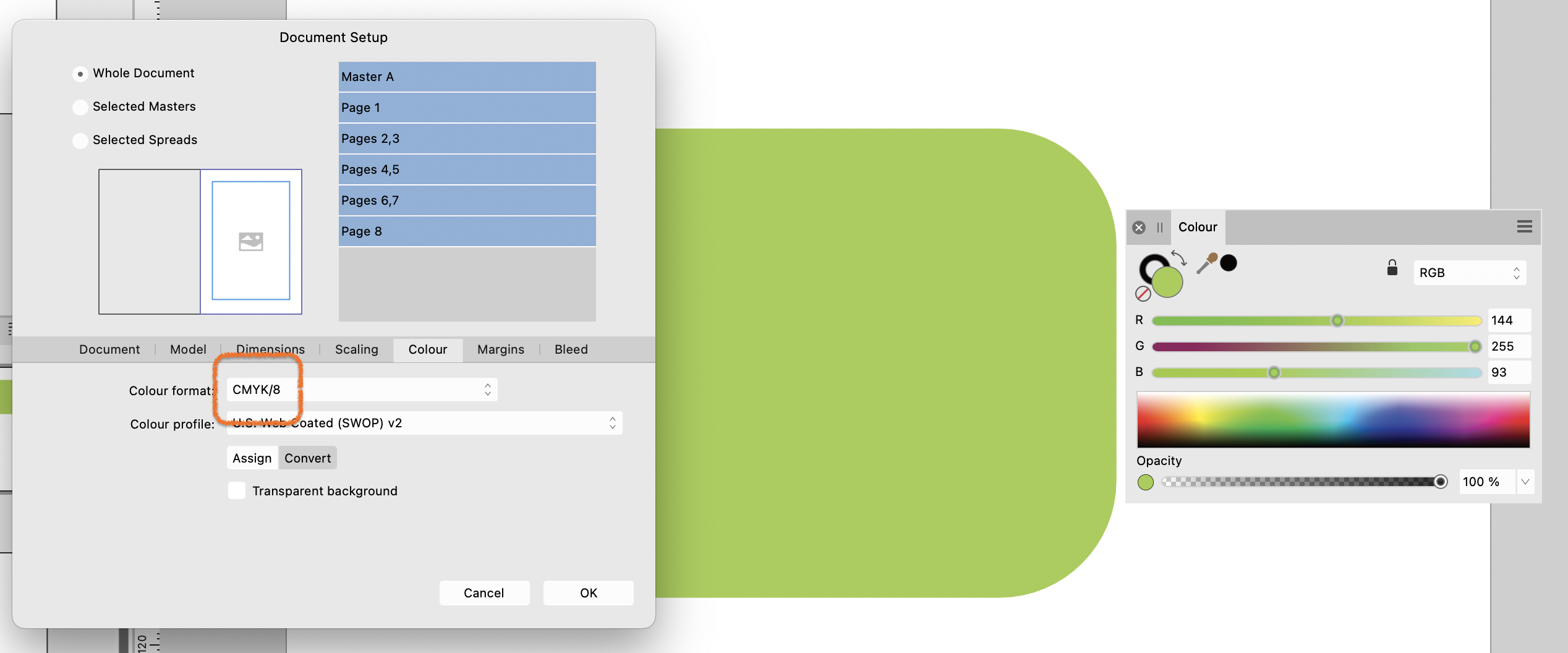
I would guess that the colour format of the 'sage' document is CMYK and the colour format of the 'vibrant' document is RGB. You can check this by going to the File menu and choosing Document Setup, Colour tab: RGB: CMYK: The CMYK version will give a closer representation of the printed copies. Vibrant greens render well on a computer screen but tend to get muddy when printed in four-colour process.

-
 bbrother reacted to a post in a topic:
Existing Slices Not Able to Export From an Imported Layer
bbrother reacted to a post in a topic:
Existing Slices Not Able to Export From an Imported Layer
-
I tried what you're describing and a brief test suggests it works if you insert the new image into the 'empty' .afphoto template by going to the Photo persona, then File > Place the full image into the empty layer stack, rather than copying and pasting. Switch back to the Export persona and the slices are where they should be, above the image. Haven't got time right now to go into more detail but hope it helps.
-
h_d reacted to a post in a topic:
New User figuring out Affinity 2 tool bar / Mac OS
-
LuckyOne777 reacted to a post in a topic:
New User figuring out Affinity 2 tool bar / Mac OS
-
h_d reacted to a post in a topic:
CMYK not coming out as expected
-
 Champ reacted to a post in a topic:
CMYK not coming out as expected
Champ reacted to a post in a topic:
CMYK not coming out as expected
-
werfox reacted to a post in a topic:
CMYK not coming out as expected
-
Publisher: remove guides completely from template
h_d replied to boffey69's topic in Desktop Questions (macOS and Windows)
I don't think there's any way of removing all the guides from all the pages - you'd have to do each spread individually. But what you could do is use the Assets panel to save regular artwork, story shapes, logos, graphics etc so that you can use them repeatedly without having to access the previous issue. Then make a copy of the previous issue, delete all the pages, add in new (guide-less) pages up to your standard pagination, then place any regular pieces of furniture on the pages. Now from the File menu Export as Template. Next time round, in the New dialog, go to Templates and pick up a squeaky clean version of the magazine, with all the furniture in place and no pesky guides. It's a bit of extra work to get it set up, but in my experience it will speed up your workflow no end. -
CMYK not coming out as expected
h_d replied to Champ's topic in Desktop Questions (macOS and Windows)
Is the printer a real-life person with whom you have human contact, or a web service? If the former, then have a one-to-one conversation with them and ask them to test your next file before printing. If the latter, then you're limited to what they offer on their website and they're probably offering a one-size-fits-all approach. It's possible that they're printing in CMYK but expect their customers to upload an RGB document. (It's certainly the case that PNG files cannot be saved as CMYK - to check this, open your originally exported PNG in Affinity Photo and check its colour format - it will be RGB.) My suggestion would be to create your design in RGB, then add a Soft Proof adjustment layer at the top of the layer stack. You will be asked for a CMYK Profile. If your printer doesn't tell you which profile they need, and offer it for download, then (a) they're a pretty useless printer and (b) try 'Generic CMYK profile'. The Soft Proof adjustment will give you a preview of what your RGB design will look like when printed in CMYK. Some colours will be muted, because CMYK has a narrower gamut (range of available colours) than RGB, especially if you are working on a very bright screen that isn't calibrated for CMYK work. With the Soft Proof adjustment layer in place you can adjust the colours of your RGB image to get your design closer to what you'll see in the printed version. Before you export the design, though, you must either delete or turn off the Soft Proof adjustment. Do not leave it on, and do not merge it with the RGB design. Your RGB document may now look 'wrong', but your finally printed version should be closer to what you saw with the Soft Proof adjustment in place. -
R C-R reacted to a post in a topic:
New User figuring out Affinity 2 tool bar / Mac OS
-
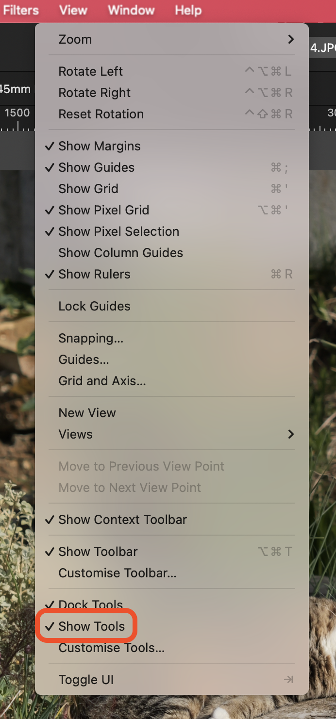
First thing to check: Pull down the View menu and make sure that Show Tools is ticked:
-
If your document has an artboard, you won't be able to change the size of the document in the Document Setup dialog. However, changing the size of the artboard in the Transform panel will change the width and height values in the Document Setup dialog to the dimensions of the artboard. If your document has an artboard, you can delete it from the Layers panel and you will then be able to change the document size in the Document Setup dialog. If your document does not have an artboard you can change its size in the Document Setup dialog.
-
h_d reacted to a post in a topic:
Letter spacing in the Publisher
-
Gnobelix reacted to a post in a topic:
Letter spacing in the Publisher
-
Letter spacing in the Publisher
h_d replied to Gnobelix's topic in Desktop Questions (macOS and Windows)
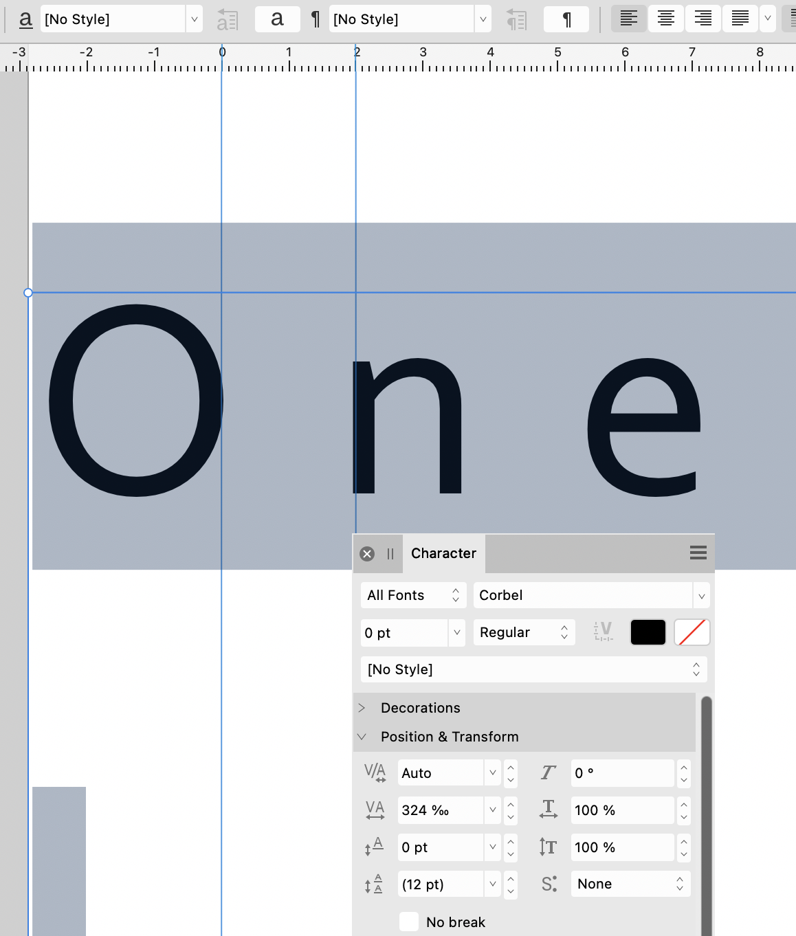
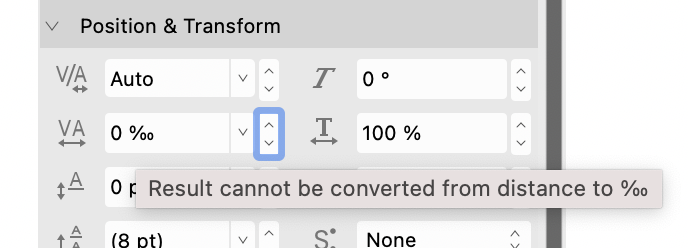
Horizontal scale distorts the letter shapes, so that won't help. Kerning applies to specifically defined pairs of letters, so that won't help either. Tracking affects the overall letterspacing, but in Affinity Publisher it is set and displayed as a relative percentage (presumably of the default letterspacing) and can't be converted to/from an absolute distance: I think the closest you can get if you want to set ('determine'?) the letterspacing to 2mm is to draw two vertical guides, 2mm apart. Create a small sample of type at the desired size. Align the right edge of the first character of your text to the left-hand guide, select all the text and increase the tracking in the character panel until the left-hand edge of the second character aligns to the right-hand guide: (I also adjusted the ruler origins to align to the right of the O.) This will give you a percentage tracking figure you can use for that font at that size. The tracking percentage will vary with the type size, so you can't use this as an absolute measure - it would have to be altered for each font and size. But's that's the best I can suggest.
-
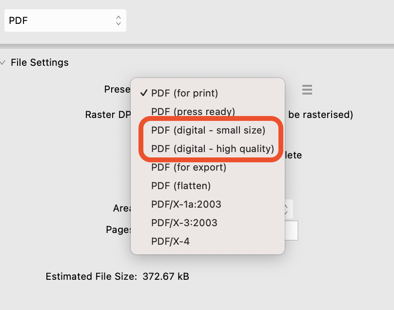
@John T have you tried any of the other presets? The preview can take a while to display but you can skip it if need be. If the other presets don't work and Affinity staff see your post they may ask you to enable pdf logging but that's a bit beyond us humble users.
-
Ron P. reacted to a post in a topic:
Can't get rid of the Artboard
-
Can't get rid of the Artboard
h_d replied to Anette's topic in Desktop Questions (macOS and Windows)
OK try this on a backup copy, not the original. In the Layers panel, click on the top layer inside the Artboard and then shift-click on the bottom layer. This will select all the layers contained by the Artboard, but not the Artboard itself. Cmd-x (macOS) or ctrl-x (Windows) to cut those layers. Select the Artboard layer in the Layers panel and delete it. Cmd-v (macOS) or ctrl-v (Windows) to paste the cut layers back into the Layers panel, without the Artboard. Just to repeat - work on a backup copy. -
The 'correct' tool is the one that does the job you want it to, but without seeing the image it's hard to know what to advise. By default the tools in the Liquify Persona are set to have very minor and subtle effects. You can get an exaggerated feel for how they work by increasing the Opacity, Size or Hardness in the Brush panel. A lot of it boils down to trial and error - you can always Undo if you over-cook it.
-
Walter Nissen reacted to a post in a topic:
[Publisher/Photo] Create grid-style collage from multiple pictures?
-
Are you able to share the pdf? I've tried this (on a Mac) and I have no issues selecting pages from a multi-page pdf using Shift-click and/or Command-click as described in (4) above (although Command+A doesn't work for me).
-
Export presets - copying to another device
h_d replied to ajpeck123's topic in Desktop Questions (macOS and Windows)
I don't know if these settings include export presets (they aren't mentioned specifically) but hopefully the above will help. -
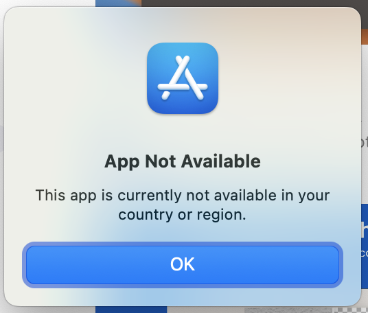
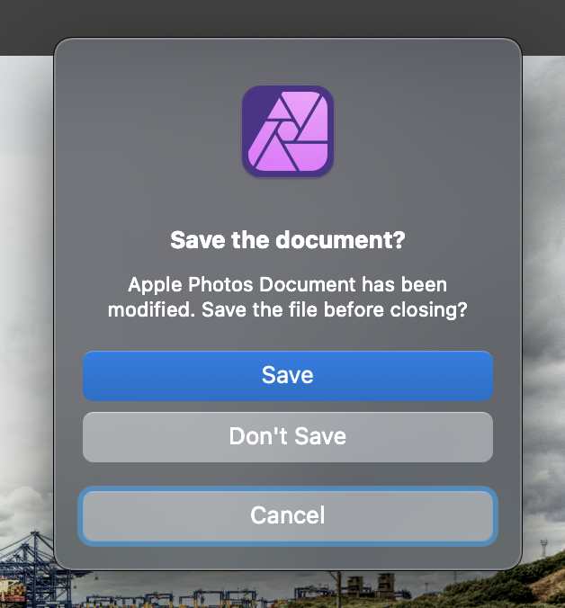
External Editors for Photos is (or appears to have been) a third-party extension to macOS. It's mentioned in this old blog post from March 2016, but when I click the link to the App Store on that page I get this: I suspect it's out of date/unsupported. I regularly use the Edit in Affinity Photo extension. That way there's no need to flatten Apple Photos images before closing them in Affinity Photo. The Affinity Photo extension does it for you when you save the image: I have occasionally seen the "Unable to edit with Affinity Photo" error message. It seems to occur mostly when the original image file is quite small. This may be connected to the rather cryptic message you get when you do successfully complete editing an image using the Affinity Photo extension: The best explanation I've read of how Apple Photos extensions work with external editors is here.
-
 h_d reacted to a post in a topic:
is it Comfortable to use Apple Magic Trackpad-2 while working on Affinity Photo ?
h_d reacted to a post in a topic:
is it Comfortable to use Apple Magic Trackpad-2 while working on Affinity Photo ?
-
h_d reacted to a post in a topic:
AffinityPublisher
-
Sharing/Linking brushes between AP and AD
h_d replied to CaroleA's topic in Desktop Questions (macOS and Windows)
Indeed. I think the reasons are historical - Publisher (2019) was introduced quite a lot later than Designer (2014) and Photo (2015) and came with a few more bells and whistles. Under the hood, the Affinity apps are all the same, but only certain elements of their functionality are exposed in the user interface. That's why you can essentially open any Affinity document in any Affinity app.