
Mik Kryger
-
Posts
15 -
Joined
-
Last visited
Posts posted by Mik Kryger
-
-
On 7/21/2020 at 12:22 PM, gewoonm said:
Cool artwork! Very exciting
would be nice to get some hint of the tools you’ve explored. Maybe a one-sentence underneath the work, that would make it easier to “go on the journey with you”
That's pretty nice idea but it would be hard to execute. Simply because I'm using many tools, adjustments, filters and so on. On top of that everything is in constant change. I think that I'm too lazy to describe every process but I might be able to prepare some tutorial that will show step by step what I'm using and how if you're interested.
On 7/21/2020 at 12:32 PM, Fred Lespine said:Very interesting experiments
")
Thanks!
-
-
-
-
-
-
Hello!
My name is Mikołaj but you can call me Mik. I've been using affinity software since first release in 2014 for graphic design(any kind of user interface design and visual identity assets).
Lately some idea popped in my head – I am using the same tools in the same way all the time, so to prevent some kind of stagnation I want to challenge myself to create different kind of artwork that I usually do.
Goal:
Creating artwork from scratch in a poster format using every tool that is available in the software.
I invite you to enjoy this journey with me.
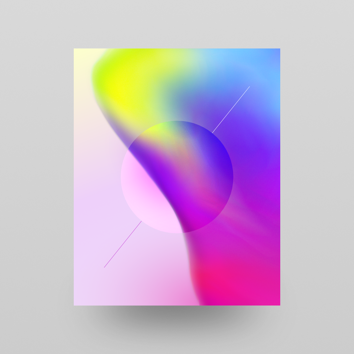
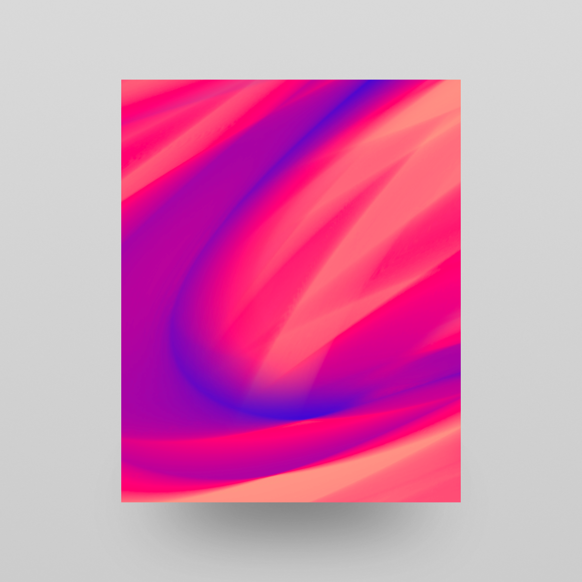
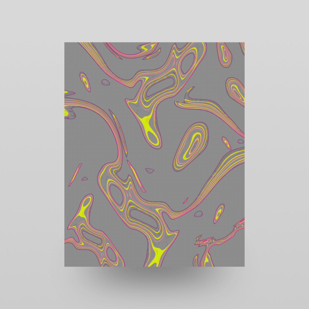
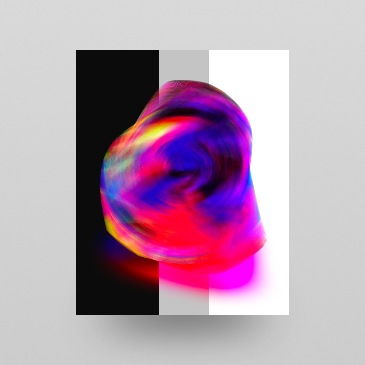
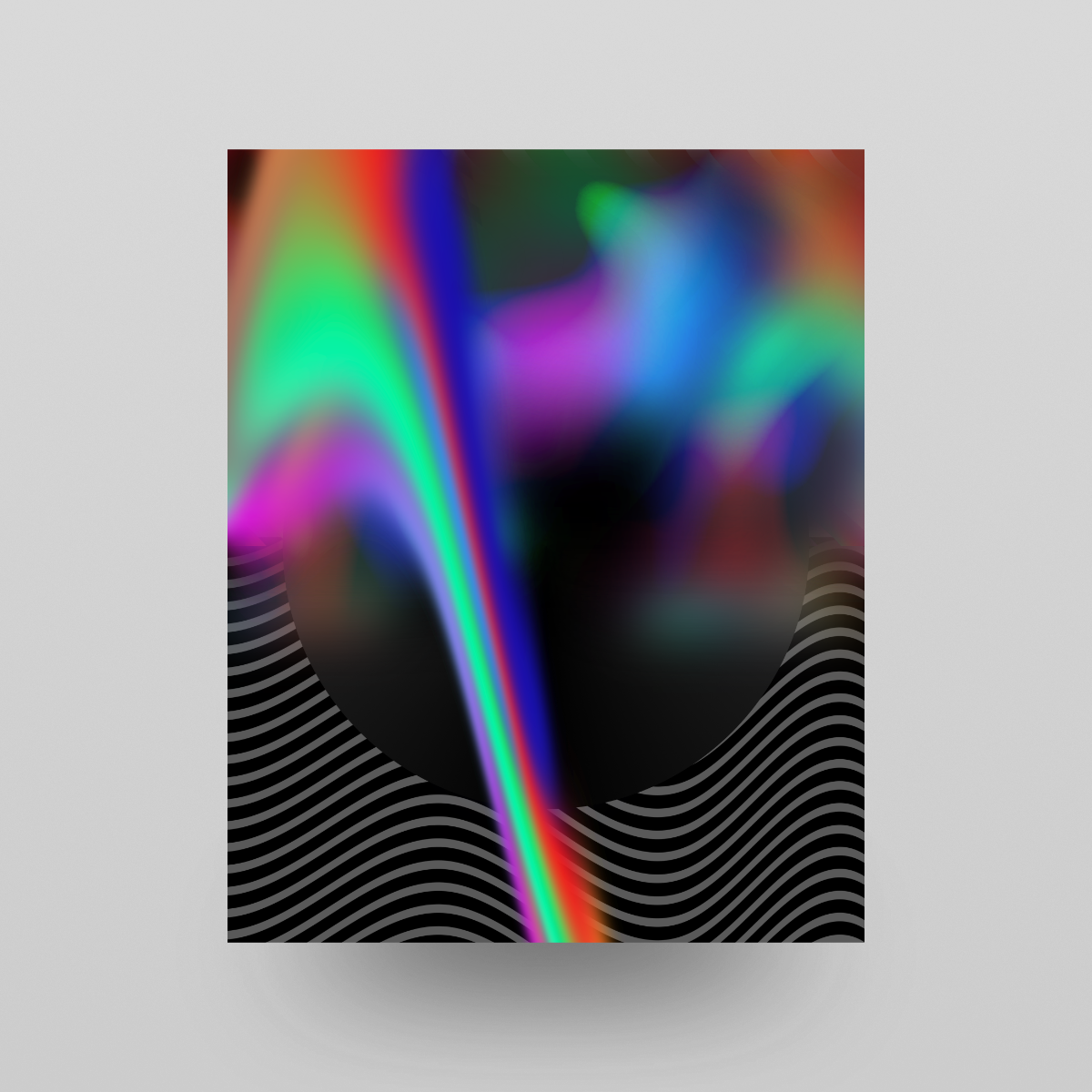
001
-
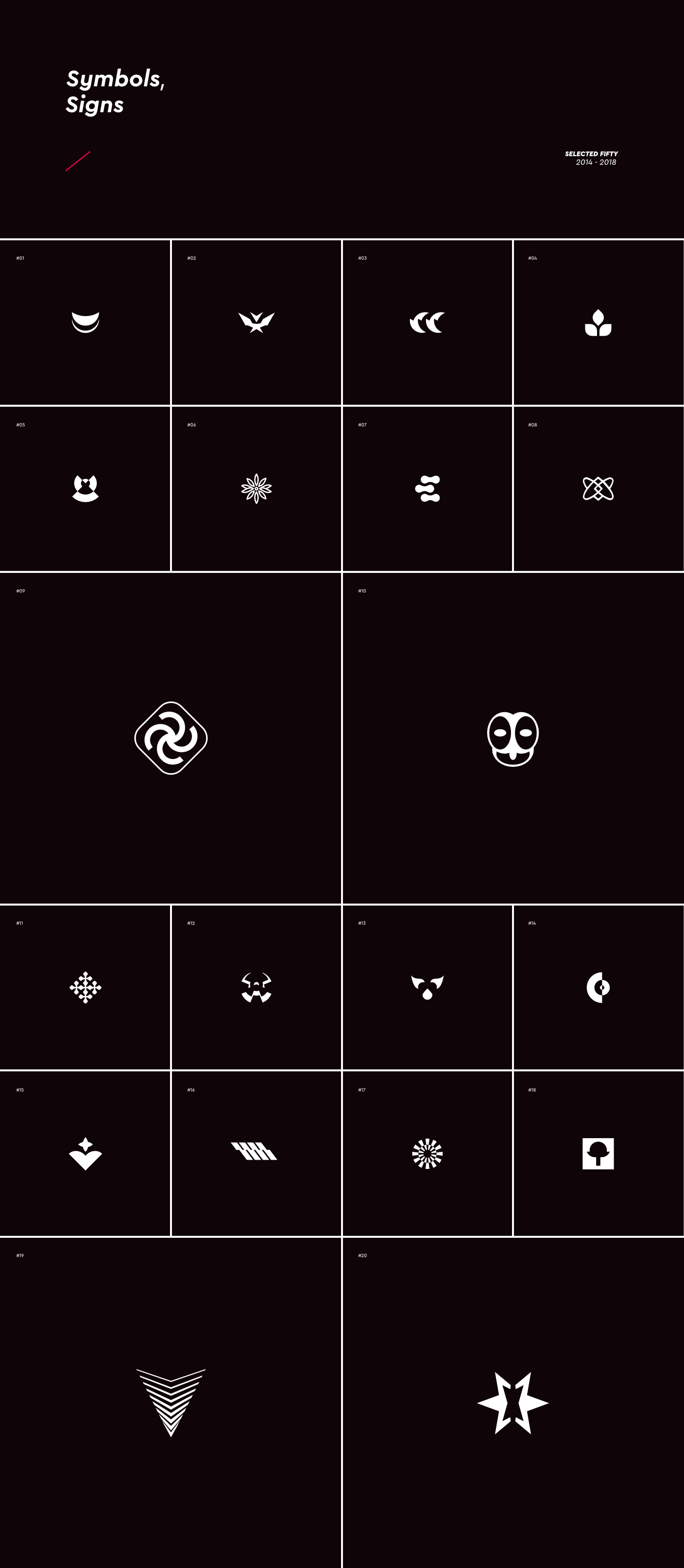
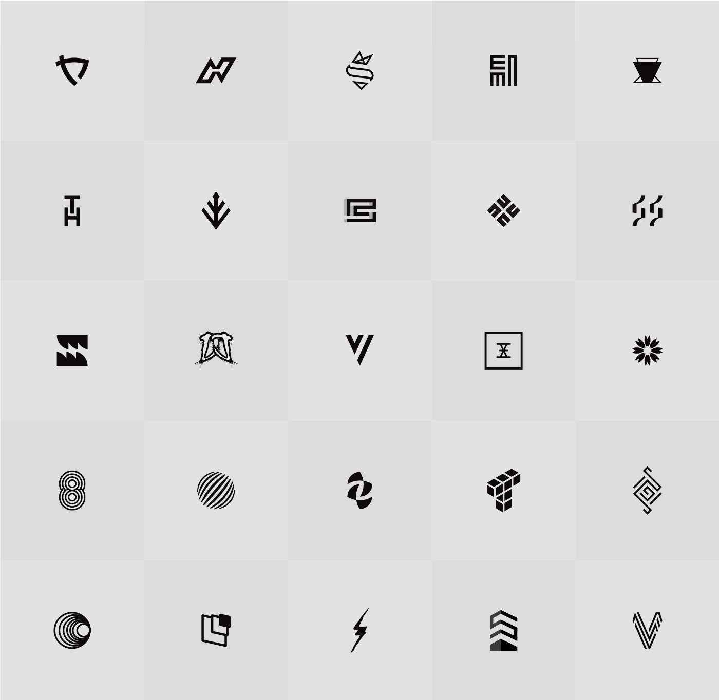
Every blink of the eye brings a picture to the human mind. Our thoughts and concepts, memories and dreams, our whole experience is played out in pictures. I share this carefully curated unpublished set of 50 shapes that I work on through years for inspiration purpose.
link:https://www.behance.net/gallery/71140757/Symbols-Signs-Collection
-
On 8/28/2018 at 9:52 AM, GarryP said:
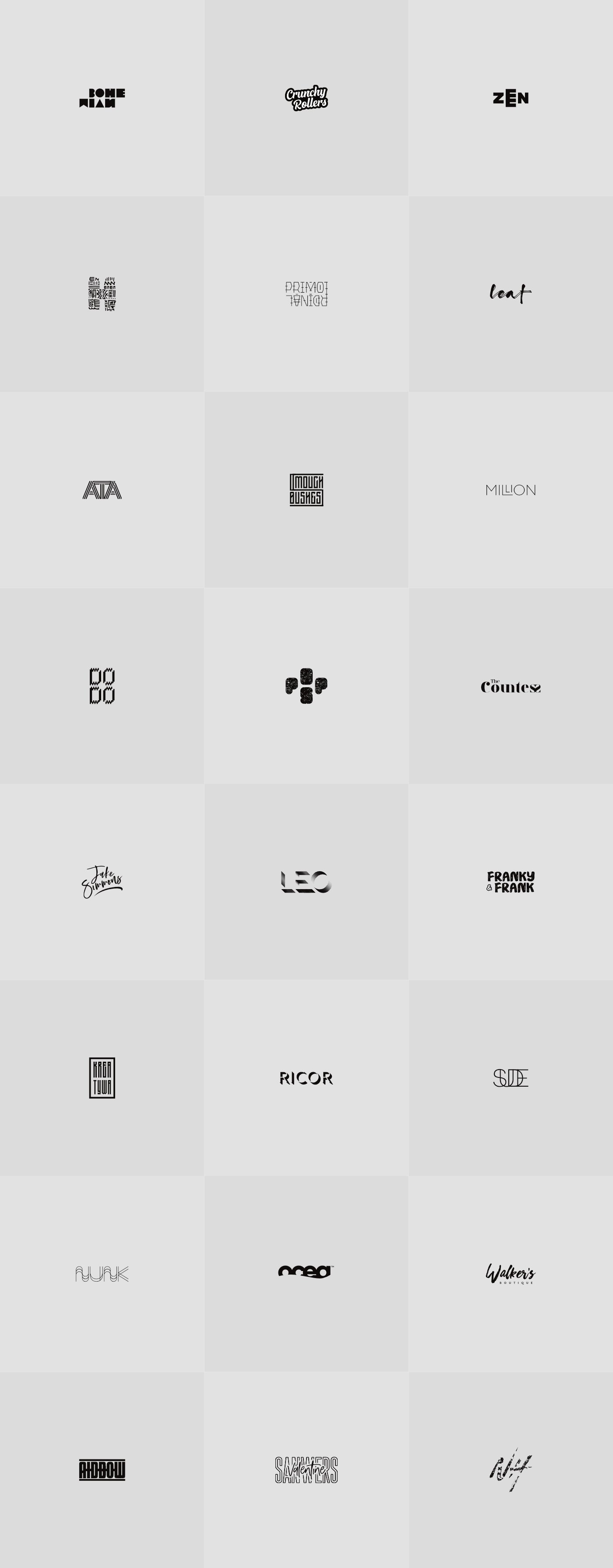
1. Difficult to read what it says at first - "Bohemian"? - and the different letter widths don't look right to me.
Yes. Letters are adjusted to the overall shape. You can clearly see that up and down lines are the same. We wanted it to be more funky and independent.
4. I've no idea what this one is supposed to be.Lettermark - with tribal feeling.
5. A bit confusing this one. Took me a while to read the word "primordinal" (which isn't an English word) but it looks like there's an extra "I" after the "O" too.
Thats the client idea..."he wanted to have a unique naming based on that word" even if I strongly dissuade that conception.
10. DO DO - Don't know if it's just me but it makes my eyes hurt a bit.We wanted it to be pixel-like.
12. The Countess - Took me a while to put the shapes on the end into being part of the word. Thought at first they were just a shape.
Can you see a women shape in last letters?
16. Kreatywa? - Can't tell what the text is supposed to spell.
Polish naming.
18. SUDE? - A bit difficult to read at first. My brain came up with "Suede" first.
Correct.
23. Valentine Sanwers? - Nice concept but can't read the background word very easily.It doesn't need to be stupidly obvious. It all depends on specific direction that is based on creative brief.
24. NH? - A little bit confusing and not quite "there" enough.Correct. We wanted it to be rusty, old and not too obvious at first view.
If I couldn't read or understand something then it could easily be that it's just my problem but, for me, if you can't figure out what a logo 'says to the viewer' within a second then it probably needs to be changed.I agree in most cases thats why in all of my creations I need good creative brief to know a lot of things before designing.
All-in-all there are some nice ideas in there and I would have been happy to have created most of them myself, but some of them are a bit confusing (which is easily-enough done when you're trying to come up with something both unique and eye-catching).
Im always designing based on good creative brief and with good understanding about the client and its target audience. In some cases I know that the solution doesn't need to be obvious at first. But you need to be careful
Please don't be disheartened by my comments. They're just the opinions of myself, someone who's deliberately looking at them to try and find fault because I want to learn more about the subject and draw better logos and icons in the future. You've actually given me some interesting things to think about, so thanks for that.
I do prefer that kind of comments rather than "good job" which giving me nothing
(my answers above in bold)
Garry thanks so much for your effort! I really appreciate the fact that you put so much energy and time to share this!
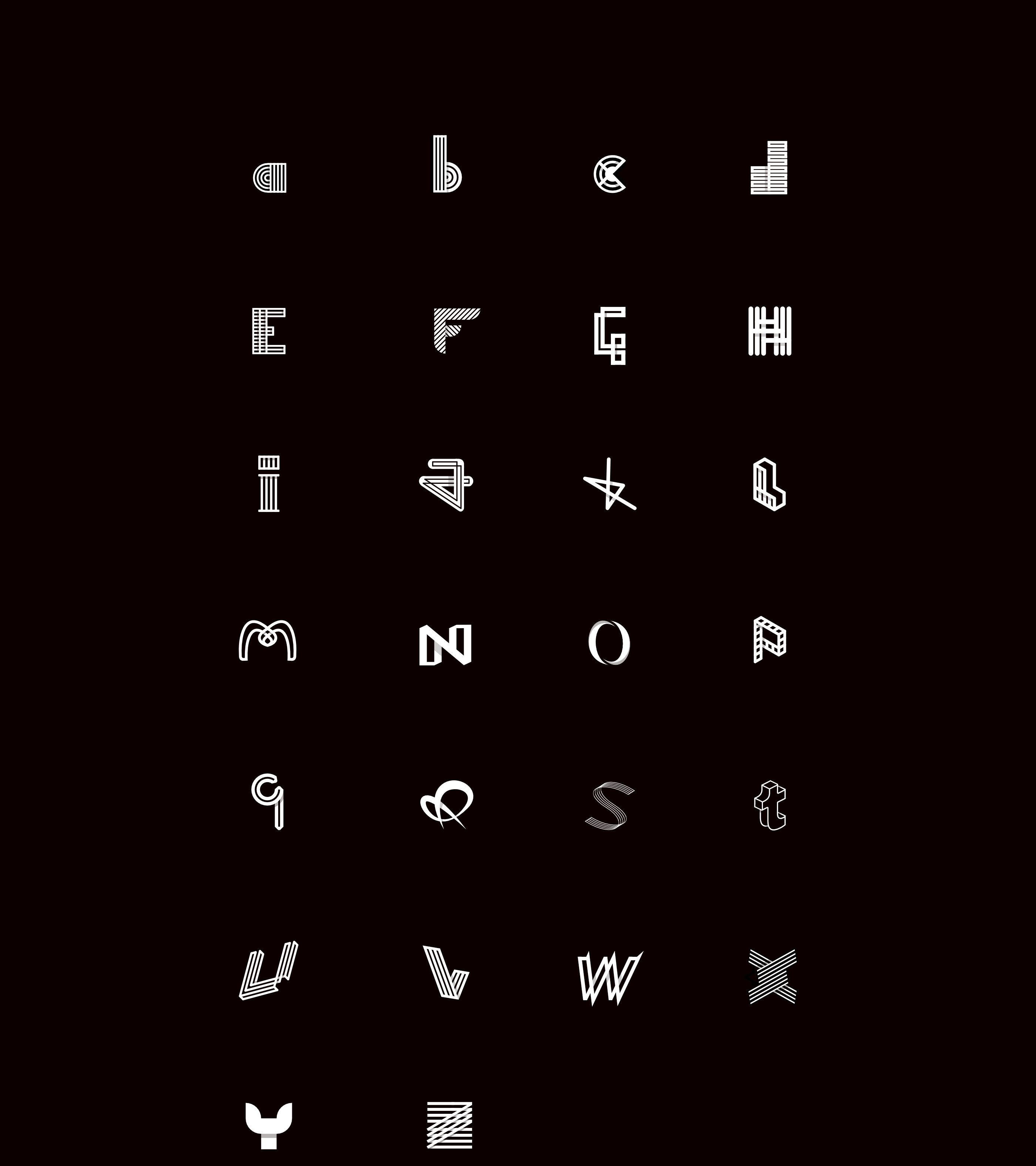
I would answer faster but I wanted to share something.I've designed alphabet of monograms.
Full presentation:
https://www.behance.net/gallery/70610901/Alphabet-of-Monograms
-
Hello!
I'm sharing second set of my logos
link:
https://www.behance.net/gallery/69491513/Logofolio-2-Wordmark-Lettermark
- Wojciech Krakowiak and Ros
-
 2
2
-
Hi!
I've finally decided to share my work after 3 years of collecting projects under my bed ...
I'm posting this here because I don't see much professional work that has been made in our lovely Affinity Designer!
I have around 100 projects portioned in 4 volumes. I want to publish one of them each week so stay tuned
Full presentation:
https://www.behance.net/gallery/69209275/Logofolio-No-1-Combination-Abstract
I would love to hear what you think about these.
Share your opinion.
- StuartRc, firstdefence, Aammppaa and 1 other
-
4
-
just.... awesome! :)
-
-
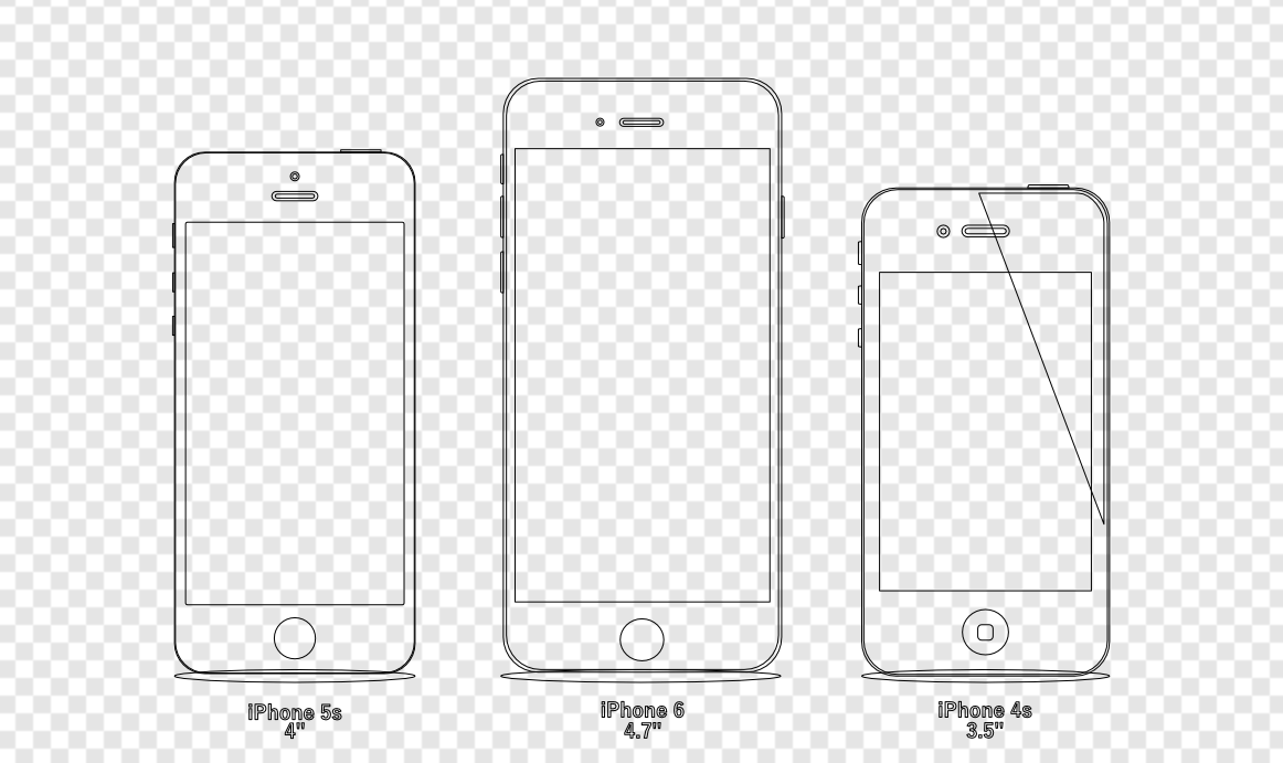
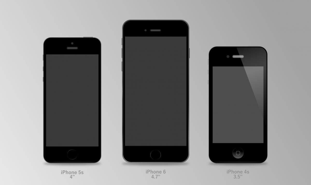
Hey !
I've created some iPhones flat mockup. (you can download source)
Just moved from Inkscape to AD.
Working in Affinity Designer is just pleasure :) It's more comfy and intuitive.
Cheers!

")
[AD][AP] Mik Kryger - Digital Art
in Share your work
Posted
Okay. I will do detailed step by step tutorial sooner or later. Creating these posters is fun and doing what I personally like gives my true freedom. There's huge difference between art and design. I'm trying not to love what I do in my everyday work. Personal attachment to any piece of design causes misjudgement which drives to unhappiness.
Baugasm was my main inspiration(you can find tutorial on skillshare) but I'm using different tools than in adobe illustrator. I like this style but Vasjen Katro(creator of baugasm) is not progressing as much as he did two years ago. Moreover I don't like to add same samples to artwork just to make it more busy. I don't want to stick to only one style. I want to experiment more, there will be much more diversity in my work.
You can find me here https://www.instagram.com/mikkryger/