-
Posts
6,949 -
Joined
Posts posted by loukash
-
-
1 hour ago, Old Bruce said:
How did you miss Ventura?
???
-
3 hours ago, bbrother said:
Calling it 'indoctrination' when people have spent decades working with the only real industry standard sounds weak.
My apologies for omitting the [sarcasm][/sarcasm] tags.

If I would travel all the way back in time, I have been also "indoctrinated" by Aldus PageMaker, Aldus FreeHand, QuarkXPress et al before even entering the Adobeverse.It always takes time to make a switch from a tool you were able to handle in your sleep. There was a time about 30 years ago when I knew QXP v3 and v4 inside out, off the top of my head. Everything. Some of my custom keyboard shortcuts in Affinity are still based on that.
-
33 minutes ago, Sergios_Guitar_Lessons said:
I am already roughly an entire hour on this BS, and I am pretty sure it is a very basic problem
Well, some of us Affinity users (like yours truly) have even wasted years at art schools to learn the basics of graphic design first.

Or, some others (also like yours truly) have been so indoctrinated for decades by the Ubiquitous Adobe Cult that it took them another few years to switch their mindset to fully understand what they're now dealing with as Affinity users. (Spoiler: it worked out fine for me )
)
In other words:
Take your time. Be patient.
Also, please don't be rude on the forum to "make a point".33 minutes ago, Sergios_Guitar_Lessons said:Seriously, I am beyond disappointed with my purchase.
If only there were a trial version of Affinity to check everything out before the purchase…

Oh, wait!
-
@currentuser, some recommended reading on the topic:
https://duckduckgo.com/?q=understanding+dpi+ppi+lpi+resolution -
5 hours ago, Martin S Taylor said:
When I do this, it puts the scanned file into the Package which is Affinity Photo 2.
This would be certainly very odd.
For me, it saves the intermediate scan into a /private/var/folders/(…) subdirectory which is for temporary files.
That's on MacOS Ventura. Haven't tried on newer OS though.5 hours ago, Martin S Taylor said:Could this be because Affinity Photo 2 has me as the owner, not 'system'?
I don't think so. I'm the owner, too.
That said, I vaguely remember having seen similar behavior before as well. But I don't remember in which context it was or if it was with Affinity or another app. Some 3rd party apps can definitely get confused by the MacOS "app package" concept and treat them as regular folders.
-
17 hours ago, Rob Ingram said:
having to go outside Affinity Photo to do all that is a real pain
You must be a genuinely lucky person if you perceive this as "real pain"…

Place the Image Capture app in your Dock and then:
Because clicking an existing icon in your Dock will cause you about as much "pain" as navigating to the File menu in APh and selecting the "Acquire Image" menu item anyway.
Then follow the setup procedure I've linked to.
If you don't want Image Capture to live in your Dock, set it up like this:
This complete workflow can be run by a few keyboard shortcuts.
To set it all up will take you a one-time investment of a few minutes which will be worthwhile if you…17 hours ago, Rob Ingram said:create books and do hundreds of scans per
-
4 hours ago, Dr. Greenthumb said:
You can set this up with pCloud as well
Even better than Dropbox: pCloud allows you to select any individual local folders and link/sync them to any individual folders on pCloud.
Whereas the virtual pCloud Drive is more or less a "bonus" for adding even more folders and files that you explicitly don't want to store and sync locally. But given it's a virtual drive, they are in fact stored locally as well, albeit hidden (on Mac) in the ~/.pcloud/Cache/cached disk image.At least that's how I use it. It's a very flexible concept.
-
4 hours ago, liumingming said:
This is a bad sign. The company is about to dissolve.
Sho 'nuff.
They all are already sitting in their interstellar spaceships, launching as we speak, because thanks to the Astrophotography Stack mode, they knew in advance that the Earth is going to be hit by an asteroid in three, two, o…
-
9 hours ago, Meliora spero said:
the claim that Photo is used by millions 😄 of professional photographers (which it isn’t)
Of course "it isn't" because you've just made this up.

Please learn to quote properly rather than spreading misinformation.QuoteAs the only fully-loaded photo editor integrated across macOS, Windows and iPad, Affinity Photo is the first choice of millions of creative and photography professionals around the world. With incredible speed, power and precision,
^ emphasis mine.
I, for one, am not a "professional photographer", but I surely am a "creative professional".
And so are allegedly millions *) of other Affinity users.Vive la grande différence.
*) Disclaimer: That all said, I'd also take the "millions" claim with at least a small grain of salt. A few years ago it's been publicly reported that there were at least 3 millions Affinity licenses sold, but how many "millions" of them actually are "creative professionals" remains anyone's guess. But that's how marketing works in general.

- Westerwälder, Komatös and PaoloT
-
 3
3
-
2 minutes ago, RE4LLY said:
the Adjustment Layer does not show up in the layer stack when grouped by itself in the Master Layer which it normally should.
Yep, I came to the same conclusion.

-
It seems that something has changed in v2.6.x (as opposed to v2.4.2 which I'm mostly using):
To make it work, do not group the adjustment layers. Place them in a blank Layer instead. Then you'll get the result as described in the old thread.
-
You're in Designer, so you have activated the Vector Crop Tool. This will crop single objects, not the canvas. It has no adjustable attributes in the context toolbar.
Confusingly, the Vector Crop Tool uses the same icon as the canvas Crop Tool in Photo. Duh.The Vector Crop Tool does basically the same thing as if you simply nest objects inside a plain rectangle shape. Nothing more.
(For the record, I haven't ever used it since I got Designer some 10 years ago… )
)
In other words:
User error, not a "bug"…
-
-
Well, no offense, but in that case it all reads as if you'd like to eat the cake and keep it, too…

-
46 minutes ago, wintermute said:
there is a possibility to input decimal values.
Yes, there is. I think Affinity even supports them, but it doesn't display them.
49 minutes ago, wintermute said:how many tones could be produced using raster?
So is there even such a high end CMYK printer where you could even tell, say, Y23.5 from Y23.6?
Let alone such a "high end eagle eye" that can spot it in print…?- wintermute, Alfred and Snapseed
-
 3
3
-
44 minutes ago, wintermute said:
does it make any difference in offset printing?
Hardly, when usually we work with integer values from 0 to 100 per CMYK channel…
-
2 hours ago, Viktor CR said:
and then copy it back to the resource?
No. Why? You don't need the resource anymore if you copy the content into your layout directly.
For what it's worth, this how I've been working e.g. with 3rd party vector logos since decades:
Often I'd be receiving some bloated or malformed EPS files (at best, because it could get worse than that).
Then I'd "crack them open" via Illustrator, clean up, save a backup *.ai, copy the curves into my InDesign layout, and save them into my custom ID library (which would "translate" as Assets in Affinity). Like this, I'd be using the logos as native InDesign objects, with all benefits that it has.In Affinity, I'm doing basically the same. (Except that it gets harder to "crack open" 3rd party EPS or AI files without having access to my old MacBook with Adobe CS5.5…)
Anyway…

Do you have an example of such a "tedious" workflow that you could upload? I'm genuinely interested.
-
To be able to edit "in place", simply copy the content of the linked/embedded document and paste it. Then you'll logically have a set of native layers for live editing.
Otherwise, how should a document know that you're currently editing content of a different document?
Besides, this very separation of contents is the exact feature here, not a "flaw" or something. -
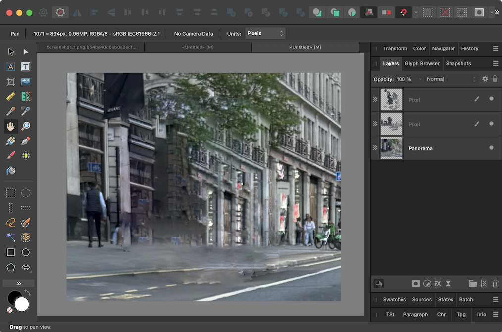
Ha, a fun challenge!


Ingredients:
- object selection tool
- mask
- PNG export with transparency
- fake panorama mode with auto inpaint
- manual inpaint
-
9 hours ago, arobiccurve said:
I would like to strongly emphasize the importance of getting this bug properly fixed in a future update. A reliable "Expand Stroke" function that respects stroke alignment and local stroke width is crucial for efficient and accurate vector design
Of course!

But… being an Affinity user since a decade by now, in the meantime I've learned not to hold my breath in anticipation of any critical bugfixes being released in three, two, one…
Hence, workarounds are our friends.
For the time being, that is.
Hopefully. -
10 hours ago, LionelD said:
I’m no expert
Obviously…
 10 hours ago, LionelD said:
Expand Stroke does not do this
Of course it does.
Or to put it more precisely: it's expected to do it.2 hours ago, arobiccurve said:The current behavior, where the expanded shape deviates significantly from the visual stroke (even with a single stroke), seems inconsistent with this expected function.
Definitely.
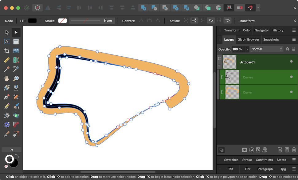
What happens here is that Expand Stroke ignores the Align Stroke To Outside setting and expands as if it were Align Stroke To Center.It's a bug.
That said, this bug is still somewhat manageable because you can work around it relatively easily:
- double the stroke width
- expand
-
voilà:

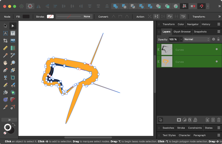
… as opposed to the old Expand Stroke algorithm in v2.4.2 and older, which had its own weird quirks and, er… excrescences:


-
-
37 minutes ago, SoCreative said:
I'm able to modify the highlighted text in all three places (Character Override will remove the parenthesis)
But as noted, in 99% of all cases you do not want to "override".
Override may have a special use as a fancy gimmick, e.g. when you want to increase leading for just a few lines inside a paragraph.
This video explains it pretty well:Also, I was not exactly correct saying that you "can't underride": You can "underride" (i.e. override by decreasing leading), but only if at least a whole line is selected. Selecting only a part of a line and override can only increase the leading.
-
18 minutes ago, thomaso said:
It appears to be just scrolled, with the scrollbar cut off in SoCreative's screenshot.
Ah, could be…


extremelly beginner-unfriendly software
in Feedback for the Affinity V2 Suite of Products
Posted
I see. Well, I've been a Mac user since 1988 or so, thus I may have "missed" thousands of obscure software titles…