lphilpot
-
Posts
416 -
Joined
-
 Ldina reacted to a post in a topic:
Huge file sizes with repeated Saves - Photo v2.5.6 Mac
Ldina reacted to a post in a topic:
Huge file sizes with repeated Saves - Photo v2.5.6 Mac
-
 I've seen the same behavior on Windows. I have to Save as... to a new file name after closing then reopening the original file. Usually that works. Pain in the neck.
- 46 replies
-
- 1
-
-
- affinity photo
- filesize
- (and 2 more)
-
Good luck. I'm in total agreement and months (more than a year?) requested the ability to dock the tool bar anywhere -- like every other GUI app -- but so far no go. I'm right handed so I prefer the tools on the right side where (as you indicated) i can access them without traversing the document preview width. I have the tool bar floating to the right, but if you move the main Photo app window, the tool bar doesn't follow -- It just sits there orphaned. Dumb, IMO. I'm on Windows, BTW.
-
 selenita reacted to a post in a topic:
File path for Affinity Photo / Start EXE-File
selenita reacted to a post in a topic:
File path for Affinity Photo / Start EXE-File
-
Eugen reacted to a post in a topic:
In-depth Affinity Photo training / book(s)?
-
Glennsart reacted to a post in a topic:
Modify a Gradient?
-
I'd love to see a non-destructive gradient that could be applied to / as a layer mask and later edited. I've played a bit with gradient fill layers but only partially successfully in that context.
-
Removing all exif etc for web publishing.
lphilpot replied to Sharkey's topic in Desktop Questions (macOS and Windows)
For what it's worth (which may be nothing ultimately) I leave my personal copyright in even if I strip other metadata. -
Yes, the shortcut can be configured to do that. But it shouldn't be necessary, especially if you're referencing a plugin owned by you, in a folder owned by you, with permissions on your account. If the plugin is installed under C:\ProgramData, that's almost certainly (IMO) why admin rights are required. If it's installed elsewhere, it might be educational to see the security rights on the GMIC plugin as well as the folder tree in which it lives.
-
I'm running the MSI version of Photo, but it should have the same permissions as the sandboxed version so that shouldn't be an issue. It's not surprising the app would've have rights to create a directory under ProgramData but I'm not sure what's interfering elsewhere. My user account is a local admin but again that shouldn't be a factor under one's own home.
-
walt.farrell reacted to a post in a topic:
Adding Gmic plugin
-
Is that where it installed by default? C:\ProgramData is a very protected location so permissions issues aren't surprising. I put my GMIC plugin (and any other third party 8bf / Photoshop plugins) into a folder under my home directory and then added that path to Preferences. Unless you're using the standalone version of GMIC and want the installer to create shortcuts, etc., you don't even need to install it. Just extract and copy GmicPlugin.8bf to wherever you've instructed Photo to look. Restart Photo and it should work.

-
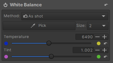
Colour difference in Affinity Photo
lphilpot replied to DebSki's topic in Desktop Questions (macOS and Windows)
Opening it in ART gives this WB: Setting Photo to those same (or equivalent) values gets closer but not the same. The lens vignetting correction is in metadata, but I can't say why Photo is apparently misreading the WB.
-
lphilpot reacted to a post in a topic:
What am I doing wrong here?
-
What am I doing wrong here?
lphilpot replied to RichiePhoto's topic in Desktop Questions (macOS and Windows)
There are other options than just Affinity or brick... 🙂 Some are paid, some are free, several are very capable from either option. -
lphilpot reacted to a post in a topic:
As a pro' retoucher these are the main reasons that I can't make the switch to Photo.
-
jmwellborn reacted to a post in a topic:
The masses are coming over, is Affinity ready?
-
The masses are coming over, is Affinity ready?
lphilpot replied to evtonic3's topic in Desktop Questions (macOS and Windows)
Maybe I hit on a lesser course, but my impression of the couple of AR Photo tutorials I looked at were ... thin and somewhat tedious (I guess is the best desccription). I realize it's probably down to personal preference but I got the impression it wasn't exactly information-dense. I would much prefer something more akin to a university-level classroom. It's not that I'm smart -- far from it 🙃 -- but I see little reason to spend time on instruction if it's relatively little 'elevated' from what I can figure out on my own (again person preference). More dense instruction will likely be more difficult but in the end you'll know more. I've been looking for landscape-oriented Photo training more in the vein of Mads Peter Iversen's big Photoshop course. At $300 USD and ~25 videos that course is in a different category from AR. So far I've found nothing, though. -
Brian_J reacted to a post in a topic:
The masses are coming over, is Affinity ready?
-
The masses are coming over, is Affinity ready?
lphilpot replied to evtonic3's topic in Desktop Questions (macOS and Windows)
Yeah, I came up with that on the spur of moment to illustrate the concept. Point is, a standard template "database" format that covers all the necessary information about functionalities is IMO the best approach, instead of a more purely prosaic style (for lack of a better term). That would tend to enforce more complete documentation. I do find it amazing -- and not in a good way -- that pressing F1 doesn't open help relevant to the current app context. You still have to search and then try to pick the best results, if any. It's not like context-sensitive help is a new concept... The current help system is literally nothing more than a basic local website. -
The masses are coming over, is Affinity ready?
lphilpot replied to evtonic3's topic in Desktop Questions (macOS and Windows)
I agree, Help isn't particularly helpful at times. It's not context-sensitive, there's no index, there's no "by menu" documentation of each function presented in the UI and what functional descriptions are there are sometimes frustratingly thin, often just repeating what's already visible on screen. And no, I can't provide examples for all of this ATM, but I've seen it quite often. Personally I think every capability should be documented along these lines: Function name Functional context / persona (e.g., raw only, vector only, etc.) Purpose Technical description / parameters, etc. Complete functional instructions Sample / brief tutorial Context, i.e., "see also" or other similar functionality That sort of template has been used in developer documentation for decades, because it works. -
Affinity 2.5.2 Problems
lphilpot replied to GraphicsByGreg's topic in Desktop Questions (macOS and Windows)
I've not run into that but Photo 2.5.2 seems to be noticeably slower in screen refreshes than before. There's noticeable pixel layer tiling which I've not seen before, even on my (very) moderate laptop. -
POSIX and other standards are great for what they are (not minimizing them) but they're only a subset of what's coded. As you indicate, it's all the non-portable (even undocumented?) stuff that's the problem. Try writing a real-world, non-trivial, usable app in completely portable ANSI C, for example...
-
lphilpot reacted to a post in a topic:
Keyboard toggle for layer visibility (Photo)?
-
Then again, as I recall you Texans got to see Comet McNaught (C/2006 P1) in the daytime during early 2007 while farther east we were totally overcast for the entire apparition. And that's way cooler than an eclipse. 🙂