
smadell
-
Posts
1,151 -
Joined
-
Last visited
Reputation Activity
-

 smadell got a reaction from Cmak in Cartoon Effect - a free macro
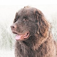
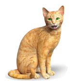
I haven’t posted any “artistic filter” macros in a while, and I needed to break my dry spell. So, I tackled an effect that, until now, I’ve never accomplished in a way that I considered satisfactory. Today, I’m posting a Cartoon Effect macro that I’m happy with, and that I think will satisfy some users.
The macro is attached as an .afmacros file, which must be imported into the Library panel of Affinity Photo’s desktop version. It can also be imported into the iPad version (although I have not tested it on my iPad as of yet). Once the category resides in your Library, you can move the macro to a different category if you like – click and drag it to the destination you desire.
* * * * * * * * * * * * * * * * * *
When you invoke the macro, it will create a Group named “Cartoon Effect” and all of the edits reside within that group. Because of this, you can turn the group on and off to show and/or hide the effect entirely. If you look at the contents of the group, you’ll find a reasonably complicated multi-level collection of layers. The important ones are labelled, so you can edit the effect after the fact.
When you click on the macro, you will be faced with a dialog box that allows you to make 6 different choices. As you use these sliders, each change will run the macro again in order to invoke your change. The final effect is written to the image only when you click the “Apply” button. The choices you can make during the macro’s run are:
1) How Many Colors?
This is a Posterize adjustment, and the default value is 3. I’ve found this to be the best value for most images, but feel free to experiment.
2) Adjust Amount of Smoothing
This slider simplifies the edges of the colored areas formed by the Posterization. Higher values will simplify (smooth) the edges more. The default value is 4 px, but this can potentially be turned up quite high. At some point, though, increasing the edge smoothing will make the image unrecognizable. Change this slider as needed, but the practical upper limit is far lower than the slider will allow!
3) Outline Width (keep low, increase only as needed):
Outlines are placed at the edges of the posterized colors. They are black, or shades of grey. This slider allows the user to increase the width of the outlines, as needed. In general, keep the values fairly low (the default value is 1 px). Like the smoothing slider above, once you get above a certain value, the results will be atrocious.
4) Outline Darkness (higher = darker)
This slider defaults to 60% and affects the “blackness” of the outlines created. It corresponds to the Black slider in a Levels adjustment. Values over 90% will start to have an adverse effect on the overall colors of the image, and setting the darkness to 100% will turn the entire image black. Values of 90% or lower are generally OK.
5) Adjust Grey Outlines (higher = darker)
This slider defaults to 0.75, and corresponds to the Gamma slider in that same Levels adjustment. The effect of the slider is to make the grey outlines (those that are not entirely black) either more or less prominent.
6) Adjust Outline Opacity
This slider affects the overall opacity of the outlines. The default value is 100%, and setting this slider to 0% will effectively make the outlines disappear. However, once you have made adjustments to the sliders for outline width, darkness, and grey values, this slider can decrease the overall prominence of the outlines.
* * * * * * * * * * * * * * * * * *
I’ve attached two images below, showing the original photo, the Cartoon Effect settings used, and the cartoon result obtained. You should be aware that this macro may not look great on every single photo, mostly based on the overall complexity of the photo and the number of different colors in the original. Also, smaller photos (in my experience, images of less than about 800 x 800 pixels) don’t end up looking great.
As with all the macros I have submitted, please remember that I am one person with one computer, testing on a limited number of images. There is no way to have foreseen all possible scenarios. I believe (but obviously cannot guarantee) that you will be happy with the results.
If you like the macro, please keep it and enjoy it. It is yours to use freely. I have learned a great deal from the users on this forum, and their continuing generosity helps my ongoing efforts at learning. I encourage you to “pay it forward” and contribute to the forum in whatever ways you can.
Be one of the good guys.
Cartoon Effect.afmacros
-
 smadell reacted to Old Bruce in Resizing canvas also increases size of cropped image.
Full disclosure: I too use Layer > Merge Visible, much more often than my Flatten choice. I will use Flatten only when I need the image to be the size of the canvas. Once I am happy with all the adjustments and cropping I will flatten and then perhaps use a tiny bit of sharpening to get the final result.
-
 smadell got a reaction from Old Bruce in Resizing canvas also increases size of cropped image.
Instead of flattening the document, I more frquently use Layer > Merge Visible to create a new pixel layer containg the sum total of all layers done to that point. If appropriate, I also turn off the visibility of layers beneath the merge visible one (so that they don’t tie up the computer processor(s) unnecessarily). This lets me maintain a copy of all adjustments, filters, and so forth, and gives me a mechanism to return to a non-destructive workflow if I need to make further edits.
-
 smadell got a reaction from Jim Smith in AFFINITY PHOTO - Resize Canvas unexpected results
When you cropped your developed raw file, you obviously brought the left border of your photo in (effectively chopping off some pixels on the left side). The thing of it is that cropping on Affinity Photo is non-destructive; the cropped pixels are still there, but are hidden by the current size of the canvas. When you expanded your canvas, you effectively revealed some of your previously cropped pixels.
The way to do what you want is to (i) crop the developed image; (ii) choose “Rasterize and Trim” by right clicking on the layer; and (iii) then increasing the size of the canvas.
The Rasterize and Trim command is destructive (there’s no getting the trimmed pixels back). You could, if you want, duplicate the cropped layer, turn off visibility on the original, and Rasterize/Trim the copy. The cropped pixels should still exist on the hidden layer, if you ever need them.
-
 smadell got a reaction from rhett7660 in Graphic Novel Effect
Based on a recent thread started by user Steps, I have finalized and am attaching a macro called "Graphic Novel Effect." It is similar to the "Paint by Numbers" macro I created a while back, but offers better control of the black outlines that are needed in a cartoon or a graphic novel illustration.
The attached file is a macros category (not a single macro) and can be imported through the Affinity Photo Library panel. Once inside Affinity Photo, the category contains a single macro which can be moved into a different category (by dragging it) if desired. Since it is provided as a category, it can also be imported into the iPad version of AP.
When you use the macro, it creates a number of layers inside a group (which can be turned on and off to show or hide the effect entirely). The user is presented with 5 options in a dialog:
1) Posterize - How Many Colors?
The macro is preset to 5 color levels, but anywhere between 4 and 6 generally gives a decent result.
2) Outlines - Adjust Black [line thickness]
This option is preset to 50%, but changing the value will make the black outlines more or less prominent.
3) Outlines - Adjust White [fill smoothness]
This option is preset to 90%. Changing the value will affect the fill (inside the outlines). Keep the value above the value set in option #2 (line thickness).
4) Finish - Adjust the Brightness
5) Finish - Adjust the Contrast
These are preset to Brightness = -15% and Contrast = +30%. Changes made here will have the obvious results, and should be considered a finishing touch.
* * * * * * * * * * * * * * * * * * * *
As always, I am one person with one computer and have not tested this in every possible scenario. Try it and, if you like it, keep it and enjoy it. This forum has provided me with so many good ideas and answers to questions; this macro is another attempt to “pay it forward.”
Graphic Novel Effect.afmacros
-

 smadell got a reaction from j3rry in 38 Gradient Maps for Color Grading
Today, let’s have fun with Gradient Maps…
Gradient Maps are a great way to color grade photos, since they map dark, light, and midtone values according to a pre-defined gradient. This can easily define a “look” for photos that might otherwise be hard to accomplish.
Although I am not a user of Photoshop, our “arch rival” has a wonderful group of gradient maps called “Photographic Toning” that are specifically designed to color grade photos. Although you have to drill down through a few panels and dialog boxes to find them (and you sort of have to know they’re there in the first place) they are a truly nice addition. Also, they are easily obtained by anyone.
But, as they say, there’s the rub. Affinity Photo cannot import Photoshop gradient maps. Affinity Photo can store pre-defined gradients in the Swatches studio, but for some unknown reason the stored gradients are not available from the Gradient Map studio panel. Gradient Maps can be stored as presets, and can be chosen from the Adjustments panel, but I don’t believe they can be easily exported from one computer and brought into a different one.
So… after a long couple of days of transcription, I have created a set of Macros that apply each of the 38 Photographic Toning gradient maps. Since macros are easy to store, and to share, I am making them available for anyone who wants them.
There are actually 2 sets of Macros included - each as an easy-to-import Category from the Library panel. The first group of Macros is called “Photographic Toning Gradients” and these are named according to the gradient map they apply. Each macro creates a Gradient Map layer, applies the appropriate color values, and names the layer according to the gradient map it applied. The second set of macros is called “Photographic Toning Gradients - reduced.” This category also applies the gradient maps in a similar fashion, but then reduces the opacity of the layer to 30%. This reduces the effect of the Gradient Map, and produces a much subtler effect.
Here is an image that shows the full-strength versions of all 38 gradient maps.
And here is a photo to which I’ve applied a full-strength gradient map, and also a reduced-strength gradient map.
These macro categories are included in the ZIP file attached to this post, along with a Letter sized JPG that includes samples of the gradient maps. Also included in the ZIP file is another macro category that includes one more macro. It’s called “Obama Hope Poster” and, as you might have guessed, it turns any photo into an Obama Hope-style poster. Just because…
Please enjoy them!
Photographic Toning Gradient Maps.zip
-
-
 smadell got a reaction from PaulEC in UI
Before you leave, @Mabel Lucy, try switching over to the Light user interface. For the longest time, I loved the “look” of the dark interface, but eventually realized that parts of the interface were getting harder and harder to make out. Not only was this an age-related issue on my end, but the contrast in the dark interface is really low. Switching to the Light mode interface was an immediate improvement, and things are way easier to see now! Things that really improved include (i) the text in individual tabs for multiple open images; (ii) selected vs unselected things; (iii) the smaller icons, especially the monochromatic ones; and so forth. The dark-to-light switch improved my experience immediately.
-
 smadell got a reaction from R C-R in Need a little help with macros
Alan. I wish I could say that all of this was perfectly obvious to me right away. But I had plenty of macro recordings crash on me when I tried to exit a Group without first selecting the parent (the group, itself). It really was quite a lot of trial and error. But, once you know how to make it work, it's pretty seamless.
You can also get things inside a group by using the "Move Inside" command from the menus. Once inside the group (or for any situation, really) you can use the various choices on the Arrange menu to re-order them (e.g., Move Forward One, Move Back One, and so forth).
My nearly-66 year old eyes had a really hard time reading and seeing all the little UI doodads in Dark Mode. I still like the "look" of dark mode, but I recently started using Light Mode because it's so much easier to read the interface text and to see the little monochromatic stuff (like those teensy weensy eyeballs).
-
 smadell got a reaction from Colin Dixon in Correcting a horizon in a photo.
Mesh Warp.
Straighten the Horizon.mp4 -
smadell reacted to Mike4Life in Luminance Masks From Channels
Thanks so much for your responses. I will look into the videos and explanations you provided.
-
 smadell got a reaction from NotMyFault in Infinity Tiles
Very Escher-esque. Like the one below, I think your image would have done well on the wall of my college dorm room!
-
 smadell got a reaction from EDHOR in Longer "Open Recent" list?
It is a MacOS Preference. Open "System Preferences" and you should find it in the "General" section. (My screenshot is from MacOS Big Sur – yours may look different if you're using an older or newer version of the OS.)
-
smadell reacted to EDHOR in Longer "Open Recent" list?
That's got it. Thank you for your help. Setting it higher in the system preferences does the trick.
Who knew? You knew. 🙏
-
 smadell got a reaction from firstdefence in Reduce Yellowishness (Warm Tone) on Face ?
Here's a nice method that can neutralize the color cast that your phone camera has introduced. Put a Levels adjustment on top of the image. Instead of making initial adjustments to the "Master" channel, select each of the Red, Green, and Blue channels. In each of them, move the "Black" and "White" sliders so they just hit the shoulders of the histograms in each of the channels. Once, you've done all 3, you can tweak the result by moving the "Gamma" slider to either side. For instance, in your image (edited, shown below) I have moved Gamma to the right on the Red and Green channels, which effectively brings a bit more Blue and Magenta into the image, respectively. In the Blue channel, I've moved the Gamma slider just a smidge to the left, which introduces a bit more blue to the picture.
You can now visit the Master channel and tweak the sliders there, which are more for luminosity than for color.
Also, you could limit the change to the face (if you were so inclined) by inverting the adjustment layer (select the adjustment in the Layers panel, and choose Invert from the Layer menu), then painting in White directly on the adjustment to bring the adjustment back to those areas you want it to apply.
[By the way, I find this method to be really helpful when I'm trying to correct the color on scans of old, faded photos that have more color casts than a simple White Balance adjustment can effectively handle.]
-
 smadell got a reaction from augustya in Reduce Yellowishness (Warm Tone) on Face ?
Here's a nice method that can neutralize the color cast that your phone camera has introduced. Put a Levels adjustment on top of the image. Instead of making initial adjustments to the "Master" channel, select each of the Red, Green, and Blue channels. In each of them, move the "Black" and "White" sliders so they just hit the shoulders of the histograms in each of the channels. Once, you've done all 3, you can tweak the result by moving the "Gamma" slider to either side. For instance, in your image (edited, shown below) I have moved Gamma to the right on the Red and Green channels, which effectively brings a bit more Blue and Magenta into the image, respectively. In the Blue channel, I've moved the Gamma slider just a smidge to the left, which introduces a bit more blue to the picture.
You can now visit the Master channel and tweak the sliders there, which are more for luminosity than for color.
Also, you could limit the change to the face (if you were so inclined) by inverting the adjustment layer (select the adjustment in the Layers panel, and choose Invert from the Layer menu), then painting in White directly on the adjustment to bring the adjustment back to those areas you want it to apply.
[By the way, I find this method to be really helpful when I'm trying to correct the color on scans of old, faded photos that have more color casts than a simple White Balance adjustment can effectively handle.]
-
 smadell got a reaction from Alfred in Reduce Yellowishness (Warm Tone) on Face ?
Here's a nice method that can neutralize the color cast that your phone camera has introduced. Put a Levels adjustment on top of the image. Instead of making initial adjustments to the "Master" channel, select each of the Red, Green, and Blue channels. In each of them, move the "Black" and "White" sliders so they just hit the shoulders of the histograms in each of the channels. Once, you've done all 3, you can tweak the result by moving the "Gamma" slider to either side. For instance, in your image (edited, shown below) I have moved Gamma to the right on the Red and Green channels, which effectively brings a bit more Blue and Magenta into the image, respectively. In the Blue channel, I've moved the Gamma slider just a smidge to the left, which introduces a bit more blue to the picture.
You can now visit the Master channel and tweak the sliders there, which are more for luminosity than for color.
Also, you could limit the change to the face (if you were so inclined) by inverting the adjustment layer (select the adjustment in the Layers panel, and choose Invert from the Layer menu), then painting in White directly on the adjustment to bring the adjustment back to those areas you want it to apply.
[By the way, I find this method to be really helpful when I'm trying to correct the color on scans of old, faded photos that have more color casts than a simple White Balance adjustment can effectively handle.]
-
smadell got a reaction from Alfred in Correcting a horizon in a photo.
Mesh Warp.
Straighten the Horizon.mp4 -
 smadell got a reaction from eobet in Independent Transformation Layer and Mask
It's way easier than that. If you have a pixel layer and an associated mask (as a child layer) just select the layer with the Move tool and either check or un-check the "Lock Children" box in the Context Toolbar. If the checkbox is NOT checked, then the mask will transform along with the layer; if the checkbox IS checked, then the child layer (the mask) will stay the same when you transform the parent layer (the pixel layer).
-
 smadell got a reaction from JIPJIP in Macro again
I've found that the best way to create a solid color layer inside a macro, with my choice of color, is to use the Edit>Fill… command and specify the color in the dialog that opens. Make sure that "Custom color" is chosen, and choose the color by clicking in the rectangle on the right. In the 2 minute video below, I create a macro that adds a purplish color layer, and sets the blend mode to soft light. I then batch process 6 different photos and apply that new macro. It works without any problems.
Batch Job - Add a Color Layer.mp4 -
 smadell got a reaction from walt.farrell in Macro again
I've found that the best way to create a solid color layer inside a macro, with my choice of color, is to use the Edit>Fill… command and specify the color in the dialog that opens. Make sure that "Custom color" is chosen, and choose the color by clicking in the rectangle on the right. In the 2 minute video below, I create a macro that adds a purplish color layer, and sets the blend mode to soft light. I then batch process 6 different photos and apply that new macro. It works without any problems.
Batch Job - Add a Color Layer.mp4 -
smadell got a reaction from R C-R in Macro again
I've found that the best way to create a solid color layer inside a macro, with my choice of color, is to use the Edit>Fill… command and specify the color in the dialog that opens. Make sure that "Custom color" is chosen, and choose the color by clicking in the rectangle on the right. In the 2 minute video below, I create a macro that adds a purplish color layer, and sets the blend mode to soft light. I then batch process 6 different photos and apply that new macro. It works without any problems.
Batch Job - Add a Color Layer.mp4 -
smadell got a reaction from augustya in Lighten the Iris (Eye) ?
Here's a step by step video of the method I would use. There are likely scores of different ways to do this, and none of them is inherently better. This particular method is non-destructive, and uses a combination of blend mode(s) and opacity to tune the effect to only as strong as you might like.
Lighten Irises.mp4 -
smadell got a reaction from R C-R in Stamp Layer?
Apologies to Robin Whalley, but this function has (and still is) available from the beginning. Under the Layer menu, simply choose Merge Visible. Affinity Photo will create a new pixel layer which incorporates the entirety of your layer stack, essentially merging all of the visible layers into a single pixel layer. If you're interested in preserving all of the non-destructive edits, but don't want to wait for them to be re-computed and re-drawn with each subsequent editing change, you can create a Merge Visible layer and then turn OFF all of the layers underneath it.
-
 smadell got a reaction from MG2 in Stamp Layer?
Apologies to Robin Whalley, but this function has (and still is) available from the beginning. Under the Layer menu, simply choose Merge Visible. Affinity Photo will create a new pixel layer which incorporates the entirety of your layer stack, essentially merging all of the visible layers into a single pixel layer. If you're interested in preserving all of the non-destructive edits, but don't want to wait for them to be re-computed and re-drawn with each subsequent editing change, you can create a Merge Visible layer and then turn OFF all of the layers underneath it.