Robert Laskey
-
Posts
26 -
Joined
-
Last visited
Everything posted by Robert Laskey
-
Thanks!
-
Moving Pages
Robert Laskey replied to jasonhuck's topic in Feedback for Affinity Publisher V1 on Desktop
Sadly not. -
Clip to canvas keyboard shortcut backslash \
-
Studio Presets Bar Selection
Robert Laskey replied to kagosage's topic in Feedback for Affinity Publisher V1 on Desktop
+1 -
Grouping text increases font size.
Robert Laskey replied to neil googe's topic in V1 Bugs found on Windows
Same problem here. -
I also wish the presets manager gets a dock-able button on the toolbar like other tools. It is easier that way than digging into menus.
-
Moving Pages
Robert Laskey replied to jasonhuck's topic in Feedback for Affinity Publisher V1 on Desktop
I wish this is improved -
I find this very frustrating too.
-
However you only see how it really looks like when you export it. While viewing a passthrough pdf placed on the Publisher Artboard, if there are missing fonts, you will get a wrong font representation (replacement) as if you are editing it. Correct viewing as in Indesign will be much appreciated.
-
Yeeessss
-
Gradient Set by tsivadharshan (with .afpalatte)
Robert Laskey replied to Sivadharshan's topic in Resources
Thank you! -
affinity photo Calm Day - Painting
Robert Laskey replied to Frozen Death Knight's topic in Share your work
Fantastic. You are good at what you are doing. Keep up the good work. -
Overprint preview
Robert Laskey replied to jocstone's topic in Feedback for Affinity Publisher V1 on Desktop
Which pdf preset do you use? In pdf export dialogue choose one of the PDF/X presets, say PDF/X-4 -
Margin Colours
Robert Laskey replied to Dimmo's topic in Feedback for Affinity Publisher V1 on Desktop
+1 I, too, find them too thick. I normally do not include them in my designs. Ability to change colours would be a bonus. -
Even if it did, the hotkeys are still very crucial. Designing is all about experimentation, trial and error. Hotkeys will make this possible.
-
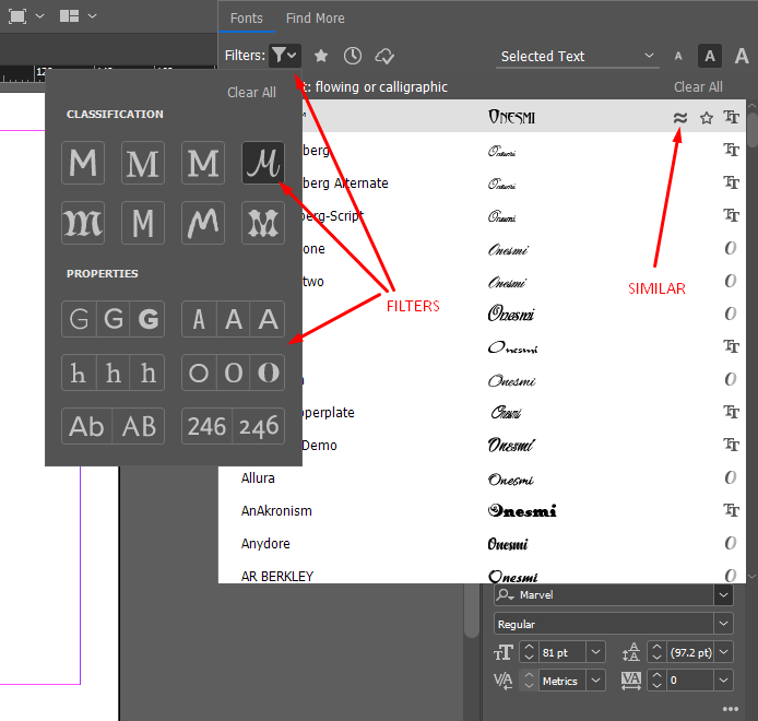
SIMILAR FONTS AND CATEGORIES
Robert Laskey replied to Robert Laskey's topic in Feedback for Affinity Publisher V1 on Desktop
Thank you for your response. I will take a look into your suggestions. -
I wish to have a font feature where you can filter fonts based on categories like calligraphic/handwritten, decorative, serifs, sans serifs, slabs etc. Indesign has this feature. Moreover, I wish there was a way where you can show fonts that look similar to the one you have selected. Indesign has a switch next to each font where you can toggle this and it is very handy. As of the current situation is there a standalone tool that can accomplish this? Below is how Indesign handles this:

-
I want to save my studio settings
Robert Laskey replied to moonchou's topic in Feedback for the V1 Affinity Suite of Products
+1 -
Alignment panel.
Robert Laskey replied to th_studio's topic in Feedback for the V1 Affinity Suite of Products
It is one click if you are working in Designer. In Publisher when you have two facing pages, you can't align the object to the centre of one page with one click. A one click will take the object between the two pages. To align it to the centre of one page you have to click the alignment icon then choose page. And it does not remember your last action, so you will have to go through these steps each time you want to perform this operation. I find it annoying. -
Thank you for responding. I don't the need for those lines. The difference in color between the pasteboard and the canvas is enough to show the page limits. Lines are unnecessary distraction. If the Devs are reading this, please remove it. We just need the line between facing pages. I don't see the lines around Designer's canvas why should I have them in Publisher? Or at least add the option to toggle them on and off. Just look at how Designer's canvas looks clean when you scale the graphics/images beyond canvas boundary. Just clean!!
-
Thank you @Nazario and I agree with everything you have said. As of now we should keep our fingers crossed and wait for the miracle to happen. Regards. RL
-
Thank you for responding. What you say is true if you are working in Affinity Designer but not Publisher. I should have stated this before. My mistake. I don't seem to solve this problem in Affinity Publisher which is my main software. Wondering if you have any suggestions. Thanks.
-
Has this been resolved? I don't find any shortcuts or workarounds for this.
-
Yes I am on Windows 10
-
Any idea?