Search the Community
Showing results for tags 'Affinity Publisher'.
-
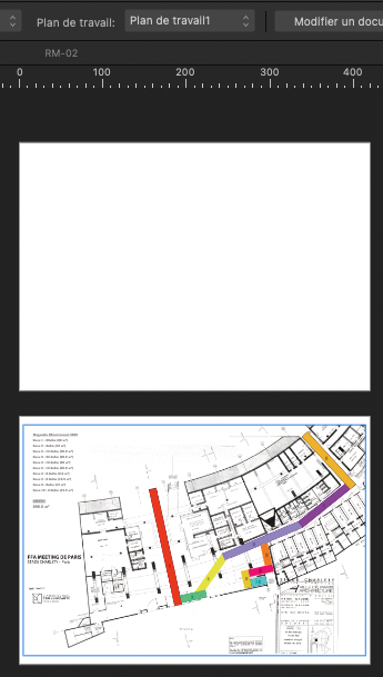
2 workplans in Designer 2 pages in Publisher : - page 2 with workplan 1 is ok - page 1 with workplan 2 is empty…

-
 I created a grouped asset with two Text Frames with one frame containing an inline image. When using this asset, it does not load the inline image. I am able to reproduce this issue. I can delete the asset and re-add it, and the behavior persists. The example below shows the Group with Inline image at the bottom of the Layers panel. The two instances below it are from the Asset Panel and don't include the inline image. Latest - V2 Publisher
-
 Hi, When copying text from Publisher, the text in the clipboard seems to be formatted as RTF text. RTF should support character styles, but it seems Publisher don't export them to the clipboard. I would like character styles were considered when copying text. This would let one export text will all the needed styles. I don't know if this would be possible, but I would also like all the advanced features (xrefs, variables, index marks) were transferred when copying text. Paolo
 -
Hi, I described the issue here: I'm forwarding it here, because I think this can be filed as a bug, more than a feature request. - The top-level frame in a composite picture is considered empty, even if it contains several elements. - Dan says that the frame is "technically empty", since it doesn't directly contain an image. But the frame is not "actually empty", since it contains images (and other elements). - The crossed frame indicates an empty frame. In this case, on the contrary, the frame contains several elements. Therefore, the symbol showing it as empty is not correct. If needed, some other symbol should be employed (not interfering with the image display). My guess is that the external frame should sense that other frames nested at its inside are not empty, and consider itself not empty. The current behavior communicates the wrong message of the the frame being empty, when it indeed contains images and other elements. Paolo
-
A massive selection of vintage and retro color swatches for Affinity, inspired by the fashions and culture of the 20th century! Get 20% off until 11.59pm, 8th May (UK time). Simply use the discount code 'century' at checkout to redeem. >>GET IT NOW!<< Finding the right vintage or retro color palette for a project can be time-consuming so, we created these Affinity color swatches to help make choosing classic color schemes quick and easy. Drawing from the art, fashions and culture of the 20th century, we’ve created three color swatch sets representing each decade. There are also 15 bonus vintage and retro color swatch palettes included (not shown in the preview). Use them for your vintage and retro designs and illustrations! The retro color swatches are compatible with Affinity Designer, Affinity Photo and Affinity Publisher. To use the vintage swatches load them into the swatches panel and you’re good to go. Add it to your design arsenal today and get the classic look just right! The download features the following files: 30 vintage Swatches – for use with Affinity Designer, Affinity Photo & Affinity Publisher. 15 Bonus Vintage and Retro Swatch Sets. A Quick Reference Guide – Navigate the color swatches quickly and easily. Instructions for Affinity Desktop and iPad. >>GET IT NOW!<<
-
 Big problem, surely a bug?: Any gradient on any object will render all selection boxes invisible in the entire Affinity suite. It happens 100% of the time, on all files. I can select objects, but there are no visual cues in the Document View window. I've had the problem since I bought Affinity in December last year. It took me a long time to figure out what was happening. I haven't found any solution on Google or in existing forum posts, so I decided to write my first post here. I hope someone can help. Please read my explanation and watch my screen recording. * Recipe: Just add a color gradient to any object, e.g. text or a picture frame. After that, no selection boxes will appear when selecting one or more objects. I can still select objects with my mouse or using the Layers panel (Right Studio). I can see in the Layers panel that one or more objects are selected. And if I use, e.g., the move tool, I can easily move them. But there are no selection/bounding boxes around the selected object(s). This obviously makes it difficult, confusing and frustrating to edit files with many objects and layers. Please note that removing the gradient will make the selection boxes reappear! In short: Any gradient on any object will render all selection boxes invisible in Publisher, Photo and Designer (in both 2.4.2 – the newest version – and 2.3, which I installed back in December). * Screen recording (50 sec) using a new demo file: The demo file has two text frames and one picture frame, all having solid fill color. When I click on and select one or several of them, a selection box appears. So far, so good. As you can see, if I then change the color of one of the objects (the blue text) to a gradient, the selection boxes disappear. As you can see, I can select any of the three objects, but there is no box or outline around any of them. In the last step in the video, I remove the gradient on the blue text and select a solid color instead. Since there are no gradients in the document anymore, the selection boxes are again visible. 1. What Application are you using? Affinity Publisher, Photo and Designer 2. Are you using the latest release version? Yes, 2.4.2 (also happened in 2.3). 3. Can you reproduce it? Yes, 100% of the time on all files using any of the three Affinity programs. 4. Does it happen for a new document? Yes (see demo file and screen recording). Machine, operating system and extras: macOS Monterey (12.7.3) on a 5K iMac (Intel) with 16GB of RAM and plenty of internal storage. No additional hardware, just standard keyboard and mouse. No font managers or display managers. Hardware acceleration? I tried both ON and OFF. The problem persisted. Note: My iMac is working well and I don't have any issues with other programs. I did a fresh install of macOS Monterey in December, just before I bought Affinity. I have very few third-party programs installed: just Affinity plus Firefox, FileZilla and Stellarium (planetarium). Irrelevant background info: I've been following Affinity and cheering for them since 2018. I finally bought the V2 Universal License in December 2023, and I have spent the last few months testing the software and watching a lot of YouTube videos. I've previously used Adobe's software for editing photos, making illustrations, and designing books, but I decided to switch to Affinity. I like many things about Affinity! Sadly, I can't use Publisher for designing books (the text justification is absurdly poor, even with the Norwegian hyphenation dictionary correctly installed and activated). But I really want to make it work for my upcoming wall calendar as well as posters and other "simple" projects. If Affinity is able to show which objects and layers are selected also when using gradients, Photo and Designer will become very useful to me as well. I like both the features and the performance of Affinity. Screen_Recording.mov test.afpub
 -
Bildschirmaufnahme 2024-04-26 um 19.37.11.mov Tab Key is not working in FX Dialog.
-
 Hello, I am fairly new to Publisher but I'm a convert over from InDesign. I have some questions relating to data merge. Is there a way I can map images to a document using data merge? For example: I have a CSV File that looks somewhat like this... images/file1.png, images/file1.png, images/file3.png, images/file1.png, images/file5.png, images/file7.png, <WHITESPACE>, <WHITESPACE>, images/file2.png So on and so forth. It would essentially be a grid of values of varying sizes in each different file. I may have file1.csv look like the above, which would be 3x3. file2.csv may be 50x50, etc. I need to be able to merge in such files and have say, the images in question map to the page. General question - with data merge - why does it seem to insist on creating many pages, say, 10 pages, if I have 10 records across in my CSV file? Essentially, I have a computer program that I wrote that outputs values into a CSV file and I wish to quickly be able to map the values from said CSV file out to a document using Publisher, with having to manually intervene as much as possible, at least for the central component of what I'm trying to do here. If this is not an option, instead of displaying images, I would display whatever characters may come back in a CSV, say, 1,3,5, etc. But I can't have the comma splits like this to show up on the page, I would want all "cells" to be within grid squares. At the end of the day, whatever I do, needs to essentially be in a fixed grid, but I prefer to display what I'm doing via custom images, rather than plain text in a grid. I hope this makes sense. Thanks.
 -
 In Publisher, I noticed that the image names of images placed in image frames are not truncated, which cause the entire context toolbar to shift.
-
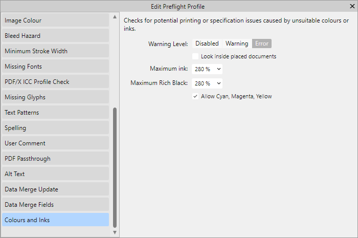
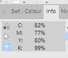
 The printer returned the cover saying that the black colour strength is too high, the maximum CMYK fill rate is 280%. I am using FOGRA39L_VIGC_300 profile, but this is too much. I am currently using Soft Proof Adjustment with ICC 260, but in some places this goes up to 280%. Where and how can I control the black fill ratio in Publisher (like in Acrobat) so that the printer doesn't send my cover back? How can I check which is the darkest point in an image? In the meantime, I found this option in Preflight (it wasn't in version 1.x), so I'll see how much and how it helps. It seems this is really useful Prefligfht tool. Then the question is: if I use the FOGRA39L_VIGC_300 profile, why does the value go above 300% and Preflight does not report an error?
-
 Running Publisher 2.4.2 on Windows 11. I have a reasonably large document ~600 A4 pages with ~200 linked jpeg images. The application regularly freezes/hangs (Windows reports app not responding) when document is open. The hang does not appear to occur in response to any user action. e.g. I can leave the app unattended for a few minutes - sometimes when I return it has hung, sometime not. Once the app has hung it does not recover (I've left it for extended periods) and has to be terminated. Looking at task manager when app hangs I see the Publisher application is at 0% CPU and total system CPU at ~7% or so. System memory is at 66%. This seems to be happening after last upgrade. Not sure how to diagnose further. Couldn't see a recent report of this problem
 -
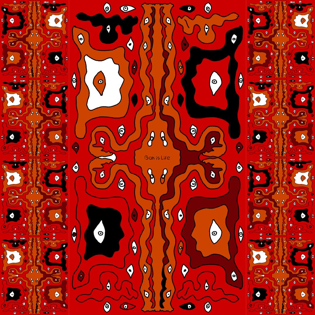
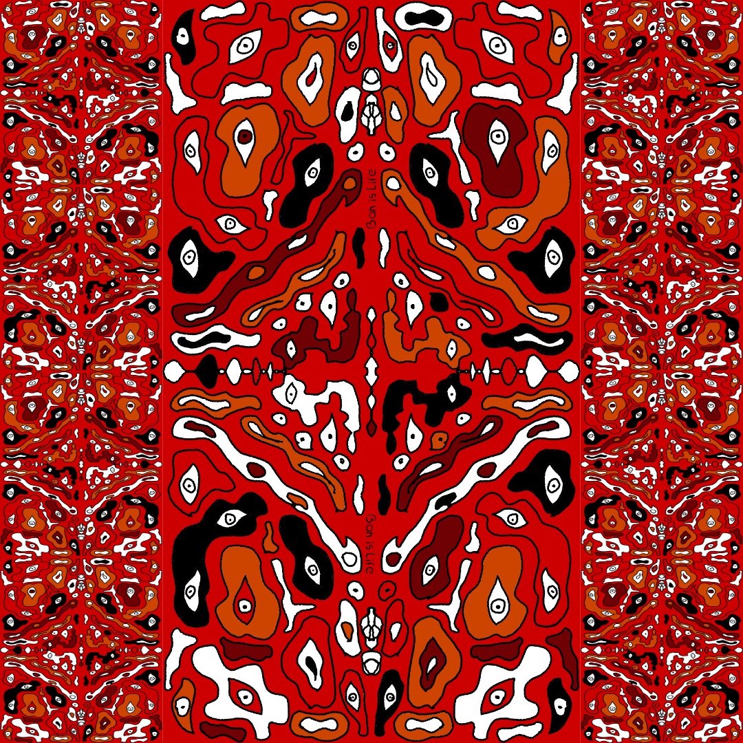
After watching a couple of Ocean documentaries I was deeply intrigued by the endless number of sea creatures that exist. Eventually I got tired watching and got inspired to create this Ocean inspired Deep See art. Enjoy. Tools: Affinity Designer, Affinity Photo, Affinity Publisher Let's connect: https://www.behance.net/bah-is-life https://www.instagram.com/bah_is_life/
- 4 replies
-
- 4
-

-
- affinity publisher
- affinity photo
- (and 2 more)
-
The "Go to page..." command could be improved by showing a page range as default, grey input (i.e. 1-224) and a page preview, so you know you hit the correct page in advance.
-
I'm trying out whether the bugs in the release version are fixed in the beta and noticed that transferring settings from the release version of Publisher do not transfer cross-reference presets. Is there another way to get the presets over? I've got quite a bunch of them.
-
 When working with the vector tool, its great that the pressure can be recorded when using a graphic tablet. But when only using the mouse, you have to use the pressure controls inside the stroke-panel. For short curves this is pretty ok, but if my curve gets too long, the precise configuration of the pressure is near to impossible. To improve the usability I suggest an seperate pressure-edit mode or something like that where you can specify the pressure value directly on the actual curve (maybe by adding points similar to those handlese on bézier-curves). This should be additional, so you could also edit the pressure on the old way.
 -
Vector brushes are cool but when they are applied to long curves, many of them break because they get streched. On the other hand with vector curves are perfect for geometric or very precice shapes because they can be reajusted afterward. Pixel-based brushes don't have the downsides mentioned before. So it would be cool to have in addition to the normal vector brushes the option to use the rasterized brushes for curves. The curve represents the mouse movement when working with the pen tool. Other advanages inclue: You could change the the brush size afterwards You could also vary the brush pressure (because this is an already existing feature in vector brushes) Have a great day!
-
 I'm currently working on a document in publisher and I would like to maintain a regular 100% zoom while working on the document but no matter what when I change pages it goes to an 84.4% zoom to fit the entire page on screen. Is it possible to turn this feature off or to set a 100% zoom default?
 -
 If you have 2 consecutive paragraphs (subtitles) set to "Start on Next Page" and you want in some cases to keep them together, you can't achieve this even if you set "Space between same styles" to 0.
 -
 Hello. I have received JPG files from a customer that need to be placed in a Publisher document. The JPG files contain an (invisible) clipping path so that they can be placed either with background or clipped. When I open this JPG in Affinity 2 Photo, the transparent background is displayed. If I place the JPG in Publisher, it is always placed with a white background. However, I need it clipped. I am missing an option in Publisher where I can choose whether it should be placed normally or clipped. Is there a trick that I may not know about? Best regards Martin
 -
Hi, While the Alignment commands are available under a single icon, the ones I listed in the subject are not. It would be handy to have them compacted, to make more room in the toolbar (and make it cleaner looking). Paolo
-
Hi all, I am laying out this book with 320 live band images as per the attached shot. Each one has to have its filename (exc .jpg) as a title added. I don't suppose there's any way to have Publisher source file names and slap them on the images as in the in the attached image? Like I say, long shot. Obviously I could then rotate all the names to make them punk rock and wonky! As I say, long shot but thought I'd ask. Thanks! Phil
-
 Add top, right, left, or bottom stroke options including weight in pts. Add corner radius options. Add default line types for the strokes and ideally mirror INDD defaults.
-
Add the ability to set global gradients so we can modify the gradient once and have it cascade rather than reapplying the gradient swatch over and over again.
-
I am annotating a book that already has some footnotes. Not many, I think 9, but I want to differentiate them from my own footnotes (of which there are over 1200). In the book, the 9 footnotes use an *, and then have the note at the bottom of the page, but there's no simple way to add those and my numbered footnotes. One solution I came up with was to have a different master page for pages with footnotes, and make the text block a bit smaller, with a separate text block on the bottom to put the original footnote. My footnotes then appear automatically and the original one shows up below it. The problem with this is that the original footnote is now below my footnotes, so it's separated from the original text. That's kind of backwards. It would make it harder for the reader to understand that those note were written by the original author. Another solution would be to stop and start the numbering of the footnotes, and insert an * in between the numbered footnotes. This, however, would mean the * is in the middle of my footnotes, and it's a very complicated way to do it, and would likely break if any changes needed to be made. I'd really like to find a simple solution that allowed me to insert the footnote below the text, didn't mess up the flow, and allowed my footnotes to be shown below the original footnote. Anyone have any ideas?
-
 When I try to change the fill color opacity of a text frame in Apub, the color changes from white to black. When I get to zero opacity it finally shows zero opacity. Affinity Publisher version: 2.4.2 macOS version: Ventura 13.6.6 | 3.5 GHz Quad-Core Intel Core i5 | Radeon Pro 575 4 GB | 40 GB 2400 MHz DDR4 Publisher Text Frame Fill Opacity.mov ADC Celtic Celebration Flyer 2024 v2.afdesign