Search the Community
Showing results for 'Your Search Here' in content posted in Feedback for Affinity Designer V1 on iPad.
-
I would really like a way to create my own fonts in affinity designer. I don’t want to have to pay for another app to do this like “iFontMaker”. Adding this feature would be really great. I don’t know if other design apps like photoshop or procreate can do this on the iPad but I could care less. Affinity Designer is my go to so adding this feature would be a game changer for me and for other designers that utilize the iPad marketplace.
-
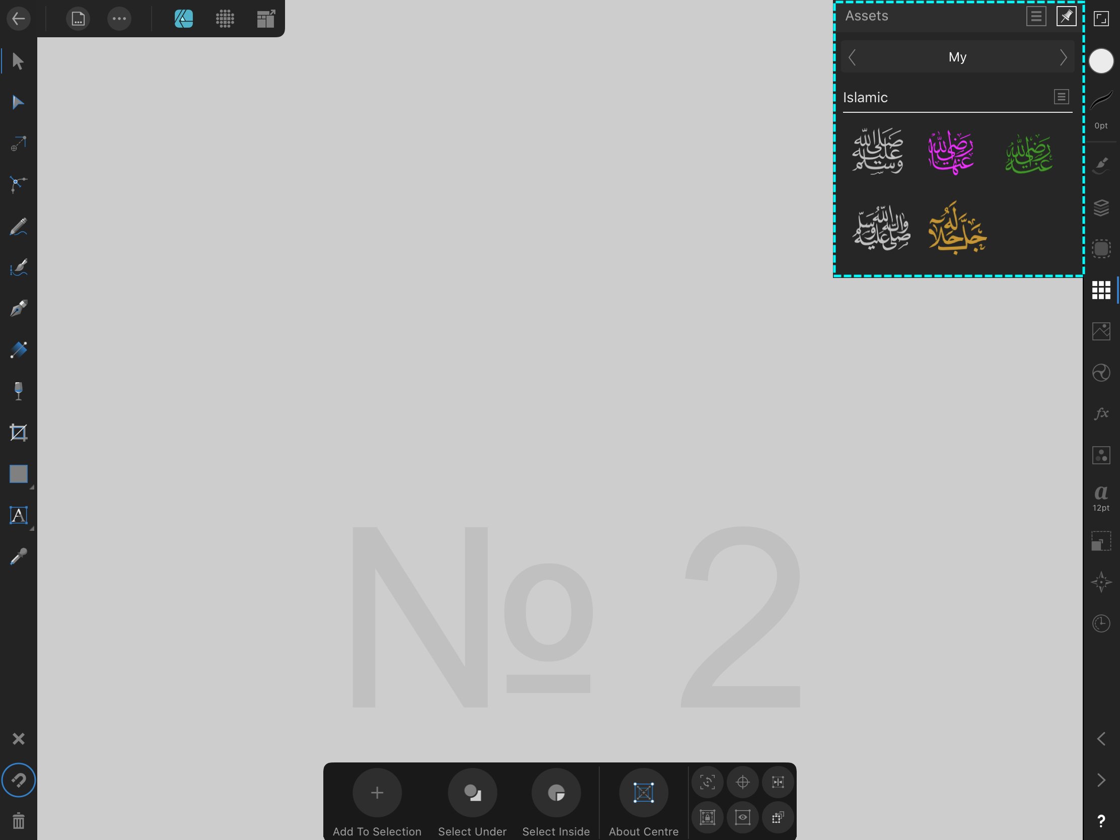
 Add: 1) Search string for fonts 2) The ability to customize, add sub-categories for your fonts and mark them as favorites, (see picture № 1) How it is implemented in resources, “Assets” (see picture № 2) • Searching among many fonts is not convenient. Add already the ability to write in Arabic, from right to left! — / For Affinity Designer and Affinity Photo / __________________________________________________ Сделайте: 1) Строку поиска для шрифтов 2) Возможность настраивать, добавлять под категории для своих шрифтов и отмечать их в избранное, (смотреть картинка № 1) Как это реализовано в ресурсах, (смотреть картинка № 2) • Искать среди множества шрифтов не удобно. Добавьте уже возможность писать арабским шрифтом, с права на лево! - / Для Affinity Designer и Affinity Photo /
-
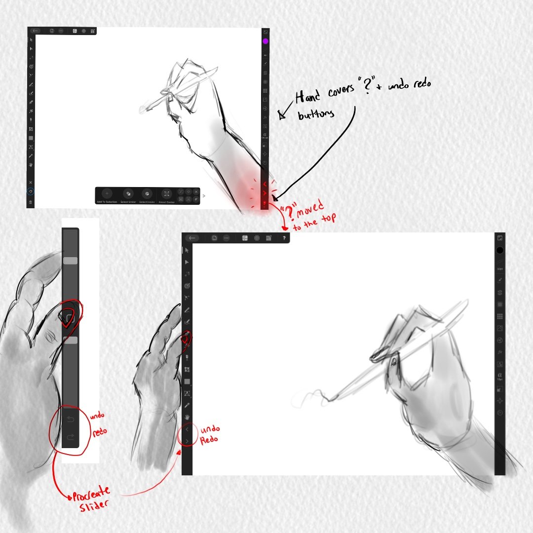
 In a previous post, I had said that the "?" tool tip icon at the bottom right corner of the interface should not be there because it triggers when you enter persona mode to draw. Your wrist is triggering the "?" icon and its disrupting your workflow. So nothing should be there at the bottom right corner of the interface. You can read all about it in this forum post I made below. However, i wanted to make a post dedicated to the undo and redo buttons because they too are located at the bottom right corner of the interface and they shouldnt be there as well. I did leave a comment about the undo/redo buttons in the post below, but I want to talk about them here in THIS new dedicated post. The undo/redo buttons should not be at the bottom right corner of the interface. They shouldnt. They shouldnt because our wrist is going to trigger them and theyre going to disrupt our workflow. Its the same situation with the "?" icon. In the preferences, you can turn off the undo/redo buttons. Which is great because now your wrist wont trigger the undo redo buttons but you still shouldnt have them at the bottom right corner if users are going to want to turn them on. Heres why you REALLY shouldnt have them on the bottom right corner of the interface. Its because of the way digital artists work on tablets/cintiqs. If youre right handed, your right hand holds the stylus(apple pencil) and then what you do is you use your left hand thumb to slide against the left side of the tablet/cintiq to press buttons that help your workflow. So your left hand thumb should be on the left side toolbar of the interface to easily and quickly toggle through your tools. On your toolbar, the undo and redo buttons should be moved there so you can press them with your left thumb. Thats how it should be. You use your left thumb to press the undo and redo buttons while you work. If you have the undo redo buttons at the bottom right corner of the interface you cant really touch them with your left thumb. You have to use your stylus to tap them which is going to be bad because your stylus is dedicated for your work and now it has to take on this new task of undoing and redoing. It shouldnt be like that. Right hand stylus is dedicated for building your work while the left hand thumb is dedicated to toggling through your tools and undo/redo button. So I need the serif team to take the undo redo buttons and move them to the left side toolbar and place them at the bottom of your tools. Not at the VERY, VERY bottom but at the bottom of your tools. Which is still going to be problematic because now you have to use your left thumb to go ALLLLL the way down since theres so many tool but I was hoping Serif could give us users the feature to remove unwanted tools from our toolbar. That way as you remove tools the tools in the toolbar move up, get shorter, and your undo and redo buttons can move up so that theyre at a closer, reachable range for your left thumb. I want to also note that procreate places their undo/redo buttons on their sliders so they should be placed here on the left side of our toolbar as well. Bellow is an attached image of what I mean.
-
I madly believe this. The color studio and stroke studio need to combine. They need to combine. I don’t know how but they REALLY do need to combine. Its not a debate. They need to combine. Before I go into any further details, the main issue for this reason of these 2 studios combing is because multiple studios can NOT be opened at the same time in the app. Only 1 studio is allowed to be opened. Its this rule in the app where only 1 studio can open at a time due to the iPad having less screen real estate and not being able to have every studio open. Thats the real main issue here. Please let me explain. An object. We work with objects. You create it and then you can change 2 things about it. The fill of that object or the stroke of that object. This object that you created has 2 properties. A fill and a stroke property. Remember that. Whats happening in the app is my properties are being divided into 2 studios by the serif team, the color studio and the stroke studio. You can only open 1 studio at a time in the app. You can only edit 1 property of your object at a time. It shouldn’t be like this. It shouldn’t be like this because its limiting. Its slow. Its too much toggling back and forth between these 2 studios and its slowing my workflow down. Its making me do extra taps when it could be less taps in 1 studio. This workflow of having 2 studios is splitting my brain up into 2 sides. 2 work flows. What do I mean by this? If I have an object, my brain splits that object into 2 studios. My brain is saying “ok. If I want to edit the color of this object I have to go to the color studio. If I want to edit the stroke I have to go to the stroke studio.” It shouldn’t be like that. I should look at my object as a whole and say “ok. I have my object selected. Now I can edit the color and stroke in this one studio that holds my color and stroke properties. I don’t have to do any toggling. All my object’s properties are here in this 1 studio.” So everything is being changed inside this 1 studio that has combined the color and stroke studio. On the desktop version of AD its a different workflow. Theres more screen Real estate there so you’re able to have all your studios open. Theres no limit to just having 1 studio open. Everything is wide open. Everything is there. There are no rules. Its this whole studio of several studios in it. The screen is a studio and you have all these studios open inside your studio. You can have layers, fx, color, stroke, and other studios all open at the same time. Its awesome because you’re not limited to 1 studio being open like in the app. You’re free. You can have any studio open. So when you have the color and stroke studio open on the desktop version you pretty much have these 2 studios combined into 1 studio because you can freely have them open. If you need to change the color you go to the color studio. If you need to change the stroke you go to the stroke studio. Theres no toggling or opening up these studios. They’re already open and you can go into them with no issue. On the app, you can’t have that. You can’t have them both open. You can only open 1 studio at a time and its so annoying. I have no issues with the other studios. My issue is specifically with the stroke and color studio because these 2 studios are IMPORTANT. They relate to my objects and I need to have them both open at the same time so I can make my changes to my object. I can’t be toggling between them. They need to be combined. They need to work together. I need to be able to click my object and change its stroke and color easily. No toggling. No opening 2 studios. Just going into this 1 studio and changing everything there. I can do that on the desktop version with ease but not the iPad app because the iPad app forces me to open up the color and stroke studio individually and its all this toggling and closing. Its really slowing down my workflow. Its limiting. I should be able to click my object, tap 1 studio, and have my color and stroke studio inside this studio. I don’t know what to call this studio. I was thinking the Properties Studio, a studio that has the color and stroke studio combined inside of it where you can change your objects properties with ease and not toggle between 2 studio. Its all done inside this 1 studio. Heres why I bring this issue up. Lets say you want to change the color of your STROKE. Ok. So If Im working with my STROKE then I need to go to the STROKE studio and change it there. Nope! You have to go to the color studio to change your STROKE color there. Ok. Now lets lower the opacity of your STROKE. Ok. Let me go to my STROKE studio to change the opacity of my STROKE there. Nope! You have to go to the color studio to do that. …….Ok. You finished changing your color and opacity for your stroke. Now I want to change its width. Is it in the color studio? Nope! I have to go to the stroke studio and change it there. Its like why? Why are my properties divided? Why am I toggling between these 2 studios. Why are my stroke related properties in the color studio? Why aren’t they in the stroke studio? Why are you diving my properties, serif? This is why they need to combine. Its all this toggling. Properties are every where. Users are being forced to work like this. Its not ok. Its not. The color studio and stroke studio REALLY need to combine. They need to combine. Users should be able to click their object and change anything fill or stroke related to that object inside this 1 studio that has combined the color and stroke studio. The serif team needs to break this rule of having only 1 studio open at a time in the app SPECIFICALLY AND ONLY for these 2 studios. Like, the whole serif team needs to all raise their hand up in the air and say, "We, the serif team, break this limiting ipad app rule of studios being open 1 at a time by combing the color and stroke studio so that users have a better workflow." They slam their hands on the desk and the rule has been broken for users. An override is need for this rule, for the color and stroke studio. The color and stroke studio need to combine. You know what else? For some reason the color studio and the stroke studio are specifically grouped together and are divided from the other studios. Its almost as if they work together. Like they should combine. You can not separate these 2 properties. They correlate to each other. They work together to make up an object. This is not a computer. This is an ipad we're working on. They need to be combined. Also, you know how you can 1 finger gesture over the icons of the studios? Like, if you 1 finger gesture over the color studio you can change the shade range of your color. or if you 1 finger gesture over the stroke studio you can change the width of the stroke? Okay. Since youll be combing these studios that 1 finger gesture wont be available since it will now be 1 studio with a different icon. Dont worry about this 1 finger gesture feature. Its a cute feature. It would just be better to trade in this feature for a better workflow for users. Maybe you can even keep this feature by putting it some where inside the newly design combined studio? I will upload some images to show what I mean below.
-
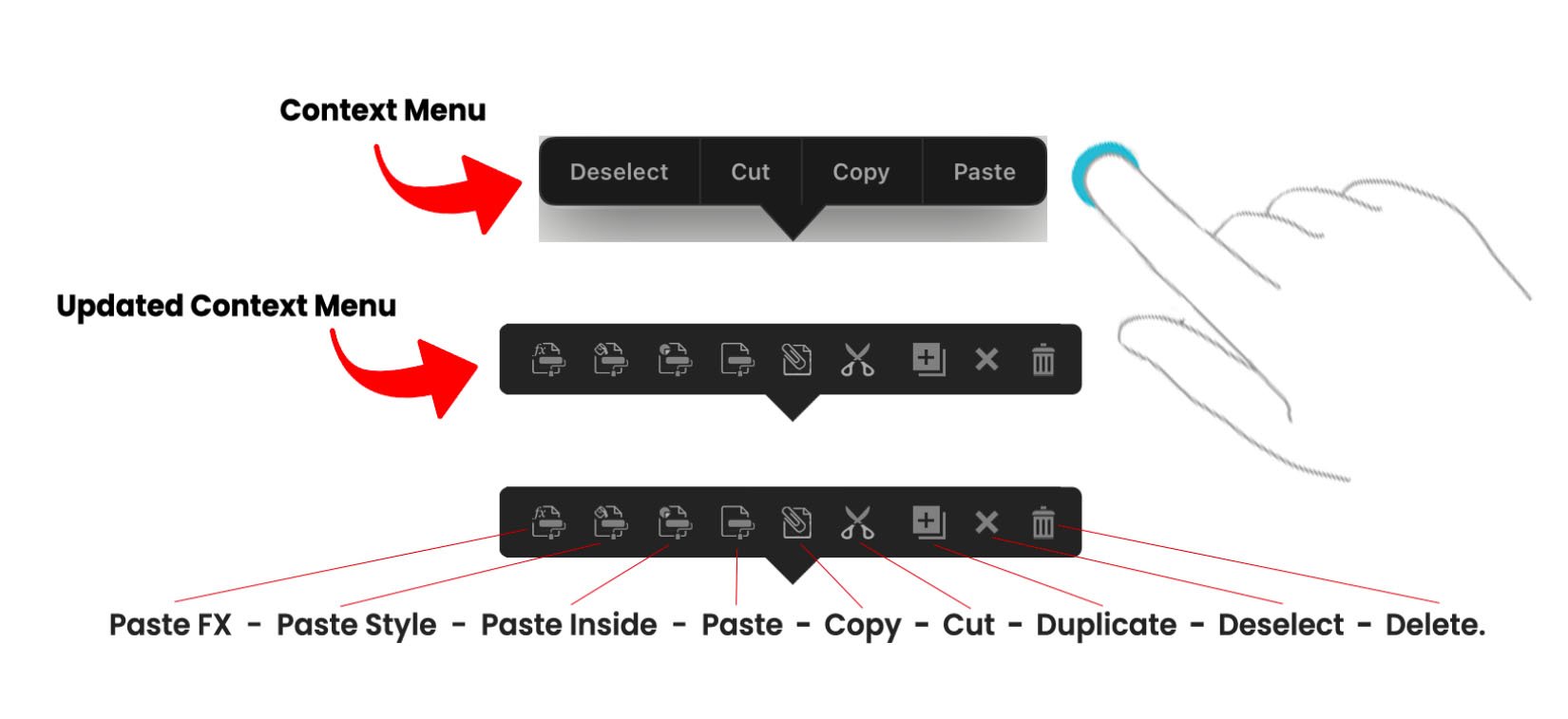
So right now there is something called the “Context Menu.” I think its called the context menu. The way to bring out this menu is to press down with 1 finger on the screen, release, and a menu should appear with deselect, paste, copy, and cut in it. This is called the Context menu. Its has your basic copy paste actions. I like the menu, but I don’t like it design wise. The reason why is because its designed in a style that doesn’t belong in the app. Its like a menu from the very earlier ipad apps. Right when apps were just starting to take off. I also don’t like it because there are some actions that I want on this menu that aren’t on the menu. I want to see those actions on this menu. I also don’t like it because its a “spelled out” menu meaning instead of using the icons for cut, copy, paste, and deselect the menu has been spelled out for you. I hate when things are spelled out. Its just wordy and over time you prefer icons because you know what the actions do already that you don’t need them spelled out for you anymore. Plus, icons take up less space. This menu is needed. Very needed. I saw an affinity designer user use this menu the other day and it just blew my mind how they used it in their workflow. It was so awesome that it made me love this menu a little more. So this menu needs the following updates done to it. 1. I think it should be called the “Clipboard Context Menu” because it has “clipboard” actions in it. 2. It needs to be redesigned in the style of the toolbar which is just a thicker gray/black bar. 3. Other clipboard actions need to be added to it. 4. Its needs to be turned into icons. No spelling. Just all icons. So! I did it. I updated it. I redesigned it, added other needed clipboard actions, and just used icons instead of words. The way it works is you select an object and then press down on the screen with 1 finger. You release and your clipboard context menu appears. Its going to give the following actions. Paste FX, Paste Style, Paste Inside, Paste, Copy, Cut, Duplicate, Deselect, and Delete. So what you do is select your object, finger press release, hit the copy button, finger press release again, and then just paste it. Or you can select your object, finger press release, hit the copy button, select a different object, finger press release again, and then just Paste FX, Paste Style, or Paste Inside. Or you can just select your object, finger press release, and just cut, duplicate, deselect, or delete it. Everythings right there at your fingertips. Its this finger press down release gesture that youll be doing in your workflow to get to your actions. The reason why these actions are in this clipboard context menu is because Fitts Law. You can’t be having users go to the top left corner to the edit menu and reach these clipboard actions. Its too the edge and it requires an extra click to get to them. Its a lot for a simple action. This work flow of going to the top left corner to reach the edit menu to reach your actions is slow and too much. Its better if users just finger pressed on their screen, release, and all their clipboard actions are there in finger reach. Theres no reaching to the edge. Theres no clicking the edit menu icon. Its just finger press down, release, and all your actions are there. So users can easily duplicate, deselect, delete, copy, cut, and paste an object, style, or fx. I want to note that I did redesign the icons the serif team uses in their app here in this context menu. Ill make a whole post later called “The clipboard paste command icons need to be redesigned" and ill explain why. Right now I’m focusing on updating the clipboard context menu. Let me know what you think. Below is an image of the old context menu and the updated context menu.
-
I saw that. Its a 1 finger gesture side swipe to select. Theres 2 workflows. Working on the canvas and working inside the layer studio. What youre trying to do is work in both workflows at the same time. Its not good, Its not good because you should really focus on 1 workflow. You have your mind focused on the canvas but its also focused on the layer studio. So your mind is at these 2 places at once. Just focus on 1 workflow. Your attention is either on the canvas or the layer studio. If you 2 finger gesture an object and move it, it will duplicate it and in your layer studio it will show that you now have 2 objects. If you select your object in the layer studio and hit the duplicate button it will duplicate your object and show 2 objects in your layers. So this 3rd way of working is just not it because theres a button already in the layer studio for you to duplicate your object and you are working as if the layer studio IS the canvas. The layer studio is not your canvas. I hope I make sense. Also, it wouldnt work because in the layer studio we use our finger or apple pencil to scroll! Theres scrolling. Scrolling would make your version hard to duplicate objects.
-
So when you select an object with the move tool, at the very bottom you have a context toolbar that appears for the move tool. On that toolbar is a "+" icon called "add to selection." This icon you have to turn on by hitting it and then what you can do now is tap other objects on your canvas and its combing other objects to your selection. So it allows you to "add to your selection." It lets you select multiple objects so that you have this 1 big selection of objects. OR there is a gesture for it where you select your object and then use a 1 finger modifier to select your other objects to "add to your selection." My issue is sometimes the gesture works. Other times it doesnt work because your pencil has trouble selecting your objects. Like, the app doesnt want to select your object. Its weird. It works and then it doesn't so it needs reworking. I guess like a bug is there or something. Its just not letting me select objects. I have to tap a couple of times on the object to select it so this gesture needs fixing My other issue is you dont need that "+" icon called "add to selection" on the context toolbar if theres a gesture for it already. Remove it. Its not necessary and no one works that way. No one says, "oh! i need to select multiple objects. let me turn on this button, select my objects, and then turn off the button since I now have my selection." No one works like that. Just use the gesture. Its easier. On top of that making users turn on the "+" "add to selection" icon is not good. Its not good because you have to turn it off. If you dont turn it off you now have us making all these selections and wondering why that app is behaving this way. Why cant I select a single object and why is the app selecting multiple objects. Why is it behaving this way? Oh! Thats right. I have "add to selection" turned on and i have to turn it off. I completley forgot I turned it on. I wish the app had turned it off for me. A lot of users are going to go through this. Youre going to confuse us. I already know it going to happen so its best to not have this turn on/turn off button to make a selection because its going to confuse users. Let us turn on/turn off this "add to selection" operation through a 1 finger modifier . Its better. 1 finger turns it on. Removing the finger turns it off. The gesture is already in the app. It just needs reworking or fixing. Also, remove "add to selection" from the context toolbar of the move tool.
-
LOL. I laugh because I know your frustration. It is so frustrating to want to lock something, go into the layer studio, click your layer, click the layer options, then click the lock icon, then have to exit the layers options just to lock your layer. And when you unlock it in the layer studio and want to lock it again you have to go through the whole process again. 🤕 I made a post here where i brought out that lock icon so you can easily lock/unlock your layers. If you dont want to go into the layer studio to lock/unlock your layer then i have created this post where I talk about the move tool needing a new context toolbar. On that toolbar will be a lock icon so you can lock unlock objects without going into your layer studio. If youre talking about adding a lock icon to each layer so we can easily toggle it off. Ive requested that on the desktop version and someones response was NO because then there would be TOO MANY lock icons in your layers, it would too be distracting to look at, so just deal with it. Yeah........adobe illustrator cs5 does it how you want it and Ive always loved it. I wish theyd add it here. 😌
-
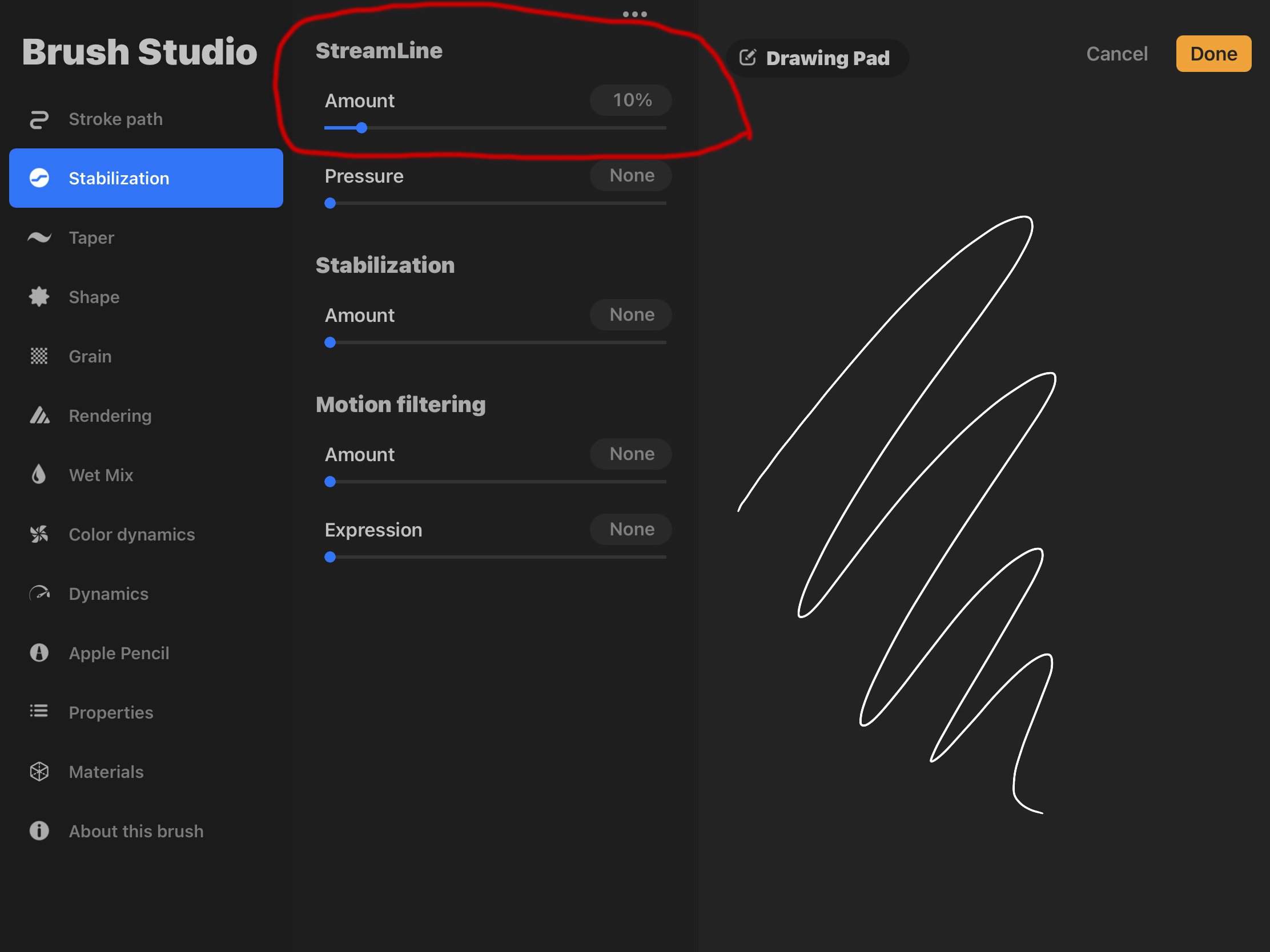
I wanted to add that when you use rope and window stabilizer the smoothness of your stroke depends on YOU. It depends on how slowly YOU move your hand. Youre still going to get a flimsy stroke. Its not going to be smoothed out for you. Its only going to be smooth if you traced out your stroke slowly. I need the app to smooth my stroke when I draw out my stroke. Thats why im requesting a "streamline stabilizer" where the app smooths your stroke depending on the amount of streamline you have it set to. Again, its exactly how procreate works. Look at how streamline works in procreate. Your stroke is more smooth by the amount of streamline you have on. So itd be nice to have a 3rd stabilizer called "streamline stabilizer" where i can draw a stroke and the app smooths it out for me based on the amount of streamline I have on. Streamline in Procreate below. This streamline feature would honestly make me like working on affinity designer on the ipad over the desktop version and make me like using the apple pencil more.
-
So I know there's a thread that has been going on since 2018 asking for this, but your Twitter social manager mentioned posting again Being able to import palettes, similar to brushes, is such a key feature that's missing from the iPad version of Affinity Designer and Photo, and it's honestly a painfully awful user experience not having it. Please add this to your roadmap to increase QoL for your users and to help your apps have a greater impact, as I'm positive a lot of people would appreciate it. Thanks!
-
 What, because it’s not going to happen? Well I understand your position, but you expressed it like a w******. I have personally found it frustrating ref the lack of response to certain issues, but to find out that AD on the ipad is superior to AI was refreshing, the latter doesn’t have free transform either, so the only other big one is rulers. That was my point, but you’re free to sound like a child if you want. Edit: I’m guessing you assumed I posted on this thread, I didn’t….. so your initial “😂” was even less called for. I probably agree with most that was said, but again, you’re ranting about a cheep and overall great app, I’f you really don’t like it, you should pull out your wallet and get your cheep ass to pay the $9 a month for AI.
 -
Ive always hated how the color picker tool works in Affinity Designer on the desktop. You pick a color with the color picker tool but the color doesnt apply to your object. I dont know why. You have to do an extra step of clicking the color for the color to be applied to your object. Its so annoying. When i tried out the color picker tool in the affinity designer ipad app I was super happy because theres an option called "auto apply." Auto apply lets you apply the color that you picked to your object. You dont have to do the extra step of clicking the color for the color to be applied. Its so good. It works how the color picker should. The problem is "auto apply" is only available when you select the color picker tool in the toolbar. You cant have "auto apply" turned on with the color picker in the color studio. The color picker in the color studio works where you have to select your color and then hit the color again to apply the color. Its annoying. I wish I could have "auto apply" turned on for the color picker in the color studio as well. So my request is for the serif team to some how allow "auto apply" be turned on for the color picker in the color studio. When i dont use the color picker tool in the toolbar I use the color picker in the color studio. So I dont know how you would do it. I was thinking that what ever settings you have turned on for the color picker tool in the toolbar, thats how ALL color pickers in the app would work. So if I have auto apply turned on then the color picker in the color studio would auto apply my color. Something like that would help.
-
Saved grid and page setting
MoonaticDestiny replied to Grayedout's topic in Feedback for Affinity Designer V1 on iPad
😅 This is reminding me of vectornator when they allowed you to change your preferences to your liking but when you started a new document you had to change all your preferences all over again. It was SO annoying! -
If you are specifically in the layer studio and working from the layer studio and not your canvas, a 2 finger gesture wouldnt be good to duplicate. Itd be better if you could just tap 1 button to duplicate your layer. Also, you cant have a 2 finger gesture to duplicate your layer because that 2 finger gesture is already being used for another action. The action of selecting multiple layers.
-
What is going on? The artboard and place image tools should not be inside the documents icon. Its not like that in the desktop version so why do it here in the app? I dont know when youre going to edit your artboard but it should take 1 click to get to your artboard tool. I shouldnt have to click the documents icon and then do another click to get to my artstudio tool. Its too many clicks. Everything should be 1 click. Anything more than that is slow workflow and bad design. Same thing with the place image icon. I dont know when you'll place an image into your document but dont hide this tool from users. Again, its this game of hide and go seek that the serif team is playing with users. I dont want to go seek. I want my tools at first time glance. Sigh. Some icons in the document icon should not be there. I really need to redesign everything inside the documents icon because things are not working out. It is annoying to want to duplicate an object so many times and have to click the document icon so many times to do several duplications. It shouldn't be like that. Artboard, place image, and other icons inside the documents icon shouldnt be there. Theres so much work to do. smh. Again, artboard and place image should not be in the document icon. Ill upload some images later of the redesign.
-
'Free speech' does not have the same precedence on a private forum, we at Affinity can choose what we do and don't allow users to post here, which is covered in the Forums Guidelines. GarryP is not a part of the Affinity Staff, but even if they were, that would in no way excuse the rudeness towards this member in your comment. They are simply trying to keep the Forum a 'tidier' place, by following the Forum rules. I can see you have since edited your post to remove the most hateful part, and I'm grateful for this - but please familiarise yourself with our Guidelines above, as continuing to post such angry comments towards other Forum members will not be tolerated and may result in your Forum account being banned. We appreciate your feedback here, and we understand you may have frustrations with the Affinity app - that does not give you the right to take out this frustration on other Affinity users. We have a multitude of threads regarding RTL support, which Garry has shown in their screenshot above. I would recommend posting in one of these pre-existing threads, should you have any more to add to this conversation, as I will be locking this thread from further replies. Our developers are aware of users requests for this feature, and have also confirmed it would require a complete rewrite of the Text Engine, and therefore is not something we've provided any timescale or guarantees for. Should you have any issues with the locking of this thread, please don't hesitate to contact me directly using the direct message feature on the Forums.
-
In the stroke studio, you have the width stroke slider. You can increase or decrease the width of your stroke by sliding the slider left or right. The max stroke width you can go on the slider is 100pts. My issue is the highest width it can go is 100pts. Why? Why am I limited or restricted to just 100 pts? Where can I go to change this? Im not talking about inputing a specific stroke width. I'm talking about making the max stroke width of the slider be more than 100pts. Like, i want the max width to be 200pts and have my slider go from 0 to 200pts. Not 0-100pts. So where can I go to change the default max 100pt width on my slider? And you know why this is an issue? Because if you type in a specific width stroke, lets say 300pts max width, if you decrease your width using the slider because 300pts was too much for you and you need to go down to 250 some, the slider goes from 300pts to 100pts. Theres no in between. Theres no 100-300pts width on my slider. It just cuts straight to 100pts. So now you have to play and guess what stroke width you really need and now you have to input specific amounts. Youre playing this width guessing game because the sliders dont show you your 0-300 stroke width in real time. So I need to know where I can increase this 100pt max width on my width stroke slider. I dont know when I'll ever need a 200 or 300pt stroke width in my work but i need to be able to go more than 100pts on my width slider because its limiting. Its restricting and yes. You can input specific amounts for now but I dont want that. I want to change my stroke width in real time using my slider without inputing specific pts and i want my slider to go from 0pts to 300pts. Please allow users to change the max 100pt width on our width stroke slider.
-
I dont know why its like this. I dont know anybody that needs THAT VERY specific width of a stroke but please remove the decimals in the stroke width slider. Its sooo annoying. Like, I just want whole numbers from 0 to 100. I dont need a very specific stroke width. Its really annoying and upsetting to increase your stroke width from 10pts to 25pts but the slider gives you 25.9pt. And when you try to decrease the width you'll just end up getting 24.6. Or some random decimal number. You can never get it to 25pts. You have to slowy, slowy move the slider to get a whole number or you have to input that whole number. I would have to input 25 just to get to 25pts. Its really nonsense. I just wish it could just be whole numbers. I dont need decimals. No one works like that. No one is saying, " okay, i need to make this stroke 35.3pt exactly so let me slide my slider." No ones working like that. Just let me slide it to 35 whole. And if I DO need THAT specific of a stroke width then I will INPUT 35.3pt. But dont make my slider decimals. Please. Just make it whole numbers. Let me go from 0 to 100pts WITH OUT decimals. Its this game of can you make your slider reach the storke width you want. Keep playing because I'm always going to give you decimals. I dont want to play your game.
-
 When I open the app your splash screen opens first, it is very beautiful and everyone I show loves it... That's great however I want to show people my art using your app. Can you please let us change the splash page.
- 1 reply
-
- 1
-

-

Timelapse with controls
Frozen Death Knight replied to wgphoto's topic in Feedback for Affinity Designer V1 on iPad
The reason it was removed was because it simply was not even close to being ready. When I was testing the feature at the time there were multiple issues with it that could not just be solved with a flick of the switch. - The export settings were broken with tons of encoding artefacts across all settings. It just did not look good. - On Windows you couldn't even export with specific settings because it required an encoding library that is not even native on many Windows versions. - The camera options were limited and did not work work well with Artboards and large canvases. If you wanted the video to follow your brush strokes the camera would sporadically jump all over the place and you could just not keep track of what was going on. The camera would zoom in super far if you did small brush strokes, so you couldn't see the rest of the painting. If you were painting across several Artboards the camera would jump from canvas to canvas while being zoomed in a ton, thus disorienting the viewer. - If you disabled the camera following your brush strokes it would record every Artboard at the same time, thus making everything look small (no way to direct the camera or decide the zoom level). - There was no way of cutting stuff out in the timeline to decide where you wanted to start or stop recording. It only recorded the entire timeline and this was a big problem if you had literally thousands of history states to record from. Since you couldn't preview the results of your recording, you would have to wait for the recording to finish completely to have an idea if it was better or worse in quality. - No way to cancel the rendering of a video in a simple way. Once you hit that record button, the entire program started to freeze and you would have to wait. - It was very unstable and crashed a lot. - Rendering took very long to finish, even if the document was very simple like line art on a single layer. So yeah, it was removed for a good reason. Hopefully they revisit the idea someday since it is indeed pretty cool to have, but it has to address the problems it had before it should be even considered for an official release. Here is also a recording I made using the feature with the best settings that were available: 1649479991_Morevaluepracticing3.mp4.d8ec2ddae8bce168ba3fc267f8310e36.mp4 -

Light Mode UI for iPad
70ms replied to mackleys's topic in Feedback for Affinity Designer V1 on iPad
I created an account on this forum just to add my voice and agreement. PLEASE update the UI so it’s not a struggle to use the app. I really love Designer, but I also own Vectornator and may have to switch to it because I can actually see the interface, even on a 12.9” screen. More than anything, when researching if there was a way to increase the contrast of the icons to make them visible, I was absolutely dismayed to see that users have been posting about this issue for at least 3 years and yet nothing has been done. Designer users have been posting about how they are older and/or have reduced vision and really struggle to see the UI. This is an accessibility issue, not just a quality of life issue for users. That it’s been requested for at least 3 years now and not fixed makes me feel like Serif is not responsive to its users, and that’s a shame because it’s a great app in almost every other way. Serif: Please listen to your users who are struggling to use your app. We don’t just want this change, we NEED it This is not a convenience issue, it’s an actual issue that impacts the usability of your app from the beginning of a session to the end. I’m so disappointed that in several years of being aware of this issue, the dev team has consistently ignored it. As a customer and user, it feels like they just don’t care. -
 Firstly, thank you all for all your hard work and excellent software. Secondly, I so much appreciate all your perseverance throughout these difficult times so I hope I won’t be bothering anyone too much. Question 1: I would absolutely love a DFX file type export in Designer. (Please?) Question 2: Publisher for iPad, when might this happen? (I know this is not necessarily relevant to this topic.) Ps. I have all three of your apps on pc and both of them on iPad. (I would love all three on iPad though.) Thank you for your time. Kind regards, Matthew Butler.
 -
Duplicate layer?
MoonaticDestiny replied to evtonic3's topic in Feedback for Affinity Designer V1 on iPad
I misread your comment and agreed with you. I actually disagree with you. "Duplicate layer" should be its own button. It should not be in any burger menu. Thats too many touches just to get to it and a slow workflow. It needs to be its own button next to the delete, group, and new layer button in the layer studio. I wouldnt say all over the place. Theres 3 workflows in the app. The canvas, the layers studio, and the edit menu at the top left of the iterface. A duplicate button should be in all 3 of these workflows but its only available in 1 workflow, the edit menu. There should be a duplicate button in the layer studio while you work inside the layers studio and there should be a duplicate button in the long press clipboard menu while youre building your design on the canvas. -

Swatch import on iOS apps!
kalmiya replied to postmadesign's topic in Feedback for Affinity Designer V1 on iPad
AirDropping a swatch from the mac to the iPad doesn't seem to work (you can save it on your iPad, but no reaction otherwise). So as a workaround: - start affinity on macOS - go to your swatches and export - open a new empty document - go to your swatches, import as document palette and select the swatch you exported. - save your swatches.afphoto image - open affinity on your iPad (main screen, not working on an image) - airdrop your swatches.afphoto image from the mac to the iPad - Now you can open your swatches... Not great, but at least I didn't have to manually set hundred or so colors. -
 Sorry, I just saw your message. This has been working now. Like in Illustrator. I don't know why it did not work before... Maybe a question of build version.