MoonaticDestiny
-
Posts
506 -
Joined
-
Last visited
-
 MoonaticDestiny reacted to a post in a topic:
What keyboard tools are you using with the affinity apps on ipad?
MoonaticDestiny reacted to a post in a topic:
What keyboard tools are you using with the affinity apps on ipad?
-
 MoonaticDestiny reacted to a post in a topic:
What keyboard tools are you using with the affinity apps on ipad?
MoonaticDestiny reacted to a post in a topic:
What keyboard tools are you using with the affinity apps on ipad?
-
MoonaticDestiny reacted to a post in a topic:
What keyboard tools are you using with the affinity apps on ipad?
-
MoonaticDestiny reacted to a post in a topic:
What keyboard tools are you using with the affinity apps on ipad?
-
OMG! That didnt even cross my mind! Wow. LOL. Thats perfect! Im so dumb! 😆 Youre right! Use the shortcut for "cut" to delete your objects. I just configured the cut shortcut to my 8BitDo button and it works. I can now delete objects....or cut. Thank you so much for this work around. Im so happy now. My shortcuts on my 8BitDo are complete.
-
walt.farrell reacted to a post in a topic:
What keyboard tools are you using with the affinity apps on ipad?
-
Walter, Im confirming with you that the shortcut was"backspace." Not "delete." I had it set to "delete" and thats why I couldnt delete in v2. Setting it to "backspace" allows me to delete my objects now. Thank you to both of you.
-
Im confirming with you that configuring the "backspace" shortcut to a button on my 8BitDo DOES allow me to delete my object in v2. It didnt work before because I had set the keyboard shortcut to "delete." Not "backspace" and and thats why it wasnt working in v2. Now, I can delete my objects in v2 using my 8BitDo. However, it doesnt work in v1. This is an issue for me because Im a v1 user, not a v2 user. I dont use v2 at all, so I cant delete my objects in v1. 😔
-
Yes. I can configure one of my 8BitDo buttons to have the backspace shortcut but pressing that button is not going to delete my object in the app because the app doesnt have a shortcut for delete. So pressing delete does nothing in the app because Serif never gave users nor the app the delete shortcut to delete objects. So the app recognizes the backspace command as doing nothing in the app. Look at the photo below. Under commands, theres no delete command to be able to delete objects and no shortcut for it. So because theres no shortcut you cant press the backspace to delete objects.

-
Rondo reacted to a post in a topic:
What keyboard tools are you using with the affinity apps on ipad?
-
Bound by Beans reacted to a post in a topic:
What keyboard tools are you using with the affinity apps on ipad?
-
Oh, I see. That explains why it works for @walt.farrell Such a shame that its not a keyboard shortcut. Exactly and this is the only action I needed to be fully happy with my device. I just needed the delete shortcut. 😩 Yes! I need to make a new post on the forums about this delete keyboard shortcut issue because it should have existed since the app was created.
-
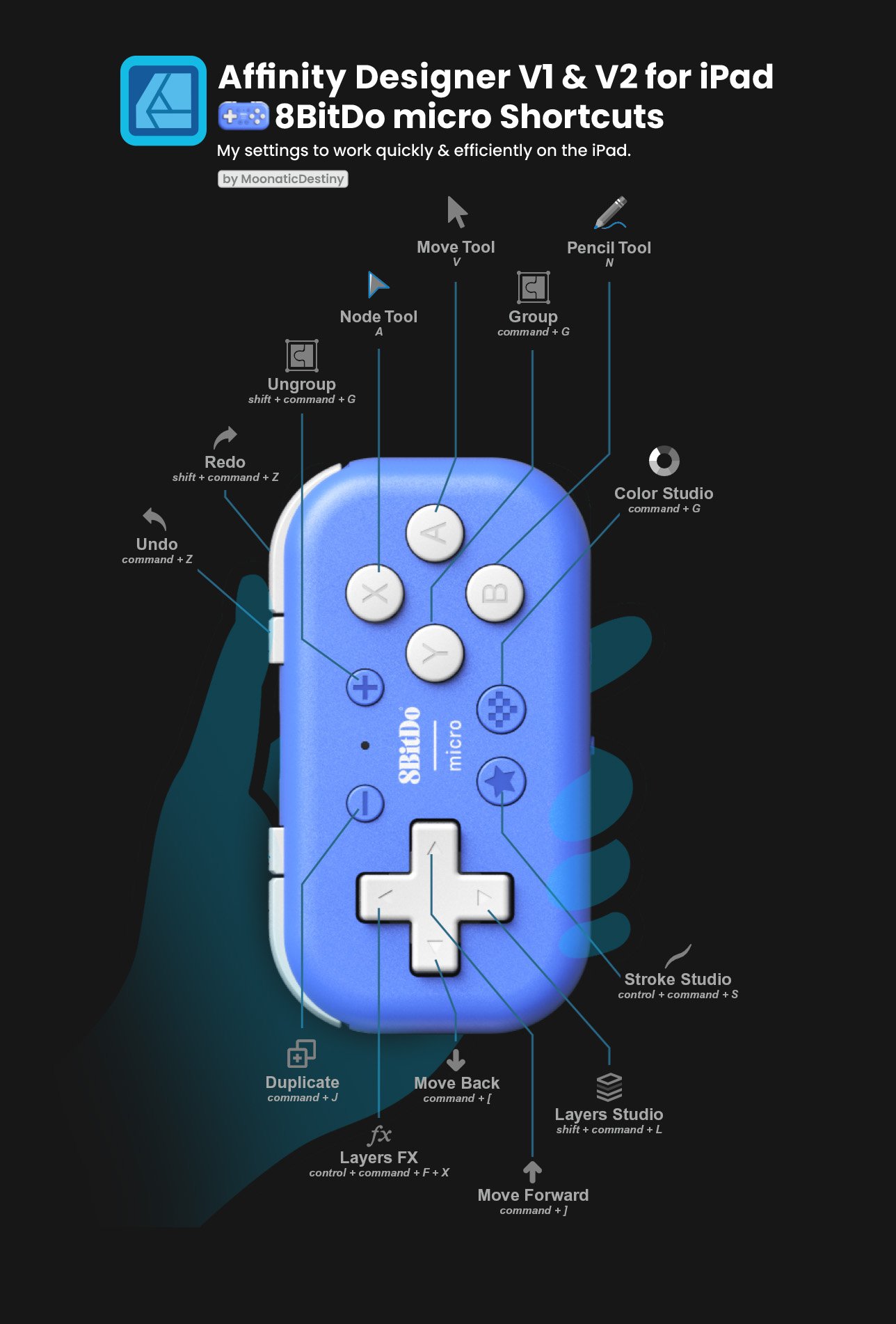
Im going to leave this here for anybody whos interested in using this 8BitDo Micro device for affinity apps on the iPad. I went ahead and shared my shortcuts based on how I would use affinity designer v1 & v2 on the ipad. I hope it helps.
-
Bound by Beans reacted to a post in a topic:
What keyboard tools are you using with the affinity apps on ipad?
-
Im saying that I cant assign the delete action to my 8BitDo because affinity designer v1 & v2 on the ipad dont have a delete shortcut. What is going on? 😱 Yes, it is a requirement. Every action available in the app has a keyboard shortcut next to it. Because theres no delete action, theres no keyboard shortcut. Because theres no keyboard shortcut for delete, I can not map any keyboard short cut to my 8BitDo. Its so disappointing. I know! How of all actions do you not have a keyboard shortcut for delete? But hey, lets give you a shortcut for layer blend modes. 😂 Thank you! I'm having so much fun. This little device is amazing, and Im so happy I invested in it.
-
I just found out that affinity designer v2 on the iPad doesnt have a shortcut for the action of delete either. 😅
-
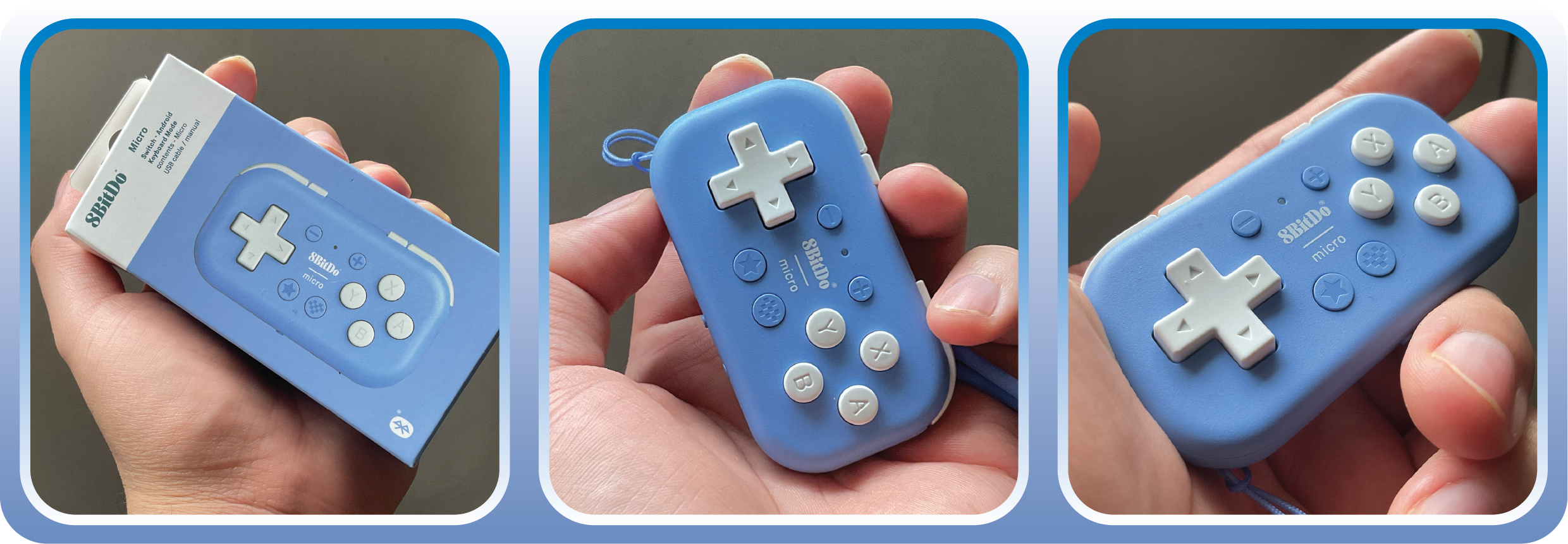
Friends, I just got my 8bitdo micro in the mail and it works with affinity designer v1 & v2 on the iPad! Its so cool! You can map all your shortcuts to this little device and all your shortcuts are at your finger tips. I bought this because I wanted to improve my workflow. I didnt want to toggle between tools by tapping on the screen with my finger tip. Thats one thing I hated about affinity designer v1 on the ipad. I would work with the node tool and then have to go to the top left corner to toggle into my move tool. Now, with the press of a button, I can toggle between tools and actions really fast. Its super easy. I love it, and I recommend it. My only issue is that affinity designer v1 never got a shortcut for delete. Which sucks so bad because thats all I need. How does an ipad app not have a shortcut for the simple action of delete? Now, that we have v2, we'll get more shortcuts down the road allowing us to improve our workflow on the ipad
-
MoonaticDestiny reacted to a post in a topic:
Will there ever be a blend tool? (duplicate objects on a path)
-
MoonaticDestiny reacted to a post in a topic:
Fix Button Style (Designer V2 iPad)
-
Old Bruce reacted to a post in a topic:
Fix Button Style (Designer V2 iPad)
-
Meliora spero reacted to a post in a topic:
Fix Button Style (Designer V2 iPad)
-
GRAFKOM reacted to a post in a topic:
Fix Button Style (Designer V2 iPad)
-
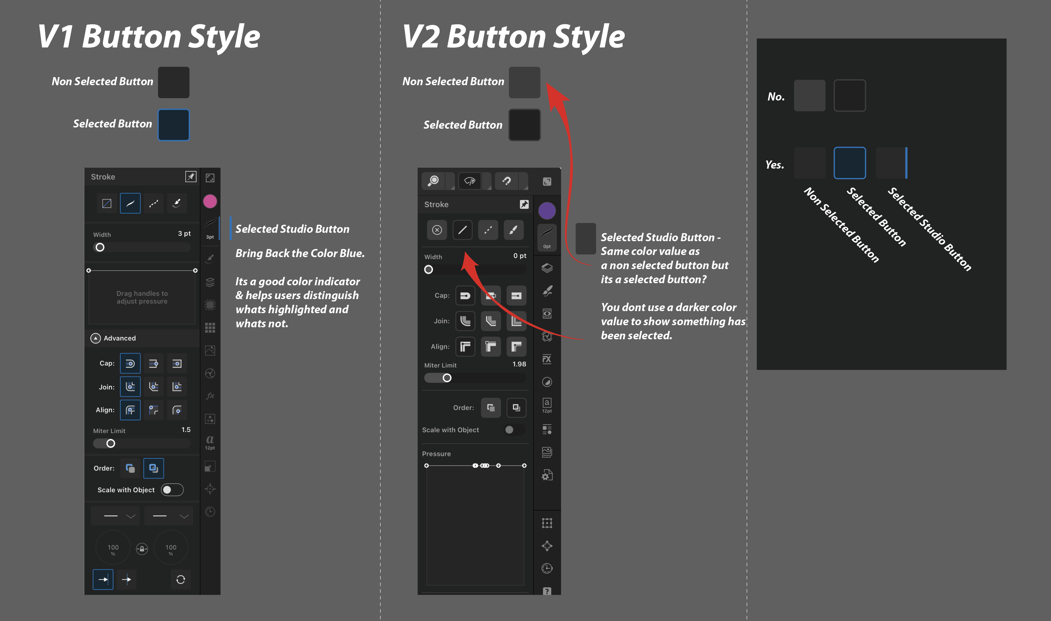
The style for the buttons on the designer V2 ipad app BADLY need to be fixed. You just cant tell what buttons are selected. Even if you are able to tell, its still badly designed and confusing. You dont use a light gray color to indicate a button is not selected & you dont use a darker gray color to indicate a button is selected. Using a light gray color for a button on a dark background only indicates that button as highlighted and selected. So when all your buttons are light gray color, theyre ALL active and selected. You can't do that. You're confusing the user. Everything shouldn't be highlighted or selected. Dont use this light gray color for your buttons. You also dont use a dark gray color to indicate a button is selected because when something is selected its usually a lighter color to show that its been highlighted or selected. So making it a dark gray is the opposite. Its been......dehighlited. Not highlighted. Even if you were to stick with the dark gray color to show that the button is selected it would conflict with the other light gray buttons because they too are selected. So pretty much all your buttons, right now, are selected. Its shouldnt be like that. Its so bad. The solution is the color blue. Blue is a good color indicator to show that something has been selected. Think of hyperlinks. You have normal black text and then you have blue text. They're blue to indicate that you can click on them and select them. So by making your button blue you can indicate to the user that button has been selected but it wont work if your other buttons are a light gray color because both are selected now. This blue button will only work if your other buttons are a deeper gray. Please review the photo attached to this post. I show you how v1 did their buttons vs how v2 does their buttons. V1 is the way to go. You use a soft gray color for your non selected buttons on a dark gray background to show that there are buttons and then you use the color blue to indicate that a button has been selected. You had it right in v1, but I dont know who made this bad design decision. Please fix it, go back to v1, and bring back the color blue. Blue is the answer. Please also use the color blue in your dials. Right now, theyre like a light gray colors. You can see them on the "new document" layout under "Dimensions."
- 1 reply
-
- 3
-
-
-
Bound by Beans reacted to a post in a topic:
Customizable Tools & Studio Bar (Designer V2 iPad)
-
MoonaticDestiny reacted to a post in a topic:
What keyboard tools are you using with the affinity apps on ipad?
-
but on the keyboard shortcuts guide on the ipad there are shortcuts for undo and redo.... command Z & shift command Z. It hasnt arrived in the mail yet but Ill be sure to share my experience. Thank you.
-
MoonaticDestiny reacted to a post in a topic:
What keyboard tools are you using with the affinity apps on ipad?
-
Oh, thats disappointing to hear. I was so excited. I was ready to improve my workflow. I mainly use designer v1 on ipad. Not sure if there are bugs there but Ill see how it works for v2. Thanks for the heads up.
-
MoonaticDestiny reacted to a post in a topic:
Allow Us to Unlock A Locked Object through Quick Menu (Designer V2 iPad)
-
lepr reacted to a post in a topic:
Allow Us to Unlock A Locked Object through Quick Menu (Designer V2 iPad)
-
walt.farrell reacted to a post in a topic:
More Keyboard Shortcuts (Affinity Designer v2 iPad)
-
MoonaticDestiny reacted to a post in a topic:
Duplicate in the Layers Panel (Designer V2 iPad)
-
Im sorry to hear that. I love affinity designer v1 on the ipad so, SO much. When v2 came out, I was disappointed how everything got changed around. I gave up on v2, but I told myself to give it another try. Which is why Im posting again . Affinity Designer v2 is bad. Its really bad. I think serif just needs to hire a graphic designer who can help them out.
-
I invested in an 8bitdo micro device that will lets me map out shortcuts to it. I saw that there are some shortcuts that have not been implemented into the app, so I wanted to bring them up here. I know some you can do via quick menu but they should also be available as keyboard shortcut. If you have more keyboard shortcut suggestions for affinity designer on the ipad you can comment them here. These are just a few off to top of my head. Convert to Curves - command + enter Lock Layer - command + L Find in Layers - command + K swap stroke/fill - shift + X
-
- 1
-
-
I dont know if this is the right place to post this. I wanted to know what keyboard tools are you guys using with the affinity designer ipad apps? I was thinking about getting a keyboard for my ipad to do shortcuts in the app and improve my workflow but i didnt want to have a keyboard next me. I also didnt want to press the keys on my board based on the keyboard shortcut. I want something more at my finger tips. I started looking online and found this little device that lets you map keyboard shortcuts. its called the 8bitdo micro. You hold it in your hand and you have all your shortcuts at your finger tips. I just bought it the other day. I havent received it but im super excited to be able to switch between tools and easily do shortcut with the press of a button in my hand. I know some artist use this device for other art apps like procreate and clipstudio. I was just curious if anyone is using any keyboard tool devices to improve their workflow. Are you using the 8bitdo micro for the ipad apps? how is it? how has it improved your workflow? do you know of any other devices that let you map shortcuts to your fingertips? im curious how everyone is working with the ipad.
.jpg.459751e6d45fb6f2098ae5e8695ba41c.jpg)