
Fantail
-
Posts
27 -
Joined
-
Last visited
Posts posted by Fantail
-
-
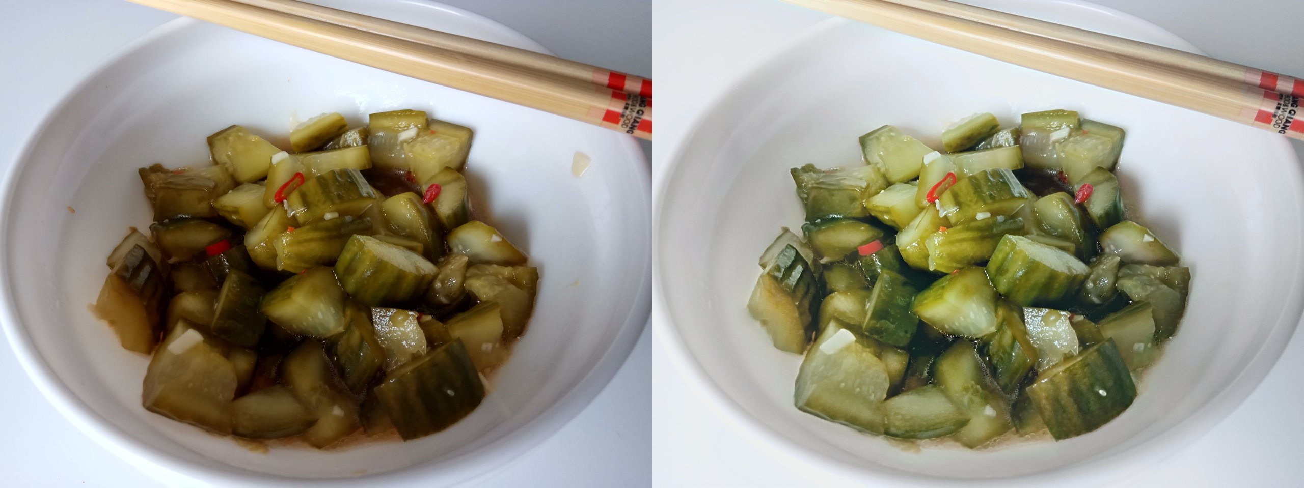
Sorry, I should have specified. My goal is to enhance the image in a way that most closely resembles an unedited higher quality picture. So no obvious color boosts or extreme "filters" to hide the original lack of colors.
So in a way, my question could be reformulated as: how do I increase the color and brightness range and variety in a way that looks natural?
Worst case I'd recolor the picture by hand, in which case advice for that is also appreciated.
-
I am not a photographer so I don't have the equipment nor the setup to take good photographs to work with.
Especially my random food pictures taken with my 170$ phone tend to end up looking so unflattering that I don't even want to share them with anyone because the colors are so bad, the food looks disgusting.
I've been looking for ways to make these pictures look more appealing and am pretty proud of the outcome of this one. Of course, it's not even close to perfect and if anyone has any advice on editing low quality pictures, it would be much appreciated. Most editing tutorials start out with professional raw images, which I don't have and a lot of the techniques used come out different than expected, so it's been a tough journey that I fear will only ever end once I get a better phone or camera.
Anyway, here's the before (left) and after (right):

-
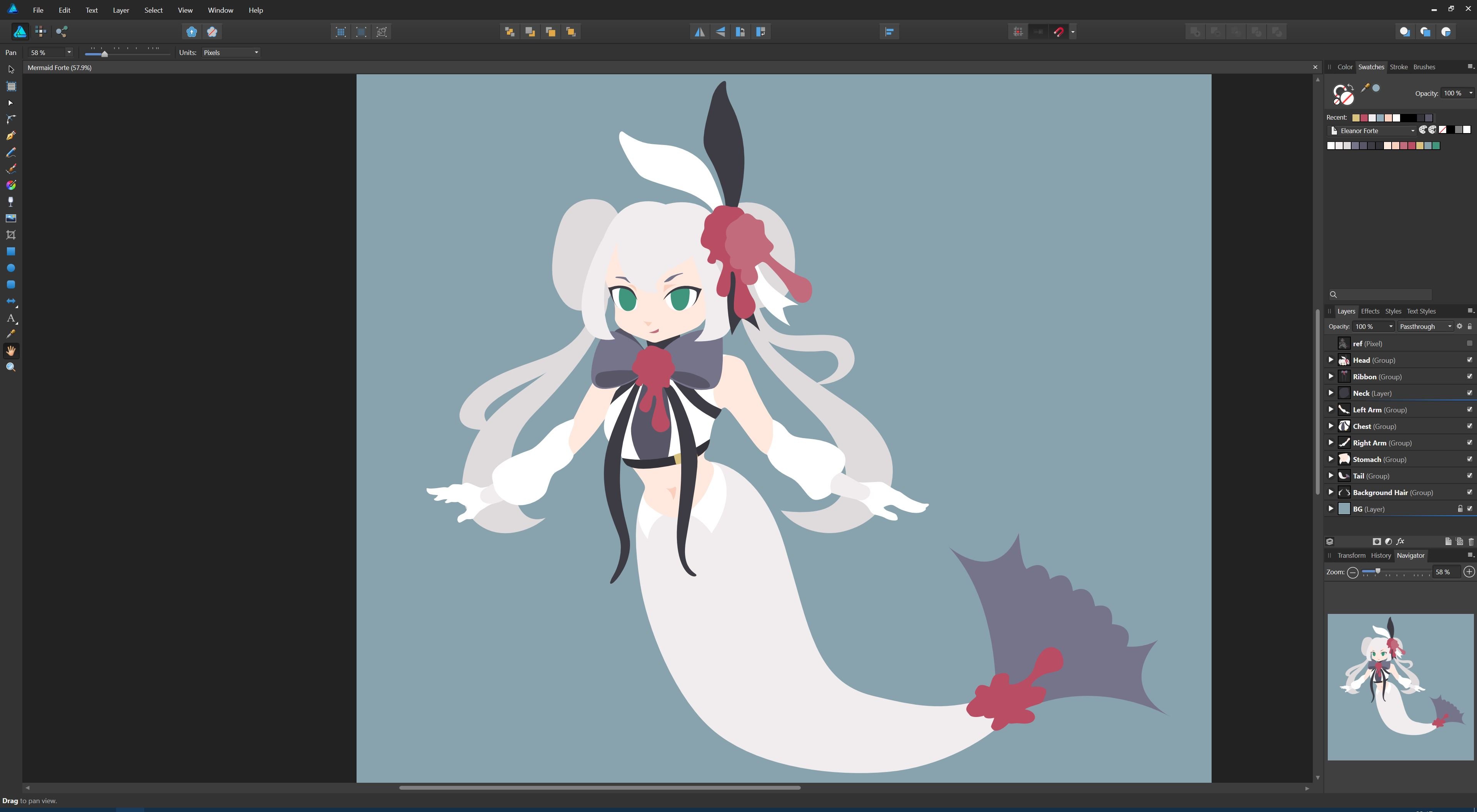
Ok, I reworked the tail curve and her left hand. Simply mirroring the other one turned out to be the wrong perspective. And sketching an ok-looking hand in pixel mode is so much easier than getting it to look good no matter the zoom
But I think I'll try to work on the other points first before reworking the hand again to get my mind off things...
-
Wow, thanks for the detailed explanation! That was really the one point I didn't get, I just didn't see it before but now that you pointed it out, that hard edge irks me too haha
I've just been tracing my sketches - all flaws included - so far but it seems vector is a whole different world of things to learn! I'll do some fixing now and update later when it's done
-
9 hours ago, retrograde said:
Have you experimented with effects/inner shadows at all? They can add a bit more dimension to your work. Also using semi transparent darker gradients with a multiply blend mode for shadows...
What do you mean by inner shadows? I'm not very good with the terminology
I kind of didn't want to use too many special blend modes because I wanted to control the number of colors are on it (except for gradients) with a strict pallette. Not so sure if it was a good idea though, just looking to experiment.
5 hours ago, firstdefence said:Nice drawing, very sweet.
A few observations.
- Needs more scales on the lower body
- Hair needs more definition, more hair strands
- The right hand looks more like a hoof than a hand
- You need to neaten your curves because you have flat spots and they would look much nicer having a nice flow to them.
1. I don't know how many to put on there. If I put too many, it feels weird if I don't scale out the whole tail. But if I put in too few, it doesn't have the desired effect. Any tips for that?
2. I'm working on it atm
3. Hands are hard but I'll try!
4. Can you elaborate? Do you mean like how the tail isn't perfectly arched?
Thank you both for the feedback!
-
-
-
Finally laid down the flat shapes. Any advice on how to make those random red blobs have a more natural flow? Or generally how best to model such a shape.
Thank you!
(Not my character. Mermaid design based off of Eleanor Forte.)
-
Cool edits, especially like the squirrel one
The concept sounds just like r/photoshopbattles on reddit. You might check that one out as well if you don't know it already ^^
-
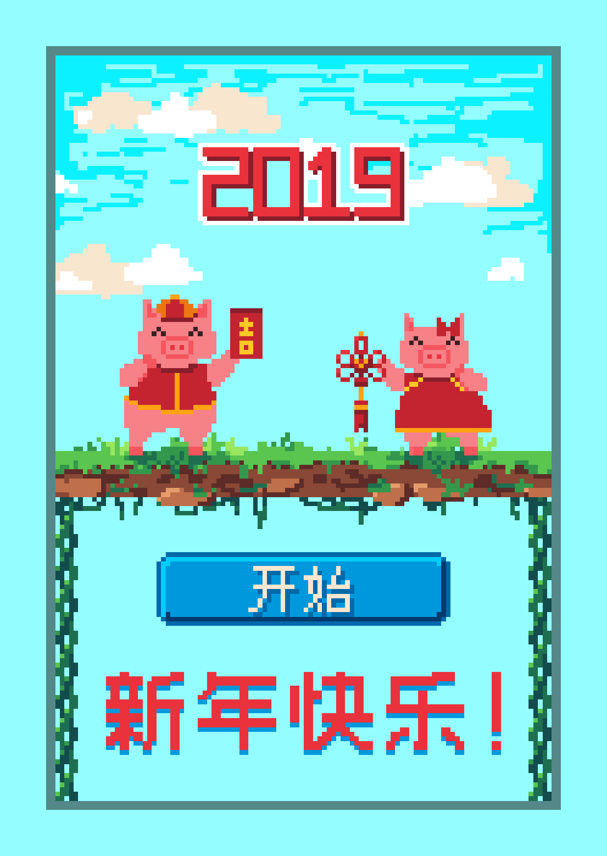
It's in Chinese because I made it for my grandparents in China. They know I'm studying games engineering so I thought it would be a fun twist to my annual traditional postcard
Aside from the lack of indexed color mode when editing, my experience with Pixel Art in Affinity Photo has been a blast. Coming from Photoshop, I love the infinite zoom, the pixel tool and the snapping to whole pixels. Placing the colors feels very smooth and accurate as well.
Anyway, here's the upscaled postcard, hope you like it ^^
-
Was the object on another layer before? If yes, put it on the layer on top and merge it down.
If not, you can't. There is no information about the parts of the object that are behind something else. You would have to reconstruct them yourself.
But why do you need several objects on the same layer in the first place?
-
So glad you are bringing this up. I made a post about the same thing a few months ago and while it didn't gain much attention, a few others agreed and there doesn't seem to be an equivalent feature yet.
This really should be a higher priority. It's part of the workflow of a lot of painters and cartoon artists and the like, and pretty much every other program with layer support has it.
I know the small team at Serif already has their hands full, but I'd consider this a core functionality of the flood fill tool.
-
Maybe I'm doing something wrong, but when toggling the UI, the document does not stay in place, which is quite annoying.
For example, when I toggle this:
It becomes this:
It seems the document is moved by as much as the upper left corner moves when the toolbox disappears.
It would be great if this could be negated so that the document stays at the same pixel position so that toggling does not effectively move the image around.
-
When Affinity Photo was last on the secondary monitor, and the secondary monitor is then disconnected, Affinity Photo will be started off screen instead of on the primary monitor.
In my case I have a graphics tablet with monitor that I plug in and out quite frequently. It's not really a bug and more of a feature, so I put it here, but I hope it still gets "fixed".
For everyone else with this problem: what worked for me was to shift-rightclick the icon in the taskbar, click "Move" and then use the arrow keys to bring it back.
-
Now that looks much more like a finished work. Last critique would be that the wires look like they are from a perfect top down perspective, which doesn't quite fit, especially with the shadows so close by indicating they should be lying on the table. I don't have AD myself so I can't tell you how to do that, but I'm sure you'll figure something out, seeing how you've already managed to do all that in just two weeks!
-
Wow, nice! The background looks a bit lazy and weird but the speaker itself looks really cool. Great attention to detail with all the rounded and shaded edges!
-
Sadly they're raster cuz I'm only drawing for myself and I'm lazy. But I'll keep it in mind, thanks!
-
Sorry for the late reply but yes, Affinity Photo and exactly as @Bri-Toon said. It's just the only way I can think of that makes the fill tool really useful, not just for painters.
-
Thanks, glad you like it ^^
-
@firstdefence Thank you so much! I was so sure I've tried it before and it didn't work... tried it again and it worked perfectly. Feel stupid now, but thanks!
-
Hi everyone!
In this file, so far I have been "drawing" the dragon using a layer mask. Now that the actual content is all on the layer mask, I wanted to edit the layer mask in a sort of non-destructive way. I wanted to add flowers and all kinds of patterns to the area outside of the dragon, but wasn't sure how to do that without having them all on the same layer mask. I don't want them on the same layer mask because in case I end up not liking the flowers and stuff, I'd have to retrace the whole outline of the dragon.
Then I thought of the great erase blend mode and wanted to use an erase layer to clear out flower patterns in the blue paint but instead it erases the vase under it as well.
Is my approach completely wrong? How should I proceed with what I have with as little extra work as possible? Is what I want to do possible in AP or should I make a feature request?
-
7 hours ago, Schorched Earth said:
Hey.
I'm Chris, been living in Japan for a bit.
After dealing with the lack of support at Adobe I decided to come here and give Affinity a try.
Adobe forces me to use the Japanese region for downloads and everything else. I can't read Kanji..
It's simply too difficult.
I just want to be able to use photoshop/video apps without Japanese.
I want to use Affinity without being forced to download it in Japanese.
Can this be done?
Hi Chris,
afaik the downloads contain all languages and while auto detect might set your language as Japanese at first, you should be able to change the settings inside the programs later.
I'm in Germany and have set both the Affinity websites and the programs to English without any problems.
Of course I can't say for sure about Japan, but I don't think they'd treat one country so differently. If I can set my Affinity language to Japanese, I'm sure it's also possible vice versa.
Why not just download the trial and see for yourself?
-
Whenever I want to make a fill on a new layer, I am forced to go to the layer that provides the colors I want to sample from, make a selection there, then go back to my empty layer and then color the selection. This is kind of a lot of work for a fairly basic functionality that is crucial for coloring line art, where you have to create lots of separate color layers.
I know painting is not your priority, but from another point of view, seeing how you like to advertise this non-destructive workflow (which I LOVE btw!), I do not see much use for a tool that is only able to realize its full potential (namely edge detection with tolerance) when it is allowed to overwrite your base layer.
-
On 10/8/2018 at 4:51 PM, heskphotography said:
It's hi time I introduced myself. Roy H. Used to use Photoshop CC until they put the price up. So when I came across Affinity I jumped at it. Mind you at first I didn't think much of it, but that turned out to be unfamiliarity. I have a CS6 disc and thought I would use that in conjunction with Affinity as I purchased it for £600. That was before CC was launched. Then I updated to CC. But after dropping CC, I tried to load my CS6 disc and Adobe blocked it telling me I had to subscribe to their programme in order to use my own disc. Which I thought was underhanded as I had purchased it outright and had paid to use it. It won't even try to load, Adobe just blocks it.
I tried to contact them several times to argue it out with them, but they didn't want to know. I should have left it on my system when I subscribed to CC. But thinking about it, CC was loaded over it so probably absorbed it but I should still be able to use a disc that I own.
I'm not looking for answers, just making other people wise to it.
Well that's off my chest, so HI Y'all. Great programme.
How was it blocked exactly? It's probably not new to you, but have you tried installing from an installer from their download page? Because their official installer download page for CS6 programs is still up, saying you should still have access to those programs as long as you have the serial number:
https://helpx.adobe.com/download-install/kb/cs6-product-downloads.html
I'm not very knowledgeable about Adobe stuff but hope I could help


Enhancing a bad picture taken with a bad phone camera
in Share your work
Posted
Those are some pretty cool tricks! Interesting to know what we're actually looking at when seeing those mouth-watering pictures.
It's a pickled cucumber salad in my image (pretty niche, I know) that I made and I wanted to share it in an online group of fellow enthusiasts. In this case, it would defeat the purpose to fake the actual food but next time I should think of a better setup and/or background beforehand when I make food with the intent of sharing pictures of it. I looked at some reference images of pickles online and they all seem to place them on a desaturated wooden table and it does look a lot better than my plain white table
Thanks for your input!