CartoonMike
-
Posts
453 -
Joined
Everything posted by CartoonMike
-
 This behavior worked in the last RC of the beta 1.7 and in the released version of AD 1.7 it seems to be broken, at least on my iMac. The previous behavior was that I would have 1 or more files open, all of them are saved and I would quit AD. Then reopened AD, in an hour or day or so. The files would be automatically opened and be ready for being worked on. Now when I quit AD 1.7 with files opened (tried it with 4, 3, 2 and a single file opened) and restart AD later, no files are opened. I restarted AD with the shift key held down (which I seem to think opens the app in a "clean" state -- default settings all around) and still no joy on opening AD with the files opened from my last session. the "reopen documents" option in the General tab of the Preferences is ticked. In other apps, they re-open the docs that were opened from the previous session. I even deleted the folder com.seriflabs.affinity designer in my Library/Containers folder. And when I restarted AD, it rebuilt those folders and everything in AD was reset to a default state. I then pasted the folders and files from the AD beta into the container/data/library folder and over writing the existing files when there was a conflict. restarted Ad and same issue of non-opening docs. And now the latest beta of Publisher is now exhibiting the same behavior of not re-opening docs that were opened when the app was last used. This beta worked as expected prior to the download and installation of AD and AP 1.7; which is why I'm posting it here rather than in the beta as it seems that the released versions install coincided exactly with the reopening docs issue. I'm going to reboot my mac and do some maintenance on it and see if the issue is taken care of. If I don't amend this OP, then rebooting and such did nothing to solve this own my end.
 -
Will Designer Beta Continue?
CartoonMike replied to Mark Oehlschlager's topic in [ARCHIVE] Designer beta on macOS threads
Not working on my end. Using AD from the Mac App Store. In step #2 there's no Library folder inside of the com.seriflabs.affinitydesigner folder. There's just a Container.plist and a folder named Data, which has a Library folder. So I used this path to paste the copied files & folders from step #1: Users \ username\ Library\Containers\com.seriflabs.affinitydesigner\Data\Library\Application Support\ started up AD and everything that I installed in the beta is now in the released version of AD 1.7. -
This is just something I kinda resigned myself that i had to do after every beta/update: reinstall all brushes, textures, assets, etc. It got to be such a hassle that I didn't bother to install any add-ons at all for a few dot releases .It would be great if the location of these add ons were in a unified location -- independent of versions, so that what I install on Designer, could be accessible (when appropriate, like for raster brushes) in Photo and Publisher. Maybe even for Layer FX,
-
Affinity Publisher Public Beta - 1.7.0.376
CartoonMike replied to AdamW's topic in [ARCHIVE] Publisher beta on macOS threads
And I'd like to thank you and the rest of the team for their fantastic skills in making Publisher the great 1.x app it is and will be in the future! -
Just tested it out on the same pesky document and the lookup word works on the 4 interior pages I checked and on the title (first) page. So thanks so much, I'd consider this issue "solved" I've used Pagemaker (back in the day) and a number of other Desktop publisher apps and Publisher is the best I've used. Affinity took the science of desktop publishing and put it into this app so all I have to worry about is the art of design. Thanks, again!
-
thanks Jon!
-
I've tried this on several docs both old and newly created in the most recent beta version (312). And here's what I did in the new docs: create new document. paste in some text in a text object. double-click on a word to highlight it. Right-click on the word and choose the "look up '[word]'" menu item (where [word] is the word that's highlighted.) IF you're on the first page of your document, then this will work. IF you're on the second (or later) page, this kitty won't purr I don't know if this has anything to do with a second monitor (which I use and have the navigation and textural palettes on, btw). But I do think this is a urgent bug to attend to, as most documents will start off with a cover or something. I wouldn't have noticed this if it wasn't for the other look up bug report; as I usually write my prose in a word processor and then copy-paste the script into a text object. so it's already been proofread by the app (Pages) and the spousal unit (Janet) and nothing gets flagged once in Publisher. Anyway, I don't see the need to attach files or anything like that, I copied the text from a plain old TXT file and rendered it in Publisher in Courier. Anything I can supply, just let me know and I'll try to provide 'em as soon as I am able.
-
and it's on the autoupdate on Mac OS. Downloaded and installed with no issues. Really enjoying this beta!
-
The Pumpkin Tutorial
CartoonMike replied to CartoonMike's topic in Tutorials (Staff and Customer Created Tutorials)
@kusayat Well gosh darn, thanks! I was thinking about dusting off this tutorial and redoing it by completing part 2 and then updating the whole shebang to 1.7 (which hopefully will be out by then). So it would be completed at long last. So I'm tentatively planning on starting this sometime top of next year. That's right after my pancreatic cancer surgery, which should be later this month or early Nov. My prognosis is excellent and I've completed the 6 months of chemo. the tumor has shrunk and my oncologist is very optimistic. Yea! Yeah I've been kicked down, but I'm not out. Thanks so much for the encouragement. -
Graphic Novel?
CartoonMike replied to Guyon's topic in Feedback for Affinity Publisher V1 on Desktop
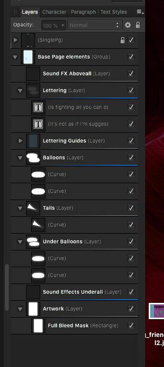
Oh yeah, the text handling in Clip Studio Paint. To say it's lacking is like saying the Sun is just a tad hot. When I was (plug time!) writing the Manga Studio 5 Beginner's Guide forPackt Publications, I had no nice words for the way It handled text. (for those not involved in comics, first there was Manga Studio then the same app got renamed Clip Studio Paint by the CelSys, the company that owned it. And of course the name change happened the very month my book was published!) The most glaring thing is that Clip Studio doesn't do anything beyond just rendering the letters of an OpenType font. No special characters, no ligatures, no replacement pairs, etc. The lettering in Clip studio would have to improve just to suck badly. I was burned once -- I had lettered an entire graphic novel, about 60-odd pages and for some reason Clip Studio just stopped acknowledging the fonts I chose for dialog and captions (two different fonts, btw). So I had to go over each page, select the text and choose the right font, one by one. I'm sweating and getting the shakes just remembering it. I mention this just as a way to show how badly independent comic creators need a good affordable lettering solution for comics. Comic Life is okay, but so far, my experience with Affinity Publisher Beta is very positive. I'm dealing with some medical issues (chemo is a bear!) and I've not messed around with a large page count yet. Hope to do that this week. As far as the tech side of APub for comics, Look at some of the templates around for comics. I suggest you go to Blambot and look at his downloadable templates (which Designer can open, I know because I bought a copy of the templates). What I like about those templates at Blambot is that they're set up for print and PDF export that ComiXology requires. Just make sure that when you export you select the "All Spreads" option in the PDF export setting. That way if you have any 2page spreads, they'll be kept together as ComiXology wants 'em. I had to delete some of the template's "extra" stuff, like who's the letterer and other info. Mostly because I felt that since I was the only one to use this and it was going to be for my own work, it was superfluous and thus axed 'em all like Lizzy B. And the sublayers in the template are not named. Bad form, imo. But the important stuff is the "Safe Area", "Trim" and Bleed Area. I used the Blambot Template to get the measurements for those areas for both a single page and a double page spread and made both into Master Pages with just the graphics for the three areas and for page numbers. Outside and Inside covers along with Text pages each get their own Master Pages. Now if you do get the blambot template or just get the measurements and make your own (in which case I do recommend making the dashed rectangles for each area in Designer and color them like Blue for the Safe area, Green for trim and Red for Bleed for example.) You'll want some layers for the lettering. Because of the way that APub currently treats Master pages, You'll have to create these layers and group them. Then make an asset of them. I've attached an image (APub_pageLayers_02) of how I have the layers set up. But first, you should have some standard comic styles set up. Like Dialog, Caption and so on. If you're using fonts from either Blambot or ComiCraft, starting with about 8.3pt to 9pt is good. Make sure that the Leading is the same as the font size and adjust for the demands of the font you chose. Blambot has a good tip page for that (for sure, check out his site for lots of good lettering info, and ComiCraft's site, at https://www.comicbookfonts.com/Default.asp , has good info, too.). One thing to make sure of is that in the Paragraph setting, make sure that the next paragraph setting is zero, else you may have a challenge, as sometimes we just have to have a line break where we need 'em so we get the text in the nice diamond shape we need for dialog and we don't want a double spaced empty space in the middle of a villain's rant, for example. anyway... Here's a walk-through of the layers.... The name I've given the group is Base Page Elements. Remember that it's easier to group things and then make assets of them. You can, if you want, ungroup them once you've dragged the asset to the page. Hint: turn on snapping, make sure that Snap to Spreads is checked and any sub-options are checked too. That way when you drag the asset onto the page, you'll see the guides appear when you have the asset placed in the center of the page (or top/botton and sides). The first layer is for sound effects that appear over all the art and/or text. This can be custom lettering done in designer and imported, or some other format (esp. a format that has transparency.) The next layers we're interested in are the Lettering, Balloons, Tails and UnderBalloons. (the Lettering guides layer is from the Blambot Template and more info on that can be gotten from the website.) The lettering layer has all the text objects for balloons, caption boxes and other (non sound FX) text. First you make an ellipse (for dialog balloons) or rectangle (for caption boxes) and using the Frame Text tool, make the object into Frame Text. Then you either copy the text from the script (hopefully you're working from a script, if not, start writing the script now! It will really make things easier for you.) And then Paste without formatting, select the text and apply the text style you want. Rinse, lather repeat for each ballon or caption box. The next triad of layers are the Balloon, Tails and Under Balloons. Scot McCloud has a 2 part You Tube video on this technique, this should take you to the videos: https://www.youtube.com/results?search_query=scott+mccloud+lettering Even though the videos feature Illustrator, the technique only requires a vector app that can create layers. The trick is the Balloon Layer has your balloon shape with no stroke, just a fill of the color you want. Then you copy the layer and either move it down to the Under Balloons layer and then give it a stroke that's twice the thickness you want. In my case I want the stroke to be 1.5 pts, so I stroke the Under Balloon shape to 3pt and make sure it's set to "Align Stroke to Center" and then I create a triangle in the Tail layer, set the fill to the color of the balloon and the stroke to the 1.5pt setting I want. And I get a seamless balloon with tail! And unlike a Single object, I can move the tail around, add another one with no consequence at all. (It does help at this point to lock the Balloons layers so you don't accidentally select them) finally we have the Sound Effects Underall layer. This is for sound effects that are below the balloons/captions and/or art. You can use the excellent masking abilities that APub has to make precise masks around sound effects you want to appear behind things. And then in the artwork layer is where some magic happens. See the FullBleedMask is just a filled, unstroked white rectangle that is precisely the size of the page prior to any trimming. And since all the layers are empty, except for this (and the lettering guides which we'll not be getting into) layer -- we need something in this layer so the snapping mentioned earlier will work. And once placed, the rectangle could be resized to the Bleed area, if desired. When you import your artwork, make the artwork a child layer of the FullBleed Mask layer (just drag the artwork layer below the FBM Layer until you see the blue line indicating where the layer will be.) One thing I need to test out a bit more is the detection that imported graphics have been altered/changed. I think of it as the Refresh Graphics feature, off hand I don't remember what it's actually called and my copy of APub just crashed because I have Safari open at the same time as it it. Too lazy to reopen it and find out what that feature is called. But it's a sweet feature. Comic Life (a under $40 app, I mention in passing) had it when you chose reference exterior files instead of saving all in one file. This was nice for me, as I like to letter from my pencilled roughs and then export the lettering (with a transparent background) and import the lettering into CSP where i can then change the roughs if needed. It's like a second draft of the comic, and the second pass makes it better I feel, just like a novel goes though drafts, why not comics? Keep in mind that only if we have a lengthy text piece in our graphic novel, we need not worry about text flow or such. And in the case of a text piece, just create a master page that has a layer that has vector rectangles of the text in one or two columns or more. Then make your text frames the size of the vectors in your pages. You can eyeball the title of the text piece. Use examples from other graphic novels for guidance. So the answer to your question is yes, Affinity Publisher can be used for graphic novels. I suggest using the beta period as "practice time" to get used to the software and try out different techniques until the final release of APub 1.7. Hope this helps, if you have any more questions, ask and I'm sure that it will get answered.
-
@walt.farrell thanks for clearing that up for moi.
-
@Fixx True about what designers ask for, but I was just focusing on what matters in my workflow, because I'm not able to speak for all designers as I'm just a lowly comic creator.
-
And correct me if I'm wrong, but using the chapter title as the section Name make it appear in the Table of Contents? If so, it's a win-win, right?
-
Faced pages PDF export
CartoonMike replied to Castle Al's topic in Feedback for Affinity Publisher V1 on Desktop
Hmm... just had a thought that maybe some kind of "output" options could be set? Either at the Application level or Document level. These options would basically set the output parameters for Tiff, PDF, etc. This way it's a set it once and forgetaboutit kinda thing. Of course you should be given the option to change the predetermined options in the export dialog. I feel like this could be included in the template function. And on second glance, I don't see a reason why a DTP document would need to be exported in an EXR or HDR format. Aren't those mostly devoted to Photography and/or 3D texturing? -
Faced pages PDF export
CartoonMike replied to Castle Al's topic in Feedback for Affinity Publisher V1 on Desktop
@Fixx I see your point, but that just means that for every document I work on -- I'll have to change that setting to be All Spreads so double page spreads will be exported as is and not split into two pages. I feel that any changes will be met with some groans and such. But if more people want "All Pages" to be the default, so be it. -
Agree with the idea that master pages should be able to have individual content. Here's my specific example: I have master pages for my comics that just has various margin things, like bleed, active area, page number-- basically things I want on every page, that'll be unchanged and can have visibility turned off on specific layers when I need to. And then I have to create the layers needed for lettering on each page: Sound Effects above artwork Text frame from object (oval or rectangular) Balloon/Caption Box shape with no stroke Pointer with stroke width desired balloon/caption box shape with 2x width of stroke Sound Effects below/within artwork Masking layer for placed artwork (comic page) And that's a lotta layers. I thought about making a symbol with all those layers, but I would just have to "disconnect" (forgive me, I forgot the actual term) them anyway when I add content and for the most part each page will be different therefore all the layers will have to be empty, so I just made an asset with all of them, just adding an 8th layer for "page size." So now I just create a new page and drag the asset to the page and let the snapping place the asset, thanks to the "page size" layer exactly where I want them. Granted, comics is a very small niche use for Publisher, but so far it's working well for me. Better than Designer in a number of ways: real pages, not artboards. If master pages allowed Layers to have individual content (i.e. child layers) on pages would be a great feature, but there are workarounds, like the asset creation method. However for projects that change in mid-completion, this isn't much of a solution. But for now, for me, it's working okay. Hope the previous paragraphs weren't too involved, but i thought it best to actually give an example, and what I do to work around the limitations that presently exist. ---- I don't consider Affinity to arrogant. I've found them to be driven, considerate and approachable. then again, they do tend to give back as well as they are given, and I kinda like that spunky snakiness. But that's me. As far as the mini-review, for the most part I can see where the author is coming from. And I've been to this rodeo enough times to realize that development teams are snowflakes in the respect that no two are alike. What didn't get mentioned in context within the mini-review, is that Serif isn't just developing stand alone app, but developing an stand-alone app that can work with 2 other apps. I have no idea how complex that is, but I'm guessing it's not a spring time walk in the park. While we all would like to have feature A, B or Z, there could be reasons why we won't see 'em for a while. Serif shouldn't have to divulge chapter-and-verse on why things are the way they are. The broad brush strokes (to mix metaphors) they have said are enough IMO. I do agree that when version 2 of the Affinity Trinity (my lil' nickname for the assortment of Affinity apps.) is when things will get popping and hopping. And so far, in my niche needs, Designer and Publisher, and to a very lesser extent: Photo (which is just damned hard for me to get my head around), fulfills them very well. All I'm really missing is an envelope distort and some kind of pucker/bloat feature (for word balloons showing thoughts and exclamations), which ain't bad; I can spend a few moments hand-creating those effects for "warm-up exercises." TL;DR: Make master pages with stuff that'll be the same from page to page, create an asset for stuff that'll contain different stuff from page to page. Serif has treated me right and with respect and I've treated them the same in return. I feel that there's a lot we users don't really need to know that may be misconstrued to them having an "arrogant" mindset. And that's an insult to everyone at Serif, imo. Can't wait for the version 2 hubaloo to commence
-
Well, standard "I can only speak for myself" disclaimer... I don't know about LaTeX for desktop publishing, and haven't needed to ever. And my choice of word processor is either Pages, Nisus Pro, Storyist or Scrivener (or a combo of them all). I find it's just easier to work on the content in a dedicated Word processor and then import a raw TXT or RTF file into a Desktop publisher. This has been my M.O. since PageMaker (RIP). Currently, I've been using Designer for lettering comics, and it's been working out okay, but the there's slowdowns when it comes to the Art board. It wasn't designed (I guess and this is not a dig at the devs) at being able to lay out 32-64 page documents. So I've been waiting for Publisher like forever. And when the beta was released the first thing I did was to create a "template" document for comics (the print size, taking into account the size that ComiXology likes its comics to have) set it up with styles and master layers and an collection of "Comix" assets to allow for the layer requirements (Like for Sound Effect lettering that's above the art, The text for dialog or narration, the balloon/caption shape, a layer for the Balloon Pointer, A layer below the shape for the balloon/narration stroke), the sound effect layer that's below all the text and finally the Art layer which contains a masking for placed art *whew*). There's just 2 master spreads, one for a single page and the other for a double-page spread. Then I place the artwork and create a shape that will become a text frame. The comic script is opened in a window on my other monitor. I select the text for the balloon/caption, copy it and paste without style into the Text Frame. I change the style of the text to what it needs to be (dialog or narration or whatever). Then I finish with the Balloon Shape (which has NO stroke and then copied on the lower balloon layer WITH a stroke that 2x the width I want it to end up being. Sandwiched in-between is the Pointer shape, that has the width I want. This way I get a balloon that has a pointer that is adjustable independent of the balloon shape). Importing the Script using AutoFlow would be a horror-show apocolypse of additional work that would just eat up time. But looking at the script itself, I can make sure I'm on the correct page and panel and get the right character saying what they need to say; it would be bad for the hero to lapse into a villain's monologue! So what I do is specialized -- so far the only dedicated comic lettering app is Comic Life, which is good -- but Affinity Publisher (even in beta) is better. And when it's possible to switch between Photo and Designer from Publisher, I foresee using all three to create comics from idea to printable pages. And I have a storybook called "The Living Room Warrior" that my wife wrote and I illustrated that, thanks to Affinity Publisher Beta, I'm inspired to revise my original illustrious and add many more illustrations, and do a 2nd edition using APub to create printing files, PDF and maybe ePubs in time. There's a comic for a client of mine, that I may redo in Publisher, and do additional work for them using APub. Even though some functionality is duplicated between the Affinity Apps, we were told about (at least I remember reading it, but my chemotherapy "fog" may be giving me false positives...). But there's so much that Publisher does that Designer doesn't. Page numbers, master spreads, table of contents, actual pages instead of Artboards, and more that escapes me presently. So purchasing this app is a forgone conclusion for me. It's a wonderful addition to my software arsenal. And that's what Affinity Publisher is good for -- in my case.
-
Downloaded and installed the latest Beta for APub (1.70.133) and was making a post in this very forum, when Affinity Publisher Beta crashed. Attached is the crashlog for it. APub has been doing this since the beta was first released. Curious if this is because of Safari, or other background processes. Affinity Publisher Beta_2018-09-23-093845_Michaels-iMac.txt
-
Been putting APubBeta through a testing. Not as thorough as others, as my needs are minimal and specific. So far it's been great at doing lettering for comics. Can't wait for the final version so I can swap between Affinity Apps for SFX lettering and hand-done titles, etc. But right now it's working wonderfully. I can set an oval as a text frame, add text to it, create the balloon in one layer and the stroke layer below that. Pretty much the same workflow as in the Red A's apps; but more fun in Affinity's apps ;) For me and my workflow, the best feature of APubBeta is the linked resource changed (or as I think of it "refreshed resource", alliteration is my jam) -- it's one feature I adored in Comic Life, as I letter to the layouts of my rough pencilled pages and then alter the roughs as needed if the text is too much or too little for the panel. This way I have a "2nd Pass" for my rough pages before I refine the pencils and begin inking. Then for the finished pages, I just re-export then from Clip Studio Paint, with the same file name and overwrite the rough pages. And bingo! The roughs are replaced with the shiny new inked pages (or fully colored pages if I go that route). Basically APubBeta is the perfect replacement for Comic Life, not that it's a "bad" app, it's just that some typographic features are missing and Affinity Designer/Publisher can do what CL does and more. While making comics is a niche publishing area, I'm sure that there's going to be more than just a few comic-makers interested in Publisher. Now if only envelope distortion and pucker/blot functions could be added soon-ish... What I mean to emphasize is that the way APubBeta works makes it very adaptable to many different needs and workflows. Because, c'mon fess up devs, how many of you guys had comics in mind when developing Publisher? So thanks for such a wonderful app, even when it's in Beta! And I can't help to smirk a bit when I use Alfred to start up the Beta, Alfred can open apps with just abbreviations. Affinity Publisher Beta's is APB, which I immediately think of All Points Bulletin (of which I blame on watching too many police shows as a wee lad).
-
Thanks! Looks like there's a lot of neat things to play around with. :)
-
Thanks! Slowly, but surely AP is the app I'm using for more and more non-comics things.
-
This mode would be like Multiply, only it would give the colors a bit of enhancement, like making the colors look more like a shadow instead of blending in black as Multiply does. Using this mode for shadows would make things like orthographic drawings, etc look more vibrant all over instead of how "dead" multiply looks. Here's the FB page posting https://www.facebook.com/DrawingVectorGraphics/photos/a.397552910260383.114321.165123836836626/1710309685651359/?type=3 that got me thinking about this. Just to be redundant (incase anyone doesn't wanna to to Facebook), here's the image that pretty much says it all: I think this could be a great addition to the blending modes we have already and make things easier as one would not have to settle for something that's almost there (like multiply) And be easier for the artist as they wouldn't have to "fake" it. Thanks for concidering this.
-
affinity designer BAHOOCHIE! - an eejits Card Game
CartoonMike replied to eejits's topic in Share your work
Best of luck on this. Great idea and art to match! -
Merghatroids!! Characters from the comic I'm working on...
CartoonMike replied to CartoonMike's topic in Share your work
@Peter: thanks for the comments. The sky was just a gradient between a light bluish and darker bluish color. The clouds were a DAUB brush that I then used the blur & smear tool on and then repeated it and this time used the blur&smear only on the bottoms of the clouds. This 2-pass technique made the sky color a bit more irregular. Happy accidents (TM Bob Ross)! -
Merghatroids!! Characters from the comic I'm working on...
CartoonMike replied to CartoonMike's topic in Share your work
and it's done! Thanks to Franketoon's Texturizer Pro and DAUB's brushes. Couldn't have done this without those bits of wonder. And of course Affinity Designer! One thing I really like about how this piece went was the contrast between the smooth vector outlines and the rough coloring within them. I think this one's a keeper.