

woefi
-
Posts
410 -
Joined
-
Last visited
Posts posted by woefi
-
-
-
58 minutes ago, NathanC said:
something that has been logged internally
Hint to the devs - The solution to this should be (conceptually) straight forward:
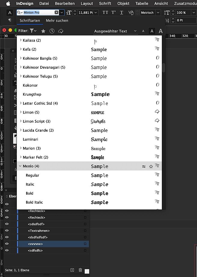
- The purpose of _the color panel_ is for mixing together fresh colors (choose freely which color space suits best).
- The popup _edit existing swatch_ must be independent of the former and it has to honor the colour space the swatch was created in.
...to clarify: the problem is that Affinity's color mixer remembers and switches its colour space globally _per App_
-
47 minutes ago, NathanC said:
to ensure that swatches are always edited in their native colour space which should prevent this behaviour
Yes, please!
I have been waiting for this since the first Publisher beta.
-
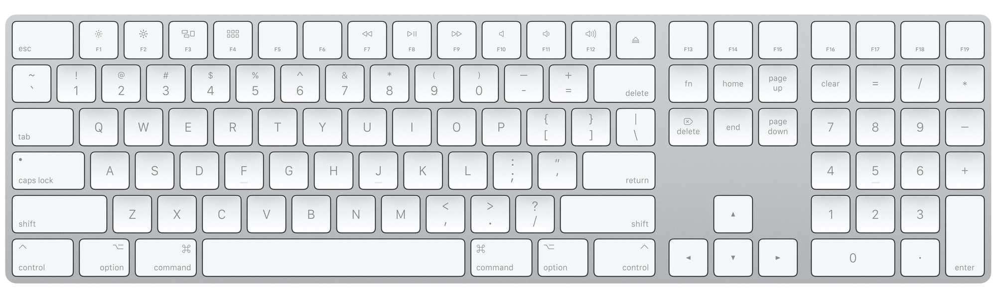
16 minutes ago, PaoloT said:
the picture of my Das Keyboard 4C Ultimate
Oh, I apologize if I made the impression that I ridicule your choice of keyboards. 🙇♂️
I'm absolutely aware that there are so many different 'tastes', professionally speaking of course. If it gets the work done, it's one's weapon of choice.
My point was: I was not that aware, that nowadays not everyone knows of the olden times in macintosh desktop publishing (aka the nineties) with the "Apple Extended Keyboard II" and on this topic in particular: "the key layout" which I would call the gold standard*. (Believe me, I would never start an argument about keyboard switches...)
*The left and right _Shift/Ctrl/option/cmd_ corners enable the most variety of keyboard shortcuts without breaking your fingers, the numpad lets you assign various text style commands on top of that and I never successfully managed to type in numbers using this ominous upper row but do so blindly and fast on the numpad.
Yes, and of course the separate Backspace and Delete keys...
p.s. I would have no idea what to do with a "globe-" or "copilot"-key, or this fourth win key in the right hand corner of a pc keyboard...
-
Happy it now works!
but now that all is golden, I absolutely HAVE TO post a picture of an "actual" mac keyboard, not a neutered laptop/mini sized one, but a real, "grown-up" keyboard for serious work:
just, you know, for @walt.farrell and @NathanC to look at.
")
(working on a laptop keyboard feels like my hands with winter gloves on...)

-
3 hours ago, NathanC said:
dependent on the colour space and profile used
@NathanC Yes, but please:
also relay to the devs to NOT simply "match" colours on screen, which would be dependant on colour profiles, but read the "actual" color value from memory/colour palette.
This is especially important for those of us who work with CMYK colours, where the AffinityApp obviously takes the (internal) LAB value of an existing CMYK colour and converts it back to CMYK. This "roundtrip-conversion" completely alters the colours and makes it unusable in print production workflows.
Example: take a "clean" yellow colour of 0/0/100/0 and _create_dokument_palette_ makes LAB L90 A-3 B86 out of it, which gives a "dirty" CMYK: 4/5/90/1.
-
1 hour ago, wet n rainy said:
Regardless of the bug, a changed linked file name surely should not trigger a change in link status. It seems like better practice to only flag a change when the file's contents change, not its human-readable label.
you are correct, technically this _could_ be handled better. (at least on a Mac...)
But consider this old-timer workflow (since 1994):
sometimes the user (as in "me") wants to quickly swap resources by renaming the established version to, say "filename_old.xyz" and copy another version of the resource into the original folder. If you have a document with hundreds of images, this will be very fast by using a bulk-renaming tool. Compared to the technically correct way of clicking in the resource-manager for each image and selecting the new version, which could take hours.So, what I'm saying is: it depends on the user's workflow. Not sure if a setting could help some or confuse others...
-
I had the same issue yesterday... I'm on an intel-iMac running Sequoia.
The obvious workaround is to force-quit publisher, rename the file back (or just make a copy of it with the old name) and then restart publisher so you can relink to the new file.
I hope this gets addressed soon as a hot-fix.
-
please try my attached test-file:
-
so... any change on that? It's still not fixed as far as I see...
Hey, @stokerg you commented in 2022 on this bug AF-3283...
-
-
This seems to be connected to AF-3611 (undocked Tools mysteriously moving)
This is known since 2022?
-
ausserdem gibt es (seit v2.3 oder so) den Shortcut, dass man die Leertaste gedrückt hält, während des Ziehens.
Als wenn man temporär das "lock children"-Häkchen angehakt gehabt hätte.
-
18 hours ago, maah said:
Also would be nice if one could turn an existing swatch into a spot colour
agree with that one!
the edit colours dialog is missing many functions the create swatch dialog has (overprint for example...)
-
@MEB Hi, any updates on whether this is already logged?
-
-
@MEB Thanks for
loggingchecking!Wouldn't you also agree that it is odd that the position of the tool panel is obviously not saved/restored with the studio preset?
-
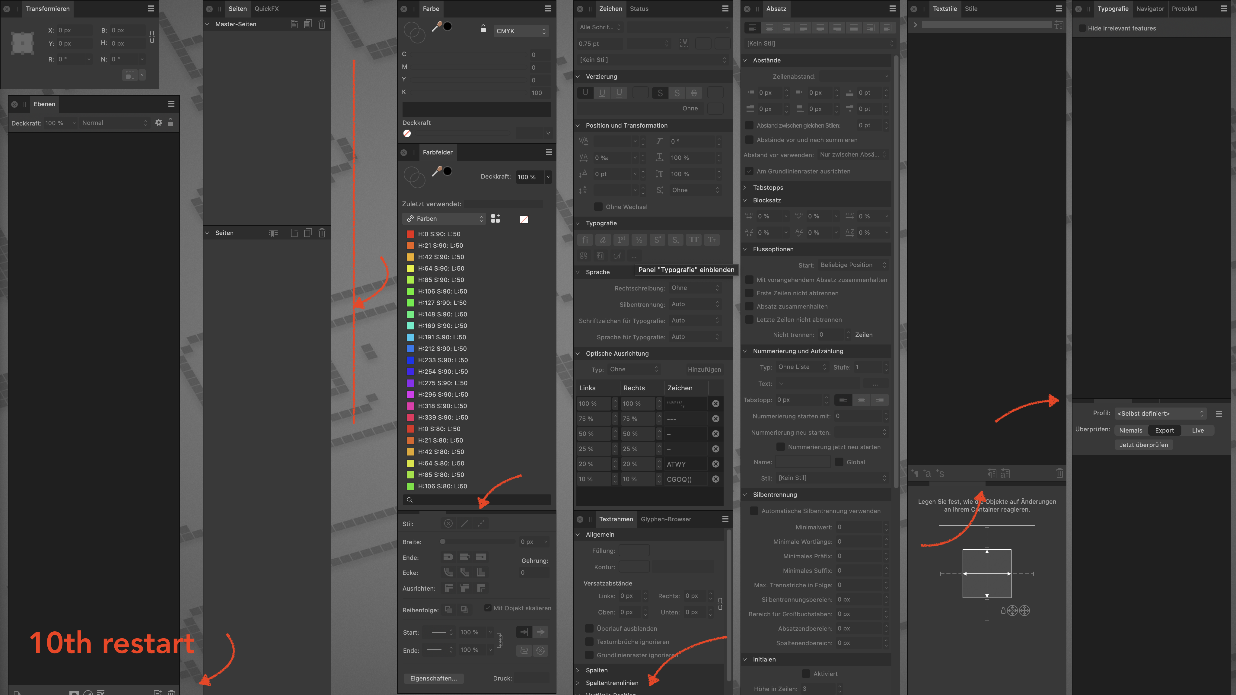
I noticed this in 2.5.3 but now with 2.5.5 it's still the same:
I have most of my panels neatly arranged on my second monitor. Some of them are "combined", or docked together, and some of them are floating freely.
the Bug: On each restart of the program, they subsequently keep getting taller. NOTE: This is at first barely noticeable as it seems to be only 1 pixel per restart. But with several restarts some of them are overlapping each other. The ones which extend to the bottom of the screen are getting their icon rows cut off.
Additionally, the Tools panel also slips downward as a whole, on each restart, but much faster (ca. 10 px per restart).
Saving and reloading a Studio preset only partly resolves this, as the tools position is not remembered and the rest of the panels still overlap by 1 pixel
see comparison video:
and separate screenshots:
-
"regression"? – I'm not even sure this was ever fixed.
For me, having all my panels undocked, it's always X, W, Y, H, R, S.
- Without switching personas.
- Tested in Publisher and Designer's own original personas.
- using macOS Sonoma
-
Thank You for pointing to the correct help page, @Hangman
I know how to work with text styles, but often times it is the exact opposite way how they are created:
You (creatively) play around with some headline/bodytext/graphical elements regarding weight, size, color, etc. and maybe scale the whole combo up or down so it uses the same relational appearance. After you (or your client) like the result of this prototype, you "cast" these different text parts into styles and begin the duller part of the work - adhering to these styles.
As it is now, you would first have to "reset" (but the other way around) the text so that it sticks to its current sizes.
My personal use-case is not about books. It's more like I have a brochure/folder and need to make a poster and a half page ad with the same typo+graphical elements - obviously in different sizes and aspect ratios but with the same look-and-feel.
-
Oh Wow. I had this too when importing IDML files in the past.
Now, with V2 2.5, we finally "see" what was happening all the time. Why did nobody ever mention this? I searched the help file but there is no explanation of "content scaling" or how you would get rid of it.
So how do I "repair" all my somewhat finished documents, which many have slightly modified text styles or no styles at all, mixed inside a single text box?
- There better be a "override scaling BUT convert text sizes to match current appearance"-button.
- How would be the proper way to scale a bunch of text boxes and graphical elements to a new permanent scale?
-
walt is right.
the difference (if you're used to InDesign) is that the warning is only briefly displayed to indicate that it has already been automatically converted.
When instead the same setting in InDesign lets you choose (e.g. ID: "and ask" instead of AfDes: "and warn")
-
Seriously, I reordered the panels in each app and additionally saved them as studio setups just to be sure.
But they still keep overlapping after reopening the app.
And when I reload the (corrected) studio setup nothing changes. There must be something off.
-
Today I saw a newer post by @srg regarding this issue but decided to instead reply to this original one as it already has two Bug tags on it:
APL-1434 and AF-1159 (which was already reported in April of 2023)
Affinity, please get to it.
I just realized I _mentally_ put on my heat gloves when handling affinity apps in these scenarios.


designer v2 Mac OS sequoia color issue
in V2 Bugs found on macOS
Posted
When you examine these two images (for example with preview.app's info panel, press the (i) icon) you will notice that:
I suspect when copying, the system wraps the image-content in the color profile of your display (p3?) and affinity tries to re-interpret this now profiled image to whatever color profile is set in affinity's app preferences.Try to change the color profile preference in affinity photo and see if this changes the pasting behaviour.scratch that. I just tried with your Pages source file.
So I would say: