Wosven
-
Posts
4,130 -
Joined
-
Last visited
Everything posted by Wosven
-
 Haha, he did it. Iwanted to compare to all-in-one kitchen robots of the 90’ we never use since we spend more time reading the manual and doing the dishes than using simplers ones. And how Mozilla and other all in ones applications broke in "smaller" apps that get biger and biger today since each one need more code for different specific purposes. Some disappear too…
 -
In his case, it's more about particular cases, and there are certainly enough styles as usually in a newspaper without adding more for 1pt difference in the leading height or/and text size. Too many possibilities: in the end, instead of searching between 354 styles which one is appropriate, you use the basic one and modify it manually.
-
incompatibility drop cap & small cap [1.8.3.641]
Wosven replied to Frisbee's topic in V1 Bugs found on Windows
The drop cap will use the character style of the Initial words, and be smaller. It's better to create a character for the drop cap first, and add the Initial words later. -
If the Character leading override is set to auto (modify your paragraph styles so it's consistent), as previously said, you only need to select a frame, and adjust size and leading without selecting the text. Or, another option is to set your vertical aligment to justify and play with the height of your frame depending of your needs.
-
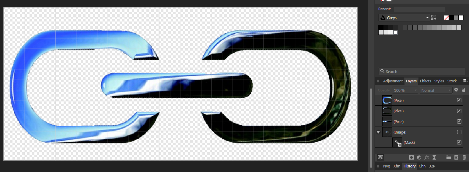
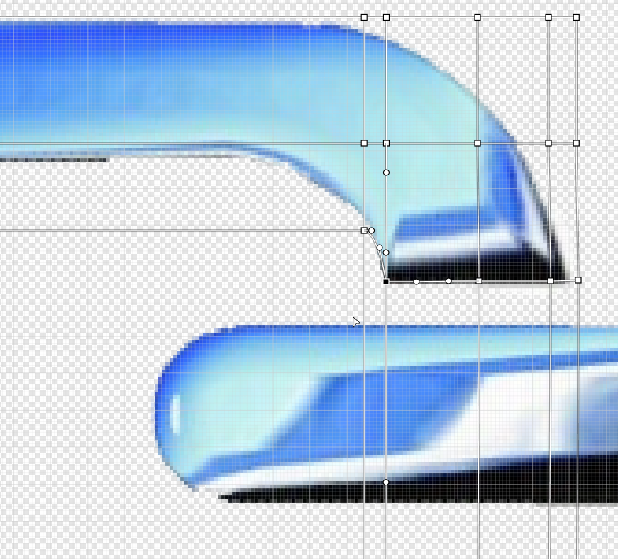
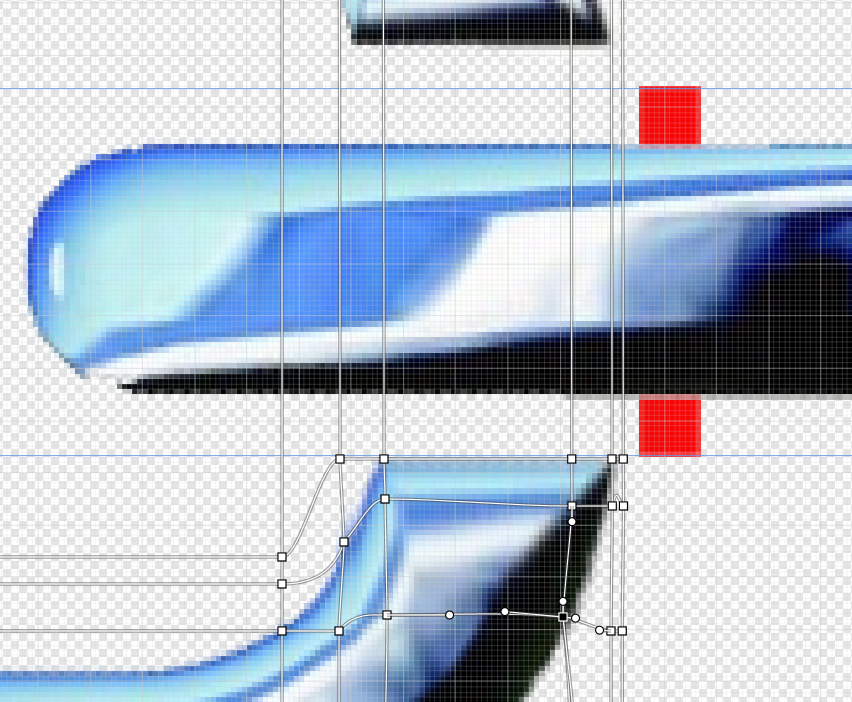
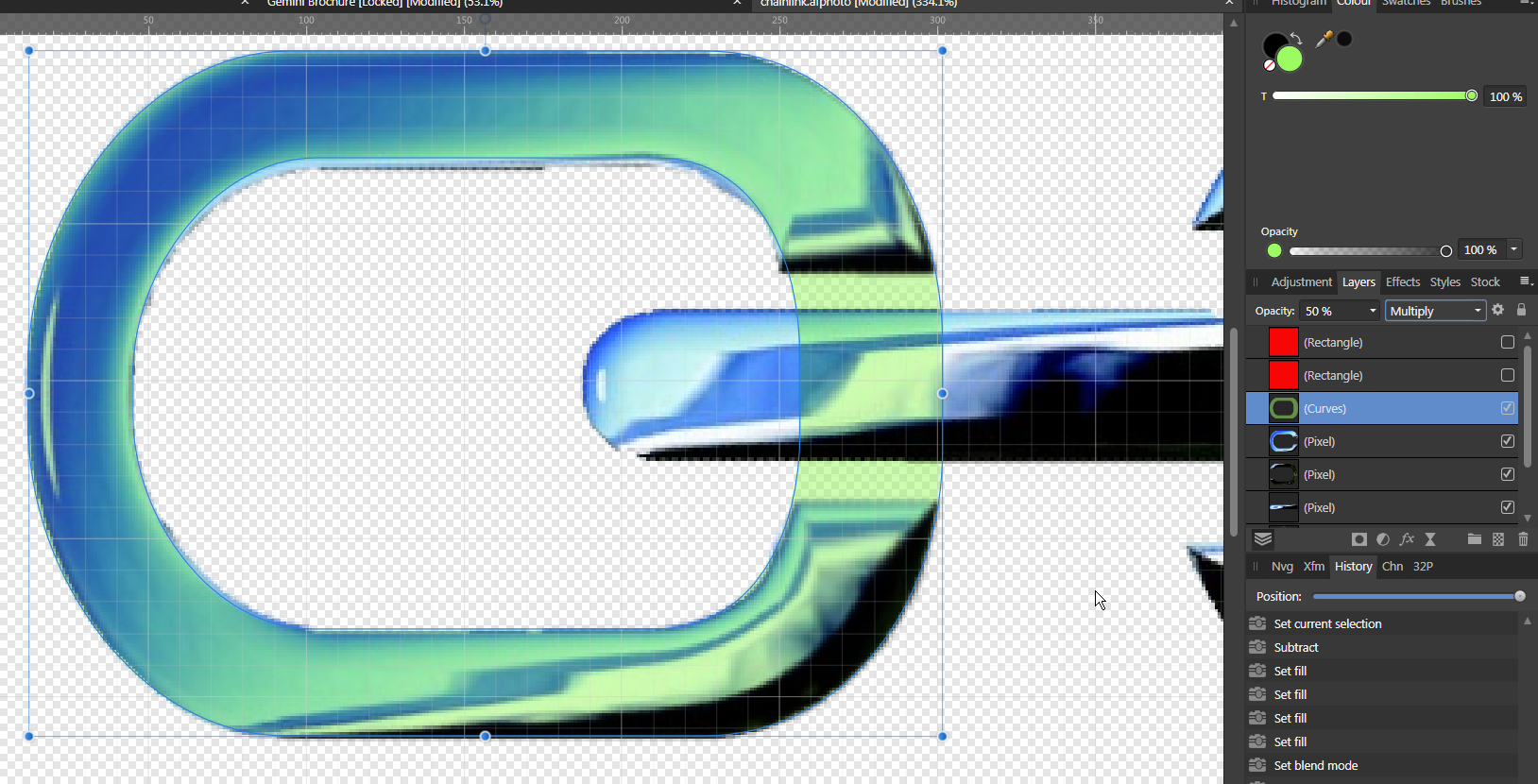
Shaping part of a png image
Wosven replied to TopRobRoy's topic in Pre-V2 Archive of Desktop Questions (macOS and Windows)
For this I would thry the Mesh Warp Tool. Separating the 3 elements on different layers. And using the tool (and guides and red rectangles to know when to stop modifying the mesh). First task, drawing a shape with the vectors shapes, it'll be easier to have the right curves and following the shape.
-
You should keep specials characters visibles (Text > Show specials characters), and check your paragraph styles. The default "12 pts before paragraph" is an hindrance that can come back… if the styles are not "pure". Select one of those paragraphs, and check in the Text style panel.
-
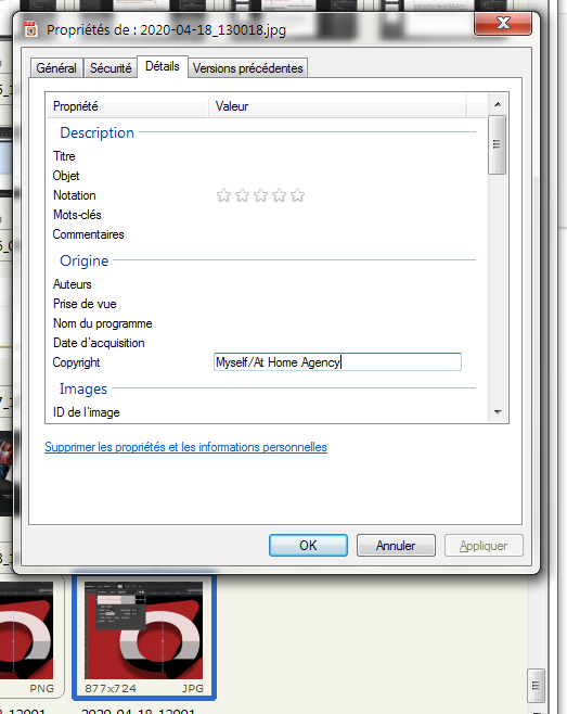
With some other app, you juste need to select the image and check the link panel: if there are metadata, they'll be listed and copiable (or you'll be able to generate automatically credits from this metadata field). I only need to add the credits first with a right-click > proprieties on the files (on Windows). Perhaps it looks time consuming, but not when clients or copyeditors ask to swap photos. I don't need to zoom and check/modify the credits, they'll be ok. Agency's photos are provided with metadata, it's easier. It's interesting to notice that AP permit to enter metadata in PNG files, and since it's what I use when I need a transparent background from a JPG or other file, it's really usefull.
-
Sometimes, you just need to gain 1mm so the body text will get room enough. This means not having your text smaller, but only modifying the leading if it's large by default. And to keep text aligned most of the time (for example, all the text but header are on the baseline grid, and the 1st line of the header is positionned to look like on the grid), I never use "default", that's not predictable. I never use it on adds either, where we have more freedom, but that's because I'm a control freak (at least for work)
-
Using the shortcuts is simpler, at least you need to learn half of the ones needed for this, and use the scroll button on the mouse* and the modifier keys for the other) : (Precise) Increase/decrease baseline: 4 shortcuts (Precise) Increase/decrease text size: 4 shortcuts * I begin on a Mac Apple II, switched to a PC with Win95… and wasn't able to go back to a mouse without scroll button when I went back to a Mac, so I keep on using a "PC" mouse with it. It's so usefull, and scrolling to increse/decrease values in Affinity apps is a time saver.
-
The problem is lot of sites, blogs, etc. delete metadata for privacy reasons. A lot of sites, even Wikipedia, don't bother adding metadata in the files, only in their data base, and they are available/readable on the pages. And, since it's time consuming to add them as metadata — a friend does this and other tasks needed in a photo agency —, that's why they don't. The least I can do for people providing me with free stuff, is putting their name (and not obligatory (only) the web site) in the credits. It's helpfull, a lot more when you need to find a pic or some similar from a shooting with same subject, that you need to buy it or ask for its usage after finding it on another support, if it's not par of the free ones. It's a pain to spend a lot of time tracking an author for this, when it would have been simpler if the site/publication, etc. were doing their work properly. Some free pic sites seems to reuse images from other free sites without importing those datas. All the Creative common licences ask for basic attribution: https://creativecommons.org/licenses/by/4.0/ If the pic is under copyrights, you need to give them. That's more difficult for public domain images (CC0), since we don't always have the informations if they are old.
-
Replicating this in Photo?
Wosven replied to KensonPlays's topic in Pre-V2 Archive of Desktop Questions (macOS and Windows)
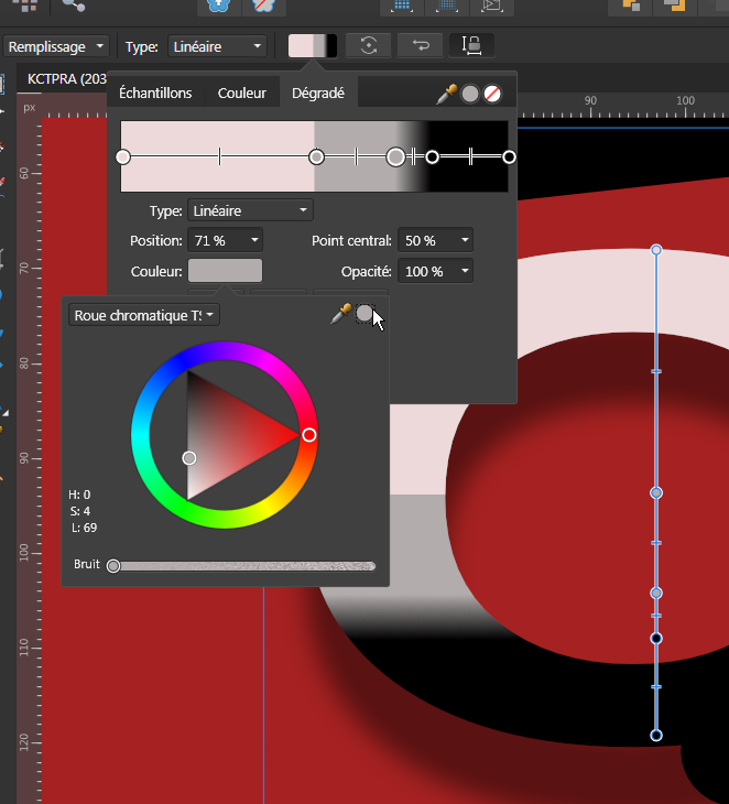
Like you, I 'd rather use the rectangle, but the gradient can be done if there are not too many nodes (it would be usefull to be able to enlarge the gradient panel). Add 2 nodes, depending of the colours you need, picking the colour of the adjacent node, for example. Set the nodes at exactly the same position:
-
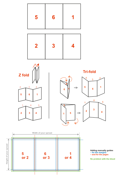
Hi, I don't know if you've looked at the sample from Affinity: Menu Help > Welcome You can download it and look at the properties of the document and of the spread, to define your own document. For example, there are 3 pages by spread, delimited by guides, and the second spread show an interesting way to use the internal pages we see when it's opened, since that's the part we always see unfolded. (like a center spread in a magazine with clips, where you don't mind writing where it folds). With this, it should be easier to set up your document. Don't forget your first page will be the one at the end of the first spread, and the last page is the second one of this spread. And be careful with the order of the pages. Depending of the content, you'll want to put important informations on the page visible when it's folded (contact informations, a map, adds, etc.), page 4 for Z-fold or 6 for trifold. trifold.pdf
-
Replicating this in Photo?
Wosven replied to KensonPlays's topic in Pre-V2 Archive of Desktop Questions (macOS and Windows)
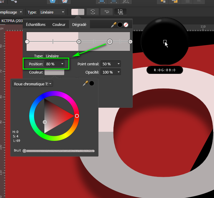
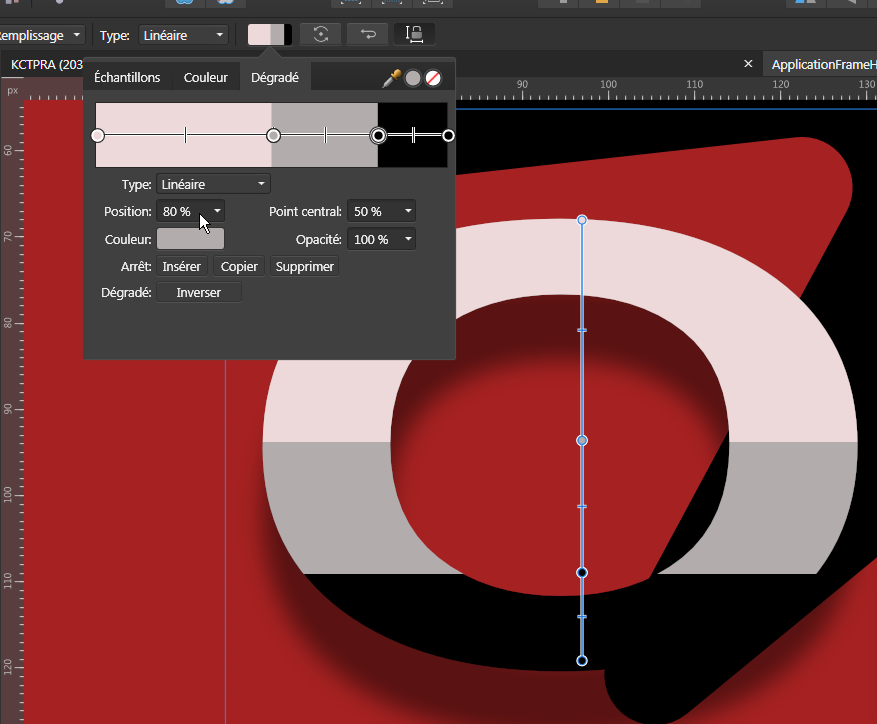
It doesn't seems to have any style applied but a gradient with the top half light pink and the top bottom half grey. You can do this with a gradient or clipping a grey rectangle inside your light pink line of text, and add a shadow. ApplicationFrameHost-usRyC4gDMv.afdesign
-
I'm happy I could help. It's a difficult text to put in a layout and check, without apps deleting some characters. Have fun!
-
Publisher - different settings on copied FX
Wosven replied to irokiee's topic in V1 Bugs found on Windows
That's strange, since all my new documents are set to CMYK, and I did my tests on a new document, to check if the bug persists on 1.8.3, and it does. -
You can also modify you original text in Words or LibreOffice, to some extend, they understand regular expressions, as ^ and $.
-
If you're on Windows, you can use the glyphes panel to enter those characters, or holding the "Alt" key while typing on the numeric pad 0150 (for en-dash, half-cadratin –) or 0151 (em-dash, cadratin —). On OS X: Opt+Shift+- or Opt+-. For using regular expressions in the Search and Replace panel, you need to set it to regular expressions This means than using some characters while searching will search specific patterns. For example: using a ^ (circumflex) at the begining of the expression* you are searching, means "beginning of a sentence". using a $ (dollar) at the end of the expression* you are searching, means "end of a sentence". A sentence is a paragraph, or all the text to a line break. Since we want hyphen at the beginning of sentences, we'll search : ^- And we'll replace with: – No specific character needed in the replace field, but the ones you want to replace with. You can also replace with " -" (for adding a space before the hyphen), "–" or "—" or "•" (a bullet, Alt+0149). You can copy the characters from the forum. * expression is a term to encompass everything in the find or replace field.
-
You can use bullet instead, or add a space before, but it's simpler to replace each hyphen at the beginning of a line with a longer one, using regular expressions. (the other replacements can be done with regular expressions too).
-
That's the problem if they don't use standard characters, and we shouldn't spend time correcting what is usually a simple task. Perhaps they need to convert them to standard characters when copied (and convert back when past again in an Affinity app), but it would be transparent for the user: no problem. Like this, it is only a bug.
-
"Real text" was typed text, we understand each other Technically, you shouldn't use the hyphen for list (it's only for hyphenation), but longer ones, that's perhaps why Words/Libre office don't understand hyphen at the beginning of a sentence, and perhaps delete them… If you use – (–) for lists, they'll be reconized (or — (—) for discussions, as we do in French). [edit] They are reconized in a text editor, but we go back to problem 1, with no paragraph breaks. [/edit]
-
If I understand you, and from my own tests: when copying text from Publisher to a text editor, there's a bug and paragraph break disappear, replaced by invisible but unreconized characters. when pasting to a word processor, the paragraph breaks are reconized. It's a bug, they should be reconized. For the second problem, are the hyphens real text or is it a list that automatically apply the "-"? In this last case, it's possible Words and such apps don't reconize the text style as a list.
-
Trouble in River City????
Wosven replied to richard gold's topic in Pre-V2 Archive of Desktop Questions (macOS and Windows)
He's writen a ebook, and he gives interesting advices and talk about workflow. And some of his video are offered to those buying the book. It's an interesting deal, since the low price permit to check if the video tutorials are suited for our way to learn. -
That's perhaps not helpfull, but the text isn't black, it's a 1.2 pt stroke around that is black.
-
Interesting trick Walt, I hope they'll implement a more robust and usable way to do references.
-
It looks like you imported a page with 3 mm bleed in another document with 5mm bleed.