Frisbee
-
Posts
17 -
Joined
-
Last visited

-
 Pyanepsion reacted to a post in a topic:
Affinity Publisher: Drop Caps, Small Caps
Pyanepsion reacted to a post in a topic:
Affinity Publisher: Drop Caps, Small Caps
-

Affinity Publisher: Drop Caps, Small Caps
Frisbee replied to Pyanepsion's topic in V1 Bugs found on Windows
Je ne crois pas que ce soit un bogue (quelque chose qui empêche une action de se passer correctement) mais plutôt une approche trop puriste de Serif qui "rejette" temporairement, j'espère, les polices imparfaites ou incomplètes (qui ne possèdent pas les petites capitales, les exposants, les indices etc.), ce dont tous les autres éditeurs dignes de ce nom s'accommodent ! -
Frisbee reacted to a post in a topic:
Changing Master Page items to editable items
-
Frisbee reacted to a post in a topic:
Create "object styles" -- in addition to text styles
-
Frisbee reacted to a post in a topic:
Export Text Only
-
Pyanepsion reacted to a post in a topic:
incompatibility drop cap & small cap [1.8.3.641]
-
Frisbee reacted to a post in a topic:
Affinity Publisher: Drop Caps, Small Caps
-
Frisbee changed their profile photo
-
Pyanepsion reacted to a post in a topic:
Affinity Publisher: Drop Caps, Small Caps
-
Affinity Publisher: Drop Caps, Small Caps
Frisbee replied to Pyanepsion's topic in V1 Bugs found on Windows
Hi everybody, I had the same bug with apub, posted 18 april, topic named :"incompatibility drop cap & small cap [1.8.3.641] Sorry, je continue en français ! D'autres captures d'écran sont disponibles dans le topic…Il n'y a pas que l'appostrophe qui permette ça, mais aussi [*-1!2,3éè('ç°] et bien d'autres caractères, je n'ai pas tout testé. Le problème apparaît quand la lettrine est suivie d'un caractère en petite capitale, ça dépend aussi des polices, des fois aucun problème. Avec XPress et ID c'est OK avec toutes les polices > le bug est dans apub, peut-être un correctif dans la version 2, ou 3… Bonne journée à tous
-
incompatibility drop cap & small cap [1.8.3.641]
Frisbee replied to Frisbee's topic in V1 Bugs found on Windows
It’s easy to blame fonts that work well (I already said) with other software. In French, a saying says "qui aime bien, châtie bien" ; to criticize a product is to want to make it grow and move it forward by finding solutions to problems. Veiling the face does not help. Apub is almost perfect, let’s make it together more than perfect ! -
incompatibility drop cap & small cap [1.8.3.641]
Frisbee replied to Frisbee's topic in V1 Bugs found on Windows
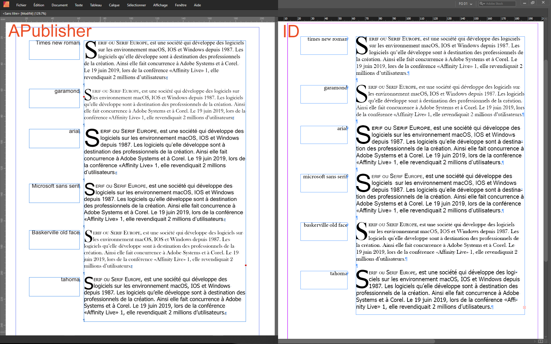
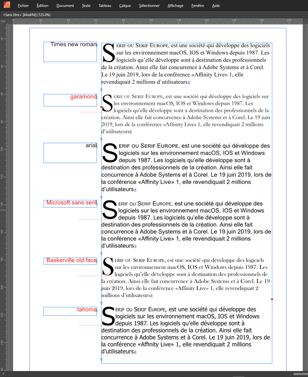
And now, two sceenshots : 1 - comparison Apub-ID (3 lines drop cap + small caps) 2 - changes in the 4 red fonts (4 lines (to get 3 ones) drop cap + small caps), drop caps have a small vertical shift up (and a size a bit small ?) except Tahoma, that can be corrected (character>positioning and transform) but it's a DIY that the user does not have to perform.
-
move a topic to another forum
Frisbee replied to Frisbee's topic in Pre-V2 Archive of Desktop Questions (macOS and Windows)
I've done a new one in the right forum, thanks but you can explain to me… -
incompatibility drop cap & small cap [1.8.3.641]
Frisbee replied to Frisbee's topic in V1 Bugs found on Windows
Why does it work fine in ID with all my fonts and in Pub about 1/30 ? The styles don't change the way the software works, but are just to save time ! I’m sure there’s a problem or my fonts are rotten, but not in ID ! -
incompatibility drop cap & small cap [1.8.3.641]
Frisbee replied to Frisbee's topic in V1 Bugs found on Windows
Times New Roman OK, but with another font ? Making a paragraph style don't change anything. Thanks anyway. -
OK, I untied all the knots ! Merci beaucoup !
-
incompatibility drop cap & small cap [1.8.3.641]
Frisbee replied to Frisbee's topic in V1 Bugs found on Windows
I don't understand, I've try some different ways : it's the same problem. In Indesign it works fine in 1 or 2 clics ! -
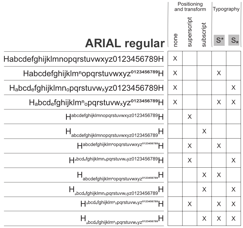
Same controls (sub/superscript in "positioning and transform" & "typography") can be interesting when it works for all characters in the same way, but here... In French we say, by being polite: what a bag of knots! (by changing the font, it can be different, and with other characters, no test). In the attached example both "H" are a visual reference. Merci
-
interface readability
Frisbee replied to Frisbee's topic in Feedback for Affinity Publisher V1 on Desktop
I just wanted to say that it is not easy to find tabs and especially its subcategories among the profusion of commands in some Studio panels ; colorize the texts as in my example (not necessarily with the colors proposed), would facilitate the search of the desired commands. Yes light mode has a better contrast but is too white for me and [préferences > user interface > artboard background grey level and Ui gamma] don't work, thanks for your answers ! -
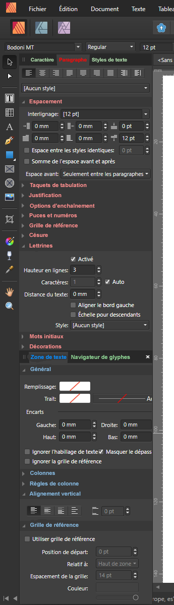
(I’m finally in the right forum!) Hello, when a drop cap is followed by one small cap (studio > character > typography > small caps) or more (recommended use in french), some problems arise with many fonts: vertical shift of the drop cap, number of lines allocated to the drop cap, drop cap size, even when only one line is requested. Thank you (sorry for translation) Bonjour : quand une lettrine est suivie d'une petite capitale (studio > caractère > typographie > petite capitale) ou plus (usage conseillé en français), des problèmes se posent avec de nombreuses polices : décalage vertical de la lettrine, nombre de lignes allouées à la lettrine, taille de la lettrine, même quand une seule ligne est demandée. Merci
-
How can I move a topic from a forum to another one (bugs report)
-
jjk reacted to a post in a topic:
interface readability
-
Is it possible to colorize the "Studio" tabs and sub-tabs for a better readability of the interface, for example… Est-il possible de coloriser les onglets et sous-onglets de "Studio" pour une meilleure lisibilité de l'interface, par exemple…
-
when a drop cap is followed by a small cap or more (recommended use in french), some problems arise with many fonts: vertical shift of the drop cap, number of lines allocated to the drop cap, drop cap size, even when only one line is requested. Thank you (sorry for translation) Bonjour : quand une lettrine est suivie d'une petite capitale ou plus (usage conseillé en français), des problèmes se posent avec de nombreuses polices : décalage vertical de la lettrine, nombre de lignes allouées à la lettrine, taille de la lettrine, même quand une seule ligne est demandée. Merci