Wosven
-
Posts
4,130 -
Joined
-
Last visited
Everything posted by Wosven
-
 @PixelPest I suppose if we use the Pixel view in AD instead of the default sharp one, we've got the same result.. juste didn't thought of this before now.
 -
If you do it once and save it as a new Style, it's possible to just have to dupplicate and paste/add the style on the other stickers.
-
multi My first exhibit with Affinity (mainly Designer and Photo)
Wosven replied to Bentox's topic in Share your work
We would certainly need such exposition here in France, to remind people and especially politics how important it is and they shouldn't destroy it like they are doing piece by piece... -
I suppose those are vectors, or EPS isn't needed. In this case, you can use PDF, perhaps SVG (check the result), of Affinity apps formats. And as @walt.farrell said, TIFF will be pixelated only if they are small resolution and probably raster formats. I didn't check how vectors in TIFF files behave, since I don't need them now — I use PDF —, but it was a robust format and versatile when used in QXD (not so much in ID, strangely, for vectors). [edit] And since some layer datas can be added with Affinity apps, so they can read them, I expect the format to be good [/edit]
-
I'm not sure EPS supports transparency, you should try other formats like TIFF.
-
Freehand Selection Cursor
Wosven replied to ChristiduToit's topic in Feedback for the V1 Affinity Suite of Products
In PS I always default those icon-cursors to the cross, for me it feels more professionnal that silly shaped cursors (and searching where is the pointer). -
Here a version without text, only the background flatten as a layer. I hope that'll help once pasted in the other document. 290145625_Bookcover_notext.psd The file use also LUT as live filters, it would be nice also in AP!
-
I'm looking at in too, and it won't be easy to obtain the same colors and effects, since the colors are completely different in AP. You can drag the second Film-Dust-17 Layer inside the Title Texte layer to correct this part. But the image is too blue and magenta, and need different adjustements to get the same result, Sadly, the angle with the house stay greyish and isn't the orange-yellow as in the flattened image.
-
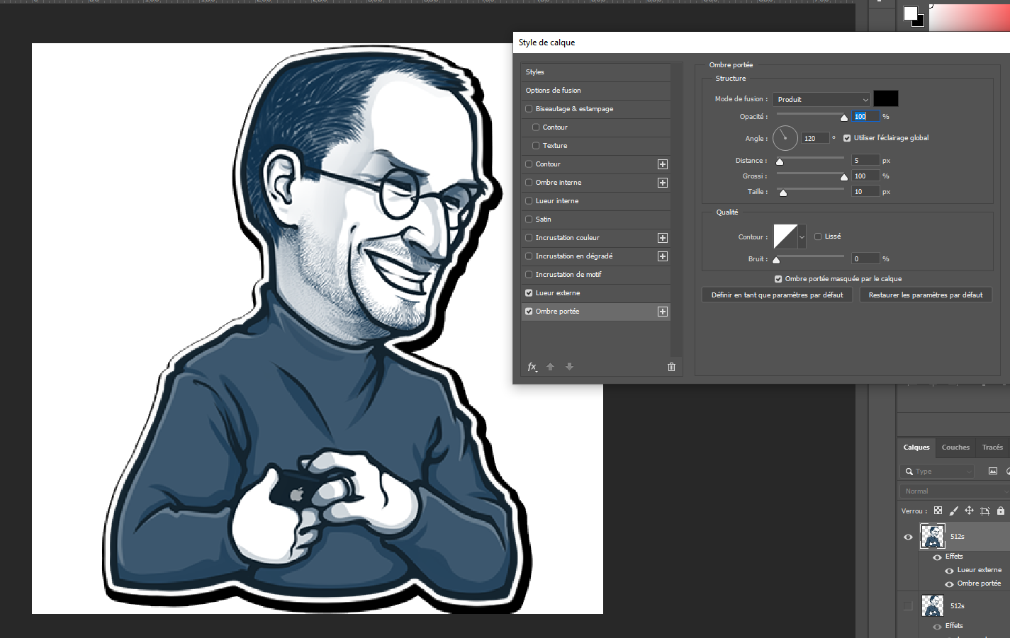
When you put the shadow to 100% in PS you get this: To get the same result in AD (but the result is terrible): The resulting file (PS) produce a bug when opening StickerExample2.psd

-
@GarryP Didn't you forget to add a radius of the same size as the outline?
-
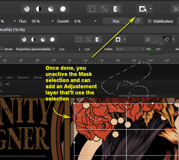
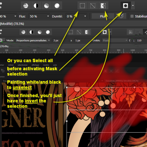
@vihtla, You can try to adjust it again, especially if it's not the hight resolution version, but it give you an example and a process to compare results until you're satisfied. An external glow of 100%, 4px, 98% seems good for this size. Try also to print it to check the differences. At some point, only having the 2 images side by side will show differences, with only one, nobody will see anything amiss.
-
Footnotes/Endnotes
Wosven replied to garrettm30's topic in Feedback for Affinity Publisher V1 on Desktop
@Trevor A, You've got the good old Cobian backup 11 that do the job. -
Look at the buttons I show with the arrows, ne need to go in the menu, just check the contextual toolbar on top. You should have the same (somewhere) on the iPad.
-
Here the result — switching from one file to the other in FastStoneViewer), when saving the file to PSD (but I kept the AD file, since it retains the effects): StickerExample.afdesign
-
A link to the video is more helpfull: You can do this in a "reverse" way in AP: Or:
-
Setting up a character style
Wosven replied to Pyanepsion's topic in Pre-V2 Archive of Desktop Questions (macOS and Windows)
Here an example and simple explanations I'll develop later, since I'm late now Test_notes.afpub -
Setting up a character style
Wosven replied to Pyanepsion's topic in Pre-V2 Archive of Desktop Questions (macOS and Windows)
It's nearly impossible... Unless you pin text frames with an ordered list in it. No need to add an extra space, indent/space before the list will do. You "just" need to add manually those numbers in the frames to increment them... But it's a lot of work, and only worth if the authors add or delete notes. -
I would try working in the larger size, and if needed, creating a new document at a smaller size in which I would import the other document or a PDF of it. I would resample only if it doesn't give bad result (pixellated) or if the new file exported to PDF give a really large file.
-
It's not only Photoshop, it's simply other apps. And as said by @jaizon, a simple and effective tool that is easier to manage than brushes (doing this with brushes means you need to calculate perfectly the size of the brush, or try again and again... or do many strokes, for not so regular results). If the apps have good and new features, this doesn't mean all the other are bad. That's why I can't answer "Which one do you prefer from QXP, ID or APub?" Each one get good features thought by good dev, and somes are better in one app than the other... some miss in this one... it would be easier if we could mix our app from the features we like in other ones!
-
Barcode visibility
Wosven replied to Natalie King's topic in Pre-V2 Archive of Desktop Questions (macOS and Windows)
I don't know either. Is the original black? Try selecting the barcode and checking the color panel, perhaps you inadvertently colour it in cyan. -
Barcode visibility
Wosven replied to Natalie King's topic in Pre-V2 Archive of Desktop Questions (macOS and Windows)
Unless you want to test different designs with the barcode at the same position, you don't need it on the master page. You can duplicate your pages to test other designs and move around items/change colors. -
Barcode visibility
Wosven replied to Natalie King's topic in Pre-V2 Archive of Desktop Questions (macOS and Windows)
Did you try putting a white rectangle below? If the barcode is on top, it should be visible (I suppose it's black on transparent background). -
Barcode visibility
Wosven replied to Natalie King's topic in Pre-V2 Archive of Desktop Questions (macOS and Windows)
@Natalie King You don't reaaly need "this" barcode, you can hide it and paste your own on top of the other elements. -
PDF Export from Publisher
Wosven replied to David Cantor's topic in Pre-V2 Archive of Desktop Questions (macOS and Windows)
They mainly ask this for text, since if plates aren't properly aligned, it'll look terrible especially for text, or the inks can produce bands (also terrible visually). This is more a problem related to your document and the use of color profiles, especially if the conversion is done only when exporting to PDF, instead of setting the color profile from the start. This problem occurs a lot, and you'll find help reading this thread: Affinity apps get for default option to export as spreads... An option barely used but for printing small documents (less paper used), for copy-editing or last checking before sending to print: usefulness of this = 1%, but despite our demand, it seems we're stuck with this for a long time. What your printer ask is to export to "all pages" instead of spreads, since spreads are of no use in a majority of cases. -
That's when being able to replace a color by another when deleting would be useful... Too bad this feature was never added.