Wosven
-
Posts
4,130 -
Joined
-
Last visited
Everything posted by Wosven
-
 It's working with version 4.7.02053 too, it seems version 4.7 is the minimum requirement.
 -
It doesn't adapt: your logo mesure a × b pixels. It's normal it looks smaller on a dense image displayed at 300 dpi than one at 72 dpi. Perhaps you need to have all the images at the same resolution, if they are for the same project.
-
I have the same config of win7, but my Visual CC++ is older (2015), and APub is working fine
-
Hi @Passorolle , Can you add screenshots in your message? Perhaps it will help us undestanding better.
-
Affinity Photo Windows Customer Beta - 1.7.0.243
Wosven replied to Tony77's topic in [ARCHIVE] Photo beta on Windows threads
I use virtual machines long ago on OS X and Windows, when I was needed some Linux distro. I suppose that's better today, and I have co-worker using some, but I don't really want to do this unless it's the last resort. I suppose today it's as easy to use them as using TeamViewer to use another PC. I wasn't fond of Win 8, and avoided it, and now, since I use Win 10 at work, it wouldn't be so bad to switch, but the offer isn't anymore possible and I'm not in a hurry for my personnal computer. I'm not sure, I thinks there's a post somewhere in this forum that explain how to generate crash report... but impossible to find it. Does your APhoto application run? It's "only" the Beta that can't run? -
The idea is to send back the "clean" text to the author, so he can shorten it himself (if he want it… yesterday, in a last minute modification, I needed an author to shorten his article of 1700 characters… he send me a new text shorten of only 1000 characters, and we decided with the publication's director to put back the 1st and shortest version we initially put in the magazine… We hope next time he'll have learnt the lesson!). For simple article, it's easy to copy-paste a few text frames in another application the authors can use. But for some yearly publication, it's better to be able to send a whole document's text to the client after the publication, for him to do modification until net time we'll update the design and text next year. The important point is to be able to send the corrected text, and not have to do again all the corrections, rewriting, etc. that we would have to do if the author send us a modified v1 text. When they do that, I need to use a difference program to search for modifications, and depending of how many differences are in the document, we go back to step 1 (re-reading, rewriting, etc.) or I modify the current article. Depending of the quality of the texts, it can be time consumming. Being able to export a whole document, or the content of some selected/copied text frames could be usefull. Options would be to keep text styles and tables, or not (can be a problem with white text or fonts), exporting to black text, justify left in few effects styles (normal + bold + italic only?). PS. I tested it, and now copying-pasting to LibreOffice is fine: it doesn't end up being an image or "texte au kilomètre", an unique line of text without paragraphs!
-
affinity designer Smarty Studio : Our Project (made with Affinity)
Wosven replied to Uncle Mez's topic in Share your work
Nice, too bad "l'Amour" run away from the heart, when the english one stay in. Shouldn't there be a fine pace between 2000 and "cfa" ? (we would have one two in 2 000 €). And I would adjust space (less) between f & a. About the text : it's strange to not have an article: "L’église de Foucks présente", and "présente", "spécial" & "février" don't need a cap. (Perhaps the english "Diner" need one!). Another small space is needed between "18" and "h" (this one, I would write "18 heures"). Did you tried the french one with a bigger heart (the text wouldn't need to be too much smaller to fit in)? And perhaps the french price could be smaller too? (the english one is fun with this font, the french one seems huge… Nice design and colours, as usual!- 103 replies
-
- 1
-

-
- graphic design
- projects
- (and 7 more)
-
Affinity Photo Windows Customer Beta - 1.7.0.243
Wosven replied to Tony77's topic in [ARCHIVE] Photo beta on Windows threads
I really don't understand people asking about why we stay on an OS version when this forum is full of people staying on old OSes for running old programs, or because their companies don't want it for now, etc. It's not he purpose of this thread, the main question is why AP stopped working on his computer. -
Affinity Photo Windows Customer Beta - 1.7.0.243
Wosven replied to Tony77's topic in [ARCHIVE] Photo beta on Windows threads
It's working on my full version 7 and on Win 10 at work. -
Affinity Photo Windows Customer Beta - 1.7.0.243
Wosven replied to Tony77's topic in [ARCHIVE] Photo beta on Windows threads
Did you installed new fonts or us programs for managing fonts as Suitcase Fusion or Nexus Font? If you use them, try loading AP before those program. I had this problem on Win 10 (Suitcase or inDesign loading new fonts or lauched before AD or AP were causing trouble. But I thought it's solved, since I didn't have this problem anymore). On Win 7, Nexus Fonts and programs that check installed fonts seems to be a problem (lag, or unable to use, etc.). -
Affinity Photo Windows Customer Beta - 1.7.0.243
Wosven replied to Tony77's topic in [ARCHIVE] Photo beta on Windows threads
It's working today on my Win7. -
Yes, updating and improving code is important. That's what I was doing, learning new fonctions and new way to do things when it happened. But I expect Affinity teams to know what they are doing, since those new programs are — from what I read — faster, and more efficient than their old ones. Perhaps, once they have completed the 3 main applications, they'll use a "common files" folder too, and the apps' folders will be lighter. But I wouldn't compare with Adobe apps, since their apps aren't perfect (the current version of PS I use need waiting few seconds before doing anything to an image… even a shortcut, perfect excuse to test AP at work!). On the other side, they have more feature too. I found more worrisome the files' size. Usually, sending an archive of all the needed files for a project (file, images, fonts), is a big/huge package. What about project made with Affinity suite?
-
As already said, there's some "Common Files" folder and some other for the CC suite, and you shouldn't compare only with the app's folder file. Size doesn't matter here. I rememeber being really proud of writing 10 lines of code that could do the same as my previous PHP page of 50 or 100 lines (can't remember exactly)… Those 10 lines with an advanced function were so slow to process that I keep them as example and revert back to my previous code doing the same in less than a second! If I had only compare files's size, I would have kept the slow code, not for efficiency but for aesthetic
-
Handy, fast to handle and you copy-paste from Inkscape to AD in a blink. Another usefull point: you copy-paste from AD to Inkscape to use the "simplify path" feature (but you need first to set the simplification option to a lower value or it'll be really simplified ). In French: Préférences > Comportement: Seuil de simplification (± Settings > Behaviour: Simplification).
-
Nicely done The first book I reconize, but the second seem too slim to be the same.
-
Sorry for not answering, the problem is solved in the .240 version: the double master page is first converted to 2 single pages, the double pages are converted to single pages No crash !
-
No more rotation of the document possible
Wosven replied to Michail's topic in [ARCHIVE] Publisher beta on Windows threads
Sorry @haakoo, I don't want to be rude. That's just annoying that an usefull added feature is removed. We could have wait for a "there's a problem, we'll improve it, be patient". But removing it is frustating, when solutions are only poor workarounds, that can be usefull on a yearly document, but not if you need it frequently enough to need it as a feature. Thanks for your file. That the way I would work for a cover since we don't have spread with multi-pages of different width, but only because it only need 3 pages. For 8 pages, with a lot of elements, having an embedded document seems chancy. And when working on the embedded document, you can't see the final document as a whole, unless on a second screen. But it seems to work, updating when modifying a picture or some text. I'll have to test with the exact layout. But for the example with tables, it would be tricky with text styles, if when finishing the document you need to change fonts or more… It all seems more convoluted than the simple rotation view we asked for! -
No more rotation of the document possible
Wosven replied to Michail's topic in [ARCHIVE] Publisher beta on Windows threads
You don't understand we're working professionnaly and not playing at rotating frame or page content here and there. We can't afford to do a mistake as if some part of the page is forgotten in a wrong place or not rotated, because we were in a hurry with last minute modifications. This would mean to print again a document. And we need worklow easy enough that co-worker or external help can be given a document, can do an easy work with simple enough workflow without having to explain silly thing as: 1. Rotate this way, 2. Do this, 3. Rotate back… Exporting final PDF, and reimporting in another document to have the pages set in a different way to export as a web PDF is already in some workflows. But that's easy as modifying a linked PDF before generation of a new web PDF. Exporting pages and reimporting them in the same document because we can't rotate the view is not a solution. -
No more rotation of the document possible
Wosven replied to Michail's topic in [ARCHIVE] Publisher beta on Windows threads
But it was a feature we asked for in another thread! When I have crosswords or other games that need text to be written or checked/corrected because the text frame is upside down, that's the way Ido it in another app. When I need to do some folded document (poster) with pages upside down, I need to rotate the canvas to do part of the pages. Another app help us leaving those rotated spread rotated in the document we work on (they can stay this way when we save, close and re-open it), but the exported PDF are done with the pages in their real state, not working rotation state. It's easy to work like this, it's like working on a regular document. When I need in a book to add really long and large tables for a biography, flowing in several pages, but in landscape mode, when all the other pages are in portrait mode, that's how I do it: rotation of those pages so I can compose them without problem… Does this mean we'll need to rotate our real screen or lay down on our desktop if we have to do some of those documents in APub? -
affinity designer Smarty Studio : Our Project (made with Affinity)
Wosven replied to Uncle Mez's topic in Share your work
But there's a comment Ok, I'll explain instead of summarize it. At first, the logo is not at the center but follow the curves of the amp and the leaves: it's strange, but ok since we look at it more. At second, I thought we had a triangle, sending the eyes below the banner, but it's ok too since that's where is the text to be read… (follow amp, ^, logo's leaves, crown, wheat leaf near the "i"). The only annoying point is the background "croissance & expansion". Perhaps the background's pic should be a little darker, and the eyes won't run from c&e strokes to background and back… (interferences! when too much (usually) white dots or specks drive the eyes away from the main subject or text to read, or when some forefront and background colors are too similar, it's like focusing on the background and on the foreground and on the background… endlessly => less readability). Or perhaps more transparency for c&e will be enough. It'll be perfect when we'll notice c&e and stay focused on the central part (logo & text): we read the whole image, and step by step: background image, c&e, logo c&e with leaves, logo (at least, that's how I process the banner). But the colors are fines, the logos "sympas" (nice)… I don't always want to tweak a design! (but the apps we use and the way we use layers and all as pieces we can move around or modify easily give us wishes to see or test what it would be moving this +1mm here, 2% more yellow there, etc.) Perhaps sometimes we want to be as annoying as clients can be…- 103 replies
-
- 1
-
-
- graphic design
- projects
- (and 7 more)
-
affinity designer Smarty Studio : Our Project (made with Affinity)
Wosven replied to Uncle Mez's topic in Share your work
Hi @Uncle Mez, Nice one, but I'm not sure about the need for the stroked "croissance & expansion"… perhaps it can be a little bit less visible? With it it's not plain wheats, but it adds too much interference… we can't stay on the central design because of it.- 103 replies
-
- 1
-

-
- graphic design
- projects
- (and 7 more)
-
It's a Quicktime video according to HTML code and isn't read in Firefox.
-
Aren't we on a Publisher bug report part of the forum? The search work fine in my language in other Bêta, but can't in Publisher since it's not translated.
-
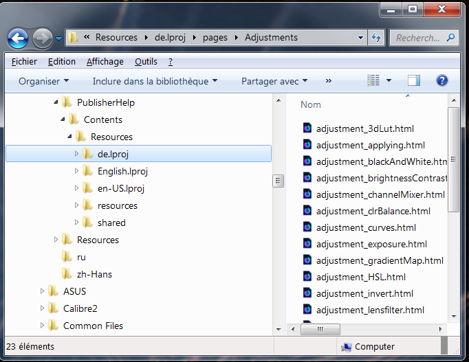
There's a de folder in APublisher help for tests I suppose, since the content is English pages.

-
But only the window's title is in French here, so it's logical that I need to search in English to find English entries in the English help… Or do you have localized help?