

Pixel and Poly
-
Posts
79 -
Joined
-
Last visited
Posts posted by Pixel and Poly
-
-
Is there a way to add a hyperlink to text in Designer so when we export as a PDF the link will stay live?
I see the hyperlink option in the PDF export dialog box but I don't see anywhere to actually add the link data to text (or an object).
Cheers!
-
16 minutes ago, Edward Goodwin said:
Thanks for the reply.
Is this something that can be added into a list for new feature requests? I think it'd be really useful. It is available in photoshop (hence why I'm used to it...)
Edward
I agree that this would be useful. Many times I like to keep the darkened area very dark. It would be great to have a % option next to the check box.
-
1 hour ago, Fixx said:
BTW, 3 colour Pantone job tends to be more expensive than standard 4-colour CMYK job, which is more expensive than simple B&W job..
Agreed! A print job with 3 spot colors plus black will be pricey.
If they are looking to save costs I would probably have one version of the logo that can be done in 1 color and then you could also provide a full color logo for 4-color printing or if they want to use it on the web.
-
I would probably just have one artboard for all the bills and then have all of the elements that are the same between them at the bottom in one (or a few) layers.
Then I would have a separate layer for each of the denominations where you can have the specific $ amounts and any specific pictures.
If you need to change any of the base features you just need to adjust them once. If you really want separate art boards using Symbols like @Alfred suggested is probably the way to go. There are some video tutorials on symbols on their YT/Vimeo channel.
-
I was able to come up with this solution by expanding the stroke and then layering two blurred smaller stroke versions inside.

-
I'm on Win10 and when I merge or flatten the file the lines stay the same and have the bolder look. Everything works as expected on my end.
-
What do you mean flattening destroys the upper layer. When you flatten a file all the layers get merged into a single one. When you save as a jpg it will flatten the file as well. Are you expecting different behavior?
-
Can you share the photo file with us so we can look it over? or post some images of before and after of the problem area and the layer settings?
-
I think they were recommending you going to this page:
https://forum.affinity.serif.com/index.php?/forum/5-affinity-on-desktop-questions-mac-and-windows/
And click on the START NEW TOPIC button so you can ask your question in a new thread so you might be able to get the help you need. It's hard for people to help you when your question is buried inside someone else's questions.
-
2 minutes ago, AffinityJules said:
Ah. . .got there in the end.
I removed the layer with the "soft light" then merged the other two layers - it went as expected. I then brought the soft light layer back in and everything is now fine.
Thanks for your suggestion - I really needed to merge those three layers because the next step for those towers is rather tricky and it will be a lot easier now that they are merged.
Thanks again.
Glad it worked out! I usually like to keep copies of the unmerged layers just in case I need to go back to them for any reason. Good luck!
-
If you needed to do that I would make a copy of that group and make a copy of the orange blend background so you have them if needed. Turn off those copied layers so you don't see them.
Then select the all the tower layers and also the orange blend background that are visible and merge selected on all of those.
-
If needed you could merge those layers AND include the background blend and it will work. But you won't be able to move them around or adjust. I would just keep them separate.
-
The blend modes will matter because Photo will be able to merge the rgb data but it can't display the same layer with different blend modes for each pixel. If they use different blend modes I would probably keep those layers as a group so you can adjust them as needed.
-
They merge for me the way one would expect. Could you post a before and after picture of your screen so we can see them?
-
Are you trying to align Text to the left or align different objects to the left?
If it's text: you can just add 8px to the left indent in the paragraph settings.
If it's objects you can align them to the left and then nudge them over 8px with the arrow keys. You can set the nudge distance in the preferences in the Tools section.
-
It would be great to have an option to let us turn on/off a "scale with object" for an entire group/layer. This would cover all things like line widths, layer effects, individual corner rounding, etc.
If you've ever had a complex object built but forgot to turn on/off scale options it can be time consuming to go into every object and adjust the setting. A way to set it for an entire group and/or layer would be a great new workflow enhancement.
-
31 minutes ago, carl123 said:
Thanks, Carl.
I was making copies and then baking some of the objects already but I was hoping to avoid the converting to curves on those corners to keep them adjustable. It would actually be nice if there was a way to set the scaling on a whole group/layer as well. Maybe they'll add an option for that.
-
Hi all,
Is there a way to switch the rounded corner tool to use relative sizes instead of absolute sizes? This can be a real issue when sizing objects that have rounded corners but you want them to stay relative in size. Kind of the way that the rounded rectangle has an absolute option/relative option.
Cheers!
-
If you are in Photo I would just add a fill layer and place it at the bottom of the layers and pick any grey that will work for you. If you are in Designer I would put a rectangle at the bottom of the layers and fill it with a grey as well. You can lock either of these so you don't move or select them. Just turn off those layers before exporting or printing the final files.
- AutoKitty and firstdefence
-
 2
2
-
It would be great if we can get the HEX input/listing on all of the color sliders. I know it shows up on the RGB Hex setting but if I'm working in one of the other slider color spaces I need to constantly switch back to the RGB Hex to read a HEX value. It would be a great time saver. We could also have an option to have it appear or not appear on each of the color sliders in case there are people who do not need it to be shown.
Cheers!
-
Those look awesome! Great job preserving so much detail with so little geometry.
-
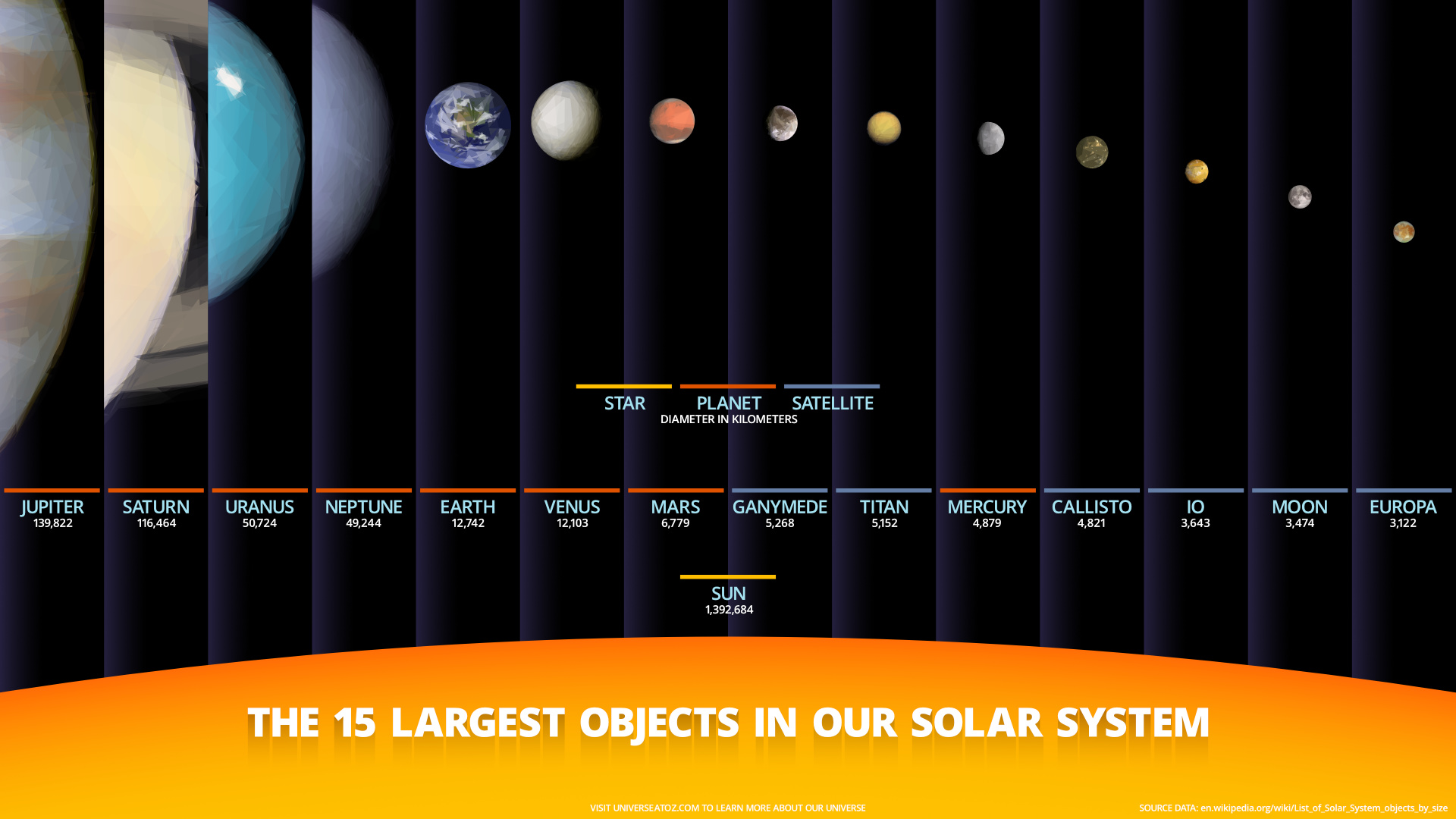
Here's a space related infographic I've been working on. It was all built in Designer.
-
On 11/16/2017 at 3:44 PM, LennartGäbel said:
I thought after a year since I last checked, this topic would have become a priority - as it is for sooo many users! Don't get me wrong - you are doing a great job for such a small team, but why implement Portuguise and Russian before this MUST HAVE feature? Again THIS IS A MUST! Hire some folks. Please hurry, I don't wanna go back to Illustrator and live with my parents!!!
I totally agree! (very funny about the parents too!)
I really hope that on one of the next major updates we can see some production oriented changes that focus on the less flashy features and address many of the features that are used by designers in a production environment every day. I know the flashy features may sell the product but the 'boring' features that are missing are the ones that keep people using a product for production on jobs.
-
Just another vote for the option to lock guides. These small important features are the difference between a production ready application and a casual fun application.

add hyperlink to text in Designer 1.7.x
in Pre-V2 Archive of Desktop Questions (macOS and Windows)
Posted
Cheers guys!
I purchased Publisher but this is for a live product so I'll wait for the final release to come out before using it on a job.