

gdenby
-
Posts
1,887 -
Joined
Posts posted by gdenby
-
-
Oh, I see you are using the gradient layer fx. The fx are always rasterized. Use the fill tool w. a gradient.
-
Hi, abysan,
Here are a few comments that may help.
As far as I know, .eps files do not support transparency. They also formulate gradients different ways. Sometimes, AI rasterizes them. It may be that Affinity rasterizes them by default. Perhaps try exporting as .pdf.
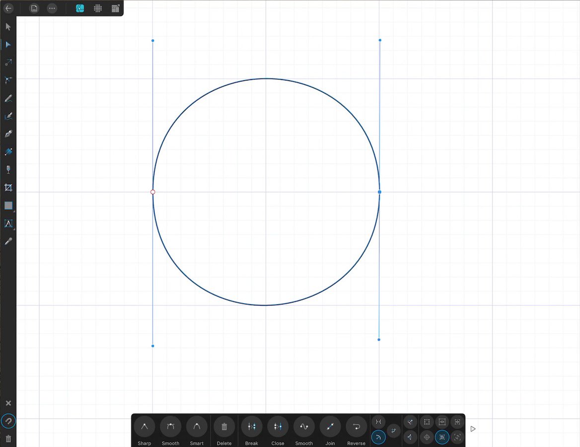
The problem with clipping probably has to the geometry of the layers. This is a common newbie mistake. All the vector objects define a 2D space. "Closed" curves can have a stroke placed on them. "Unclosed" will have a stroke on the defined lines. But if a fill is added to them, it fills from end point to endpoint of the defined curve.
You may want to duplicate the curves that define the oval-ish shape. Take the original shapes, get rid of the stroke attribute, and the, using the pen and node tool, join the 2 shapes that are there. The gradient can be nested within that.
Gradients are designed to be modified by the user to point in whatever direction the users wants, and have the end point placed wherever.
You might want to switch the view to "Outline." That way, you can see where the open curves are more easily.
-
15 hours ago, affinity4Christ15 said:
I'm sorry, but the proposal to use the 3D FX as a suitable "workaround" is not only unsuitable, it is 100% unable to remotely achieve what is being asked here. It seems a "mod" would know better than that. That (cheap if you ask me) 3D tool can absolutely NOT achieve intricate realistic 3D lighting effects. It almost always looks amateur when used. Having the ability to curve gradients seems pretty much like a no-brainer feature that surely many others have also seen the obvious need for before me ???
Reading the specs for .svg coded images, the gradients AD offers are those the standard supports, and which work w. vectors. Any gradient edge that offered a 3D look, whether from a shading routine like the fx, or a rendering from a 3D engine would need to be reproduced as pixels. The image then becomes larger (less suitable for web use) and will degraded w. scale changes.
Note, Photo does have the mesh warp which would sometimes aid in deforming a standard gradient.
-
-
Hi, Affinity100,
I think this will do for you.
Make a rectangle, any size. Duplicate it and move it just as far to the side as it is wide. I often have a grid active, and w. snapping, can get even spaces.
Select the group of rectangles. Open the transform panel. W. the anchor point positioned at the center of the bounding box diagram, enter identical values for H & W, what ever size you like. Everything will be in a square.
W. the rectangles selected, use geometry/add. Then w. the node tool, select a row of points. Again using the transform panel, center the anchor, and enter what ever width you like to make a trapezoid.
As practice using the pen tool, start snapping nodes the corners of the trapezoid line shape. If they are not quite right, switch to the node tool, zoom in, and tweak the positions.
You can then nest the line shape inside the trapezoid, and the trapezoid's fill will block any layers lower in the hierarchy.

-
Not quite what is wanted, but an idea for an approximation:
-
"As few as possible. If you need to you can add nodes simply by tapping. Remember to use the edit feature to 'shape' your lines into curves. Try drawing circles using only 4 taps with the pen. Keep practicing with simple shapes and curves and before you know it you will be drawings cats ."
Just 2 will do.
-
If you don't want and embedded object, the saved .svg should be "opened" not "placed," But an .svg retains the vector structure, such as the layer hierarchy, and groups. AFAIK, vector images always retain the mathematical descriptions of the element sizes and positions, so that they items can be scaled and transformed. So each element has to remain and individual item within the structure.
-
Hi, Vegard,
Use the menu "View/Studio/Assets." Select an object, either vector(s) or pixel. Use the "hamburger" menu in the asset panel, and create a new asset from the selection. No need to export.
-
I don't have Publisher, but I'm supposing the color picker works the same as that for Designer and Photo. You can sample the wallpaper illustrations, and transfer the color reading from the monitor to the Affinity document. Also, the swatch panel allows creating a palette from and image.
As far as choosing your colors from images found on the web, realize they are at best approximations of what you might see in real life. The "Seaweed" illustration is a .gif file, so the color range most likely has been reduced from the original.
Also, because printing depends on specific inks, different printers may or may not give a good representation of a CMYK image. Something that one might be expected to be a standard, simple black, can be quite hard to match. I worked w. a group trying to faithfully reproduce contemporary Chinese ink drawings, all monochrome, and it took at least half a dozen test runs to get the blacks right.
- Alfred and William Overington
-
 1
1
-
 1
1
-
group the vector items, then rasterize the group layer. the group will form 1 pixel layer, which can be broken up by selection in the Pixel Personna.
-
Hi, Hematite,
Which app?
If Designer, use the pencil tool. If Photo, a bit harder, but still do-able.
Can you post a pic of something like what you want to do?
-
Here's my try:
Duplicated the background twice. Hid the background.
On one, selected tonal range/shadows and feathered 2 px. Inverted then used B&W adjustment layer.
Repeated w 2nd dupe, but selected mid-tones.
Merged those 2, and used the filter, Colors/erase white paper. Unchecked Document/transparent background.
Couldn't find a way to make the "white" any whiter w/o loosing brown.
-
1 hour ago, Old Bruce said:
Actually it will be hard, they are not evenly spaced. Slide rules are hard to make, straight or circular. Look at the bottom of the image, the outermost set of numbers. At about 4 o'clock there is a 10, follow along and see how 11, 12, 13,14 etc have smaller distances between them.
I was uncertain if the dial GreenGirl was doing required logarithmic markings. if I remember my old slide rule, at least one of the log scales packed ticks in by powers of ten, so the rule would be 10 ticks, subdivided in length x. The next set, dame length, ten tick, less subdivided, but for amounts 10 -100, next set, 100 - 1000. All they same procedure, just more of the same. Hard, but in the sense of lots of repetition.
-
Hi, GreenGirl,
Adding all the numbers & fractions will be the hard part. Making the ticks, not so much. You can use a formula in the rotation transform. In my small example, I drew a vertical line, extending from the center of the page. Made it 2 pt tall, and placed its center of rotation at the center. Did a command Duplicate, and entered 360/600 into the rotation dialogue. Helf down command-J till I had 90 degrees of ticks. Returned to the 1st line, duplicated it, made it 2x as long, and repeated, but w. 360/20 (18 degrees fwiw). This sort of routine will work for any number of divisions and radii.
-
Good work. Not the easiest thing moving into all vector. One must pretty much think in layers instead of strokes and fills. A bigger tool kit than pencil, paper and eraser.
-
Pretty much a hobbyist here, but you are mixing pixel layers w. vectors. Typically mixing the 2 causes everything to be rasterized. From the looks of it, the logo could be done in all vectors. Get rid of the masks. Convert the letters to shapes, and XOR them.Ddraw a rectangle over the letter forms, and subtract.
FWIW, Adobe considers .eps a legacy file format.
-
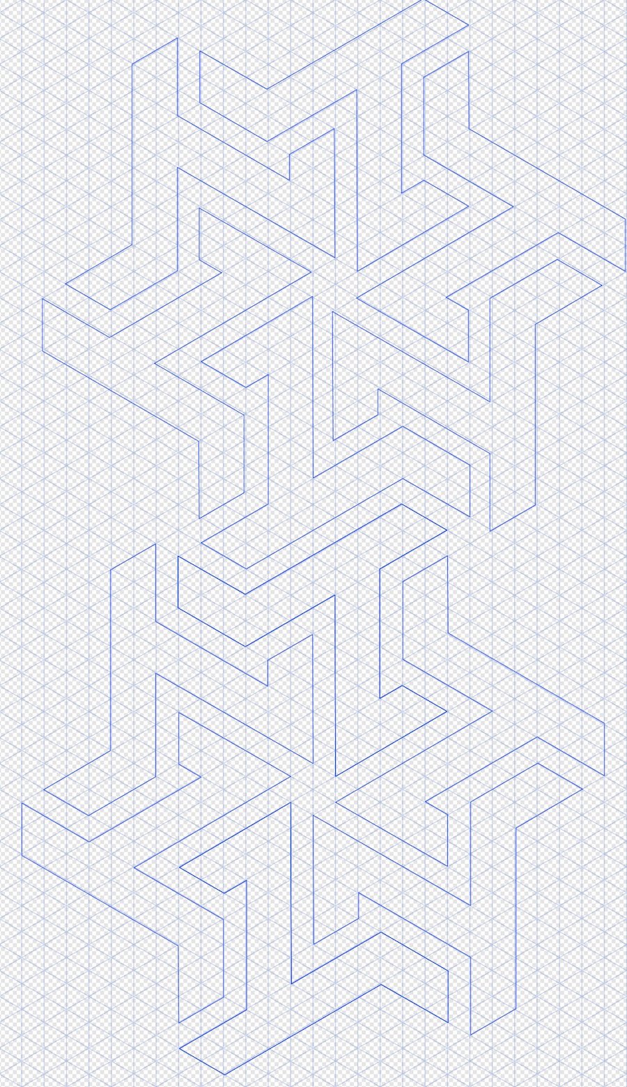
I started w. 6 triangle symbols on a triangular grid. Placed them over the screen shot, and built the center. But when I went to transpose them, realized the screen shot was elongated. That was about 12 minutes.
Started again w. the file. Not easy to use. Could see the pattern, but whenever i clicked on a tool, only the 3 letters remained. Eventually got the pattern grid shaped to a triangular grid. Spent time clicking back and forth, drawing the base shape to the sometimes visible text grid. Then copy paste, rotate. Grab the pieces and transpose them, locking to the Affinity grid. Total time, about 30. A good portion of that was flicking back and forth between the text grid view, counting intervals, and then using the pen.
With something regular to start w., probably would have been about 6 min.
-
The nodes are just points along the series from 1st to last that define an area. In and of themselves, only the 1st and last necessary. So copying a portion get the whole thing.
If just a section is needed, duplicate the curve, and, using the node tool, break the nodes where needed. That fragments the duplicate line. The unwanted parts can be discarded.
-
Unfortunately, the boolean operations, and where forms have edges that are close together, the operation(s) for many very small objects. Every red dot node means a separate curve. When you do the second divide, those will all detach, and can be trashed fairly easily.
-
Booleans always close open curves, and take on the attribute(s) of the lowest in the level hierarchy.
-
Hi, MarshallHarrison,
Note that w. traditional art, hand/eye skills can take years, even if you start as a child. It may feel a bit silly, but old fashioned "penmanship" exercises can help. Draw lots of circles, parallel lines, squares, triangles, until your arm gets the feel of moving across the rather slick surface of the tablet.
At least there is the perfect eraser of "undo."
-
It appears the .svg export routine generates all sharp points. Bring the .svg export back into Designer, and, in node mode, select the nodes at the ends, and change the nodes to smooth.
Re-export.
-
A lot can be done w. transparency control and blend modes. But from the 2 samples in the 1st post, I'm having trouble trying to figure out exactly what you want to do.
Care to offer any shots of quick trials? Or something like you are aiming to do?


How to create a comic from a photo
in Pre-V2 Archive of Affinity on Desktop Questions (macOS and Windows)
Posted
Hi, Don Tango,
Try this approach for something like the above. Increase brightness and add a little contrast. Then use a small value for Dust & Scratches.