-
Posts
1,887 -
Joined
Everything posted by gdenby
-
affinity designer Designer Pocket Watch Illustration
gdenby replied to doar's topic in Share your work
Hi, doar, Exquisitely simple. Everything just right. Hat is off to you, and thanks for the example. I opened it w/o problem in the 1.6 consumer version, and the 1.7.0.10 beta w/o problems. -

affinity designer My First digital painting on affinity designer
gdenby replied to Manozac2000's topic in Share your work
Yes, good. Obviously a 1st step, but it feels good to look at it. -
If the bottling company needs all vectors, try this. Add the stripes that will be the etched glass together. Duplicate the text layer, convert it to curves, ungroup, and add the letter shapes into 1 shape. Then subtract from the stripes. Repeat w. the star array. I don't know how the bottle making process works, but I suppose they 1st etch the glass w. a stencil that protects the areas to remain clear, and then apply a stencil that will hold the white enamel for the stars. If they can provide info about their process, it might help setting the vector file up.
-
Just read your reply. I'm not certain why you made them paint layers, but if they are vectors, they can be rasterized after the text is subtracted. Most work can be done as all vectors, and rasterized as needed. That way, the shapes can be moved, resized, recolored, etc w/o generating pixel artifacts till the end.
-
Sorry if I was not quite clear, I was just about to go out the door to a legal meeting. I should have said add them together, not add them in. That will create a mesh of stars that can be subtracted as one object from the stripes, which would also need to be added into one object.
-
Hi, LukeJS, Looking at the layers panel, I infer the groups are rows of stars. Objects cannot be subtracted from groups. Ungroup the starts, all of them, and add them in. Add all the diagonals. Subtract the star curves from the diagonals. The text can then be subtracted from the diagonals w. star holes. If the document has a white background color, and is not set up to be transparent, that white remains under the subtracted remains.
-
It appears all the text was converted to vector objects. Its been years since I used either photoshop or illustrator, but once text was converted to curves back then, it was no longer able to be changed as text. It was just a vector shape that could be used by a postscript capable printer. It was something that was done because not everyone had access to specific fonts.
-

Can't add style
gdenby replied to Lucio's topic in Pre-V2 Archive of Affinity on Desktop Questions (macOS and Windows)
Lucio, If you edit an image in the tone mapping personna, you can save the settings, such as exposure, contrast, etc as a new preset. AFAIK, the image needs to be in RGB 8 color space. -

Can't add style
gdenby replied to Lucio's topic in Pre-V2 Archive of Affinity on Desktop Questions (macOS and Windows)
Hi, Lucio, In my experience, styles are generated from the strokes and fills of a vector object. They don't come from pictures. Pictures can have tone mapping presets added to them. Is that perhaps what you want? -
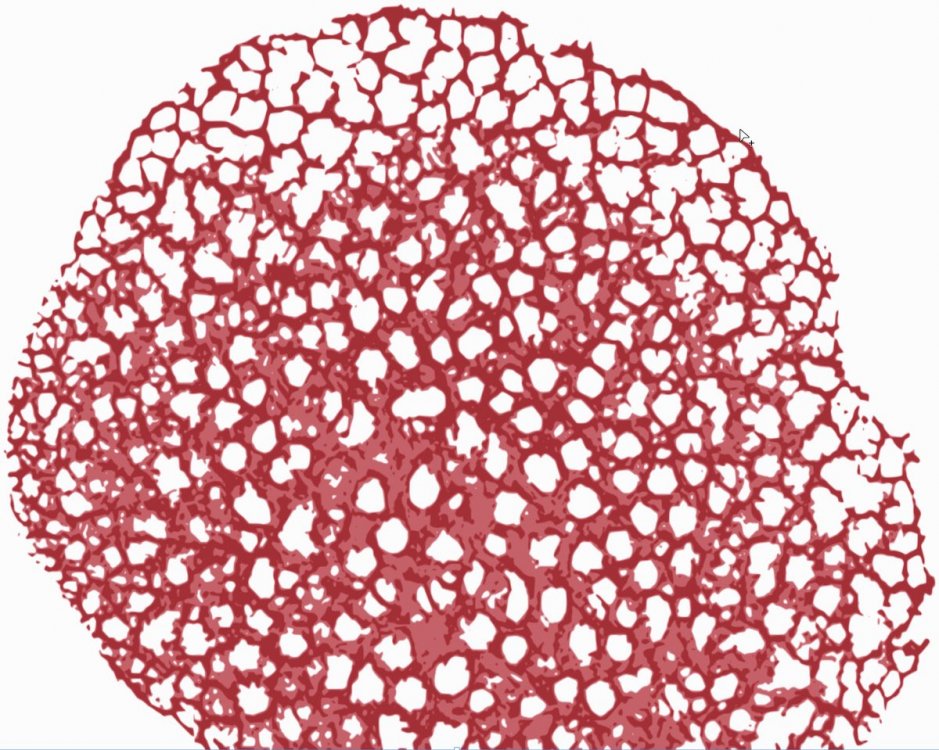
A result from running the sample image thru A-Photo to clean it up some. Then a trace in Inkscape. Then some color work back in AD. The resulting vector file was quite large, 4+ Mb, so offering a visual only.
- 8 replies
-
- logo design
- natural shape
-
(and 3 more)
Tagged with:
-
Hi, chocomel, Do you mean you want everything to be a vector representation of the odd slice thingy? BTW, what is that?
- 8 replies
-
- logo design
- natural shape
-
(and 3 more)
Tagged with:
-
Hi, dhb, My complicated solution. I tend to work that way. Lets hear it for fuss and bother. I noticed a couple of things in your file, and wonder why. The two rectangles have different gradients, and at the adjoining overlapping edges, they have different grey values. Seems like there is no way they could not have a noticeable edge. The texture images has different values as a result. The banding seems to be worse w. the shadow fx turned on. Probably not the thing to do. Also, the rectangles, having straight edges, create a sharp line wherever there is a difference in the texture image. Attached is a file where I tried something different. In stead of having a gradient fill, w. a child image layer, I saved off the concrete texture, and used that as a bitmap fill. That way it could be reshaped as needed for variety, and the rectangle could have transparency applied to it, causing more variation if you need bands. I made the rectangles curves so I could roughen edges. Also added another layer of curves to obscure the seams more. SHARP_EDGE.afdesign
-
Hi, Mark, I'm pretty much a novice when it comes to A Photo, but here are 2 things to try. Make the selection brush smaller, and turn on snap to edges. That should grab contiguous areas of the flat colors. Alternatively, use the flood selection tool, set it to a small tolerance, maybe 2%, and turn off contiguous. That should pick out any area in the image w. the sampled colors.
-
Hi, PLSNDL, I'm assuming you have snapping turned on. It might help to start the construction w. a grid in place, and have snapping to that also turned on. No need to draw a complete triangle, just the bottom section, and the diagonal. Use the pen tool in polygon mode, and adjust the lines to arcs as you like. Duplicate the shape, flip, and slide to the side till you get snapping indicators. With both portions selected, switch to the node tool, and use the join curves widget. There will remain a red node dot, and if you zoom in on that, you will see that there actually 2 nodes on top of each other. You can slide the top on to the side. Slide it back over the lower node till it snaps, and marquee select both. Then use the close curve widget. Assuming you didn't happen to nudge the node after snapping, the two should fuse. Note, the 1.7 beta works a little better w. node positioning, and other shape fine tuning, but I tried the above in both 1.6 & 1.7, and it worked OK.
-

Affinity Photo - Blend Ranges Explained
gdenby replied to Multi4G's topic in Tutorials (Staff and Customer Created Tutorials)
Very Good. I don't us APhoto much, and am often perplexed. Your demonstration gave me lots of useful info -
Do you have a layer selected? And is the layer a "pixel" or an "image?" I don't use Photo that much, and often forget to select/high lite a layer before applying an adjustment, or using a tool like a dodge brush. Pixel/rasterized layers can have various adjustments made on them, but "images" can only be re-sized and have opacity and blend mode changes. They need to be rasterized before adjustments can be made on them.
-
Clear and concise. Good work, and good demonstration.
- 2 replies
-
- tutorial
- photo manipulation
-
(and 2 more)
Tagged with:
-
In Affinity, the stroke is not an object. It is just an attribute of the curve geometry. I don't use Inkscape enough to say, but in affinity, Expand stroke may be like convert to path in Inkscape. It makes a filled area that was the stroke, and that can be cut away.
-
Hi, webcat, I'm not familiar w. the term knock-out, but I suppose you mean you want to remove the rectangle(s) or star shape from the diamond. The objects do not need to be converted to curves. When they go thru a boolean operation, such as subtract, the results will be a curve. Your 1st problem was that you only had 1 on the rectangles selected when you did the subtract. So only one was cut away. If you had all the shapes selected, the 2 rectangles above the diamond would have both been subtracted. The order of the operation is from top of the stack down, so when the diamond was on top, it cut away from the rectangle. The results of the operation have the attributes of the bottom object. So if you subtract any shape from one that has an outline, the resulting shape will still have the outline. I'm not quite sure what was going on w. the star example, the star arms should have been cut away from the diamond. Attached, a file saved w. history so you can step thru what I did. I hope this is what you were aiming at. Knockout.afdesign
-
None of this is really elementary. Work has been done on these problems for at least 30 years. This is an over simplification. If the project depends on photo or artistic images, Photo will probably be better. If clean shapes, smooth gradients, and transparency fades on those do most of the job, go w. Designer. But most work has some overlap, so both apps have elements of the other. To choose the starting point. If you want to make an image that depends on a photographic, or at least photo derived picture, start w. Photo. It has many tools for making adjustments to all aspects of color. If the image needs some shape manipulations, such as blurs, or shape corrections or distortions, Photo is made for that. One can then add text, or shape design elements like logos. Designer is better suited to making vector shapes, and laying them out within various spaces, such as business cards, or mobile device screens. Or (something of which I do very little) isometric mechanical/architectural renderings. It does do some image processing, but nothing as extensive as Photo does.
-
I was using the flood select tool. When doing a contiguous select, it will grab everything within the tolerance. So it grabs a whole blob of the watercolor. The selection bush will do much the same thing, but can be limited to just the area within the brush nib selection. Then copy, and paste, which creates a new layer. Using the move tool, position the duplicate where you like, and transform it in proportion and rotation as you like. Merge down, changing the opacity and blend mode as you might like.
-
If you look at the view modes in Designer, on the Mac, there are 4 view modes, pixel, pixel (retina), vector and outline. If you switch between them, you will notice that you have representations in Photo that are similar to the pixel views in Designer. Designer is made to let one makes shapes to the maximum that can be displayed at different zoom levels in the vector modes. The pixel representation is limited to high definition at 100% zoom. When the vectors are transferred to Photo, they can only be represented in their pixellated form. If you are familiar w. music, consider this analogy. A stretched string will produce hundreds or thousands of individual notes, depending on where it is stopped. But a piano uses a set of 12 strings of certain proportions of the much larger number. That is similar to the difference between vector and raster graphics. You can have many thousands of points along a line, or 144, which is the current maximum for computer displays on the market.
-
And another approach. Used clone brush to dabble over the letters. Not happy w. the result. Started using the wand select, copying and pasting various selections from the upper veggies. Transformed them in different ways, reduced opacity, and merged down. Some times changed the blend mode to screen or soft light. Then used the wand again to catch most of the lower grassy area, and added a bit of monochromatic noise to hint at the original paper. Oh, and used the smudge brush w. a coarse bristle nib to break up some of the patch edges.


