thomaso
-
Posts
13,563 -
Joined
-
Last visited
Everything posted by thomaso
-

New Document Window Display Issues
thomaso replied to Murfee's topic in [ARCHIVE] Publisher beta on macOS threads
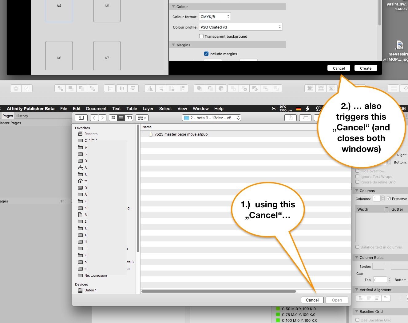
Some issues, some are possibly more obvious in light mode ...: The last sidebar option appears to be the "Open..." menu command. Unfortunately when canceling this option the entire "New..." action gets quit:
-
New Document Window Display Issues
thomaso replied to Murfee's topic in [ARCHIVE] Publisher beta on macOS threads
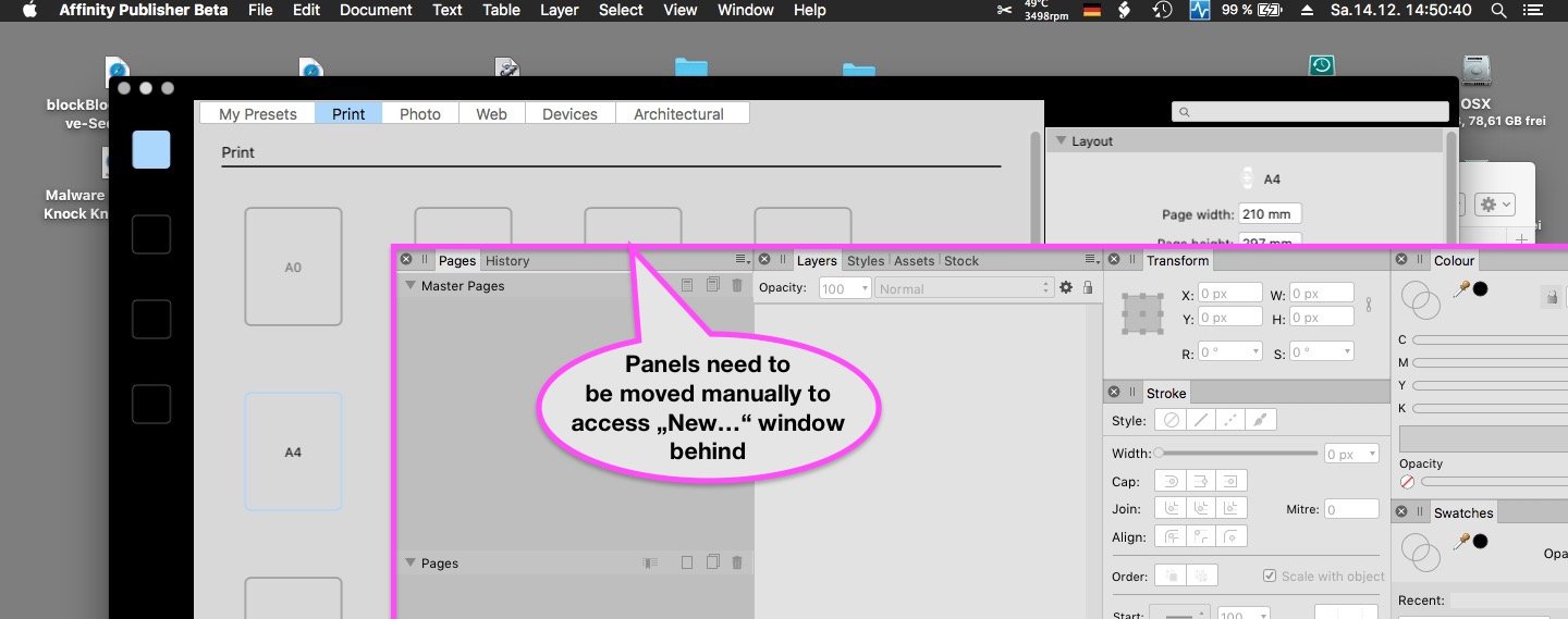
In my case it doesn't open that large but the window occurs on the smaller of two monitors and behind all panels. Unfortunately toggle-UI doesn't work then, and also doesn't work before using "New..." when no document is opened already.
-
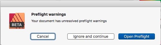
How can I open the panel? Sorry I miss a menu command and the panel. All I get is a warning window on export – but its button appears to open nothing ...
-
Das Schloss einer Ebene gilt leider nicht für jedes Werkzeug. Aber was meinst du mit "dort auch mit aufgetragen"? Das klingt, als würde dein Malen auf der Grafikebene + zusätzlich auch auf der Vorlagenebene (also auf beiden Ebenen) gemalt werden, anstatt nur auf der ausgewählten (blau markierten) Ebene (egal ob sie oben oder unten sitzt). Ich kann das nichtmal mit ungelocktem Layer + aktiviertem "Edit All Layers" button erreichen. Macht dieser Button für dich einen Unterschied? @v_kyr, zwei Fenster haben den Nachteil, dass sie beim Zoomen nicht synchron sind; da müsst man u.U. viel hin- und her-klicken.
-
Ja, du kannst die Beta Version jetzt schon verwenden. Beim Öffnen deiner Datei wirst du gefragt ob du sie als Kopie öffnen möchtest; das ist sinnvoll, weil du daran nicht mehr mit v1.7.3 arbeiten kannst (nicht aufwärts-kompatibel). – Zum Download geht's hier, das oberste/erste Thema enthält immer die aktuelle Beta Version: https://forum.affinity.serif.com/index.php?/forum/57-publisher-beta-on-mac/ Anhand einer Angabe in deinem PDF vermute ich, du bist Mac-User? Du kannst für leichtere Foren-Kommunikation in deine Signatur z.B. deine Betriebssystem-Version eintragen, die dann unter jedem deiner Beiträge erscheint. Im Zusammenhang mit Musterseiten ist evtl. interessant, dass auch in v.523 das Arbeiten mit Masterseiten noch nicht ganz rund läuft, d.h. momentan ist es noch etwas tricky mit Einzelseiten als Master in einem doppelseitigen Dokument zu arbeiten:
-
Left and right margin values switched
thomaso replied to Aleksandar Kovač's topic in V1 Bugs found on macOS
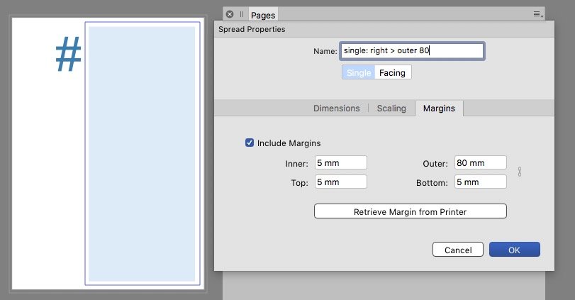
v523: I don't experience any change or improvement. – When creating a single master the margin label still says left/right, but on re-opening this spread property it says inner/outer. That makes the right margin as outer and this single master still as a left page. It still gets confusing when adding such a single page as a right page: Since its position as odd/even page affects its margins position, it's master's objects still stay fixed and don't get re-placed according to the page and alternating margin position: v532 single master right-outer.m4v
-
Im modularen Modus kannst du Fenster nach Belieben anordnen. (Menu Fenster). Eine automatisch angpasste Zoomstufe in allen Fenstern geht dabei nicht. Alternativ: du vergrößert die Bildfläche für den Malvorgang und platzierst die beiden Objekte in 1 Dokument nebeneinander. Du arbeitest also in nur 1 Fenster; der modulare Modus ist dazu nicht nötig, die Zoomstufe ist dann immer identisch.
-
It seems to be fixed in current beta v.523: v532 page move with master.m4v
-
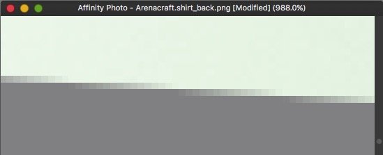
You probably will see it in AD, too, if you place a non-white background behind the bars (as I did with grey in my screenshots above). To prevent these you could enlarge the single stripes slightly to make them overlapping each other. The glitches above and below (at the outer edges of the set of bars) don't appear in 100% view. • So avoid using the PNG in larger size. Or export it in larger size but use it in smaller. • Another, more tricky/complex workaround could be to blur the complete edges in the width of a few pixels, that would prevent the partially appearance but creates a transparency along the entire edge and look more even that way (but blurry, too). • A third trial could be to add a stroke at these edges in the final color of the background, covering the 'steps' at the bar edges created by antialiasing which occur as repeatedly increasing opacity (visible in my 1st screenshot as a stepwise gradient from gray to green).
-
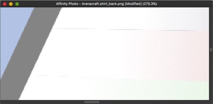
Hello merkelz, Welcome to the Affinity forums! It looks like an issue caused by antialiasing (of a former vector object?). This zoom shows how the edge gets converted in the pixel raster image format PNG: It doesn't show up for me in 100% view: But I see a different glitch above/below the red bar (which possibly is positioned with a gap between violet and green bars):
-
resizing images come out fuzzy
thomaso replied to Lorel's topic in Pre-V2 Archive of Desktop Questions (macOS and Windows)
For such a massive downscaling it is useful to sharpen the image afterwards. Example from 1500 px > 125 px: not sharpened / sharpened: (enlarge your browser zoom to make the difference more obvious.) < bilinear < bicubic < lanczos The resampling algorithm doesn't really matter here.
-
Changing Colour using Global Colours sets Tint back to 100%
thomaso replied to 000's topic in V1 Bugs found on macOS
Nevertheless, this thread might be almost ideally fitting as a reminder to that quite related issue: This issue still occurs in v1.7.3 and current beta v518. -
In all Affinity apps I see white object edges which do not really exist in the objects but are rather a rendering issue. Their occurrence varies with the zoom level and appears flickering when zooming. They are quite disturbing because they force me to look for an object's displacement again and again (e.g. of 2 objects with distance = 0) or look for wrong cropping of image resources. Example in APub: two identical vector rectangles with distance = 0: flickering edges_APub.m4v Example in ADesigner: same as APub + a non-rectangular object position, whose edge even does not disappear on zooming: flickering edges_ADesigner.m4v Example in APhoto: just a photo – one pixel image layer, not cropped, not edited: flickering edges.m4v
-
Instant Crash when Pages Reordered or Blank Page Deleted
thomaso replied to Clanks's topic in V1 Bugs found on macOS
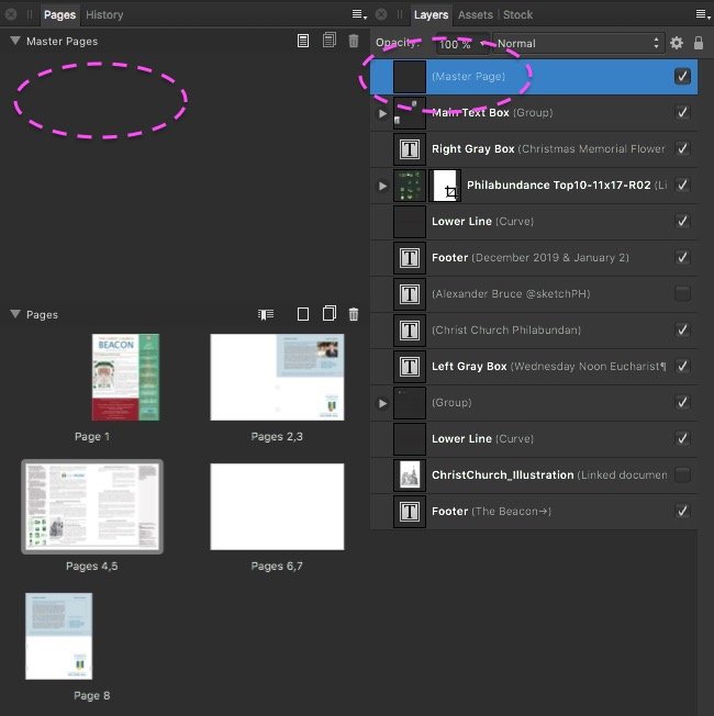
Glad it works for you! – I still would like to understand how that happened: Did you initially start with a master page which you deleted later but not before page 4 was created? And did you move this layer in the layers hierarchy? Or were does this layer "(Master Page)" come from?- 5 replies
-
- 1
-

-
- crash
- page moving
- (and 1 more)
-
Instant Crash when Pages Reordered or Blank Page Deleted
thomaso replied to Clanks's topic in V1 Bugs found on macOS
I was able to delete in your .afpub the spreads 2/3 and 6/7 successfully. Here the .afpub reduced to 4 pages as shown in your PDF: Dec2019Jan2020Beaconlayout_4 pages.afpub Whereas when trying to delete page 2 as a single page I got a crash, too. * I also got a crash for this action in APu beta v518, which is a pity because in v502 the pages panel got some improvement but that obviously doesn't help in this case. EDIT: Supplement: I think the culprit for the crash is on page 4 an orphaned layer, (auto-)named as "(Master Page)". There is neither a master in the pages panel nor does this layer occur on in the document window layout view. This seems to cause the crash of single page before 4 because it would force all layers of page 4 to become moved from a left to a right page whereas a deletion of spread 2/3 simply alters the internal numbering. * After deleting this orphaned master layer I was able to delete pg 2 with no harm.
- 5 replies
-
- 1
-
-
- crash
- page moving
- (and 1 more)
-
Left and right margin values switched
thomaso replied to Aleksandar Kovač's topic in V1 Bugs found on macOS
@TheOtherRoland, unfortunately the switch of left/right (or inner/outer) margins, or just their labels, appears to be intentionally and so-called "by design". Although with the previous beta (v502) came improvements for the behavior within the pages panel this left/right issue still exists in the current beta v518 in the way it has been answered already earlier: User: Does that mean a single master in a facing document always is treated as a left page? Serif: For now, yes that is the case. It's just the way it's been designed. https://forum.affinity.serif.com/index.php?/topic/78148-master-page-margins/&do=findComment&comment=529943 -
Fixed position of the Edit Text Style window
thomaso replied to wlb's topic in Feedback for Affinity Publisher V1 on Desktop
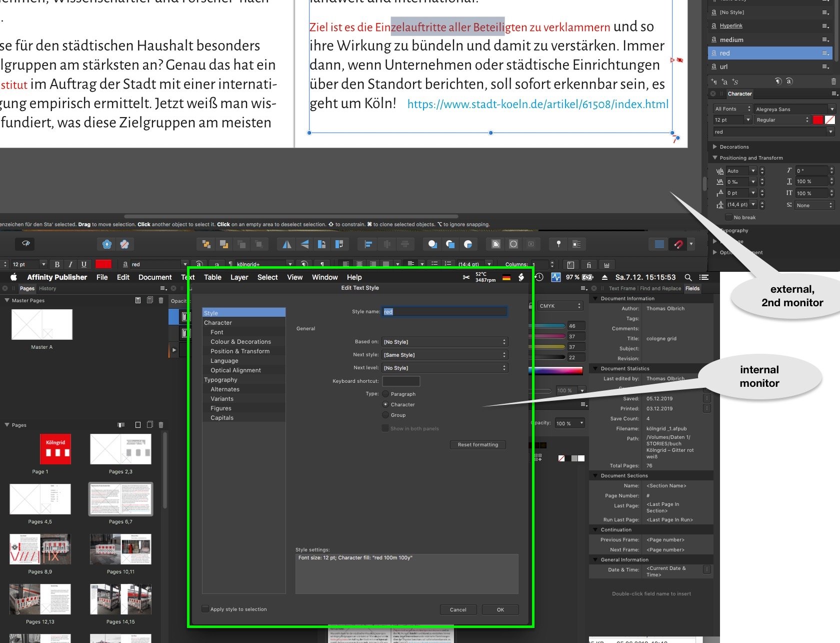
Interesting: this fixed window's position works like a charm when using two monitors, then its occurrence in center and docked to the menubar appears perfect:
-
Moving object + ALT = copy ... incoherent
thomaso replied to Pattex's topic in Feedback for Affinity Publisher V1 on Desktop
This not-mac-typical behavior is related to the fact that in Affinity opt/alt vs. cmd modifier keys are switched and work vice versa. It was discussed already, as far I know with no Serif respond yet. It is still unknown what made Serif set these two modifier keys that way – though it is always documented in the toolbar info: So, using the cmd key instead opt/alt does ignore the moment of pressing the key and behaves as usual and expected.
-
PNG transparency black when printing compressed PDF
thomaso replied to REL's topic in V1 Bugs found on macOS
Ok, it shows up white – on screen only or when printed, too? If on print then everything is fine, isn't it? I'd say if you do see transparency in various apps on screen (as I do with both your pdfs and the other files as mentioned) then the black on a print would be related to and generated during the printing process and by all involved software, including the app which is used to send the print task. p.s.: to test transparency a white background is less useful than your previous gray because in some apps + printed on paper the white can be the default color which also occurs with no content at all. With a white image background a non-transparent JPG looks the same as a TIF with transparency. Maybe Pauls (from Serif) will come back with more detailed or even different results. -
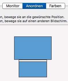
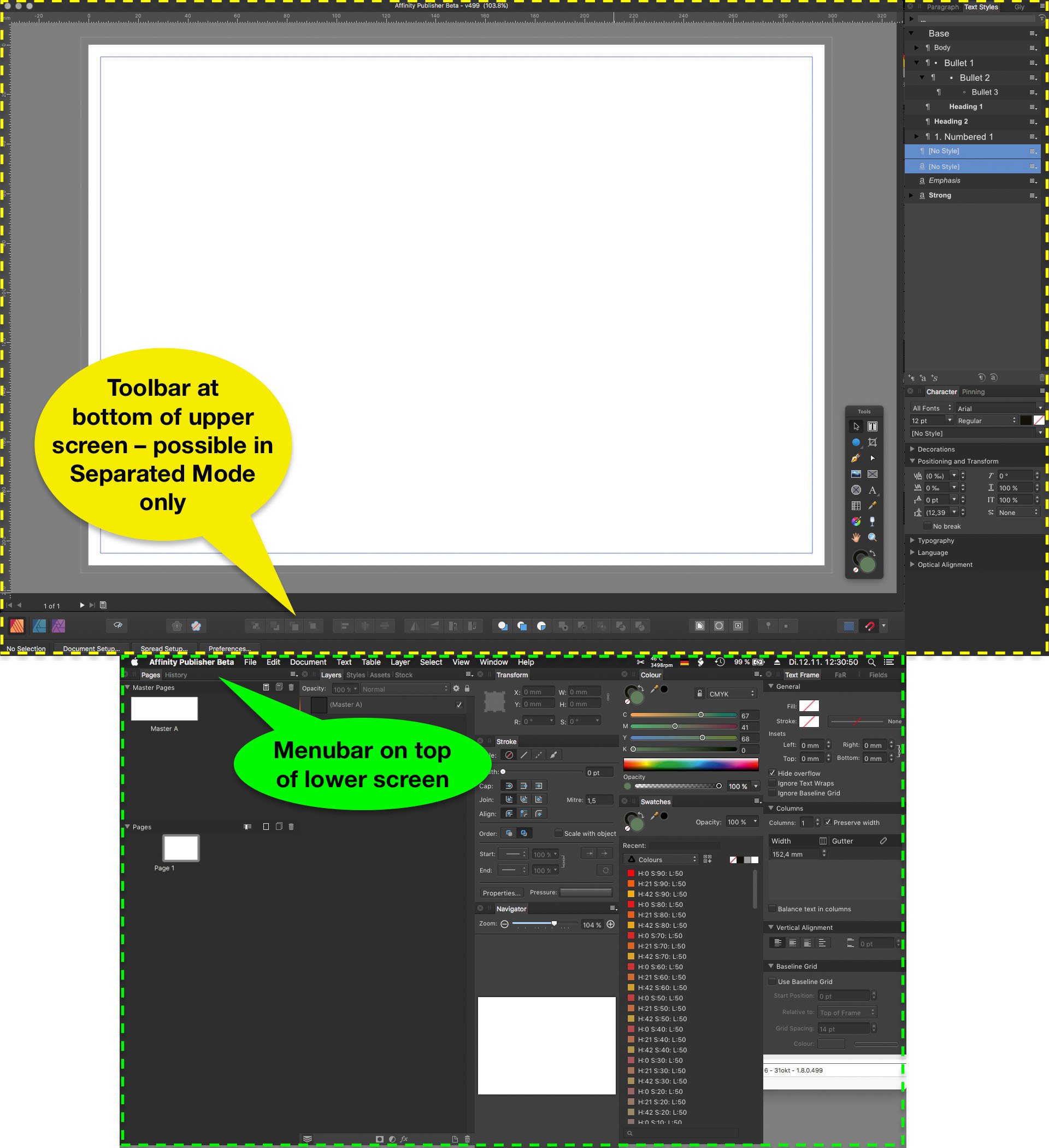
This feature improvement request is currently relevant in Separated Mode and when using two monitors. Some users of a laptop have a 2nd monitor connected which allows to place document windows on the larger screen and panels on the smaller. Unfortunately for a custom panel arrangement Affinity currently demands to switch to Separated Mode. Separated Mode also separates document windows by default. Also new windows get opened on the 'main screen' (e.g. the laptop's internal), regardless of its size (resolution) and of already existing document windows on the other screen. That way any new document window appears covered behind panels and is therefore 'invisible'. To combine these document windows as tabs in 1 window the user needs to select "View" > "Merge All Windows" – every time a document gets opened. Unfortunately to do so it also is necessary to first select (activate) the already existing window, otherwise this command moves all documents to the newly opened document on the unwanted screen and behind the panels. Requests: a.) enable a Separated Mode which does not affect document windows but panels and toolbar only. b.) make new document windows open on the screen which already shows a document window. c.) remind in Separated Mode the document window size and position. d.) allow to auto-fit document windows between panels instead of behind them in full screen size. Or: e.) improve the Not-Separated Mode by enabling custom panel + toolbar arrangement on 2 monitors. This would have the same result as a) + b) + c) + d). Since in not-separated mode the panel docking and sticking works better than in separated mode this option e.) is the preferred towards a.) – d.) for users who still want to arrange panels as groups around the document window and currently use separated mode just to make use of 2 monitors. Example setup of two monitors (macbook internal + larger external): Same example with menubar, Affinity panels, toolbar and document window: New documents open on smaller screen, covered behind panels:
-
PNG transparency black when printing compressed PDF
thomaso replied to REL's topic in V1 Bugs found on macOS
I see in your flower PNG, TIF, .afdesign and PDF transparency on screen for PNG and TIF. Also your "Untitled.pdf" prints both images to me with not black but transparent background and shows the light grey. Possibly your black print result is a printer software issue. Are you aware whether your printer supports postscript transparency? How does the background appear on print if you export as PDF/X-1 (it prevents postscript transparency but flattens)? -
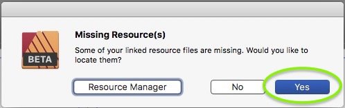
(In both retail v1.7.3 and beta v518) When opening an .afpub which has a missing resource I may choose "Yes" to locate a folder or file in a finder-like window. Unfortunately then the finder's "Search" text field may be selected (highlighted) but is not accessible for my text cursor. I can't use the search though I would need it in particular this situation.
-
Presets – Feedback & Suggestions
thomaso replied to thomaso's topic in [ARCHIVE] Publisher beta on macOS threads
At this moment of this new "New..." window (1st occurrence at all, not finalized yet * ) I see a lot more reason NOT to limit thoughts, fantasy and feedback in a way as it will be useful in a later beta or especially in a retail version. * In particular the occurrence of "Recent documents" in this "New..." window and the layout of only two columns for landscape icons (+ free wasted space) makes me feel of this current window version to be an idea, a trial, a test. -
Presets – Feedback & Suggestions
thomaso replied to thomaso's topic in [ARCHIVE] Publisher beta on macOS threads
Of cause it can. It's just a matter of layout, design, navigation etc., in short: of consequences. It even is possible to treat presets totally different and separated from templates. -
Presets – Feedback & Suggestions
thomaso replied to thomaso's topic in [ARCHIVE] Publisher beta on macOS threads
This may be true for presets, but not for templates. Templates show the picture of a page. This thread is about "Presets" in particular – NOT about templates.