Aleksandar Kovač
-
Posts
158 -
Joined
-
Last visited
-
 Aleksandar Kovač reacted to a post in a topic:
Canva
Aleksandar Kovač reacted to a post in a topic:
Canva
-
Aleksandar Kovač reacted to a post in a topic:
Canva
-
 Aleksandar Kovač reacted to a post in a topic:
Canva
Aleksandar Kovač reacted to a post in a topic:
Canva
-
Aleksandar Kovač reacted to a post in a topic:
Canva
-
Aleksandar Kovač reacted to a post in a topic:
Canva
-
Aleksandar Kovač reacted to a post in a topic:
Canva
-
Aleksandar Kovač reacted to a post in a topic:
Canva
-
Aleksandar Kovač reacted to a post in a topic:
Canva
-
Aleksandar Kovač reacted to a post in a topic:
Canva
-
 Aleksandar Kovač reacted to a post in a topic:
Affinity is joining the Canva family
Aleksandar Kovač reacted to a post in a topic:
Affinity is joining the Canva family
-

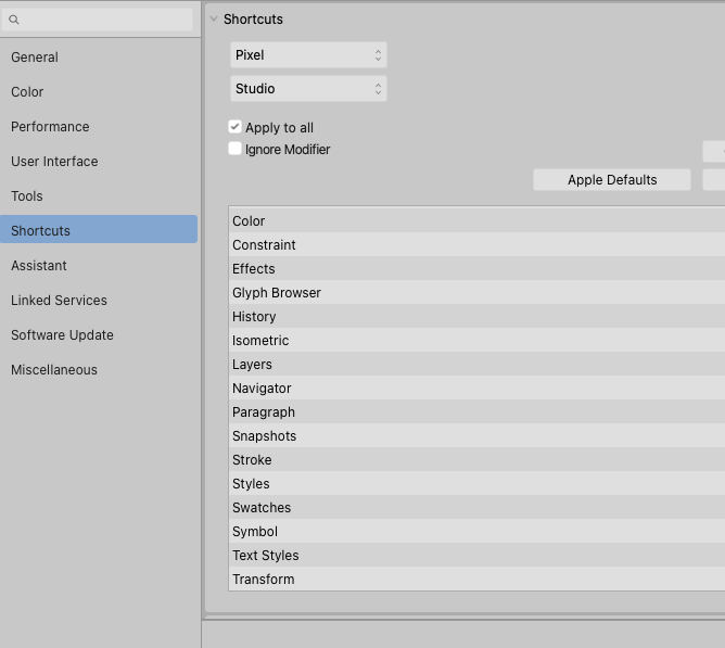
Shortcuts: Pinning a shortcut on Pinning?
Aleksandar Kovač replied to Aleksandar Kovač's topic in V2 Bugs found on macOS
@walt.farrell, @Hangman Great catch! On Mac, Appearance panel exists in pixel persona and works as intended. However, as mentioned above, it is missing in shortcuts preferences list. -
Shortcuts: Pinning a shortcut on Pinning?
Aleksandar Kovač replied to Aleksandar Kovač's topic in V2 Bugs found on macOS
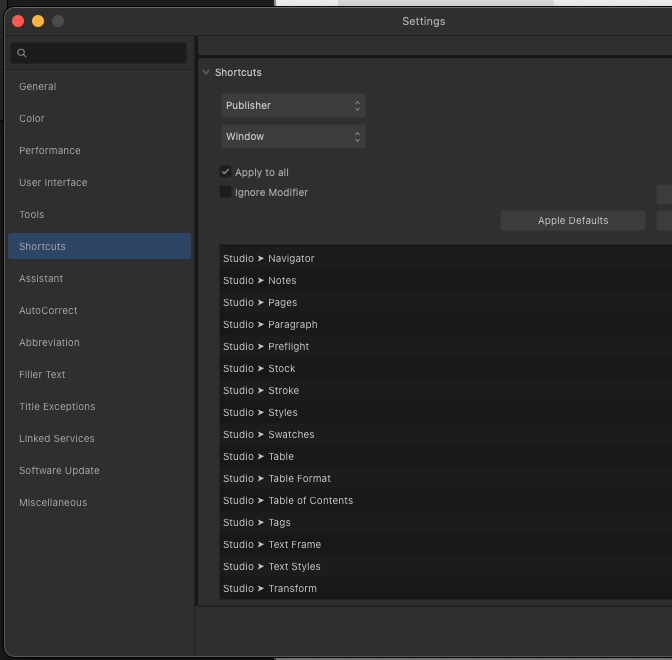
Thank you @Hangman for affirmation and addition. I have also noticed these where plural and singular are used! Here is another one here... Stock is missing from Designer Pixel persona's Studio and Window Shortcut editing lists...
-
Shortcuts: Pinning a shortcut on Pinning?
Aleksandar Kovač replied to Aleksandar Kovač's topic in V2 Bugs found on macOS
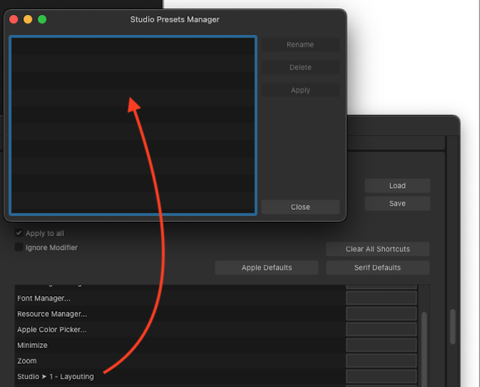
Yes, @Callum I did have this preset. I did not delete it, but it does not show up in Presets manager. App has been restarted a few times. Computer, too. Additionally, I did have Typography, Graphics presets, too. But, I would only ever see the first one on the list of presets in shortcuts editor. :( Now I see @Return has all those presets showing up nicely in Shortcuts… And, what can I say, I am jealous. Do other Mac users lack “Pinning” in Shortcuts editor, too? -
Shortcuts: Pinning a shortcut on Pinning?
Aleksandar Kovač replied to Aleksandar Kovač's topic in V2 Bugs found on macOS
...Or, better still... it seems I can see studio preset that is not even there
-
Shortcuts: Pinning a shortcut on Pinning?
Aleksandar Kovač replied to Aleksandar Kovač's topic in V2 Bugs found on macOS
@Return Thank you for reply! Wow, you have it!... see how it looks on my machine... (Mac, Sonoma) The other thing is that you seem to have shortcutable studio presets... I can only see my first preset in this list.
-
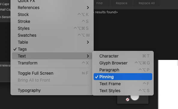
Handy Pinning panel is listed in Studio/Text but it seems it does not exist in (exceptionally badly done) Shortcuts settings. Anyone knows where did that little Pinning rascal go?
-
To continue @MikeTO’s independent grid blues... Independent grids don’t work in groups either. File attached. Who cares about independents anymore.afpub
-
MikeTO reacted to a post in a topic:
No Ch-Ch-Ch-Changes… on Initial words
-
No Ch-Ch-Ch-Changes… on Initial words
Aleksandar Kovač replied to Aleksandar Kovač's topic in V2 Bugs found on macOS
@Old Bruce This is precisely what I did. Reported bug anyway. -
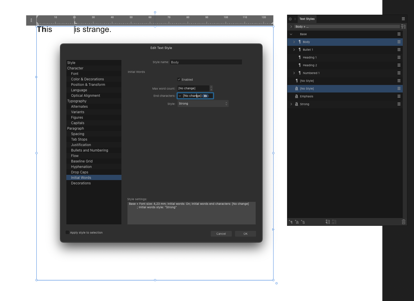
Affinity Publisher 2.2.0 This one is reproducible even on fresh documents with untouched default text styles. On Ventura 13.5.2. Sample document is attached, and a screenshot of what happens. Edit a text style/Initial words on a text style that is based on some other style. ‘End characters’ input will show [No change]. Try editing this variable by clicking on the dropdown and choosing TAB or anything else. ‘End characters’ still displaying [No change]. But, if user clicks inside the input box, actually TAB is added, right after [No change] label. However, there is no effect on the text. I would expect that choosing TAB (or something else) would set end character to be TAB and work according to this setting. This would remove [No change] label from the input. However, this does not happen. Besides, I have noticed while working that some other Text style settings get lost, malformed, ignored… if a text style is based on another style. However, this bug above I am able to reproduce consistently. Inital words not working as expected.afpub
-
I agree with @Welsbach. Regarding the ‘synchronization’ of master pages, the process that is executed when pressing ‘synchronize’ is not synchronization but rather ‘propagation’. If this is indeed ‘by design’ this is by very bad or incomplete design. As it is now, it is: damaging to the fluidity of the workflow – good preparation is important, by all means, but having to make absolutely perfect layouts beforehand eliminates the advantages of using this tool and this medium fully to the benefit of the user; unnecessarily wasting user’s time – if there are more than one master in the style source chapter, time needed to delete all the unneeded propagated masters (one-by-one!) in other chapters grows exponentially; propagated master versions accumulate quickly. Unless a user has been diligently renaming them before each synchronization/propagation, obsolete masters will have the same names as newer masters, which makes cleaning and maintaining the file a pain. E.g.: 3 changes on 6 masters in a book with 10 chapters will propagate 120 obsolete masters. 2000% increase of unneeded masters! confusing – text styles synchronize, masters propagate. Two different processes are executed with the same command; self limiting – Books concept should help manage complex publications but complex publications are precisely the kind of job where the current synchronization shortcomings are the most crippling. I’d say all the above are no-nos, and that the Books feature is not up to the task. Of course, I could be wrong. As I have been before...
-
Puck reacted to a post in a topic:
No, No, Noooo… Notes. (and then a crash)
-
Hangman reacted to a post in a topic:
No, No, Noooo… Notes. (and then a crash)
-
No, No, Noooo… Notes. (and then a crash)
Aleksandar Kovač replied to Aleksandar Kovač's topic in V2 Bugs found on macOS
Thank you for verification on this and your time @Hangman, @Puck! I am adding a ‘bug’ tag on this. And starting to hope for a fix, because... notes. They’d be handy, right? -
No, No, Noooo… Notes. (and then a crash)
Aleksandar Kovač replied to Aleksandar Kovač's topic in V2 Bugs found on macOS
Oh, here is another certain way to crash Publisher using the file attached before. For example, position cursor in the first column, at the note marker after the word ‘vivamus’ and try to delete this note. The result here is invariably – crash. -
Working with footnotes and sidenotes has been a crash-y experience. I believe there is a bug or two somewhere here. File attached consists of one text frame with 4 columns and some styled text on A4. In that file, I can reproduce the crash consistently by reducing the number of columns on the text frame. This file does not include any pinned images (or any images) so previously proposed workaround does not apply. There were some other user actions that resulted in crash, too, but I have not isolated them. E.g. tinkering with footnote’s gap before would crash Publisher, if I remember correctly. If anyone has some free time to verify if they get the same crash? Thank you! 2023-06-30 crash on footnotes.afpub
-
A simple use scenario is to use a compound shape as a part of a master page. A master page is applied to 10 pages. Shape operations on the Master page consistently propagates the change to 10 pages with that Master applied. This consistent propagation is not happening here. @Return Actually, I have stumbled on this while editing the shape on Master page. 'Edit linked’ was not used at the time. I think Edit linked does not propagate the changes throughout… might be wrong on that one.
-
@Return Yes, but that could be destructive, possibly? 🤔 Another workaround (verified on Mac) is to create the compound shape on Page and then move it to Master. @Hangman Yes, that is visible from the layer panel. What worried me is that this seems to be due to no user action. Additionally, if ‘Edit linked’ is used on this compound, and operator is changed by hand, the result is as it should be. But, it should not happen in the first place, right?