thomaso
-
Posts
13,555 -
Joined
-
Last visited
Everything posted by thomaso
-
 In v532 it appears that a cursor drag selection even undesirably fetches the invisible area of groups that were cropped with the Vector Crop Tool: (I don't experience that in retail v1.7.3) grouped-cropped selected.m4v
 -
CMYK Black Overprint regression ?
thomaso replied to BigStef's topic in [ARCHIVE] Publisher beta on macOS threads
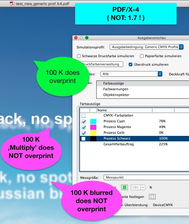
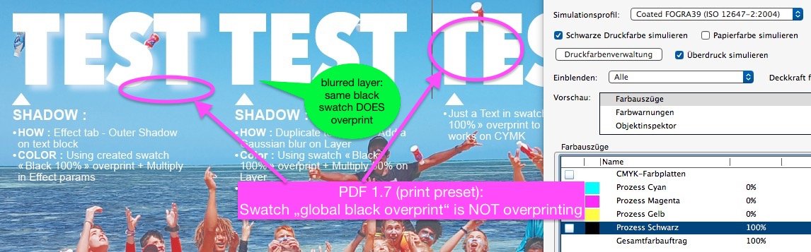
Sorry, I can't confirm such improvement of v531 with your .afpub. – (btw: a 100K text as PDF/X-4 does overprint already in APub 1.7.3) – Instead it appears that in your .afpub it even does NOT overprint the black of a gaussian blurred 100 K text // ... and is different to BigStef's file in that point to me: • Jens' afpub, generic cmyk profile, X-4: test_new_generic prof X4.pdf • BigStef's .afpub, fogra 39, X-4: test-cmyk-shadow-v-1-8_ot X4.pdf Like MikeW I also see still in v531 issues with overprinting 100 K, both in PDF 1.7 and in multiply color mode.
-
Affinity Publisher Not Applying Motion Blur on PDF Export
thomaso replied to SamMN's topic in V1 Bugs found on macOS
For now possibly you can live with the 1-click workaround: just rasterize the filtered layer (or a copy) to make its effect appear in a PDF exported from APub. motion blur _ot rast pdf1.4.pdf It is a known issue and has been recently confirmed to be still unsolved.- 1 reply
-
- 1
-

-
v531. The crop tool improvement mentioned in the update list for v531 reminded me to the opacity issue with the crop tool. Unfortunately it still occurs: A crop tool layer seems to double a transparency value assigned to its content. Regardless whether vector shape or pixel image. See in this video the black rectangle, set to 50% opacity, gets lighter as soon the crop tool starts masking: crop tool opacity.m4v It might confuse even more that the unwanted effect does *not* appear in an exported PDF (print preset): v531 crop tool opacity.pdf ... but is visible in a JPG : All files (afpub + exports) of this sample use same cmyk space/profile.
-
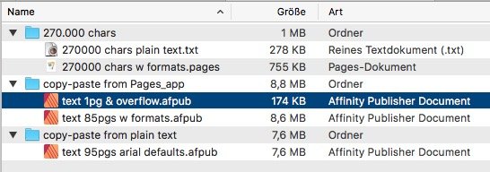
tallulahlucy, I'd like to understand what made your .afpub file size increase that much. I can't reconstruct an increasing file size with overflowing text: In short tests with copy/paste I get the result that an .afpub file size with not-linked overflowing text (1 frame on 1page, overflowing) is a lot smaller than the same document with not-overflowing but linked frames (over 80 frames and pages). The overflowing file is even smaller than the according plain text (.txt) document (174 kB / 278 kB). I wonder about the file size increase between an overflowing vs. not-overflowing .afpub, but it is not that much as in your file and rather in the MB range than GB. _ There is just a little difference in file size with not-overflowing and formatted versus not-formatted text. _ A higher number of pages is influencing the file size less than the use of various text styles. (not-formatted, 95 pages: 7,6 MB / formatted: 85 pages: 8,6 MB) _ Also it doesn't make a difference whether the text was copied/pasted from the Pages.app or from a plain text document. _ Copy/paste from the Pages.app doesn't influence the .afpub file size if the copied text includes images. To detect what made your file size increasing so massive it would be helpful to know the steps you used in your .afpub – e.g. how exactly the text came into APub (paste, drag, place), the number of different text/Pages files, the number of frames which contained different overflowing text, or the number of changes (paste, delete, save, close/open action) with that document – though I don't know yet in which way these steps would influence an .afpub's file size at all. This makes me wonder what thought let you possibly paste any text several times, and/or how you solved the overflow: either by a series of single clicks (frame by frame) – or by only 1 shift-click on the first frame overflow icon to get created all pages and frames automatically?
-
It appears very weird that just adding text made the file increase so massive – regardless of text overflow, because all text is saved anyway in the .afpub, regardless of its visible or hidden state. That makes me wonder what kind of data did increase the file size. Do you remember whether you had done a "Save As..." with that 3 GB file – and experienced any change of size? You say "in future I will add a chapter at a time" – does it mean that you had filled a lot of pages and text frames + ignored their overflow first, and then, in later steps, cared for their many overflows page by page, e.g. by linking text frames, changing frame sizes or formatting text size? – What makes you think that the order in your workflow was responsible for that extreme file size?
-
What problem did you solve this way? – Did the enormous 3 GB file size shrink?
-
Can't export PDF as All Pages instead of All Spreads
thomaso replied to cgartists's topic in V1 Bugs found on macOS
Just take a look into the OP's .afpub. The links are on pg 2-5, it is no problem to export just these pages, totally without pgs with the targets. If your thought would be correct than it would work best if *all* pages get exported. Instead I experienced it, as I mentioned, different and needed to exclude some pages (e.g. odd) from export to make it work. -
Can you specify in Test.afpub a page number your where you see such an issue? I scrolled through the first 20 pages and could not detect any affected spot. Also it would be useful if you upload a screenshot (or PDF) of such "before – after" occurrence.
-
The transform panel names object rotation angles.
-
Can't export PDF as All Pages instead of All Spreads
thomaso replied to cgartists's topic in V1 Bugs found on macOS
Strange, with another trial I wasn't able to export again. Yes, the hyperlinks seem to prevent the export, but obviously not all of them. For instance I can export as single pages 1-6 + 8 + 10 + 12 as PDF 1.7 with working hyperlinks. Katalog-konferencje-2020_1-6, 8, 10, 12.pdf But as soon I try with the odd pages 7 or 9, 11 the export quits with the typical unspecific error message which occasionally occurs with font issues – though here a font issue is quite unlikely because spreads do get exported successfully AND I have none of your fonts installed but used the default replacement Lucida. I also tried with beta v.523 with no better result. -
Actually it would work if you replace only the affected frames – as long you are able to detect them. Indeed, if your 47 frames are copies of one which got scaled with the outer handle than they all will be affected. In your video I see a different frame height of 12 (tuesday) (at the bottom, compared to 13 – 16) / and a slightly rotated frame 15 (friday). Possibly you will remember your workflow and way/order of creating the frames. The cursor size in your video makes me suspect a high screen resolution; it may be recommended to perform detail layout tasks in closer zoom view to avoid that handles are mistakenly used incorrectly.
-
The font size of the text frame at the end of your video says "4.3 pt". So I assume as before that you have scaled at least one text frame with the outer handle. E.g. downscaling the text frame in the upper left could result in that impression. Unfortunately in Affinity is still no helpful UI to avoid (and/or repair) such behavior and issue. For now the only way for you to fix it would be to delete and recreate the affected text frame(s).
-
Can't export PDF as All Pages instead of All Spreads
thomaso replied to cgartists's topic in V1 Bugs found on macOS
I got the crash, too. I noticed the empty master and its layer position within your custom layers. After selecting all page icons and choosing "Clear Masters" I could export as single pages successfully.
-
Indeed, now I get it in beta v523, too. Tried yesterday only once with a virgin doc. Quite strange, even in a 2 page document: When I type a number ... • it takes about 3-4 secs showing nothing, • then the beach-ball occurs, rotating for about 4-5 secs • then it crashes.
-
Ah. Then clicking the arrows is unfortunately not a useful replacement for clicking a page symbol in a multi-page document. So I don't understand your advice above. Would you really click more than ca. 5 times, e.g. if you want to go from page 2 to 20, or even 120 for example? In this case, scrolling in the document window would even be easier than those many clicks. However, I just don't want to click through single spreads one at a time nor do I want to scroll through the main window in a long document. I just want to make use of the available navigation feature of clickable page icons – but just without a change of my current/custom zoom level.
-
I don't need to triple-click. Just a right- or ctrl-click with mouse over path text opens the context menu. (Then: > Services > Reveal ...) To me it looks similar to Old Bruce's screenshot. Can you show yours, Murfee?
-
UI too small
thomaso replied to mr.burns's topic in Pre-V2 Archive of Desktop Questions (macOS and Windows)
How about an option to scale the entire UI ? That might influence the UI items sharpness (resolution) but would not need any redesign. It just scales all items, panel dimensions included, as it is done successfully with a change of the monitor resolution. -
empty window remains sometimes
thomaso replied to woefi's topic in [ARCHIVE] Publisher beta on macOS threads
woefi, you can reuse this empty window also by manually dragging another document window title bar onto the empty one. That colors both windows and, if you release the mouse, merges them. Yes, I use this empty window as an anchor, with the advantage that both its position and its size doesn't need to be set manually. So its a pragmatical use of a cumbersome workaround – but in what way "much humor" ? -
Really? – Could you please give instructions how to achieve "FIRST: ...locate in finder" for a linked resource?
-
Hm? "kluge" is what language here that enables to make you frighten?
-
Yes. It's standard Walt, so as not to misunderstand: a.) You "don't" get the zoom when you use the "Page navigator (bottom left in the window)"? b.) It is "standard" not to get the zoom? – a) vs. b) sounds contradictory. Which of the above is wrong? while two mac users report to experience both a + b as wrong. – ?
-
Thanks Walt, this option needs additional clicks/typing. I'd really appreciate a simply click on the icon. But your hint makes me experience a bug which was reported & logged but still occurs reproducable: Edit: I don't experience this crashes in beta v523 – but there I get the unwanted zoom again. @Old Bruce ,do you experience the zoom in macOS .12 only – or in .14, too? @walt.farrell, don't you experience the zoom in Windows?
-
Enlarge thumbnails
thomaso replied to owenwc's topic in Pre-V2 Archive of Desktop Questions (macOS and Windows)
Glad it works for you. You can use these options in any app on your mac, not only in Affinity. Just notice that this great help delivered by macOS might not work anymore in a future Affinity version, as the recent publisher betas (v518, v523) appear to promise. They seem to prevent these handy macOS features and create a design and navigation by their own instead. -
empty window remains sometimes
thomaso replied to woefi's topic in [ARCHIVE] Publisher beta on macOS threads
I experience this, too – and I do appreciate it. Like woefi I am working in Separated Mode and on 2 monitors, APub's document window is placed on the external screen, all document windows get merged there manually via the extra menu command. For this use this 'empty window' shows that the window size and position is in the app's memory. Nice. Unfortunately any newly opened document doesn't go there (instead insists to appear on the internal screen, behind the panels) – At least I can use this 'empty window' to merge all documents there. Sometimes. In case it works.