PButler
-
Posts
37 -
Joined
-
Last visited
-
Tilt?!?
PButler replied to PButler's topic in Pre-V2 Archive of Affinity on Desktop Questions (macOS and Windows)
Bingo! Thank you very much! -
Somehow, while thrashing around focused on something else, I managed to tilt my whole Publish document, just a little. Each spread now displays a little low on the left, or maybe a little high on the right - not just the objects on the pages, but everything. An 8-inch wide line of 12-pt Times regular type which starts at the top left of the screen is about half obscured at the right. Drawing a rectangle and then pivoting it to line up with the ruler at the edge of the window indicates everything is approximately 0.8° askew. The good news: a test export shows my document does not output at a diagonal - I can meet my deadline for this project tomorrow (assuming, knock wood, no further screwups). The not-so-good: I can't even find anything about this in the Publish help window (searching for "angle", "alignment", "page", etc). What have I done here, and how can I undo it/not do it again? Thanks in advance for all suggestions!
-
Ahh - should've thought of/looked for that. Still can't figure how that "15" got out of line (or back in it)...
-
I often move such text frames around and resize them, so no surprise that they end up in different shapes. Though my main monitor (a 27" iMac) has a lot of room, I use it all in laying out 2-pg spreads, so when doing batch duplications I don't do much close-up work. But I try very hard not to tilt them, and - so far as I can tell (zooming to 800% & drawing a selection rectangle (is there a panel or somesuch that shows angles?)) - the "15" frame, so far unreplaced & untweaked from when I made that vid, is squared to the screen in the same document now. (Sharp eye!, btw.)
-
Thanks to all for your replies: it looks like I made a mistake which feeds right into AffPub's mistake, and we both need to take some time to make corrections. Alas, in my present work document, that will mean replacing 47 text frames, most of them encumbered by surrounding text. I don't know where one goes to vote for what-to-fix-first, but this glitch deserves a high position!
-
Again, apologies to all for having let this drop: a combination of big projects with firm deadlines and personal problems knocked me out for a couple of months. Anyway, here's a 28-second clip of how text sizing jumps around and makes it hard to do elementary layout functions in AffPub. Pls note the same problem recurred when I erased all the existing text and pasted in re-created 24-pt Times Bold numbering from TextEdit. Screen Recording 2020-01-10 at 12.44.04 PM.mov
-
Apologies for the lag in replying - bigger distractions than expected came along. haakoo has it right about how I was reading the wrong figure. And carl123 has it right that locking the text frame would probably interfere with other functions I need. I hope to re-create my procedures with the tool Gabe suggests this weekend. Thanks to all for your comments and suggestions!
-
ALL the text I copied & pasted displayed at 26 points - so why did it change formatting when pasted into new text frames? I still feel sure I did not use the "outside handle" feature in any of this, but let's say I somehow mistakenly did. Though I see how it could come in handy in some situations, right now I'd prefer a way to just turn it off entirely - does AffPub have a way to do this?
-
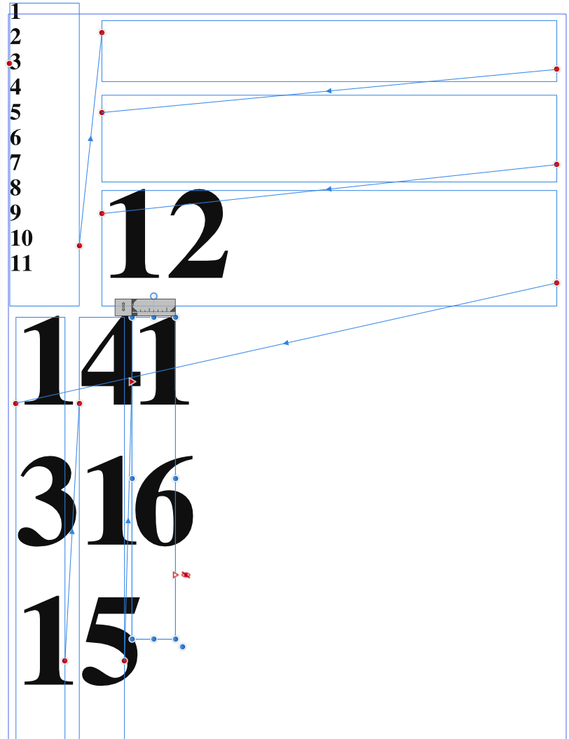
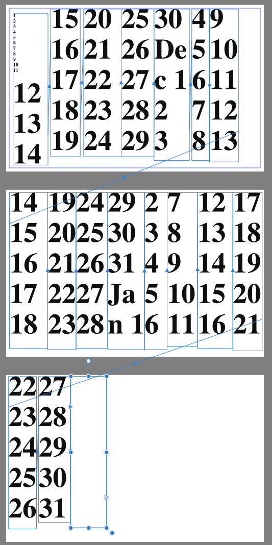
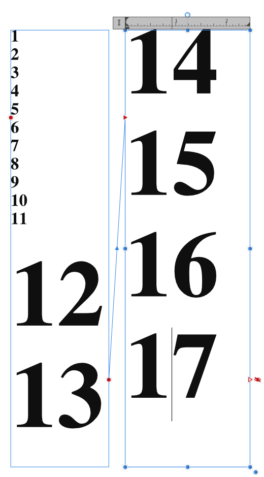
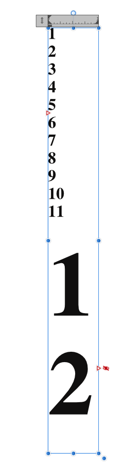
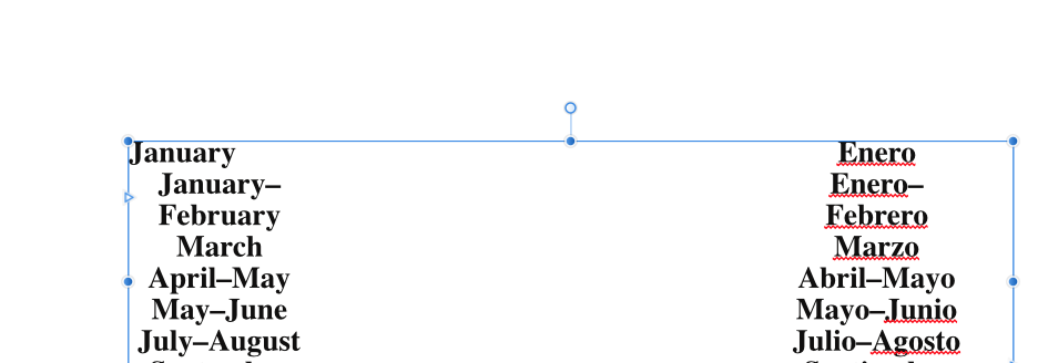
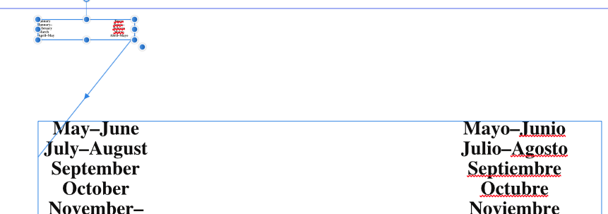
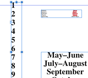
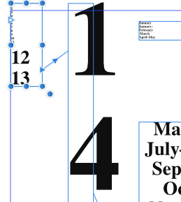
Gabe - I started with the current version of the file I uploaded recently. That includes a string of numbers separated by returns, the first elevent in one text frame, then 54 in separate frames (two with accompanying text, "Dec " and "Jan ") on another page, and seven more separate frames on a third page, all displaying as Times Bold 26 pt. I clicked in the first frame, did a Select All and a Copy, opened a new file (which defaulted to the same page specs as the first), drew a long vertical text frame and pasted within it, and got 1-11 in TImes 26 Bold and 12 in Times 144.4 Bold ("AffPub 01.png"). I widened that to allow 2 characters on a line, clicked the flow-arrow and drew another frame using the flow arrow on the left ("AffPub 02,png"): 1-11 in Times 26 Bold plus 12-13 in Times 144.4 Bold in the new first frame, 14-17 in Times 144.4 Bold in the now-second frame. "AffPub03.png" shows what happened when I added frames and pages to display the whole text sequence: all but the first 11 numbers in 144.4 pts. I never used the outer edge handle, I promise you. Next I tried a new document with fresh text, the alphabet separated by spaces, in a series of frames also created with the flow-arrows. Nothing I did with changing fonts or sizes could get the text to misbehave (unless you count overflow not appearing below the last frame as wrong) - see "AffPub 04.png". So I pasted the string of numbers from before into the same linked text frames, and go the same 1-11 in 26-pt, 12-on in 144.4-pt display I had before ("AffPub 05.png") I don't know if you'd count this as replicating the problem - apparently the glitch is in the string of numbers, not in the frames. I'd play some more with that string, except that meeting my most recent deadline involved staying up to 3 am last night & I'm more interested in sleep than in bug-chasing at present. Affpub xprmnt 02.afpub AffPub xprmnt 01.afpub

-
But I didn't use the "outer handle" in creating any of these examples - after one experiment to see what it does (and not, so far, having any use for that feature), I've carefully left it alone ever since.
-
Igcal template.afpub
-
I have no experience with screen recordings, and am close to deadline on a major project so don't want to take time to learn how to do that. Here's a sequence of screen caps. The only difference between the first two is that I clicked on the text frame's preceding-frame text flow arrow and drew a text frame above the first one. The text I started with was Times 24-pt Bold, with spacing set to 25 pts; the same text in the new frame is Times 4.3-pt Bold, with spacing of 4.5 pts. Resizing the upper frame causes the text to flow between them as it should, except that it changes size up or down depending on which frame it appears. This does not happen consistently: for example, from the same page on the same document, the 3rd cap shows a line of numbers. The 4th cap shows what happened when I did the same thing by creating a preceding text frame with flow between the two: the text which had been in that frame (24-pt Times Bold with 26-pt spacing) shrank to 4.3-pt (4.5 pt spacing), the next two numbers which flowed in to the preceding frame stayed at 24 pt, and the numbers which moved into what had been the first frame went to 133.3-pt (spacing 144.4 pt). I'll attach the whole document in my next post, along with extraneous material. You will see on pg 4 that I tried to duplicate this effect using a following-frame text flow with the same sequence of numbers, but in that case the software behaved itself and the sizing and spacing stayed the same.
-
Publisher layers?
PButler replied to PButler's topic in Pre-V2 Archive of Affinity on Desktop Questions (macOS and Windows)
My typical recycled entry looks like this: Q pm. So all I have to do is select the "Q", type in the bolded part of the new entry, click the right-arrow key once, and type the rest. Quick and easy (though I needed matching styles as well, particularly since Pages sometimes likes to change 10-pt times to 18-pt Helvetica when part of a text box gets deleted; at least the matching quirk in AffPub apparently needs a text-frame link to go that nuts). -
Publisher layers?
PButler replied to PButler's topic in Pre-V2 Archive of Affinity on Desktop Questions (macOS and Windows)
That Pin panel looks like exactly what I need (at least once I get a better grip on the Decorations possibilities). After I finish each issue's calendar, I usually make a copy with a filename for the next issue and, during slack times of phone calls, etc, eliminate nearly all the text, saving only an initial letter or two in boldface for the lead words and a little in plainface for the rest of the entry (except for reliably repeating items, where I might delete only the title of a talk). That sets me up as well as I can predict it for the next month's production - typically done a few hours before going to print, with someone looking over my shoulder. -
Publisher layers?
PButler replied to PButler's topic in Pre-V2 Archive of Affinity on Desktop Questions (macOS and Windows)
I spent my AffPub time yesterday trying to understand/duplicate your example, and only got partway there - gotta dig more into text styles and other panel esoterica. Each time I thought I'd figured out how to do two different types of after-paragraph Decoration, results came out inconsistently at best. In my Nov-Dec example, the 3rd Sunday, for example, is "Dec 1". Our next issue will be Jan-Feb, and the 3rd Sunday will probably be "[Jan] 26" (because we will come out, again, on the 2nd week of the month). If I can't slide the numbers around by text flow, I'll have to re-enter each one - time-consuming and especially aggravating after having used an easier system. But possibly I can have the best of both by embedding date-number text frames within text columns (maybe the Edit menu's "Paste inside" command will help there - a pity the Help section doesn't even mention this not-seen-anywhere-else-in-Mac-apps feature). Damn, I miss the days when software developers produced systematic manuals, instead of leaving users to bounce around between videos, help-file topics, chat fora, and trial-&-error. At least I'm pretty good at that error part...