sheriffderek
-
Posts
30 -
Joined
-
Last visited


-
 Lutz Pietschker reacted to a post in a topic:
Crop Canvas in Affinity Designer?
Lutz Pietschker reacted to a post in a topic:
Crop Canvas in Affinity Designer?
-
HawaiiAna reacted to a post in a topic:
accessibility | tagged pdf support
-
hFA reacted to a post in a topic:
Noise on Affinity Designer (Color panel)
-
 "allows you to apply a non-destructive warp over any vector artwork or text. Choose between a fully customizable mesh, or use presets including arcs, perspective, fisheye and twists. Editing a warp gives a super-fast live preview, even on complex illustrations, and gives a true vector end result" Is it finally here!!?? https://affinity.serif.com/en-us/press/newsroom/affinity-v2-sets-new-standards-in-creative-software/#affinity-designer-2
 -
SallijaneG reacted to a post in a topic:
accessibility | tagged pdf support
-
PaoloT reacted to a post in a topic:
accessibility | tagged pdf support
-
accessibility | tagged pdf support
sheriffderek replied to kai2's topic in Feedback for Affinity Publisher V1 on Desktop
I've been focusing on HTML and web-specific accessibility tree type things, but this year I attended CSUN conference and learned a bit more about PDF accessibility. I'm trying to think through the steps that would be needed. When creating documents, we already use paragraph styles. Those aren't necessarily semantic, however they aren't a big leap from tagging things. I'm laying out a pricing sheet in Publisher right now (which is fairly simple) - but as an example, if there was a panel like the paragraph styles panel - but with h1, h2, h3, h4 - (or however they do it in PDF land) - it would be quick to select the headings and assign them to their respective hierarchical tags. There could be a panel for "Assistive technology" and it could be like the "appearance" panel / and contextual. Whatever was selected could have its options. An image could have alt text. A block of text could have optional headings. Given that there's a history panel - and we're able to record state and key: value pairs for just about everything - I'd be curious what the hold up is here. Is it a gap in the real-world reasoning for how it works? (as you can tell - I don't know either / on the actual PDF output side) (or the legal side) - But as someone who would use a screen-reader or braille reader to read a basic PDF document, that part seems like something we can illustrate to help move this forward. As it stands, Publisher can't be used to create official (legal) digital documents for any company - unless you plan on sending them out for remediation.
-
sheriffderek reacted to a post in a topic:
accessibility | tagged pdf support
-
sheriffderek reacted to a post in a topic:
SVG filters
-
I couldn't put the video here because it was over 2mb - so, I put it on this page: https://perpetual.education/resources/sizing-your-art-in-affinity-designer/ I was frustrated about changing the document size, but once I realized I could just use the artboards - that's all I use now. Sizing to the selection isn't always perfect - but here's a few examples in case it helps in the discussion.
-
Azure Sea reacted to a post in a topic:
Crop Canvas in Affinity Designer?
-
 iuli reacted to a post in a topic:
Option to turn HSL color wheel to have red at the top (0deg)
iuli reacted to a post in a topic:
Option to turn HSL color wheel to have red at the top (0deg)
-
Well, I'm glad you've found an outlet here. I just wish it wasn't drowning out my feature request. - for no good reason. I'm sure there are 30,000 Discord servers where you could go and correct people for fun.
-
Thanks Adam. This is really useful. Why did you retire, if you wanted to continue to try and teach people math?
-
Snapseed reacted to a post in a topic:
Option to turn HSL color wheel to have red at the top (0deg)
-
Snapseed reacted to a post in a topic:
Option to turn HSL color wheel to have red at the top (0deg)
-
sheriffderek reacted to a post in a topic:
Option to turn HSL color wheel to have red at the top (0deg)
-
sheriffderek reacted to a post in a topic:
Option to turn HSL color wheel to have red at the top (0deg)
-
sheriffderek reacted to a post in a topic:
Option to turn HSL color wheel to have red at the top (0deg)
-
OK. So, for anyone with common sense - I'm sure the request is clear. For anyone who wants to fall on their sword about the not-so-perfect wording of my request, please do so.
-
NotMyFault reacted to a post in a topic:
Option to turn HSL color wheel to have red at the top (0deg)
-
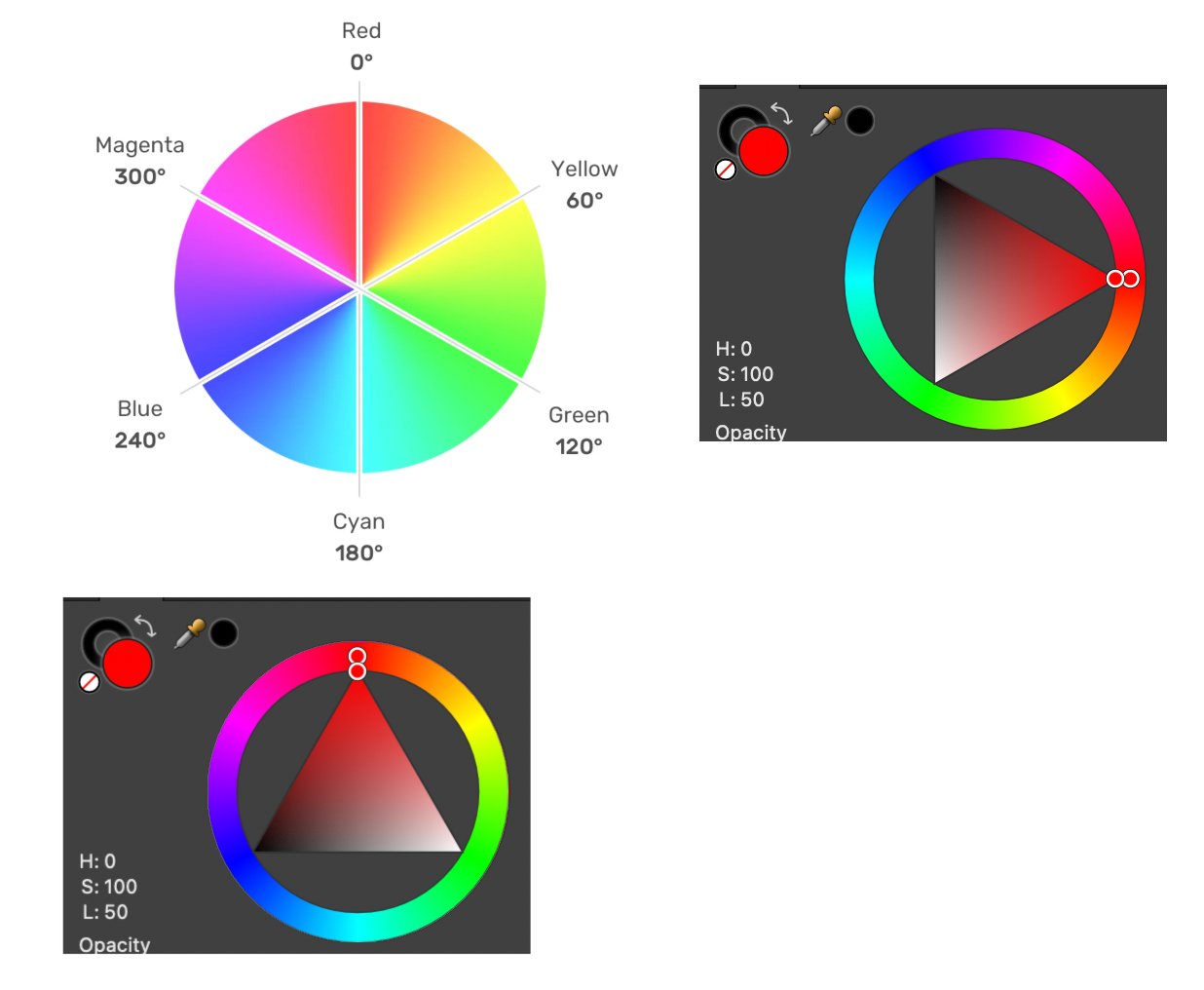
Who knew it would be such a snappy topic! I might not be smart enough or emotionally intelligent to understand the joke / or specific version of attitude here. But I'm OK with that. It would benefit me, my web designer/programmer colleagues, and my students - to have the wheel match up with what we perceive to be "the top." That's just my opinion. And I totally agree that when searching the web there are figures showing it at 0deg, 90deg, 310deg - and all over the place. But my desire is clear enough. I'd like it at the top. Anyone who cares to hear me, can talk about it more. If they want to implement a single checkbox, 4 radio buttons, or a number field to choose the degree of choice: that'll be up to Serif. https://www.w3.org/wiki/CSS/Properties/color/HSL https://www.smashingmagazine.com/2021/07/hsl-colors-css/ Maybe I'm just relating it to a clock? Top is zero? When I'm skateboarding / I'm going 0deg straight. If you think my idea is something that would hurt other people, or that there is a better way to think about it, or that you can explain some history of it - please do. I would love that. But saying "I don't care - it's fine" - is a waste of everyone's time. (yours too) Maybe we just shouldn't use HSL at all: https://wildbit.com/blog/accessible-palette-stop-using-hsl-for-color-systems I'd be curious how it works for people who can not see the colours.
-
I can't see the coordinate system. I can only see the color wheel. Is there something I can do to clarify the request?
-
I care more about AD specifically, but the whole sweet uses the color wheel. So, I think the change would be across all of them. The H in HSL - is a 360deg (well, and beyond in many cases) - spectrum of hue. Most examples/figures show red at the top of the wheel. Being able to learn the colors - is a major win over hex or rgb. You can't really learn those. However - you can could on 0deg or 360deg being "red" and then adjust the saturation and lightness from there. You can count on 180deg being a light blue. Over time, you can learn where the colors are - generally. The color wheel in affinity - is a daily joy. We love it. It's the best. But - the red starts at 90deg. If we could set it to turn -90deg then it could match up with our mental model for the degrees. A checkbox in settings would be lovely.
-
User interface and transform
sheriffderek replied to Neil M's topic in Feedback for Affinity Designer V1 on Desktop
There are many other topics with the goal of explaining our desire for a free-transform tool. I suggest you add to those instead of creating a new one. and I believe there's one from 2015, but I can't find it. -
Ah! I have it wrong. The SVG is in the correct order but the HTML would in the incorrect order. I'll edit the request. It's not a problem exactly - but I will explain how it would be helpful in the edited post. : ) As far as the code - I'll link to this CodePen: https://codepen.io/perpetual-education/pen/NWaWxrx?editors=1100 which shows some SVGs being used inline - (as opposed to as src in an img element) and being manipulated with CSS state and animated.
-
Plainly - "naming many layers at the same time" - is useful just by itself because you are doing something 1 time instead of many. You might have 20 "eyes" in your illustration of a jungle at night - and want to name them all "eye." Currently: you would (find the layer, double-click twice, and type "eye")*20. Here is one of my use cases: I have this illustration. I'm tasked with preparing it to be used for an SVG / where I'll be giving each path it's own --custom-property for dark mode and it may also be animated in some way. Affinities options for SVG export are another can of worms, but - I'd would like to select > similar fill (which will then highlight all of the layers with paths using that fill color) - and I'd like to name those layers. If I could right-click and just rename them all - that would be really fast. Other wise, clicking each one will remove the highlights - and I'll be doing the process many times. In this situation, grouping them is not an option. And these layers must stay in this source order. Does that help explain it?
-
When working with SVG files (The code) as inline SVGs - the source order is the same layers panel. However, when visual designers are mockup up layout ideas for HTML components, the layers panel is in the opposite order as the HTML source. With HTML, the elements will be 'on top' of each other when they appear after one another in the source. A toggle to flip this could help us with the visual-design/graphic creation and the mental model for how things will work between graphic artist and the developer who will be working with that file later.
-
I would like to rename a bunch of paths to the same name. (because then when I export - I want to change those IDs to classes for some inline SVG CSS stuff). I can select many layers with command and click /or with select > similar https://affinity.help/designer/en-US.lproj/index.html?page=pages/Layers/selectEditLayers.html?title=Selecting and editing layers but I do not see a way to rename all of those things. In our case, I can't group them - because they are many paths away from each other - in a stacking order.
-
sheriffderek reacted to a post in a topic:
Multiple Curves in one stroke
-
I've been tasked with something like this as well. I thought I might use multiple strokes, but - haven't found something that will allow me to draw many lines and magically have them be adjacent. One of my students is trying to emulate this coffee ad. Just droppin this example here in case it stirs up any ideas on this. It seems like it would be complicated math - and that it would need some controls for how many and how thick to calculate it. Do you have any advice on what terms I could use to search for this? Maybe I can use illustrator for this part of the project. "Adjacent stroke" was all I could think to type.