softsound
-
Posts
64 -
Joined
-
Last visited
1 Follower

-
 keiichi77 reacted to a post in a topic:
Artboard set size?
keiichi77 reacted to a post in a topic:
Artboard set size?
-
keiichi77 reacted to a post in a topic:
Artboard set size?
-
 I always think of what I imagine being there.... Maybe one day we can features like a button for the news XD I know the modern style of UI and UX does not have condensed UI but ah well, in my head it's far faster, just right there is a logical spot. Also, man does Photo 2.5.2 have issues with blur! Man, nothing worse than just moving something and having it get all blurry. And yeah, I'm not going to spend time making this all match up perfectly it's just a quick mock-up here.
-
[Designer] Flip/Rotate Canvas
softsound replied to Tankitha's topic in Feedback for the Affinity V2 Suite of Products
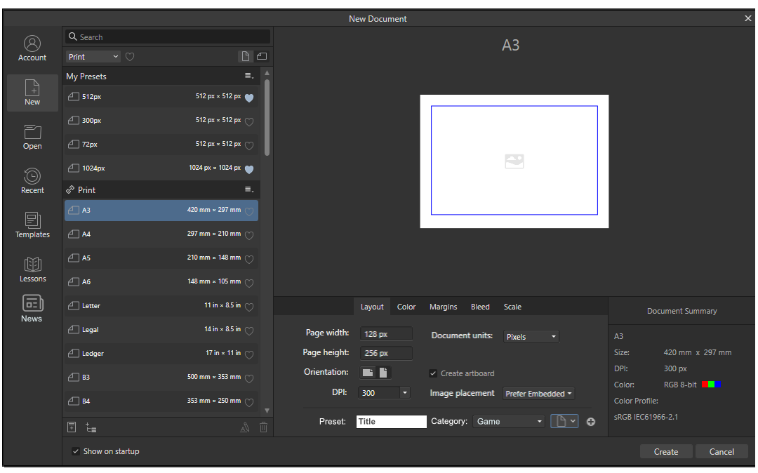
To me, this is a poor oversight when thinking of presets you *might* think about toggling it there but I think that just also having this button or something similar associated with the actual width and height makes way more sense from a UX perspective. That's why other software does it. So this is bad in multiple ways UX wise, it fails Jakob’s Law about working with similar models (aka not reinventing the wheel). Sure it kinda works with law-of-similarity in that it's grouped by search and presets and functions as a global switch-a-roo but honestly most people when working on a doc and typing in their dimensions aren't thinking globally and if they need to flip their local document aren't thinking ah yes, just need to flip all my global presets and everything on the page...! This comes up so often in the forums. Just make a copy of the button and stick it next to the page dimensions or add a local button that only affects that document properly and not the presets. Problem solved. Now if only Affinity would implement this... I suppose it's functional sure, but only in a roundabout way. Since I work in games I tend to work in the power of 2 (64, 128, 256, etc)so it's not something I use *that* often but when I'm looking for the function I seem to have to look it up often since it's a poor association.... On that note, I'd probably redo quite a lot of this screen if I could... -
 William Overington reacted to a post in a topic:
I visit this website and I get lots of Affinity Hey Hey adverts on YouTube
William Overington reacted to a post in a topic:
I visit this website and I get lots of Affinity Hey Hey adverts on YouTube
-
I don't think I've seen an ad for Affinity and I've been using them for years. Then again, I use a lot of ad blockers XD
-
bryanwithay reacted to a post in a topic:
Allow Gradient Swatches To Be Set Globally
-
Please! We really need a tool like this, almost all my work is with gradients and the fact they are basically not reuseable is so frustrating. We also could use a feature that has gradient presets, transparent to opacity, vice versa, would be even more awesome if we had maps we could use to quickly remap an image like in Clip Studio. I get gradient packs all the time with clip, wish we had something like that with Designer. Just having the basics like in Photoshop would go so far.... Even Krita has some basics even if they aren't very good some presets are better then nothing. Please allow for global styles, or bare minimum presets we can save and alter!
-
softsound reacted to a post in a topic:
Allow Gradient Swatches To Be Set Globally
-
softsound reacted to a post in a topic:
Allow Gradient Swatches To Be Set Globally
-
softsound reacted to a post in a topic:
Line (Stroke) Width Tool
-
softsound reacted to a post in a topic:
Variable Font Support
-
Raptosauru5 reacted to a post in a topic:
Separating Layers by selected Artboard
-
Yes, I was thinking the same thing recently, why show all this stuff I'm not using at the moment?
- 1 reply
-
- 1
-
-
softsound reacted to a post in a topic:
Separating Layers by selected Artboard
-
softsound reacted to a post in a topic:
Support Layers Clipped To Groups
-
This is such a nice style, thank you for making it free!
-
Samuli reacted to a post in a topic:
QOL improvements artboard tool
-
softsound reacted to a post in a topic:
Artboard set size?
-
softsound reacted to a post in a topic:
Insert artboard that has specific (or print) size
-
deeds reacted to a post in a topic:
Feature Requests that Were Added to the v2 Applications
-
Where did the news screen go in V2?
softsound replied to softsound's topic in Desktop Questions (macOS and Windows)
Thanks, though I'm disappointed they removed that feature, I rather liked it as it saved me a little time. Even just adding a link somewhere for updates would have been nice. -
softsound reacted to a post in a topic:
¿HowTo: Convert between Art Text and Frame Text?
-
I used to use it to download whatever freebies normally came with the upgrade, and sometimes just browse updates. Did V2 get freebies? Normally every upgrade might throw in a brush or font or something extra when upgrading.
-
eoaaeo reacted to a post in a topic:
The UI at first look it's nothing special
-
softsound reacted to a post in a topic:
form fields and interactive pdf export would be nice
-
For me in addition to the original post: trace tool better gradient controls it was hard to reuse gradients... Like if I make a layer effect gradient I want to use elsewhere what now? Why doesn't this work like color? Why are layer and fill color/gradients not the same? Paint format tool like in google docs so I copy text fonts/styles quickly and reapply in 1 click.. I'm still surprised we don't have symmetry tools/rulers that doesn't sound that hard to implement.... I feel overall Publisher upgrades were nice. Designer upgrades so-so.. Photo not that noticeable...
-
I think you made some good points. 1) They lost information with the some of the new icons, the source of color made them easier to scan on those icons. Removing the color will slow down users. 2) I agree, looks better. 3) I'm not sure if having colors for particular software is good or bad, but would make the color schemes at least make more sense. To me most of the color in affinity feels kind of random. 4) The placement of the horizontal or vertical button is really bad, layout info should be in the layout section... I feel those buttons should be larger and in a place you scan more often, same with the heart though, that feels like an awkward place for it. Personally I preferred more of the old layout as it felt the info was compacted better and looks faster to use. 5 & 10) Yeah it's a big downgrade. 7) I still can't believe they don't have this. I complained about this years ago! The bad UI changes is a big disappointment for me. It's made me debate getting the upgrade, I used to admire Affinity for some their design choices but it feels like they didn't care as much with this round. I've always thought their icons were not great but at least readable, some of the new ones now are again just bad... And I'm disappointed they didn't follow standard UX laws of grouping like info, and reducing clicks when possible, etc. It feels like they wanted to really use screen space in this update, but the problem with using a lot of screen space is it slows you down. A fair amount of other posts bring up where they slowed down the experience. Most of the time it's better not to show advanced features or previews unless the user asks for it and it would be better to make them a separate window as most users won't need that info. I think it would have been better not to make the UI changes a selling point as they are mostly a disappointment. That said I've been a fan of affinity for a while so I intend to upgrade and hope things will improve in the next version 10 years from now
-
PixelEngineer reacted to a post in a topic:
Does Affinity offer export to pdf/x-1a:2001?
-
jbikeler reacted to a post in a topic:
QOL improvements artboard tool
-
This is pretty awesome! Thanks!
-
Those are some nice resources, I'm going to bookmark your website because it's really useful just need a bit of google translate and it's great.
-
@GBF15 You can probably get away with PDF/X-1a:2003, as it seems affinity handles the transparency right, worst case you can ask for a refund from affinity or just use the trial version. The trial version is great, fully featured and you can download it as often as you want (I think, don't quote me on it).
-
Well, I'm not great at book cover's so take what I say with a grain of salt, maybe just try a few different designs and have people vote on it? You can try different text styles and see if anything stands out better. I made a quick attempt at it, and I don't exactly like your font but I think it's easier to read then what I have though so... maybe try a few different designs and look at a few book covers and try those styles. I think for the most part at the end of the day it's mostly personal preference...
-
There is another way to do if you are in a hurry, if you copy and paste in image you should be able to directly change the color. But yeah using layer effects is the pro way to go about it. Oops. Did not realize this post was so old, sorry! exampleColoring.mp4