Samuli
-
Posts
34 -
Joined
-
Last visited
1 Follower

-
 Samuli reacted to a post in a topic:
Transparency on PDF export
Samuli reacted to a post in a topic:
Transparency on PDF export
-
QOL improvements artboard tool
Samuli replied to softsound's topic in Feedback for Affinity Designer V1 on Desktop
This is an obviously useful feature and would make a big difference. -
Samuli reacted to a post in a topic:
QOL improvements artboard tool
-
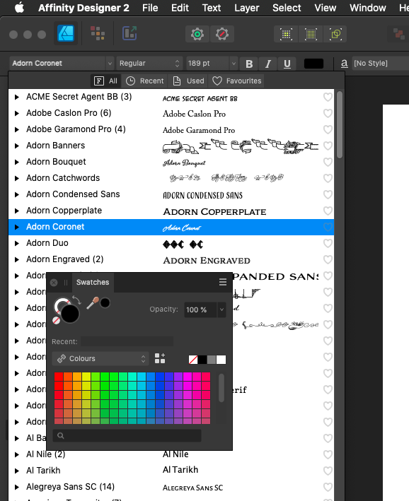
Beautiful-Cranberry reacted to a post in a topic:
How to create a Swatch?
-
Fixx reacted to a post in a topic:
Has V2 fixed Affinity's biggest issues?
-
AllAppsUser reacted to a post in a topic:
Has V2 fixed Affinity's biggest issues?
-
Has V2 fixed Affinity's biggest issues?
Samuli replied to Kal's topic in Feedback for the Affinity V2 Suite of Products
Adobe used to have employees on their forums who knew the apps and their development and were occasionally super helpful… and other times the opposite, but they’re human, so they get frustrated. It’s been years since I last tried the forums because I’ve just minimized my Adobe exposure but it did work. The larger the dev, the bigger the chance that someone on the forum knows the issue. -
Kal reacted to a post in a topic:
Has V2 fixed Affinity's biggest issues?
-
Has V2 fixed Affinity's biggest issues?
Samuli replied to Kal's topic in Feedback for the Affinity V2 Suite of Products
Only used Freehand at school, but we were taught to use find & replace. InDesign’s links panel could do something like it but not seamlessly. To be honest, I preferred InDesign over Illustrator for basic vector work. With this 2.0 update of Designer, I feel kind of homeless again, it’s such a letdown that they let all these UI issues slide. Maybe they got hit hard with covid or something, they haven’t said. Maybe this is just the way Serif is going to be. But there is no alternative really. Seems there is no money in going against Adobe, otherwise we would get actual competition. I’m just floored with how disappointing this is. -
Samuli reacted to a post in a topic:
Has V2 fixed Affinity's biggest issues?
-
Samuli reacted to a post in a topic:
Has V2 fixed Affinity's biggest issues?
-
Samuli reacted to a post in a topic:
Has V2 fixed Affinity's biggest issues?
-
Drop-down menus spawn behind panels, obscuring parts of the menu until you move the panel. Not a new bug, there's dozens of pages on this on the v1 forum, but just on the off chance it slipped someone's mind, here's the thing again. For me it's a deal breaker, I need to be able to place my panels freely. I'll just stay with v1 until it's changed or a better alternative comes along.

-
I was ready to pay for the upgrade just to get this bug fixed but apparently they just don't think it's that big of a deal. It's a hard pass for me.
-
For anyone coming to this topic later, dragging the image with the Crop tool works in Designer. Took me a long time to figure out that it switches from the mask to the image when you click on the image and switches back when you take the cursor out of the image area and bring it back. Not a fan of this mechanic, it's super confusing and breaks all kinds of established UI conventions. Feels more like a bug than a feature but it works. A much more conventional solution would have been to use CMD-drag but Affinity doesn't use CMD in the conventional way either.
-
seaxsun reacted to a post in a topic:
How to display brush names in Brushes Studio?
-
Efvee reacted to a post in a topic:
1bit / bitmap mode colour format?
-
1bit / bitmap mode colour format?
Samuli replied to Clyde's topic in Feedback for Affinity Photo V1 on Desktop
There is no substitute for 1-bit 1200ppi images and how they are used in print publications. The filesize is negligible compared to greyscale or heaven forbid, CMYK. We are talking 1-bit – a couple dozen MB and CMYK – several GB. This has a direct effect on speed at every stage of the process. Add to this the fact that Affinity has no Live Trace equivalent, which makes large scale hand drawn type next to impossible to work with in Affinity. I have to send my type as separate Photoshop prepared files and just tell the client to place it into the layout themselves. It’s not a great look for a professional. -
I hope you are fixing all dialog boxes that are behind panels at the same time, because it's making single display setups very cramped when you can't have any panels in a space where a dialog box might appear.
-
Marcus_Dobler reacted to a post in a topic:
Default location for Save As (and Export)
-
Samuli reacted to a post in a topic:
dialog boxes and tool palettes
-
Samuli reacted to a post in a topic:
dialog boxes and tool palettes
-
This is really getting old.
-
Default location for Save As (and Export)
Samuli replied to p10n's topic in Feedback for the Affinity V2 Suite of Products
It might be a system feature but obviously there are different ways to work with it, otherwise this issue would affect each and every app on your computer, but instead, it's a problem of a select few apps. Most apps I use (for example: Photoshop, Clip Studio Paint, Ableton Live, LibreOffice) do not have this behaviour. So, this kind of makes it a developer issue, instead of an Apple issue, unless all these other developers have some sort of side deal with Apple which is not available to Serif. As for Default Folder – I have made it a rule to stay away from apps that change system behaviour. I have found that they invariably break another thing when they fix one. It might not be an issue for you, but I have a very bad track record with them, so I steer clear. -
Default location for Save As (and Export)
Samuli replied to p10n's topic in Feedback for the Affinity V2 Suite of Products
Still an issue in 2021. And it's not just "Save As…", each file action is its own little island. So if I open a file, Save As…, find the original folder, then I'm ready to Export that file and I get to do it again because it assumes I want to Export to where I exported last time. So, basically this is designed to work well with large series of images that all end up in the same places. But that's what Lightroom does for photos and Affinity is not particularly suited to that workflow. It's even more obvious when you consider Designer and Publisher. They're not factories, they're design apps. It's engineer logic vs. designer logic again. Serif sits squarely in the engineer space. -
Samuli reacted to a post in a topic:
How to display brush names in Brushes Studio?
-
How to display brush names in Brushes Studio?
Samuli replied to R C-R's topic in Feedback for Affinity Photo V1 on iPad
Really, really need this feature! My pattern recognition skills are way below what Affinity expects of me. I need names for brushes!- 14 replies
-
- 1
-
-
- brush names
- assigned brushes
- (and 1 more)
-
A customer Serif lost reacted to a post in a topic:
How to create a Swatch?
-
Ok, this is what I said: ”This icon doesn’t work, it’s too small and vague.” You said: ”Look, there are other things that do its job.” I said: ”There are other apps in which this icon works.” See the difference? You don’t have to agree with me but the discussion is about the icon, not all the documentation Affinity has come up with to explain the problem away. Let’s put this into a form that’s more approachable: you design a book cover, but let’s say only 25% of the target audience can read it. The back cover does a good job explaining what the front cover is about but you still don’t exactly know why. Is the front cover good? Is it fulfilling its task? This is the same thing, the icon should work. I think I’ve proven that it can work much better because it does in other pro apps.
-
Not the point and you know it.
-
I do admit that I have a very strong dislike of UI cramming. I like my workspace calm and spacious and tightly crammed buttons increase stress for me. I realize there are a lot of people who want everything in a tiny cluster and it’s not just a simple ”engineers vs. designers” debate, but yeah, they go too far when legibility is at stake. I’m sure that they should aim for better than that in a graphic design app. Tooltips are crutches, especially when they are just a mask for what it really is – they made the buttons too small and the icons too complex. And like I said, tooltips aren’t trivial to access on a cintiq. If you’re fine with bad design and it doesn’t get in the way of your work, that’s ok, but it has nothing to do with my point. If you need a tooltip to find out even the ballpark of what an icon is supposed to depict, why is the icon even there? What is its function other than a placeholder? There will always be a bunch of people who aren’t bothered. The real question is would you be bothered if it worked better? So, why fight it?